[Help us become a crowdfunded podcast! Go to our Patreon homepage to become a Data Stories patron. Pledging starts at $3 per episode. And thanks!]
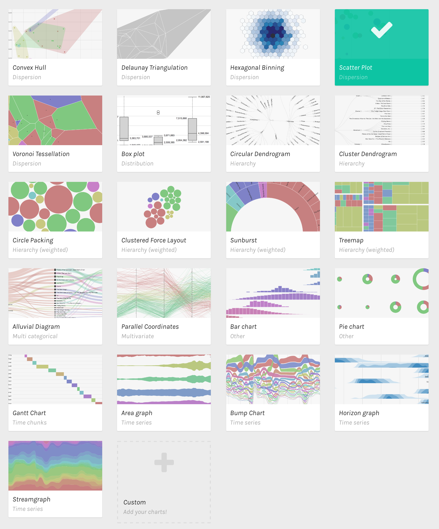
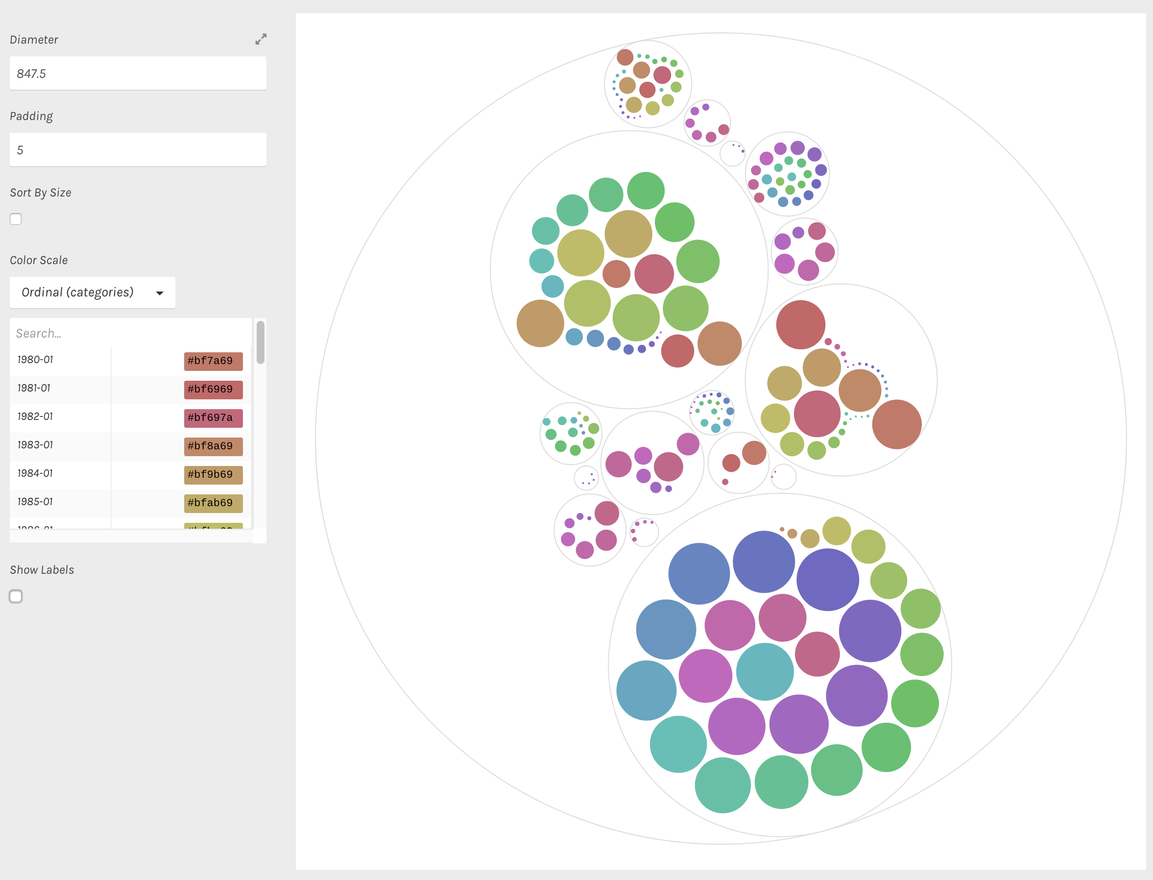
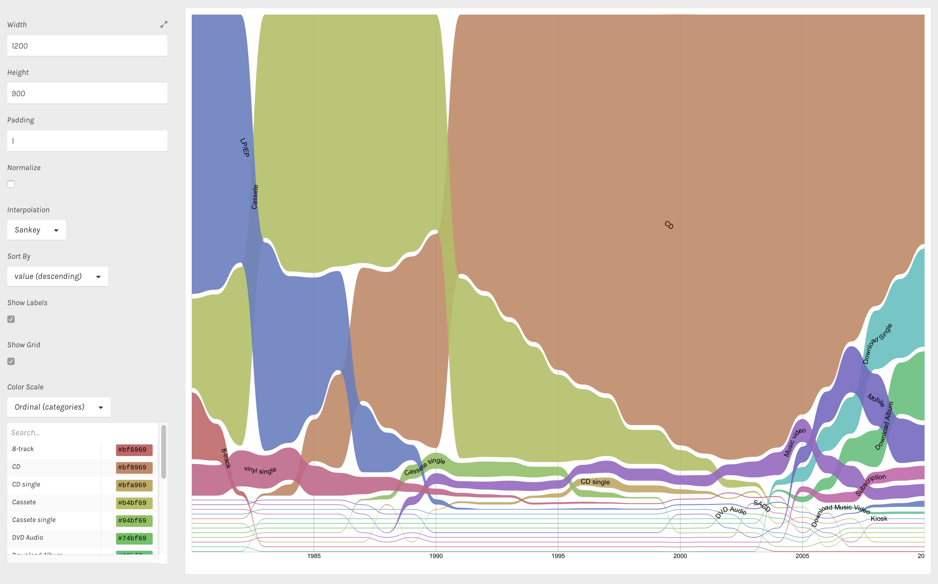
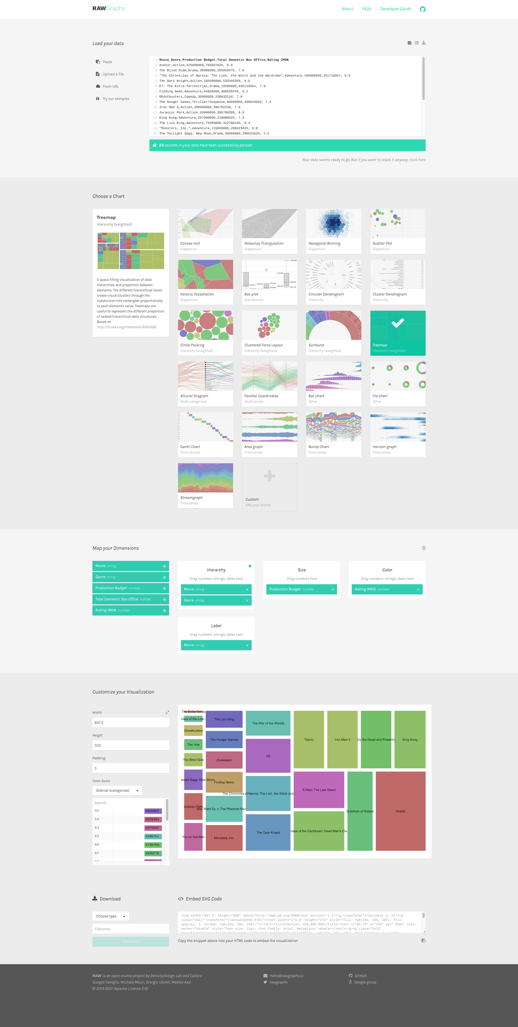
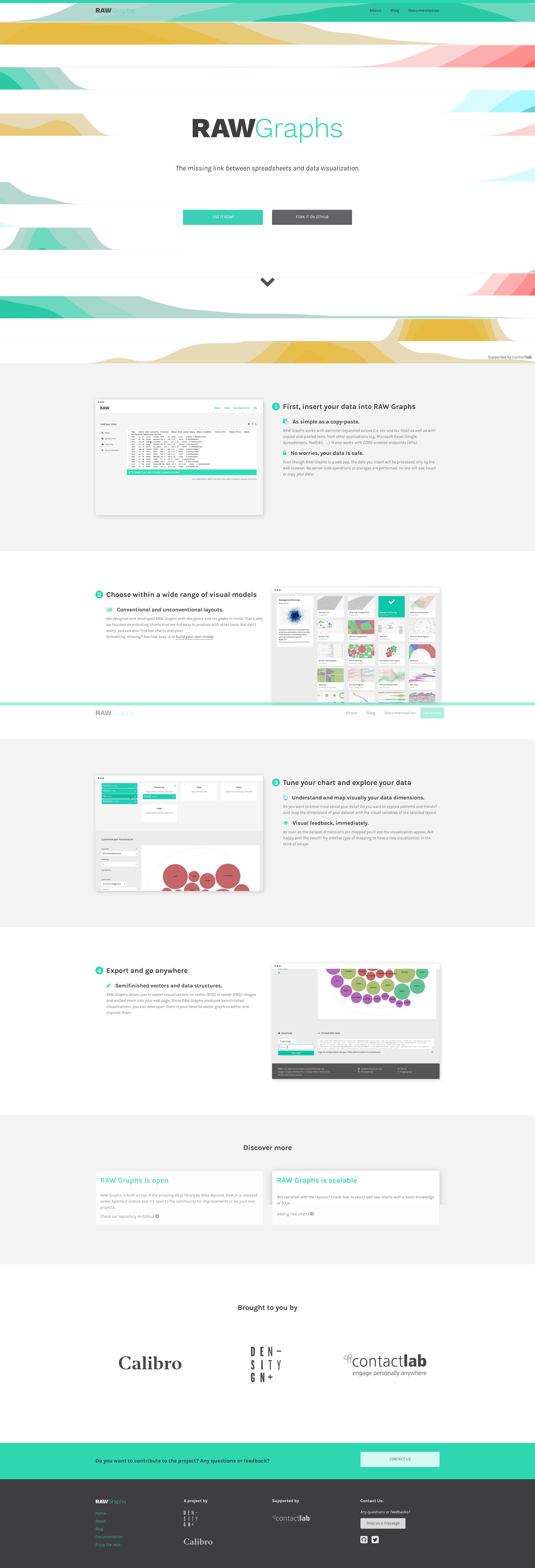
In this episode we have on a nice trio of Italian visualizers — Michele Mauri (Density Design), Giorgio Uboldi (Calibro), and Giorgio Caviglia (Trifacta) — to talk about RAW, the data visualization tool they built to help people visualize data interactively.
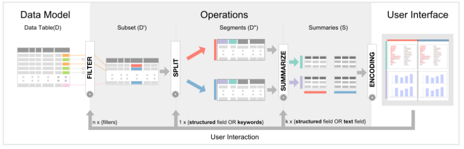
RAW is a very nice web-based and open-source data visualization tool that permits users to easily create charts without coding and to export them as vector graphics for further editing in external tools.
On the show we talk about why the team decided to develop RAW, how they got started, how they evolved RAW over time, the lessons they’ve learned, and their future plans.
Enjoy the show!
Data Stories is brought to you by Qlik. Are you missing out on meaningful relationships hidden in your data? Unlock the whole story with Qlik Sense through personalized visualizations and dynamic dashboards which you can download for free at qlik.de/datastories.
Before delving into this episode’s content, we have a special announcement: we started a crowdfunding campaign to turn Data Stories into a show that is fully-funded by our listeners! You can support us by visiting our Patreon page, and all the details of the initiative can be found here.
For our first episode of 2017 we had a very delightful chat with Brendan Dawes. Brendan is an artist and designer who works with interactive installations, data visualizations, and all things across the digital and physical sphere. He has a lot of super fascinating projects, including the famous Cinema Redux, an art piece that visualizes entire movies as a collection of snapshots.
On the show we talk about his projects, his design process and philosophy, his relationship with the data visualization world, how he generates ideas, and his upcoming projects.
We hope you enjoy this great conversation at the intersection of data, art, design, interaction and visualization!
Data Stories is brought to you by Qlik. Are you missing out on meaningful relationships hidden in your data? Unlock the whole story with Qlik Sense through personalized visualizations and dynamic dashboards which you can download for free at qlik.de/datastories.
We are ready to try something new together with you. After many years of financial support from our generous sponsors, we now want to move to a crowdfunding model, where the show is funded by you — our listeners.
If you have enjoyed listening to our show so far — now you can show your appreciation and help produce the show!
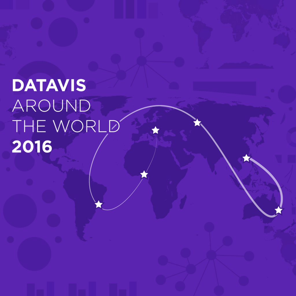
For the end of the year we decided to experiment with a new, very special kind of episode. We asked 6 different visualization experts from 6 different countries (and 5 different continents!) to tell us what happened this year in the data visualization space on their side of the world.
How is the data visualization scene where you are?
What were the major developments or projects this year?
What do you hope for next year?
As you will discover by listening to this episode, a lot is going on in these countries. It’s fascinating to learn about it, and we really hope you’ll enjoy our new experiment. Let us know what you think!
…And with this, we wish you Happy Holidays and a Happy New Year! It’s been great serving all of you through our show, including a total of 24 episodes this year!
Take care.
This episode of Data Stories is sponsored by Qlik, which allows you to explore the hidden relationships within your data that lead to meaningful insights. Don’t miss their webinar on business intelligence trends 2017 on January 11, 2017!
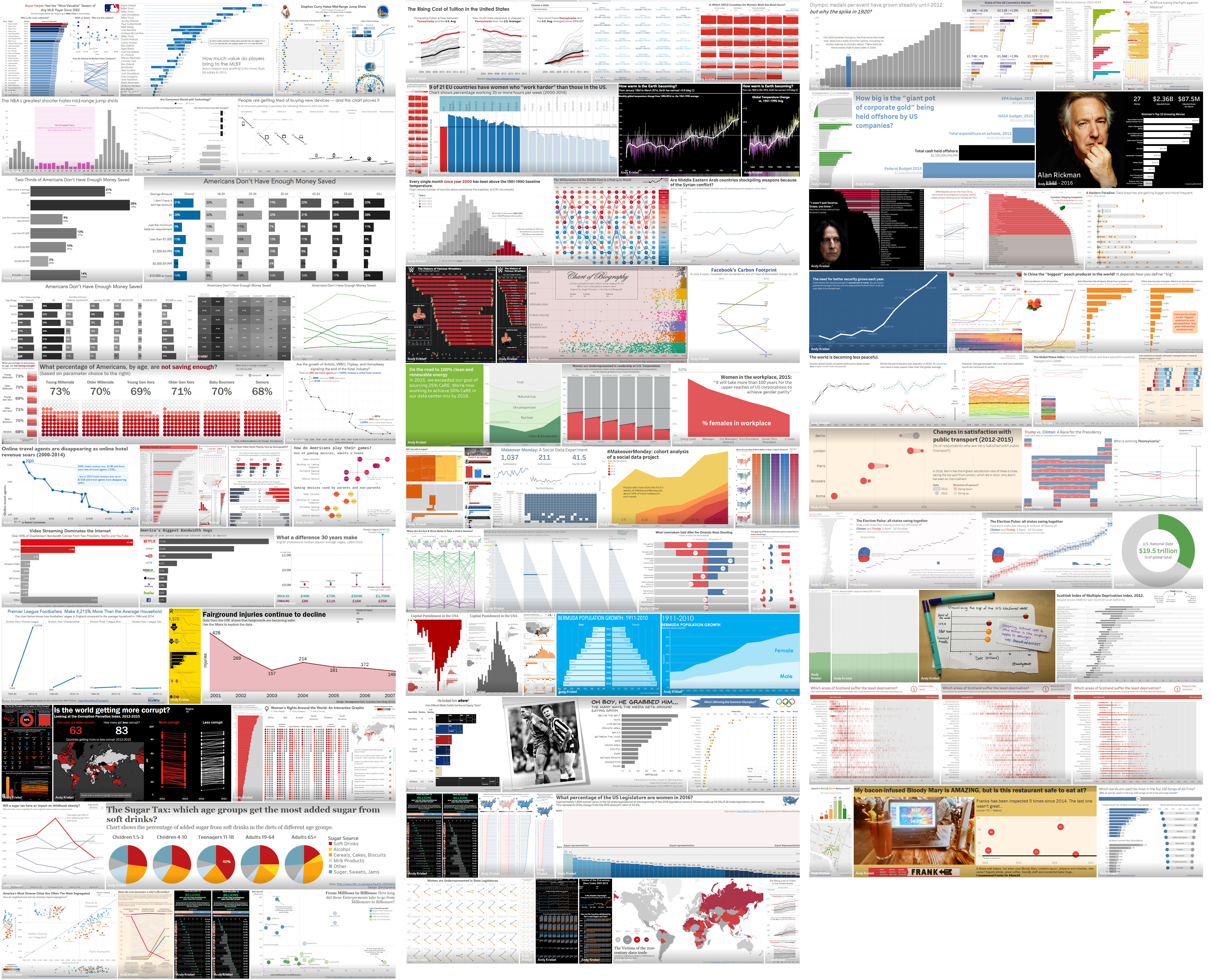
This is how #MakeoverMonday works, according to Andy and Andy: “Each week we post a link to a chart, and its data, and then you rework the chart. Maybe you retell the story more effectively, or find a new story in the data. We’re curious to see the different approaches you all take. Whether it’s a simple bar chart or an elaborate infographic, we encourage everyone of all skills to partake. Together we can have broader conversations about and with data.”
The series has recently gained a lot of traction: they have seen more than 2,800 entries from 470 participants, and will soon complete a whole set of entries for the year.
On the show we talk about how they got started with the project, how the series works, some interesting solutions they have received, and what is coming next.
This episode of Data Stories is sponsored by the Centre for Interdisciplinary Methodologies at the University of Warwick, where students study masters courses in Urban Informatics and Analytics, Big Data and Digital Media. These courses include subjects such as Visualisation, Big Data, Digital Sociology, Advanced Quantitative Research, and Spatial Methods including Geographic Information Systems all the way to User Interface Cultures and Playful Media. Find out more about studying and working with CIM at www.warwick.ac.uk/datastories.
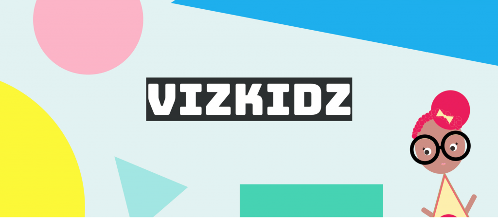
Hey, we talk about a super lovely project on the show today!
Book illustrator and product designer Abigail Ricarte and data journalist Liv Buli join us to talk about their Kickstarter project, VizKidz, an illustrated book series designed to teach kids about data visualization.
The series features four lovely characters: Penelope Pie, Laney Line, Barnaby Bar, and Bertie Boxplot, each with a specific “personality.”
On the show we talk about how the project started, how they designed the characters, and what it takes to launch a data visualization project on Kickstarter.
If you are interested in buying the book or learning more about the project, check out their website: http://www.vizkidz.rocks/.
Enjoy the show!
—
This episode of Data Stories is sponsored by Qlik, which allows you to explore the hidden relationships within your data that lead to meaningful insights. Check out the blog post about how Qlik’s vice president taught first graders some data visualization skills. And make sure to try out Qlik Sense for free at: qlik.de/datastories.
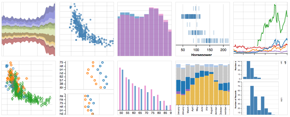
In this episode, Jessica Hullman and Robert Kosara join Enrico at IEEE VIS’16 to discuss highlights from the conference, including noteworthy presentations, papers, panels, workshops, and overall major trends.
ProPublica – Jeff Larson http://www.propublica.org
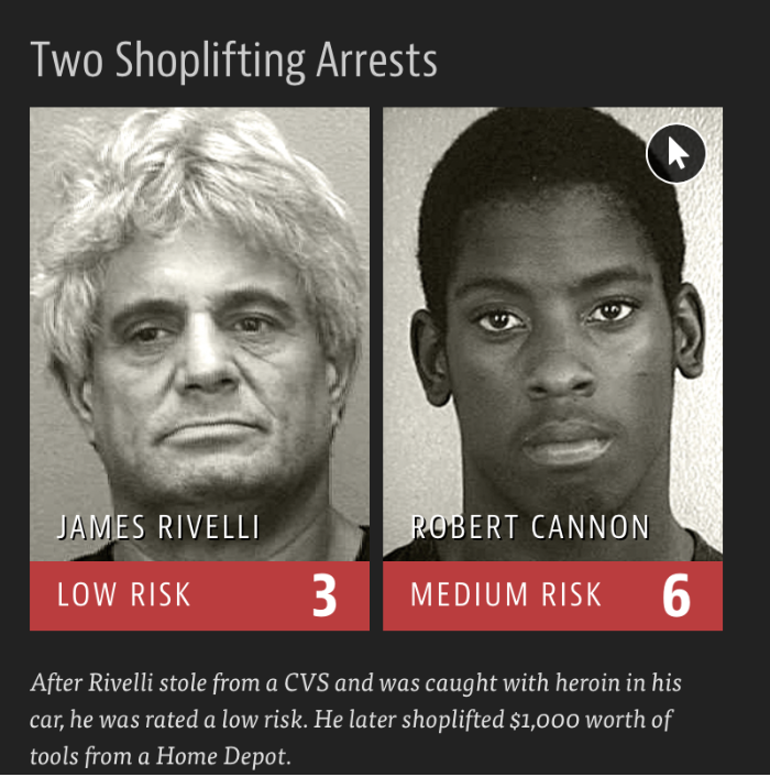
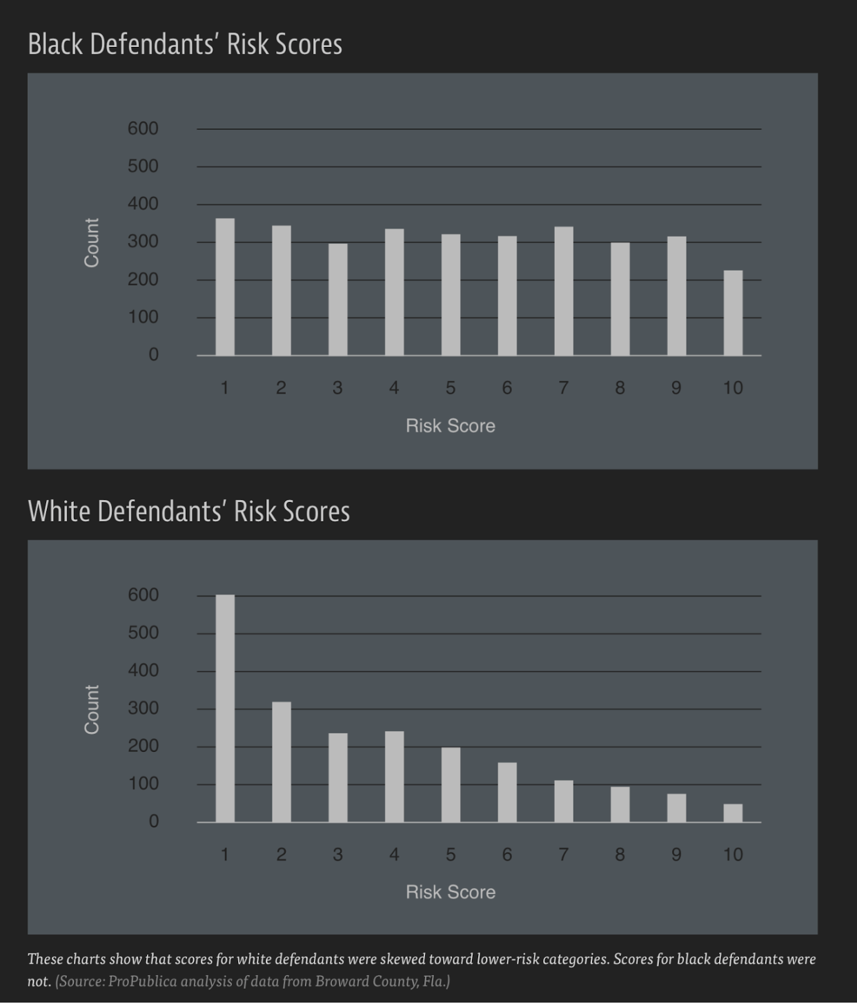
On the show this week we have Jeff Larson, Data Editor at ProPublica, to talk about his team’s recent work on “Machine Bias“. Jeff and his colleagues have analyzed the automated scoring decisions made by COMPAS, one of the systems American judges use to assess the likelihood that a convicted criminal will re-offend.
By looking at the COMPAS data, Jeff and his colleagues sought to determine the accuracy of the algorithm and whether it introduces significant biases into the criminal justice system — racial or otherwise. (Their finding: Yes, it seems that it does.)
On the show we talk about how the software is used by judges, how the ProPublica analysis was carried out, what the team found, and what can be done to improve the situation.
Jeff also gives us a small preview of other stories his team is working on and how you can go about developing similar projects.
Enjoy the show!
This episode of Data Stories is sponsored by Qlik, which allows you to explore the hidden relationships within your data that lead to meaningful insights. Take a look at their Presidential Election app to analyze the TV network coverage for every mention of both Donald Trump and Hillary Clinton. And make sure to try out Qlik Sense for free at: qlik.de/datastories.
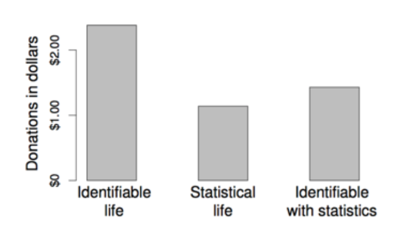
We have Professor Paul Slovic from University of Oregon on the show to talk about “Statistical Numbing.” Professor Slovic is a renowned expert on the effect of numbers and statistics on empathy (or lack thereof). His fascinating, if not depressing, experiments have consistently shown how hard it is for statistics to elicit any sense of scale in human tragedies and how numbers can often even be detrimental if the goal is to elicit compassion and generous actions from an audience.
On the show, we talk about “Statistical Numbing” and it psychological underpinnings. Professor Slovic also describes his experiments and their implications. And we address one of the most important questions: Is there hope? Is there something we, as practitioners, can do to counteract these negative effects?
Enjoy this deeply scientific episode and let us know what you think!
This episode of Data Stories is sponsored by FreshBooks, the small business accounting software that makes your accounting tasks easy, fast and secure. FreshBooks is offering a month of free unrestricted use to all of our listeners. To claim your free month of FreshBooks, go to http://freshbooks.com/datastories and sign up for free without the use of a credit card. Note: Remember to enter “Data Stories” in the section titled “I heard about FreshBooks from…”
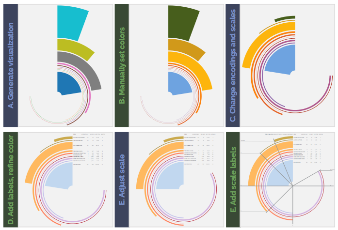
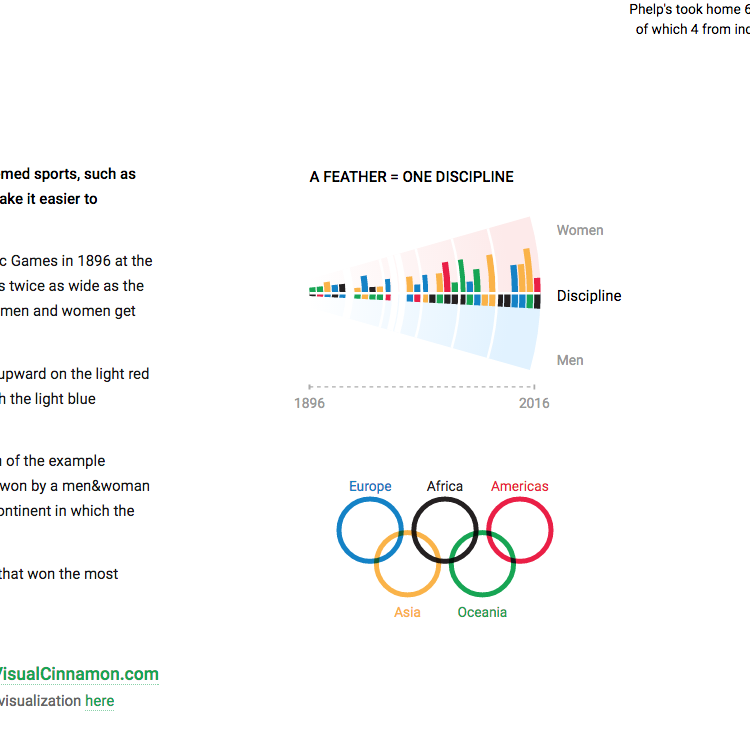
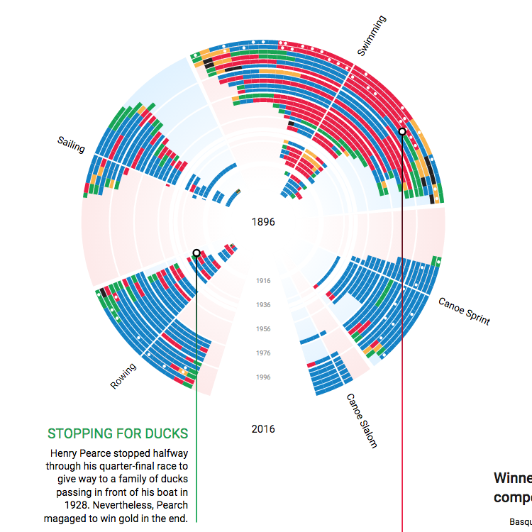
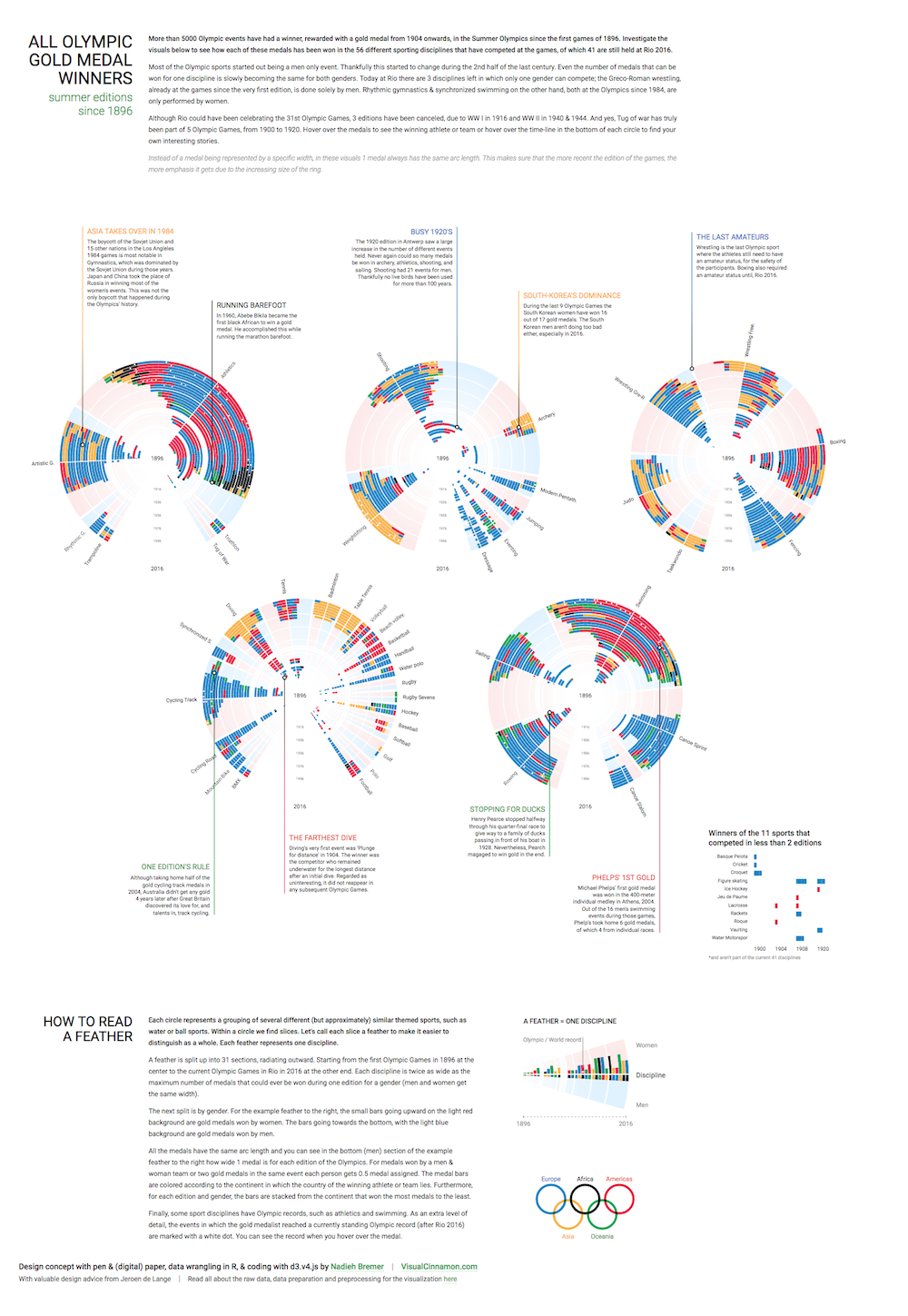
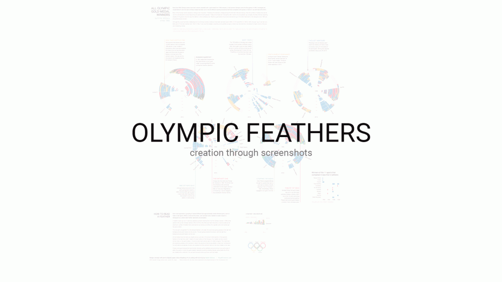
We have Nadieh Bremer (a.k.a Visual Cinnamon) on the show to talk about her latest project, Olympic Feathers, an interactive data visualization that shows the history of olympic medals from 1896 until today. The graphics depict how medals have been distributed by discipline, country, gender and geography, and also provides interesting insights into the evolution of Olympic disciplines over time. Take a look at the images below to get a sense of the visuals before listening to the episode!
Enjoy the show!
This episode of Data Stories is sponsored by FreshBooks, the small business accounting software that makes your accounting tasks easy, fast and secure. FreshBooks is offering a month of free unrestricted use to all of our listeners. To claim your free month of FreshBooks, go to http://freshbooks.com/datastories and sign up for free without the use of a credit card. Note: remember to enter “Data Stories” in the section titled “I heard about FreshBooks from…”


 We have

 We have

