[Help us become a crowdfunded podcast! Go to our Patreon homepage to become a Data Stories patron. Pledging starts at $3 per episode. And thanks!]
In this episode we have on a nice trio of Italian visualizers — Michele Mauri (Density Design), Giorgio Uboldi (Calibro), and Giorgio Caviglia (Trifacta) — to talk about RAW, the data visualization tool they built to help people visualize data interactively.


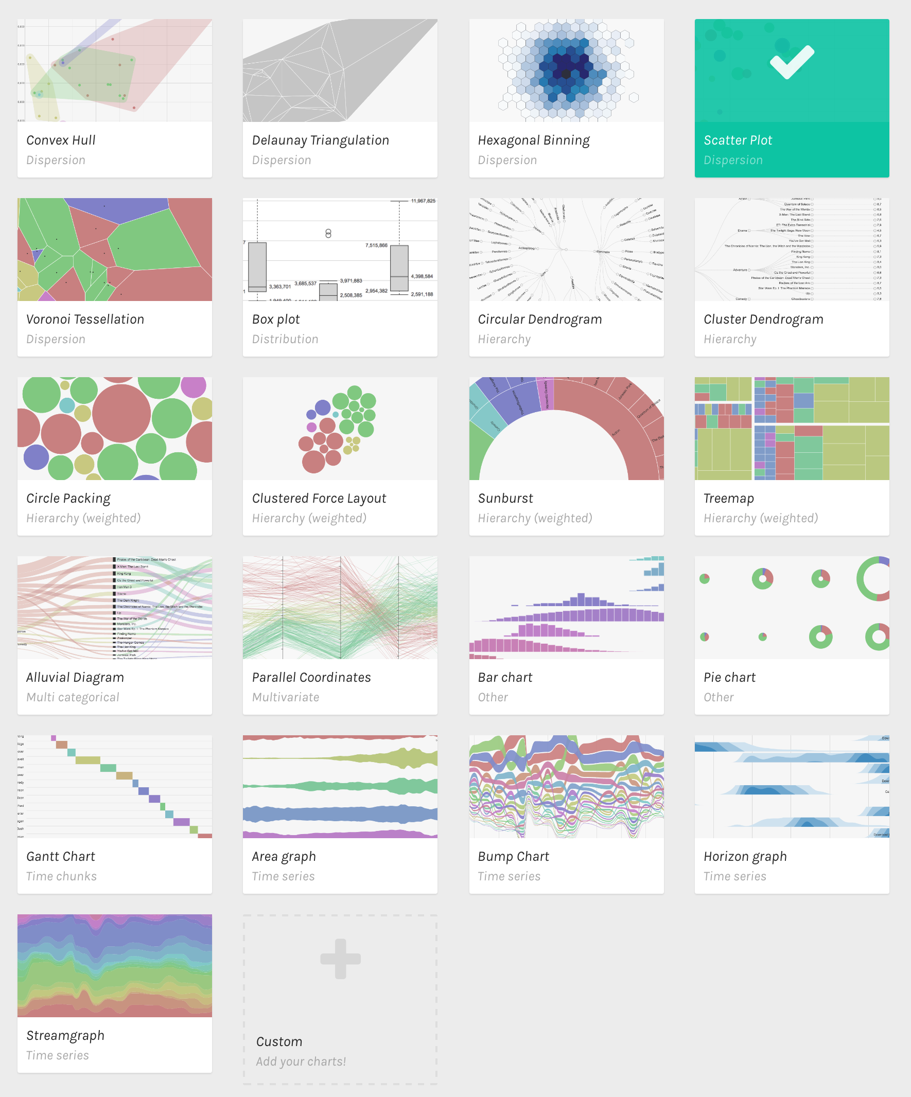
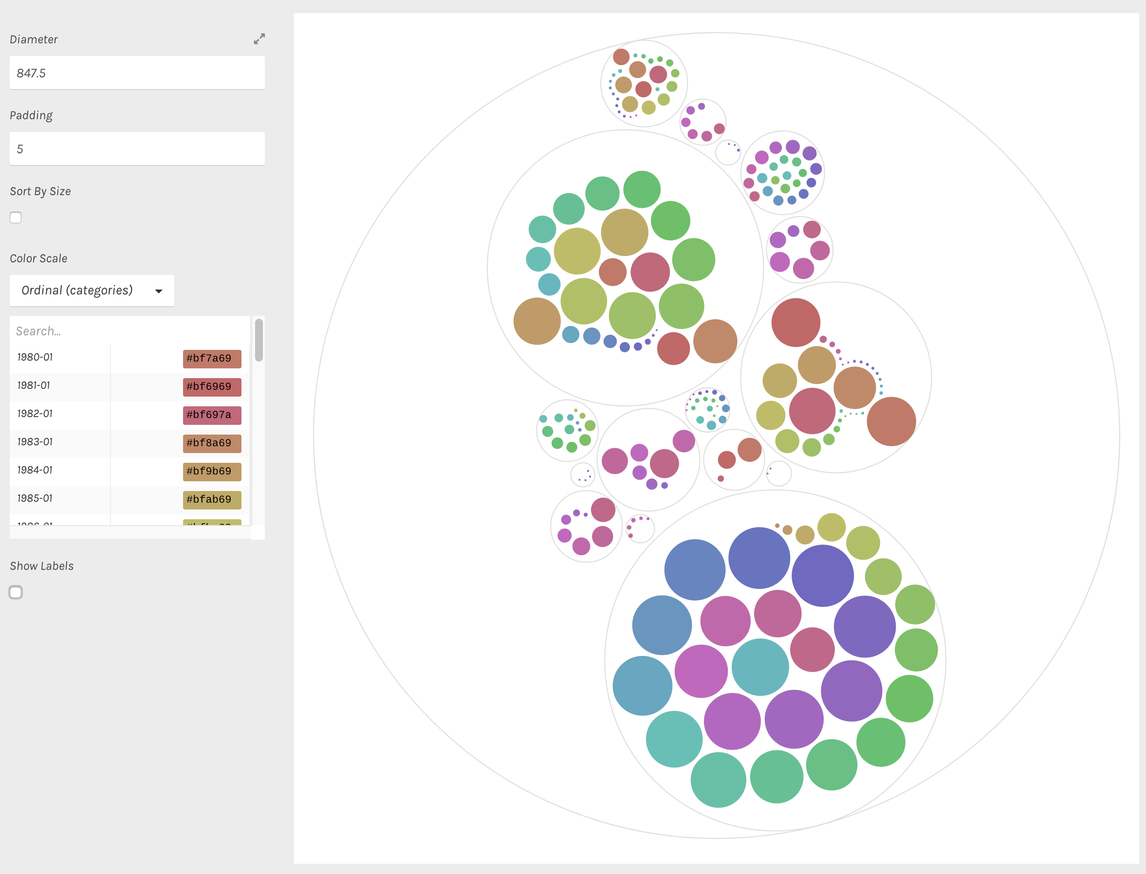
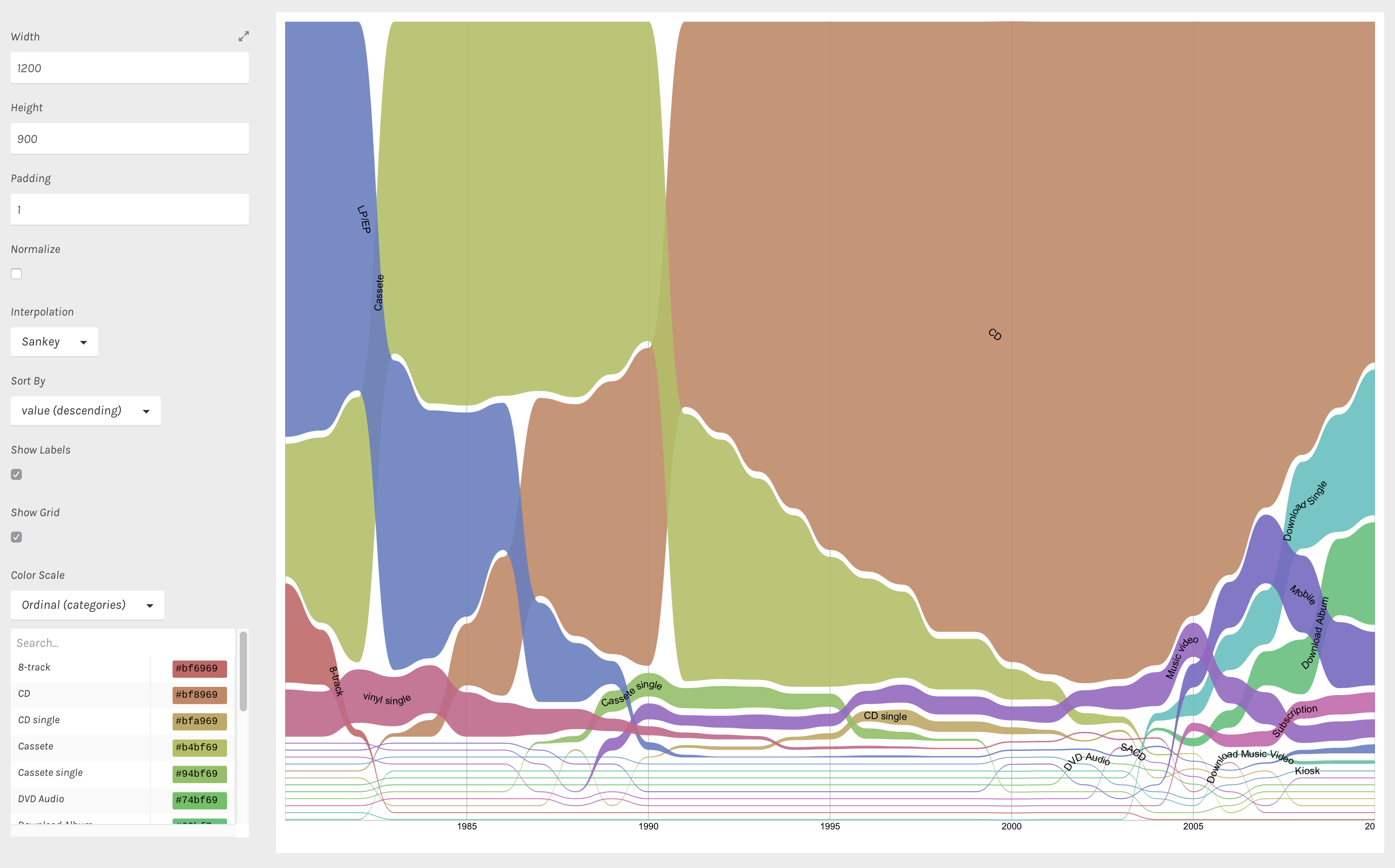
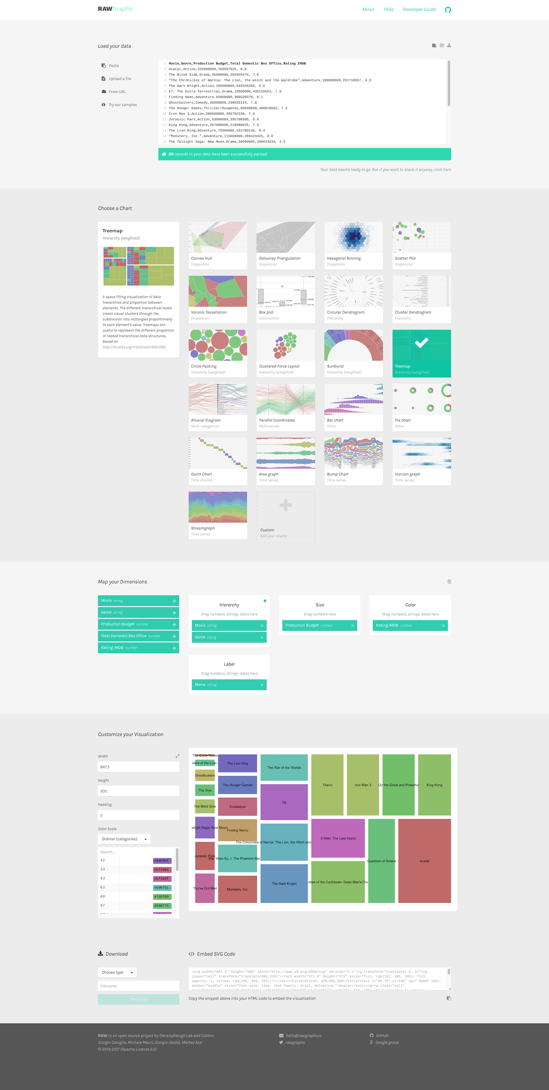
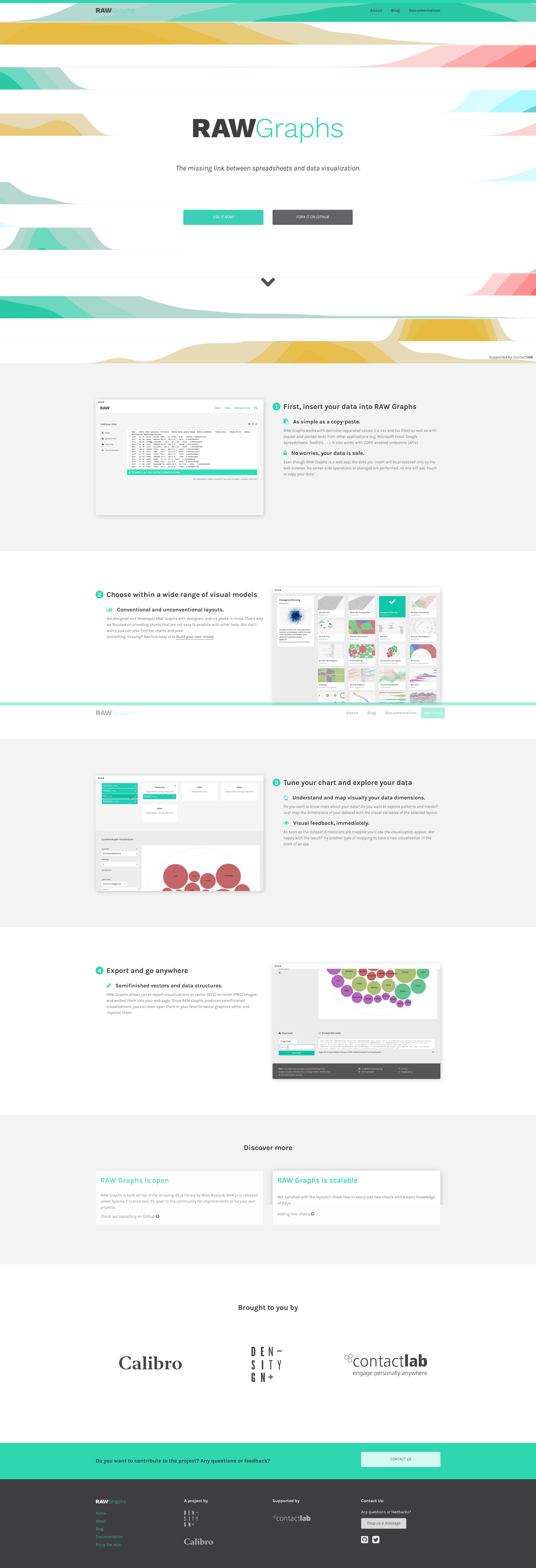
RAW is a very nice web-based and open-source data visualization tool that permits users to easily create charts without coding and to export them as vector graphics for further editing in external tools.
On the show we talk about why the team decided to develop RAW, how they got started, how they evolved RAW over time, the lessons they’ve learned, and their future plans.
Enjoy the show!
Data Stories is brought to you by Qlik. Are you missing out on meaningful relationships hidden in your data? Unlock the whole story with Qlik Sense through personalized visualizations and dynamic dashboards which you can download for free at qlik.de/datastories.

Links
- RAW: http://rawgraphs.io/
- Michele Mauri: http://www.densitydesign.org/person/michele-mauri/
- Giorgio Uboldi: http://calib.ro/
- Giorgio Caviglia: http://giorgiocaviglia.com/
- Pure JS: http://purejs.org/
- Angular JS: https://angularjs.org/
- D3 JS: https://d3js.org/
- Contactlab: http://contactlab.com/en/