[Our podcast is fully listener-supported. That’s why you don’t have to listen to ads! Please consider becoming a supporter on Patreon or sending us a one-time donation through Paypal. And thank you!]
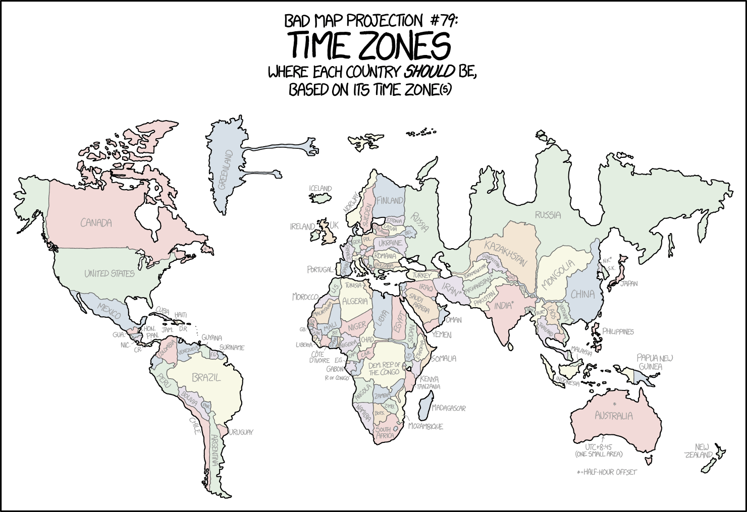
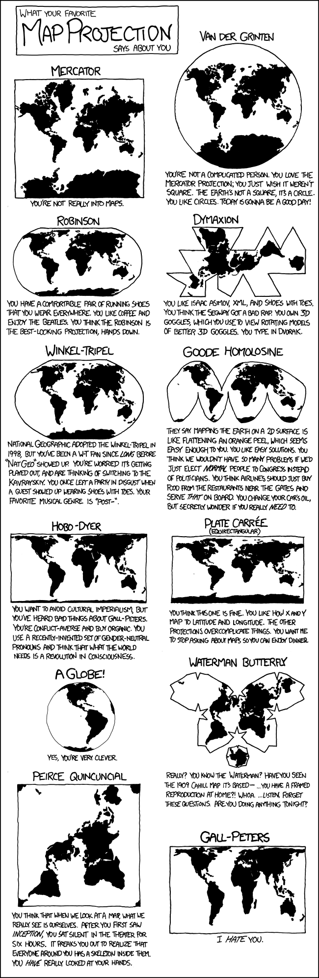
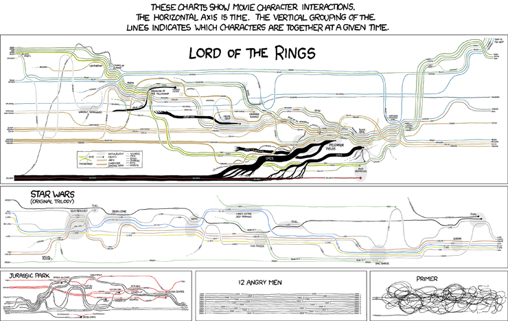
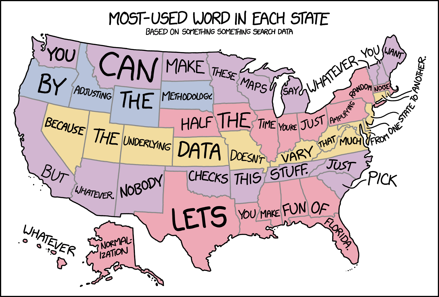
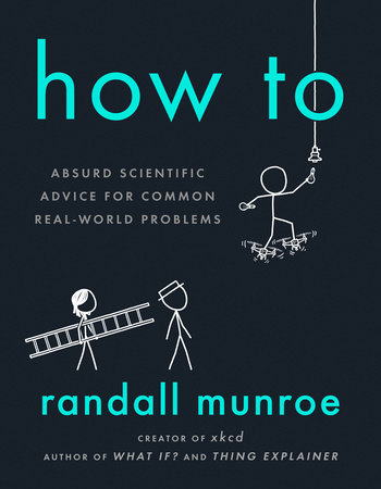
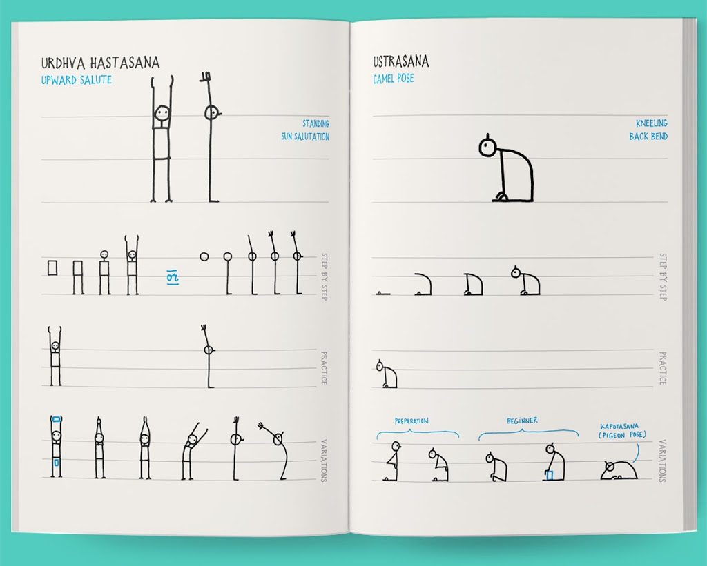
This episode is a dream come true – we have long wanted to invite Randall Munroe to the show. Randall is the mastermind behind the xkcd webcomics which have zillions of fans around the globe. In his stick figure cartoons and hilarious mini-stories, he comments on complicated scientific issues.
Over the years, Randall has also created a number of data-heavy visualizations. Some of them tackle pressing issues such as climate change, while others mock conventions of visualization such as map projections or chart types.
On the show we talk about his latest book “How To”, his work process, and the relation of complexity and simplicity in his visualizations. Enjoy the show and please make sure to listen all the way to the end, because Randall is calling out for some internet wisdom. Can anyone help find a software tool for manipulating maps in a three-point azimuthal projection?
[Our podcast is fully listener-supported. That’s why you don’t have to listen to ads! Please consider becoming a supporter on Patreon or sending us a one-time donation through Paypal. And thank you!]
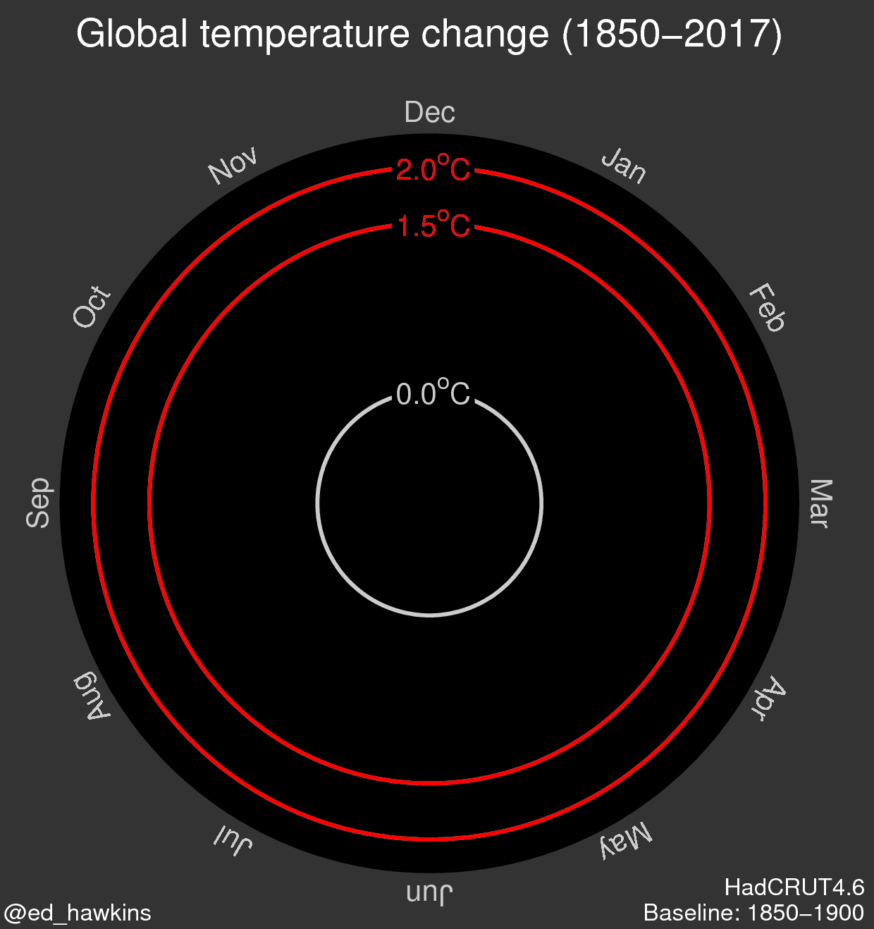
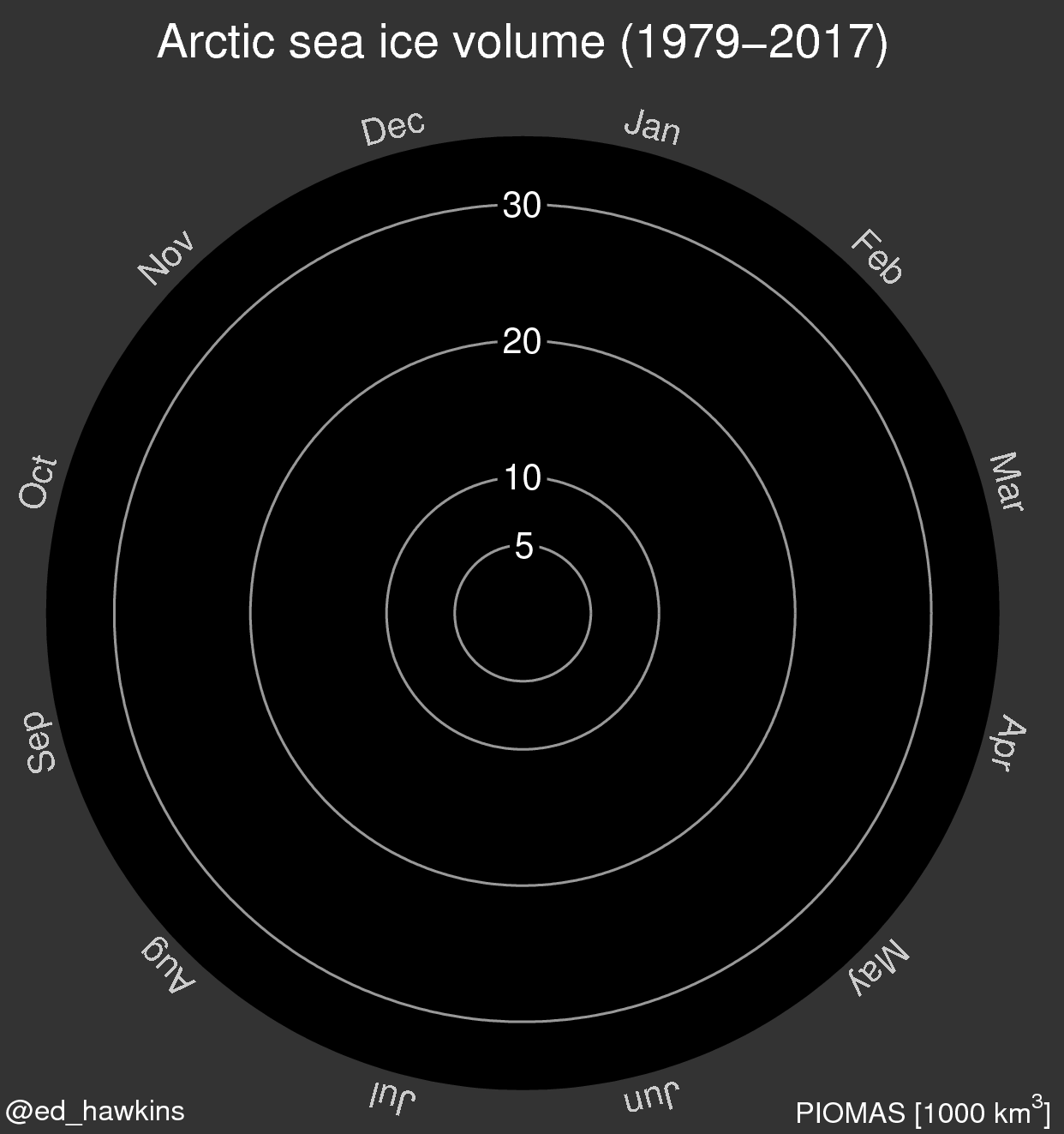
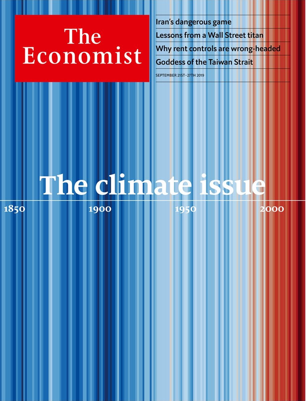
We have climate scientist Ed Hawkins on the show to talk about climate visualization. Ed is the person behind the famous spiral and stripe visualizations (see the images below). On the show we talk about how he created these visualizations and what was the impetus behind them. We also talk about breaking data visualization “rules”; climate visualization work from the visualization community; making climate information more local and more personal; and how to collaborate with climate scientists (see in the links below the list of climate scientists who are active on Twitter!).
[Our podcast is fully listener-supported. That’s why you don’t have to listen to ads! Please consider becoming a supporter on Patreon or sending us a one-time donation through Paypal. And thank you!]
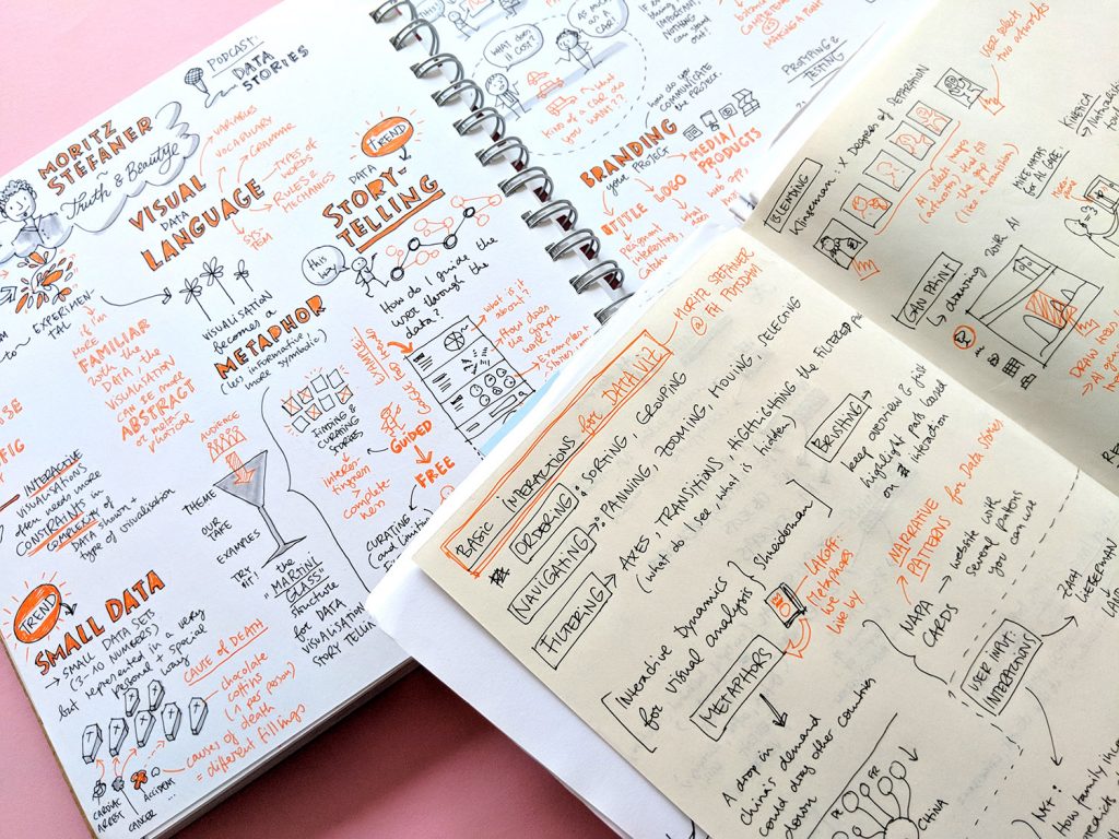
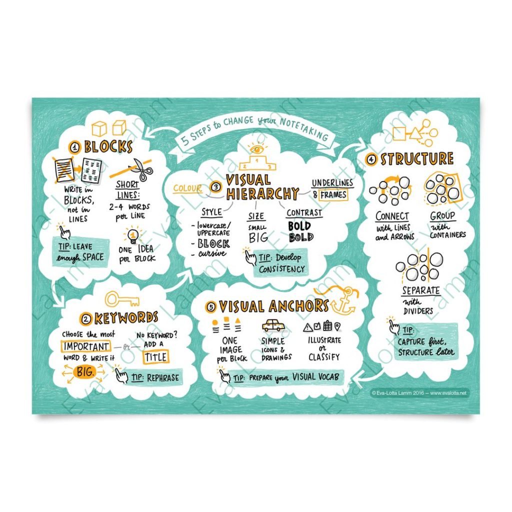
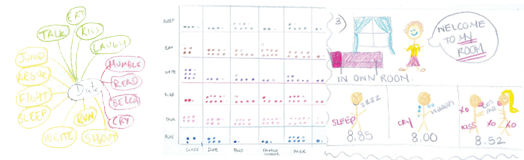
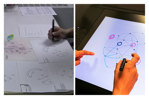
We have Eva-Lotta Lamm joining us to talk about the value of sketching and how it relates to data visualization. Eva-Lotta is a UX designer turned expert on sketching and sketchnoting: the art of summarizing talks through sketches. In the show we talk about visual thinking, sketchnoting and parallels with data visualization.
[Our podcast is fully listener-supported. That’s why you don’t have to listen to ads! Please consider becoming a supporter on Patreon or sending us a one-time donation through Paypal. And thank you!]
How do you represent data with sound instead of graphical properties? Is it even possible?
It turns out that it’s not only possible, but there is an entire field — called sonification — that is dedicated to representing data with sound.
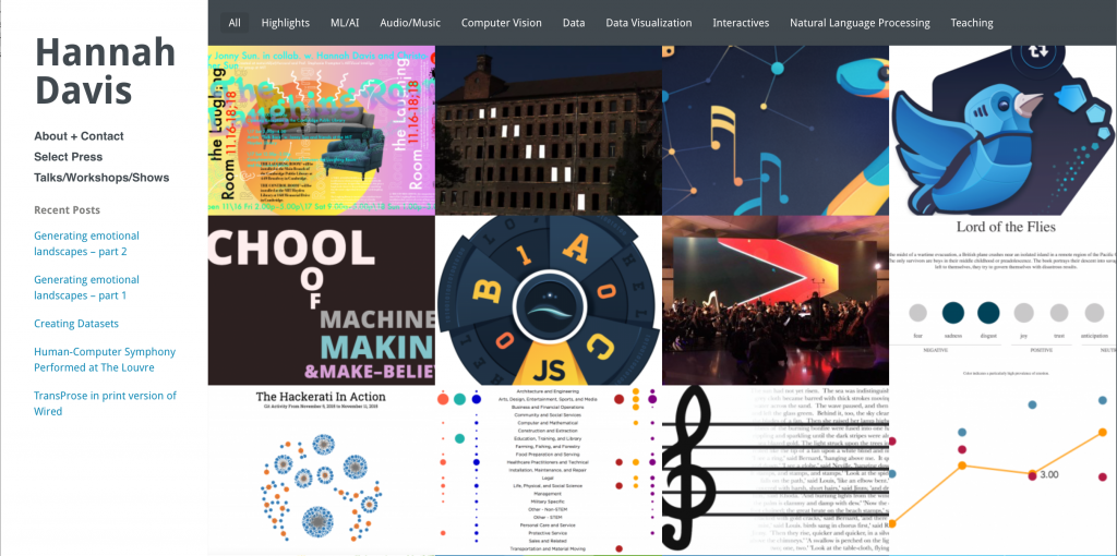
In this episode we are joined by Hannah Davis, a data visualization and sonification expert, to talk about how sonification works and how she has gone about making her own amazing sonification projects, which create musical pieces based on data. Get your ears ready! This time you are not only going to listen to our voices but also to some really interesting sounds!
P.S. We’ve actually touched upon sonification once before in Data Stories. Check out our episode with Scott Hughes on the sonification of black holes.
[Our podcast is fully supported by our listeners. Please consider becoming a supporter on Patreon or sending us a one-time donation through Paypal. And thanks!]
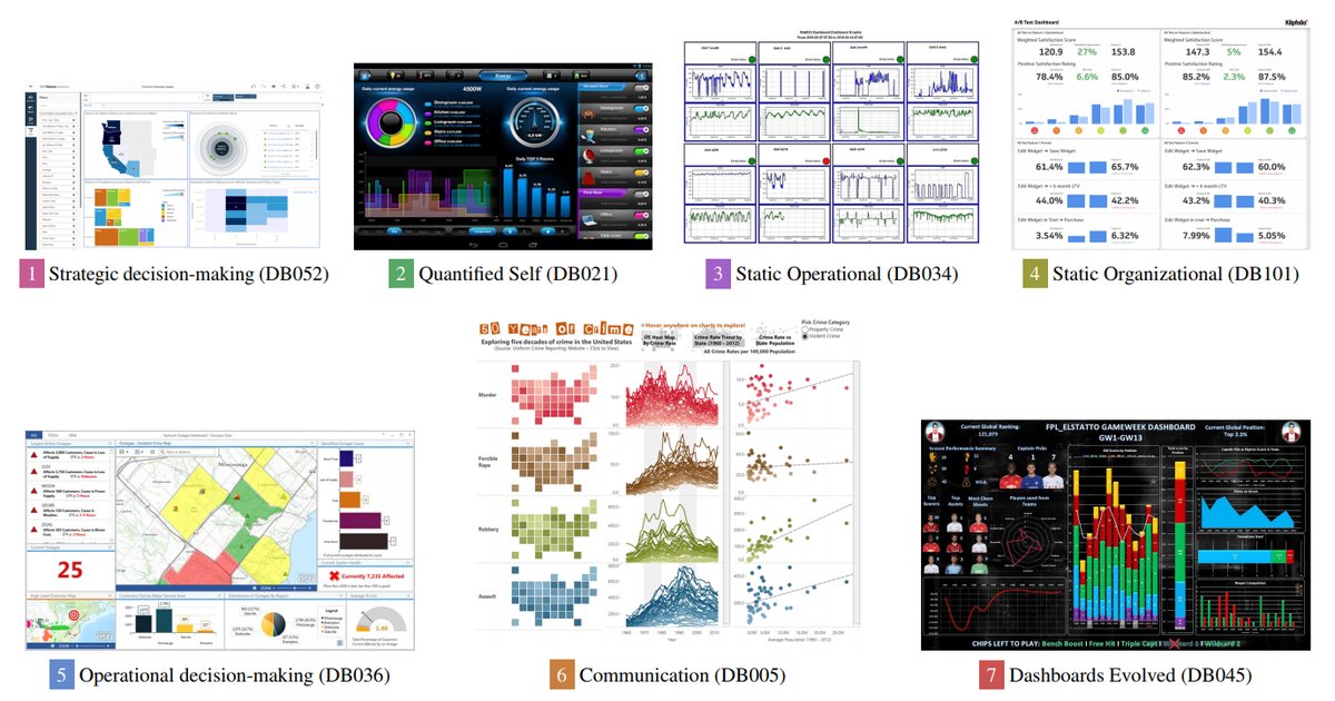
Oh dashboards… dashboards… what are they? For some, they are just ugly examples of bad visualization design (speed dials anyone?). For others, they are a first citizen of the data visualization world that deserve to be learned, studied, and understood.
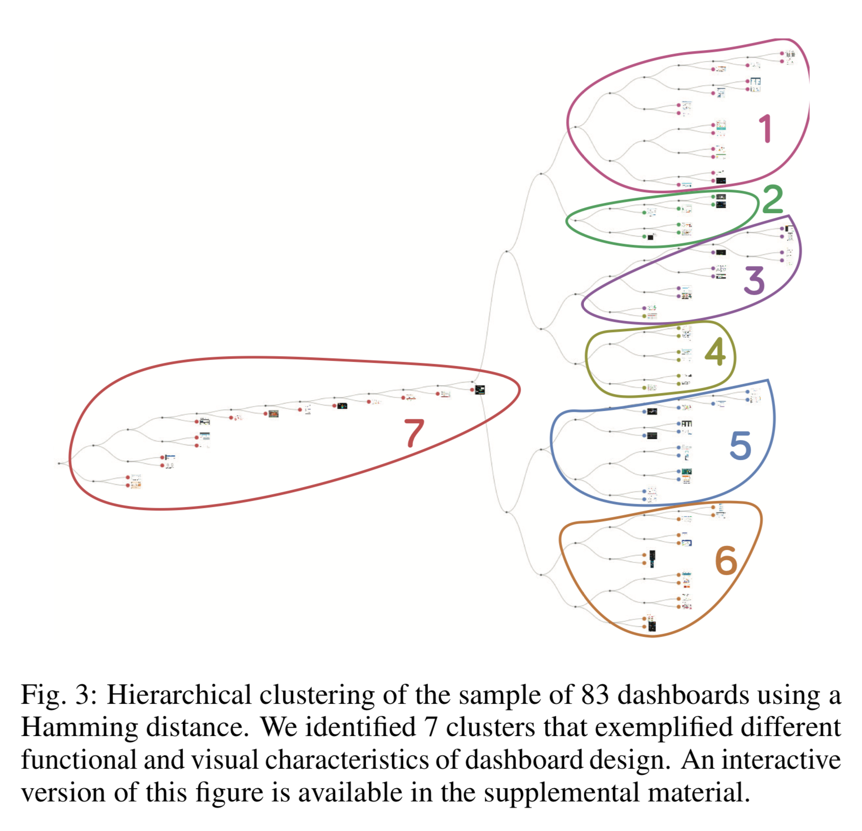
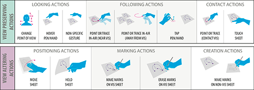
To dig into this debate, we have Lyn Bartram of Simon Fraser University and Alper Sarikaya of Microsoft Power BI on the show to talk about an exciting research project they developed. Their research seeks to build a better picture of what dashboard are and how they are used “in the wild.” The results are summarized in a paper they wrote with their colleagues from Tableau and Honeycomb.io: What Do We Talk About When We Talk About Dashboards?
On the show we talk about how the project got started, what they discovered by analyzing a large corpus of dashboards, and the many ramifications of their research.
[Our podcast is fully listener-supported, which means that it’s actually your podcast! Please consider making a contribution on Patreon or sending us a one-time donation through Paypal. Help us to stay ad-free!]
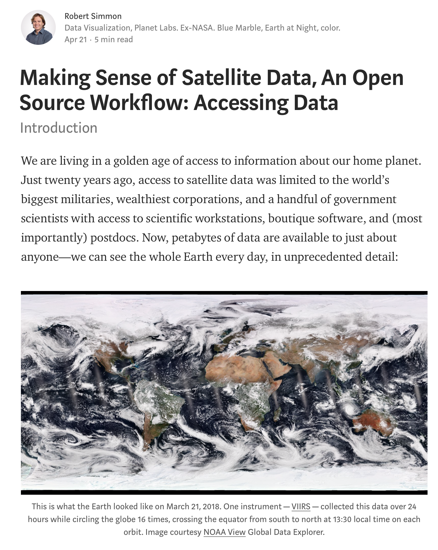
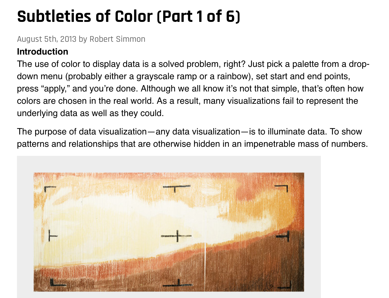
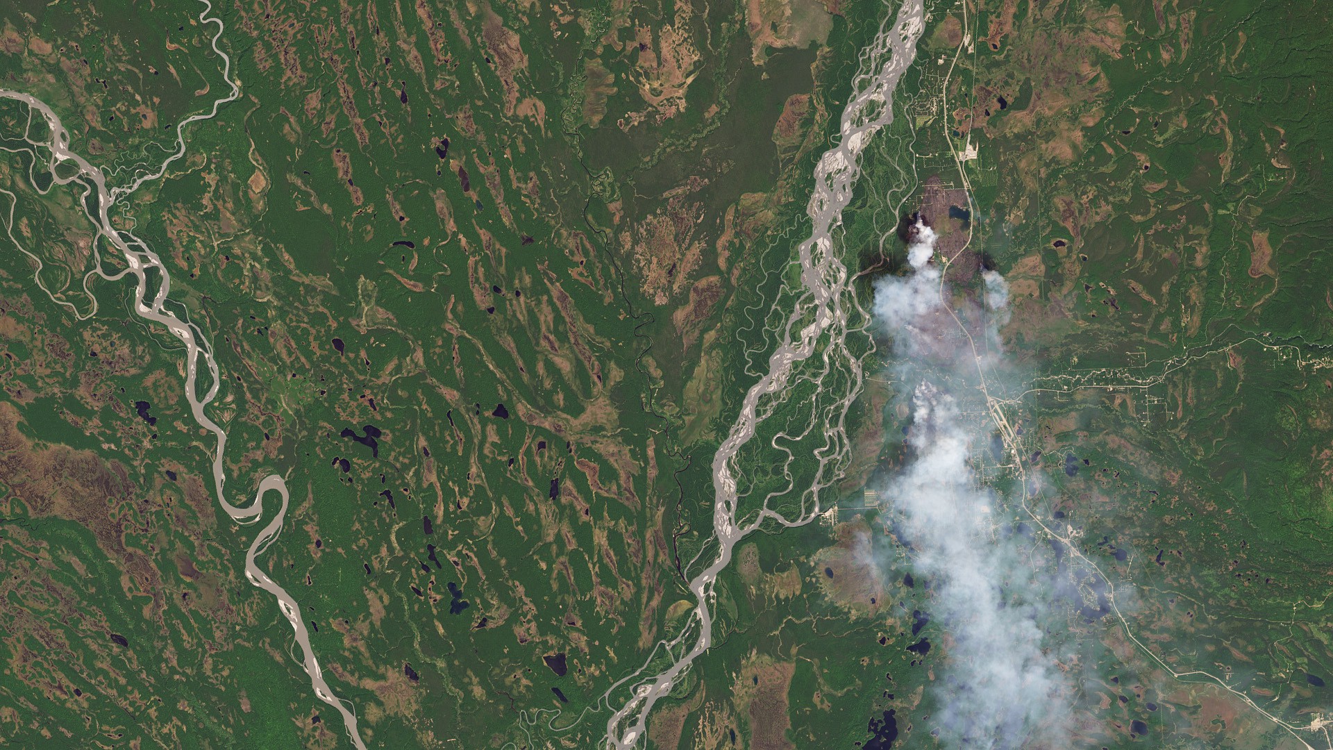
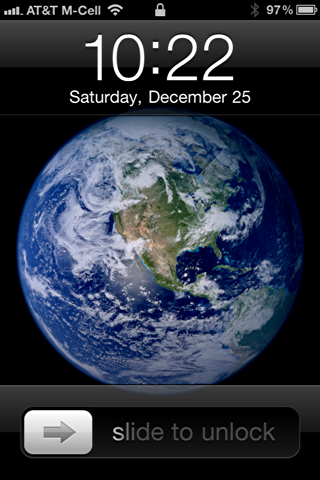
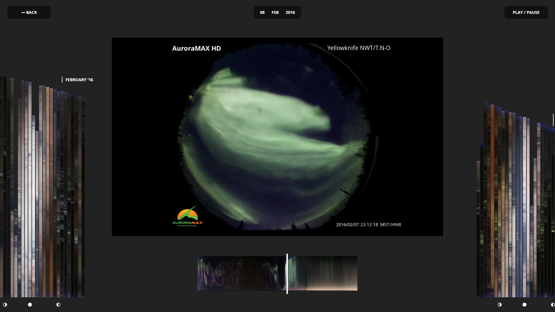
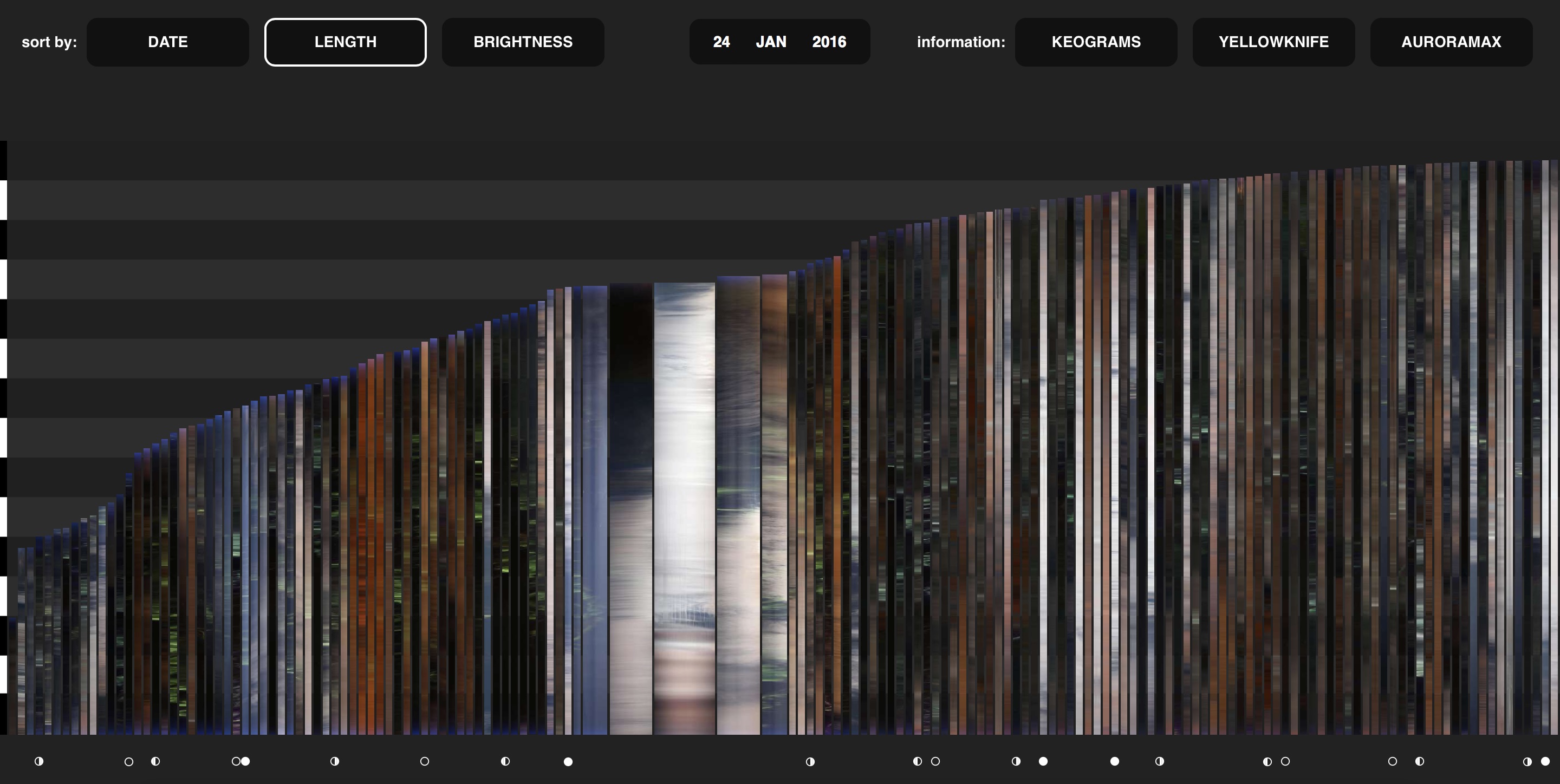
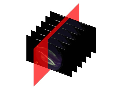
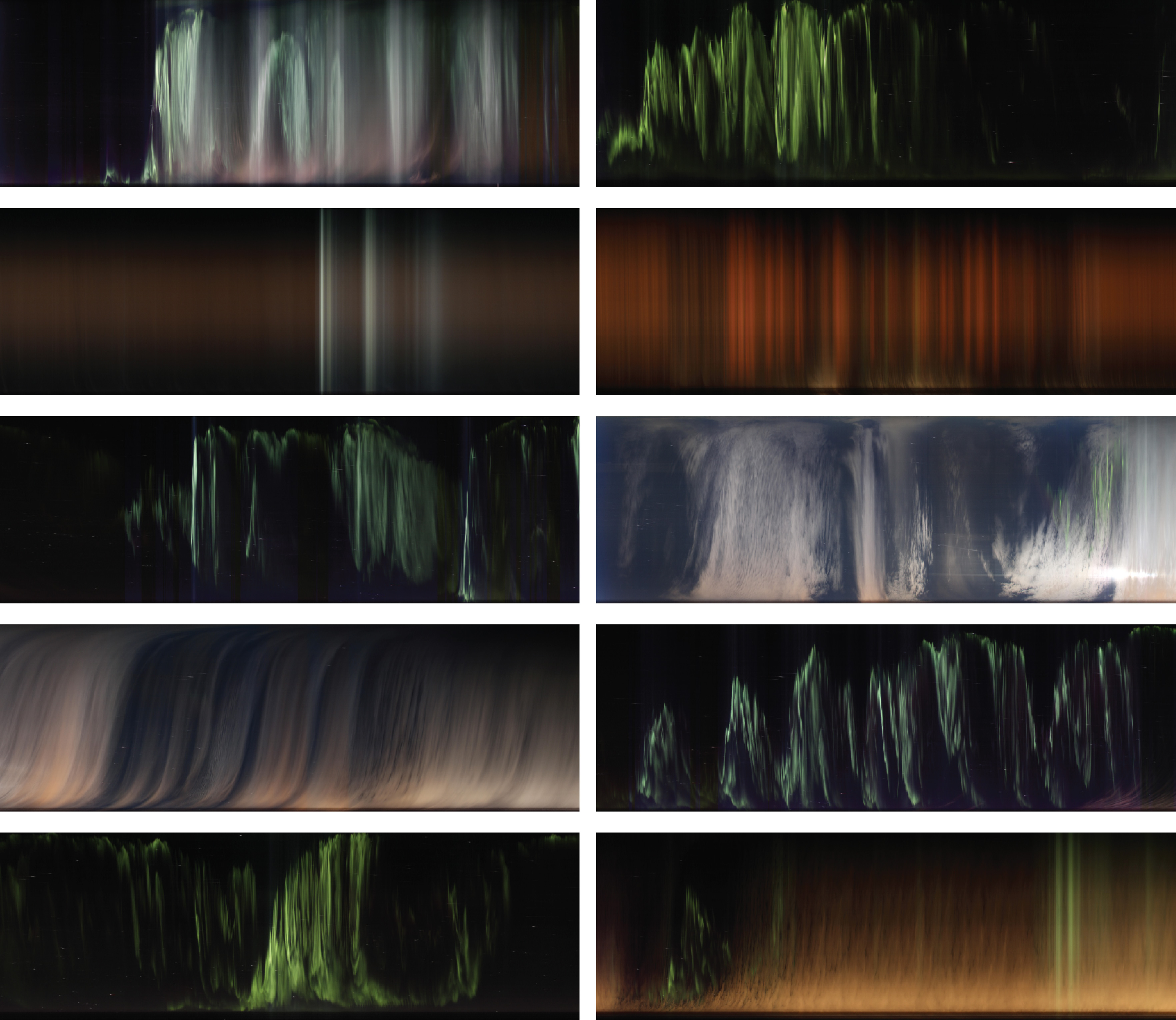
This week we have Robert Simmon on the show to discuss satellite imagery. Robert is a data visualization engineer at Planet Labs, where he creates visualizations of the earth from satellite sensor data. Previously a Data Visualizer and Designer at NASA, Robert is also known as “Mr. Blue Marble” for the image of Earth he created, which Apple later adopted as their default image for the iPhone lock screen.
On the show we talk about satellite imagery and what it takes to transform satellite data into something that is enlightening and intelligible. We also talk about the multiple parallels between satellite images and data visualization, the key role that color plays in creating effective visualizations, and Robert’s amazing color guide “Subtleties of Color.”
[If you like what we do, please consider supporting us on Patreon or sending us a one-time donation through Paypal. Data Stories runs thanks to your financial support. Thx!]
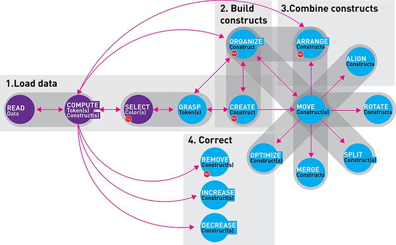
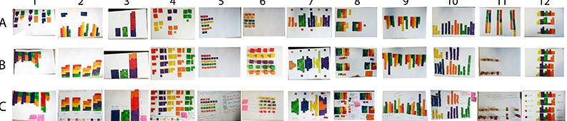
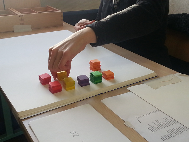
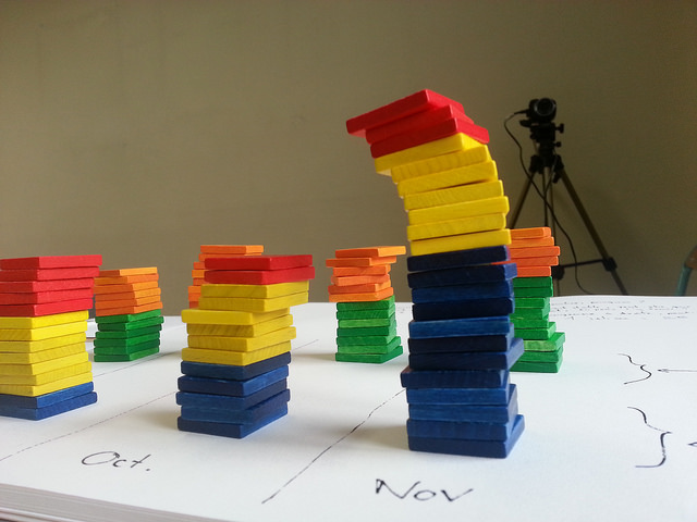
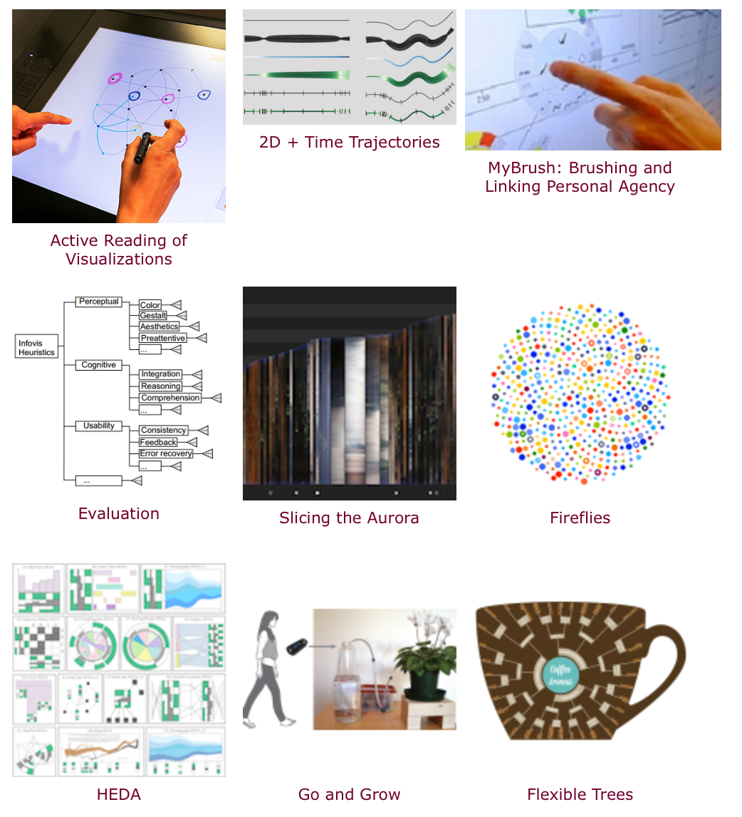
Sheelagh Carpendale is Professor in the Department of Computer Science at the University of Calgary, where she leads the Innovations in Visualization (InnoVis) research group. Sheelagh is one of the most prominent figures in visualization research and, this week, she joins us to discuss the research taking place in her lab, as well as her innovative ideas about all sorts of information visualization. Sheelagh is renowned for taking a much more holistic view of visualization than usual; she emphasizes interaction, visualization beyond the confinements of desktop displays, and the use of design, qualitative research, and psychology. On the show we talk about the uses of sketching in data visualization, the concept of “active reading” of visualizations, and the standard data viz ideas that are holding us back.
[This podcast is fully supported by our listeners. If you enjoy listening to Data Stories, consider supporting us on Patreon. And now we also accept one-time donations through Paypal: just use this link. Thanks so much for your support!]
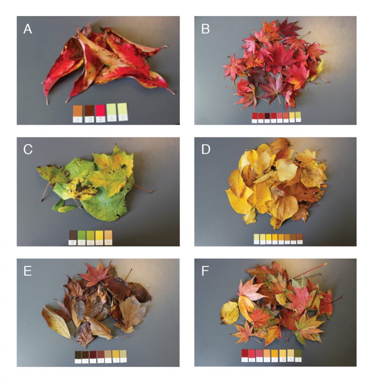
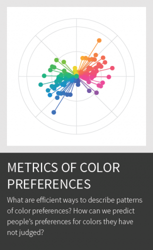
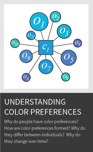
In this episode we have Karen Schloss on the show to talk about color. Yes, color! Karen is Assistant Professor at the University of Wisconsin Madison where she conducts research on the effective uses of color in visualization and everyday tasks.
Karen walks us through the intricacies of color: explaining how it works and why it is so hard to get right. We also discuss the infamous rainbow color map, the association between colors and meaning, the tools developed in her lab, and her fascinating research on coloring trash bins!
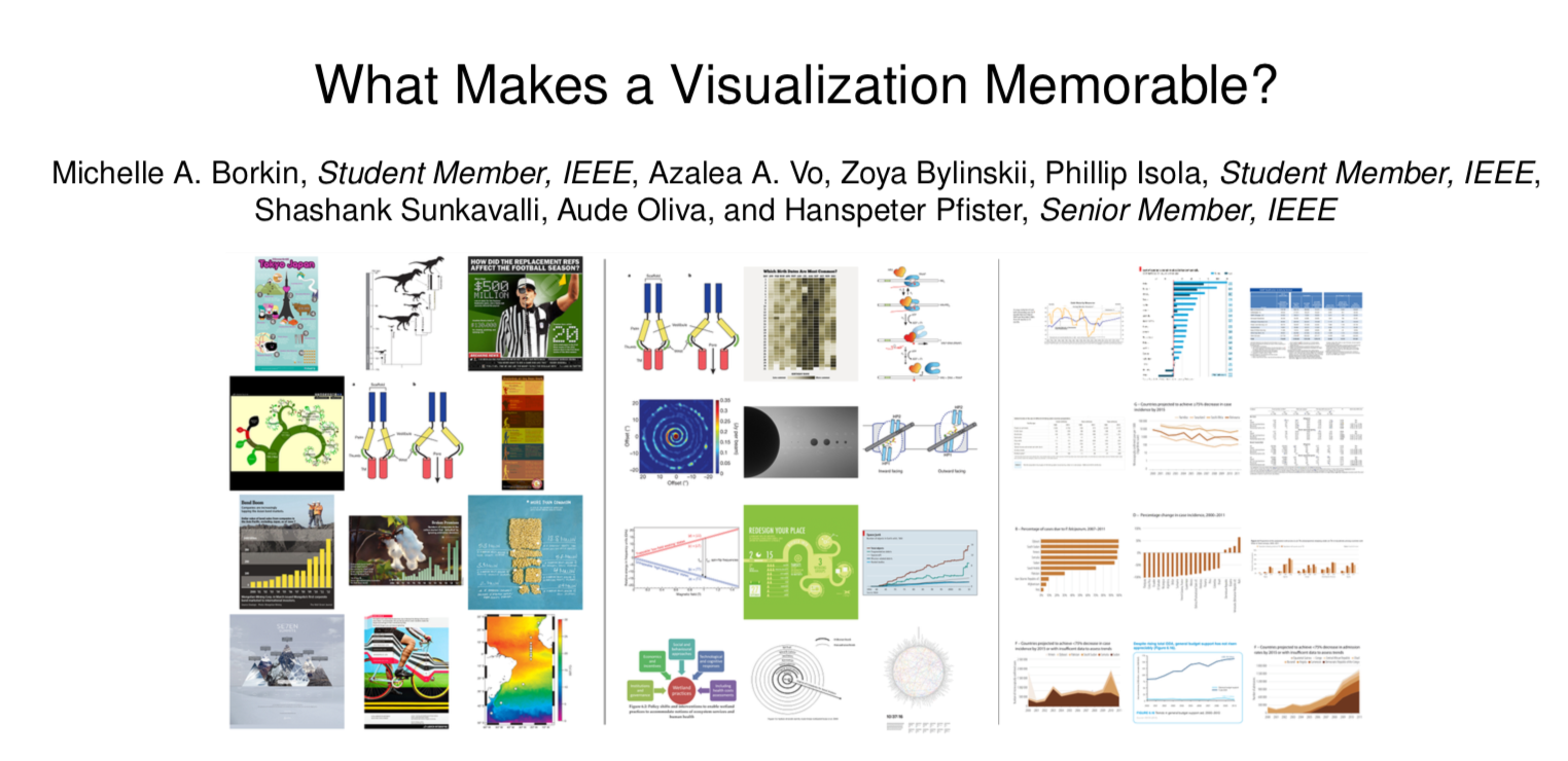
Michelle Borkin is Assistant Professor at Northeastern University where she studies the use of visualization in science research, in particular how it impacts human perception and cognition. On the show we talk about how the data viz community can better support the work of scientists, her popular research on data visualization memorability and, of course, the infamous data viz dinosaur.
[If you enjoy Data Stories, consider supporting us on Patreon. The show is now fully funded by our listeners!]
We have Catherine D’Ignazio on the show this week to talk about feminist data visualization. Catherine is Assistant Professor of Data Visualization and Civic Media at Emerson College, where she works across art, design, science and research.
On the show Catherine explains how feminist theory can be used as a lens to look at some interesting problems in visualization and data analysis in general. We also talk about the struggle between objectivity and relativism, methods to apply the guidelines proposed by Catherine to data visualization work, and some super interesting projects she has developed over the years.