[Thinking of gift-giving this holiday season? Consider a gift to Data Stories! You can join our growing community of Patreons or make a one-time donation to us on Paypal.]
“Would you define this as a dashboard?” The question provoked quite a reaction!
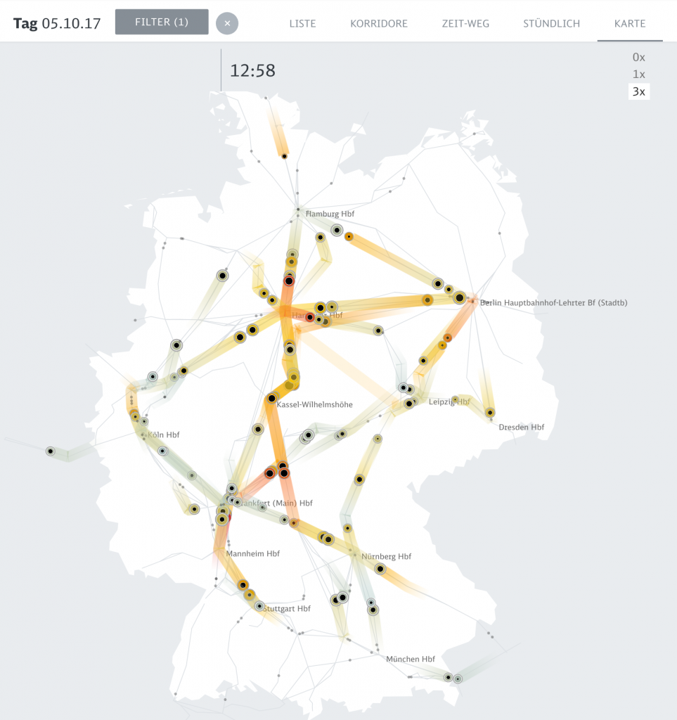
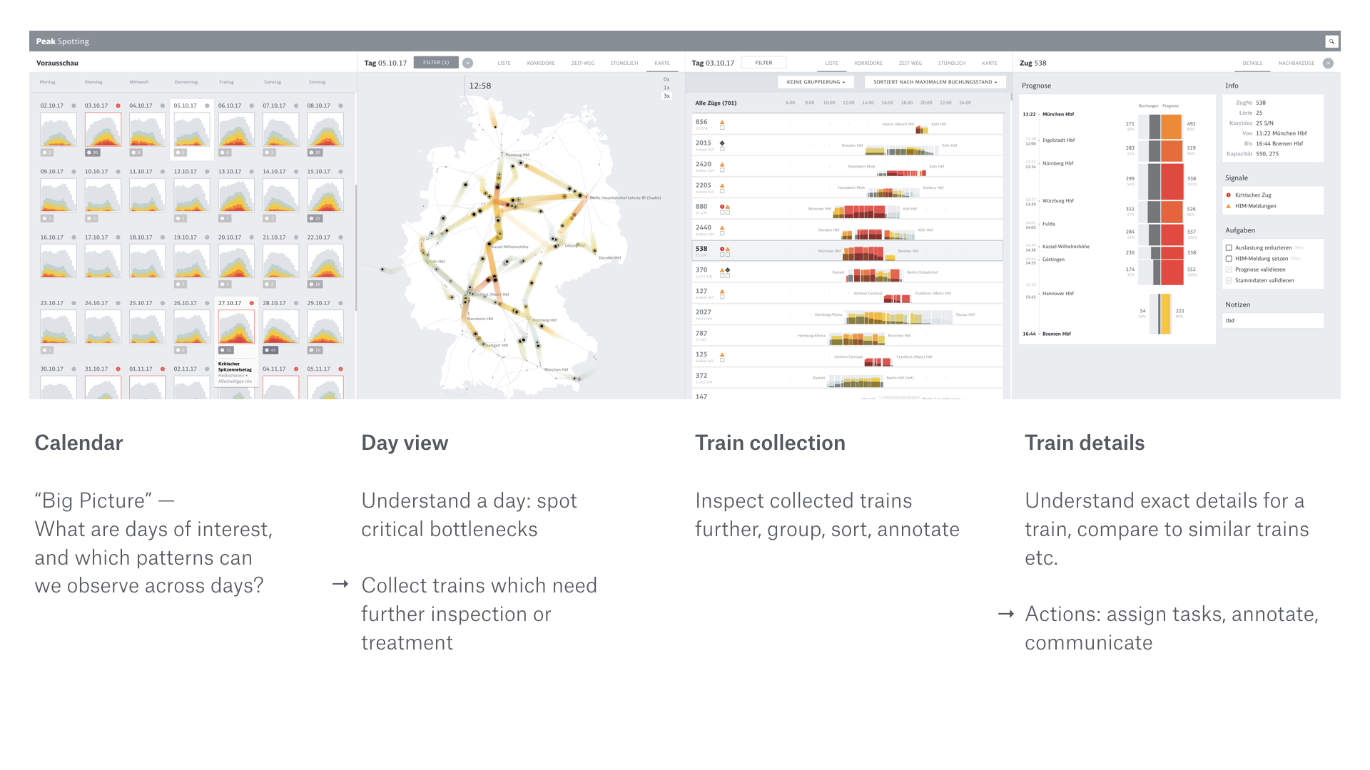
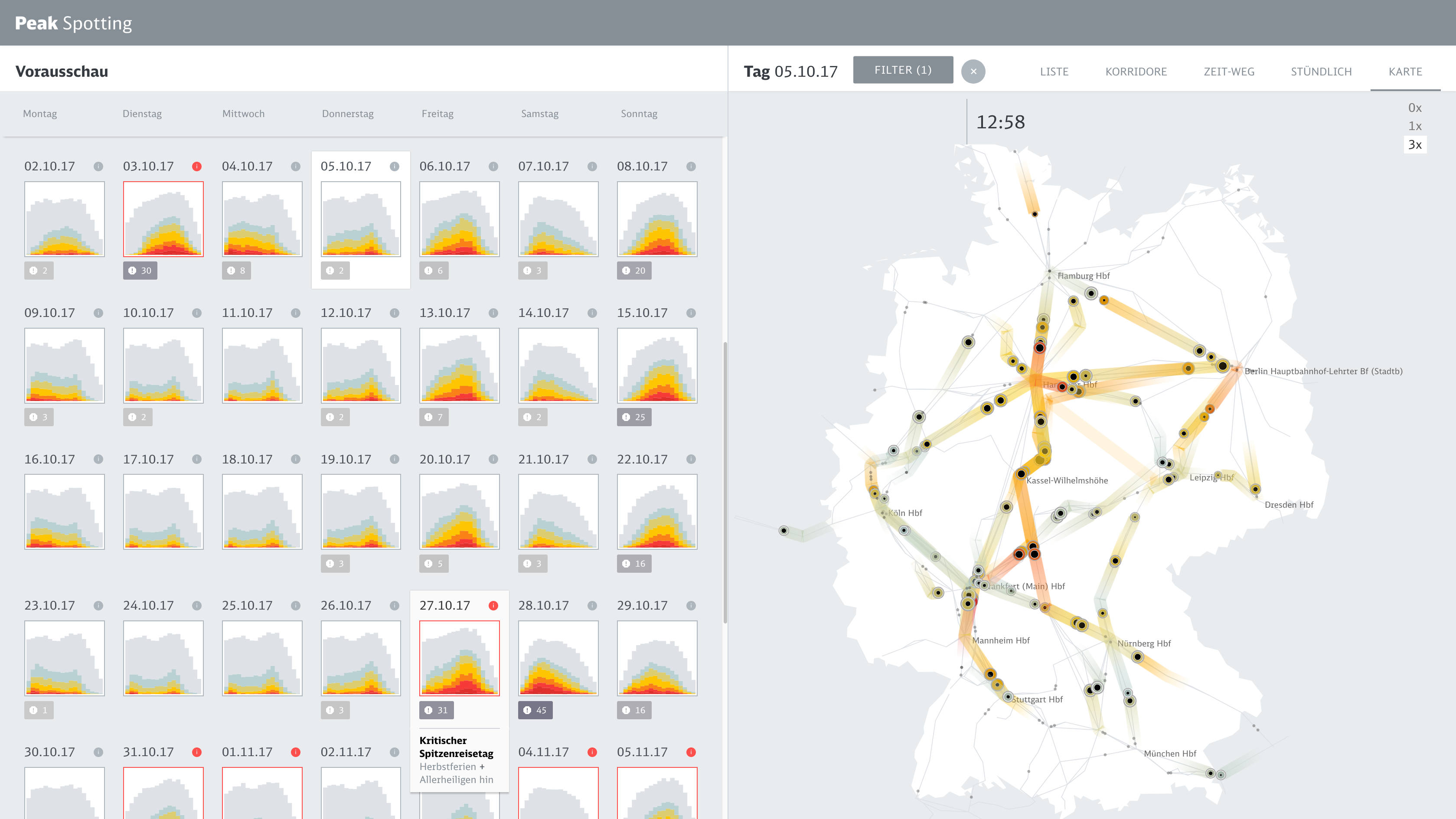
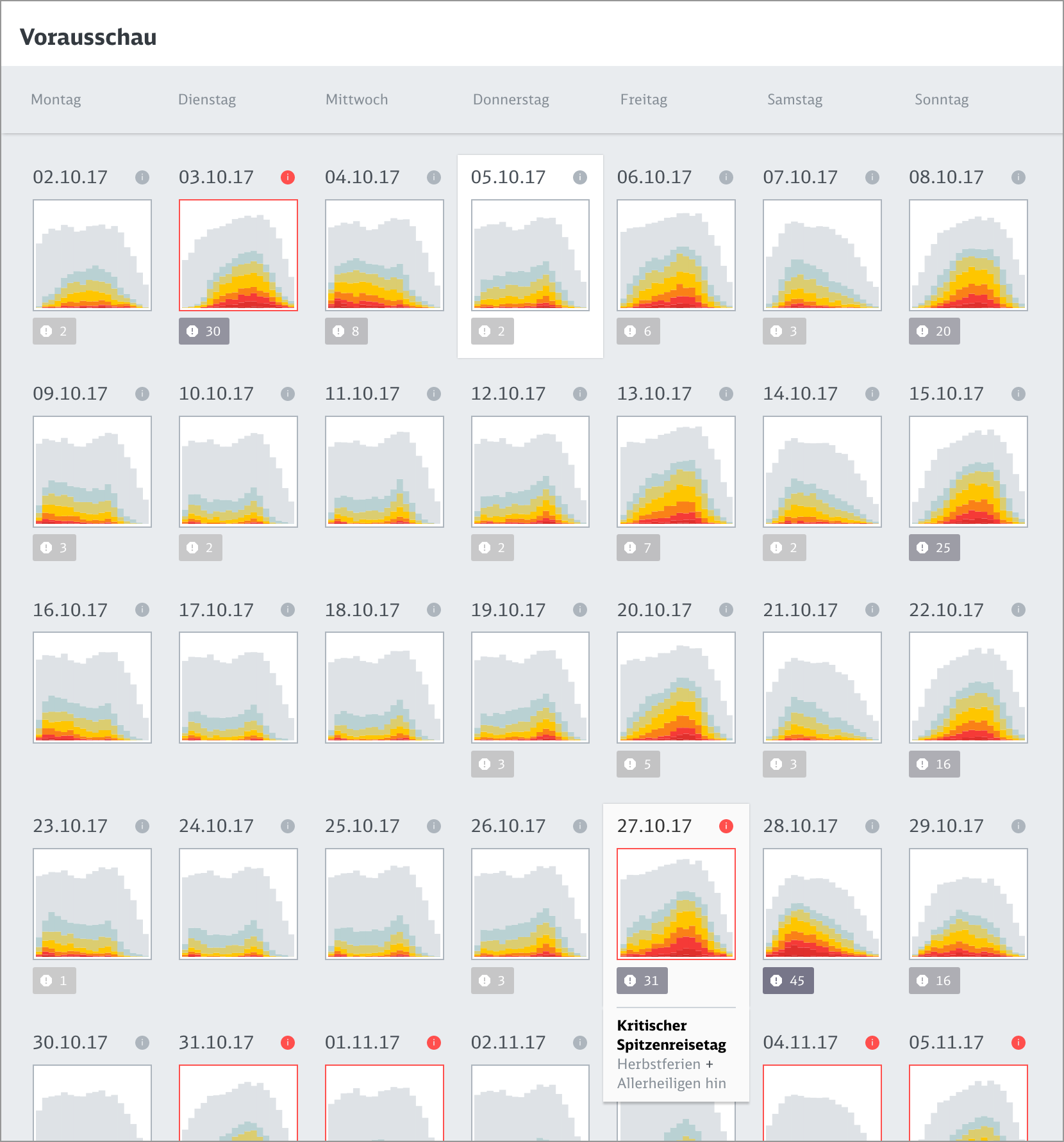
In this episode, we talk about Peak Spotting, a new data visualization tool designed to help capacity managers at the German railway Deutsche Bahn handle passenger loads within the train system.
We recorded the episode live in Berlin, all together in the same room, with Moritz, the creative lead of the project, as well as the project’s other collaborators: project director Christian Au, technical lead Stephan Thiel, and designer Christian Laesser.
We talk about how the project started, the process the team followed to design the tool, how people at the German railway are using it, finding innovation within big companies, and the role of visualization in the movement towards automation.
Enjoy the show!
Links
[If you benefit from Data Stories, consider becoming a supporter on Patreon or making a one-time donation to us on Paypal. We fully depend on listener support to keep the show running!]
It was a great week in Berlin! Info+ and IEEE VIS took place at the same time and both Enrico and Moritz were there to document the conferences. We also organized a super fun Data Stories listeners meetup — more on that to come!
This week, our friends Jessica Hullman and Robert Kosara join Enrico to comment on their greatest highlights from IEEE VIS.
We discuss a handful of IEEE VIS events and then spotlight a few projects and papers that we especially liked. As usual, this is just a very thin slice of the conference offerings. There is much more to discover from the program!
Find links below to all the projects that we discuss on the show.
Enjoy!
Links:
Related episodes

[Our podcast is fully listener-supported, which means that it’s actually your podcast! Please consider making a contribution on Patreon or sending us a one-time donation through Paypal. Help us to stay ad-free!]
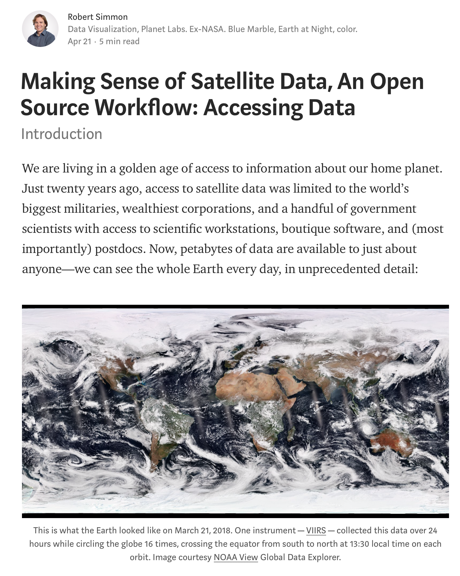
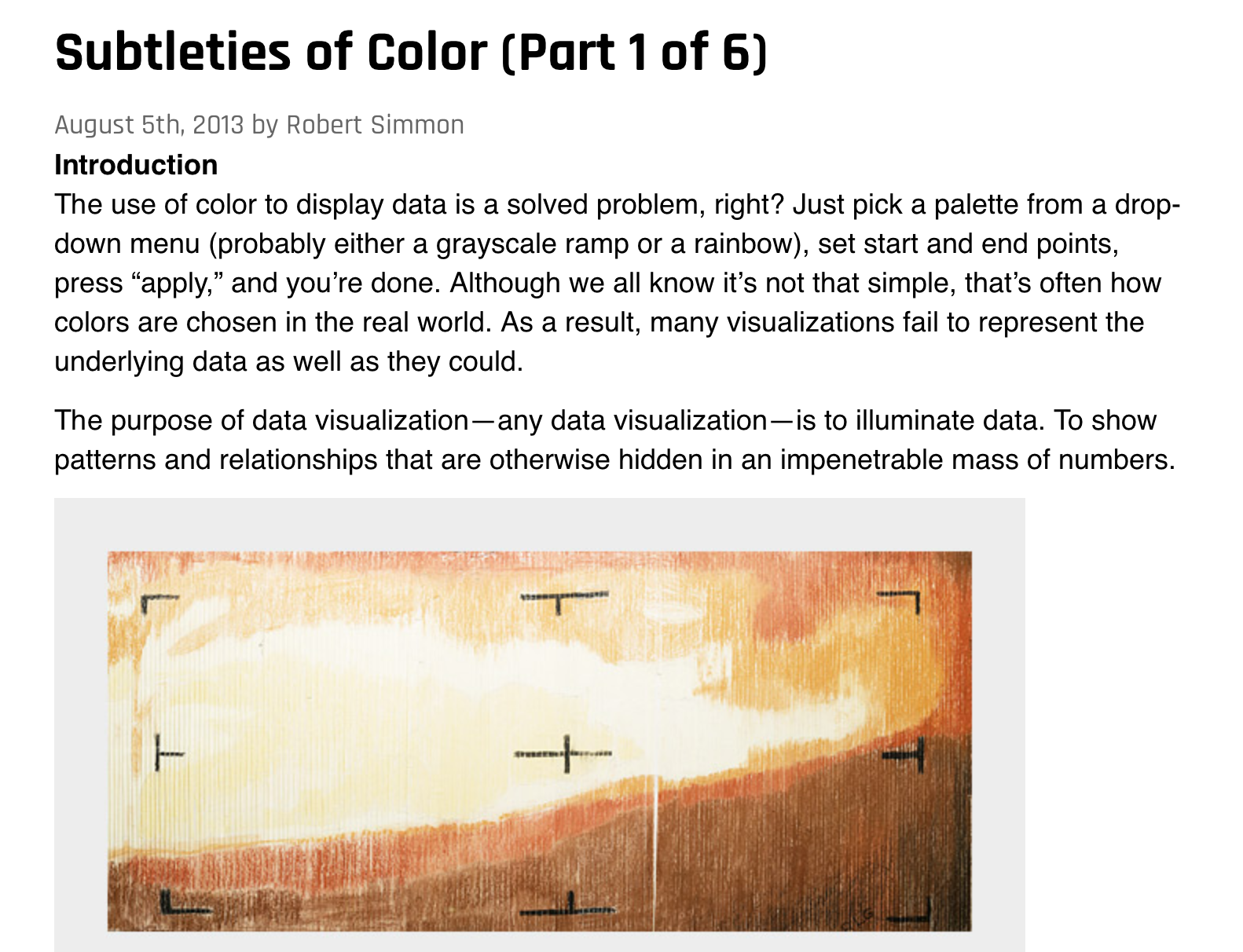
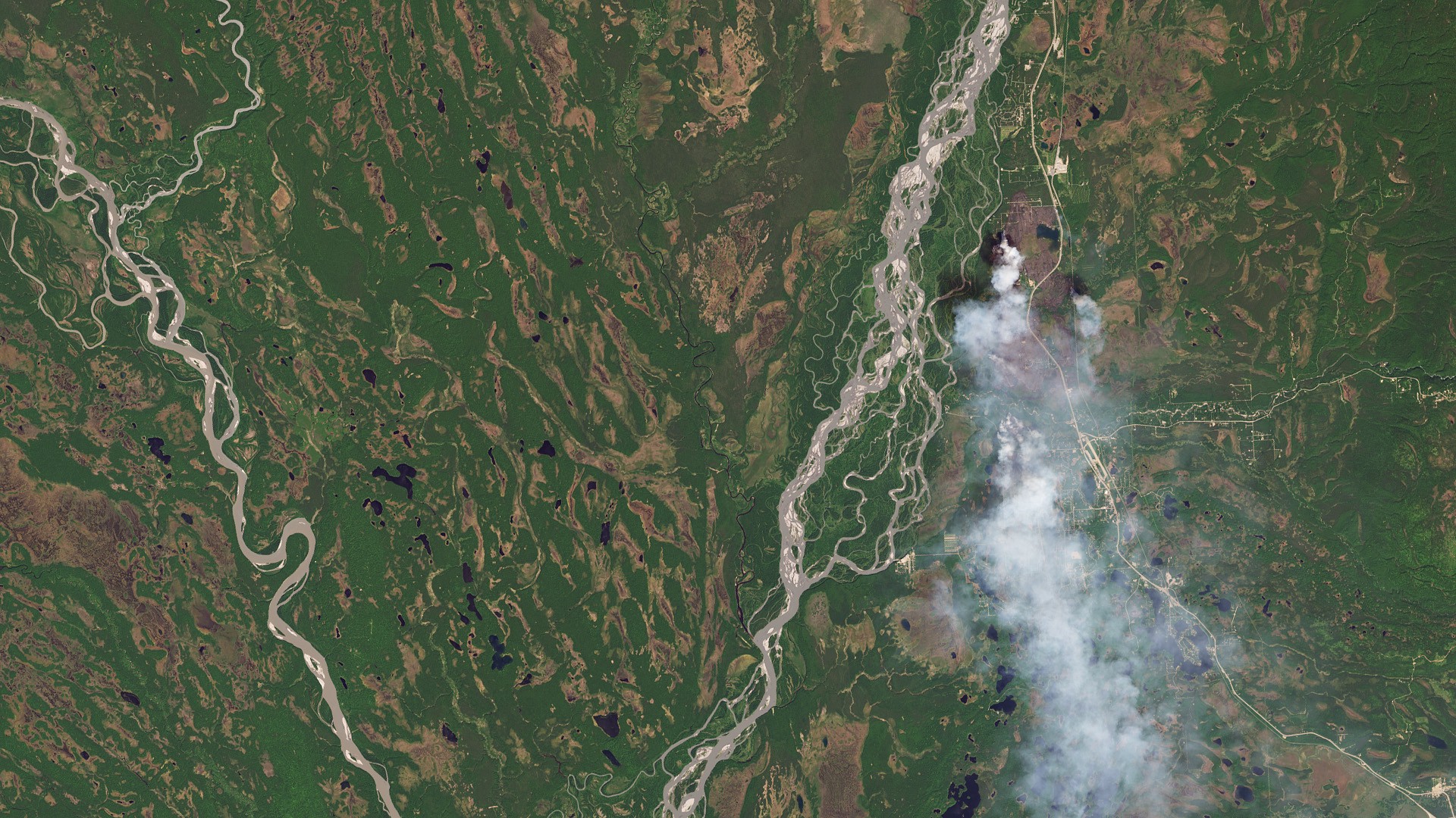
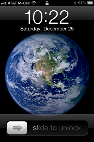
This week we have Robert Simmon on the show to discuss satellite imagery. Robert is a data visualization engineer at Planet Labs, where he creates visualizations of the earth from satellite sensor data. Previously a Data Visualizer and Designer at NASA, Robert is also known as “Mr. Blue Marble” for the image of Earth he created, which Apple later adopted as their default image for the iPhone lock screen.
On the show we talk about satellite imagery and what it takes to transform satellite data into something that is enlightening and intelligible. We also talk about the multiple parallels between satellite images and data visualization, the key role that color plays in creating effective visualizations, and Robert’s amazing color guide “Subtleties of Color.”
Links
 [Please remember that Data Stories is fully listener-supported! Please consider contributing to the show on Patreon or sending us a one-time donation through Paypal. Every dollar is appreciated!]
We have Steve Haroz on the show to talk about visual perception in visualization. Steve is a research scientist at Saclay, France near Paris (AVIZ) where he studies how “the brain perceives and understands visually displayed information like charts and graphs.”
Steve is also a very active figure on Twitter, where he is frequently asked to comment on visual perception problems in visualization.
On the show, we talk about what vision science is, practical examples of the use of vision science in data visualization, and how to use visual science to make predictive decisions about our data visualization designs.
Enjoy the show!
Links

[If you enjoy listening to our show, please consider supporting us on Patreon or sending us a one-time donation through Paypal. Data Stories runs thanks to your financial support!]
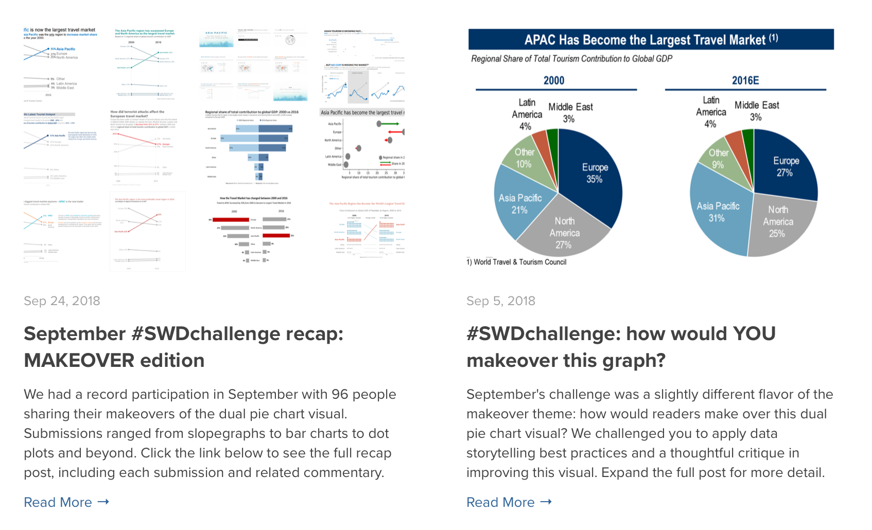
We have Cole Nussbaumer Knaflic on the show to talk about her work in visual storytelling. Cole is an educator, blogger, freelancer and author of Storytelling with Data, a successful data visualization book about effectively presenting data through visualization.
We talk about how Cole got her start in visualization through her former job at Google, how she created her business, the story behind her book, and many of her other activities (including her great podcast!).
The episode is full of useful tips, especially for those of you who are thinking of becoming a vis-oriented business-owner or freelancer.
Enjoy the show!
Links
[If you enjoy listening to our show, please consider supporting us on Patreon or sending us a one-time donation through Paypal. Data Stories runs thanks to your financial support!]
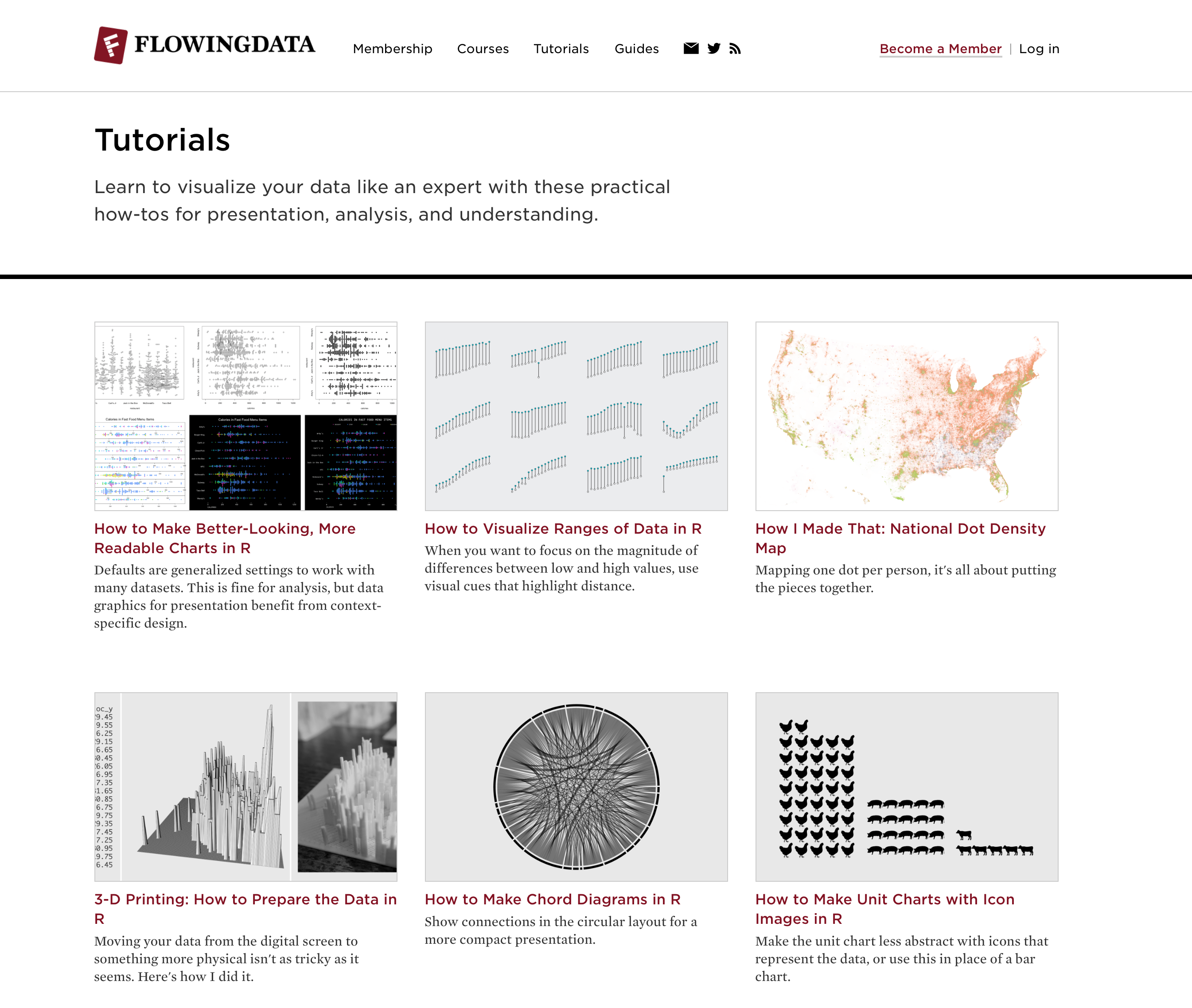
We have Nathan Yau with us on the show to talk about his mythical FlowingData blog. Nathan was one of the first people to write a blog about data and visualization, and he is one of the very few who continues to blog virtually every day after more than ten years.
If you want to know what has happened lately in visualization, you can’t go wrong by visiting his site. It’s very comprehensive and never misses a beat.
On the show, we talk about how and why Nathan started FlowingData, the evolution of the blog and visualization over the years, his data visualization projects and membership program, and the secret “sauce” behind his persistence!
Enjoy the show!
[If you like what we do, please consider supporting us on Patreon or sending us a one-time donation through Paypal. Data Stories runs thanks to your financial support. Thx!]

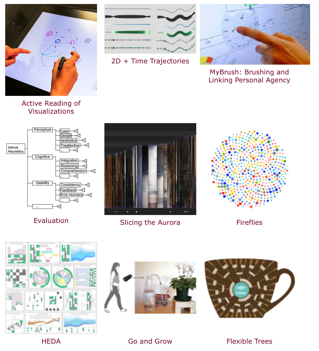
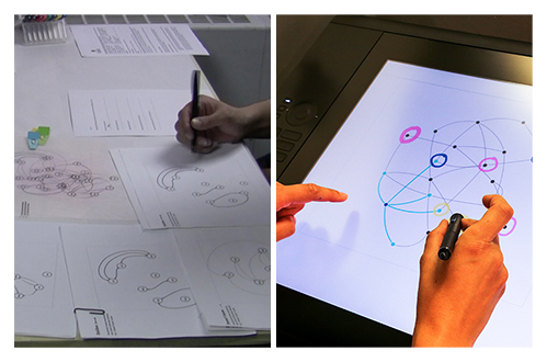
Sheelagh Carpendale is Professor in the Department of Computer Science at the University of Calgary, where she leads the Innovations in Visualization (InnoVis) research group. Sheelagh is one of the most prominent figures in visualization research and, this week, she joins us to discuss the research taking place in her lab, as well as her innovative ideas about all sorts of information visualization. Sheelagh is renowned for taking a much more holistic view of visualization than usual; she emphasizes interaction, visualization beyond the confinements of desktop displays, and the use of design, qualitative research, and psychology. On the show we talk about the uses of sketching in data visualization, the concept of “active reading” of visualizations, and the standard data viz ideas that are holding us back.
Enjoy the show!
Links
[If you like what we do, please consider supporting us on Patreon or sending us a one-time donation through Paypal. Data Stories runs thanks to your financial support!]
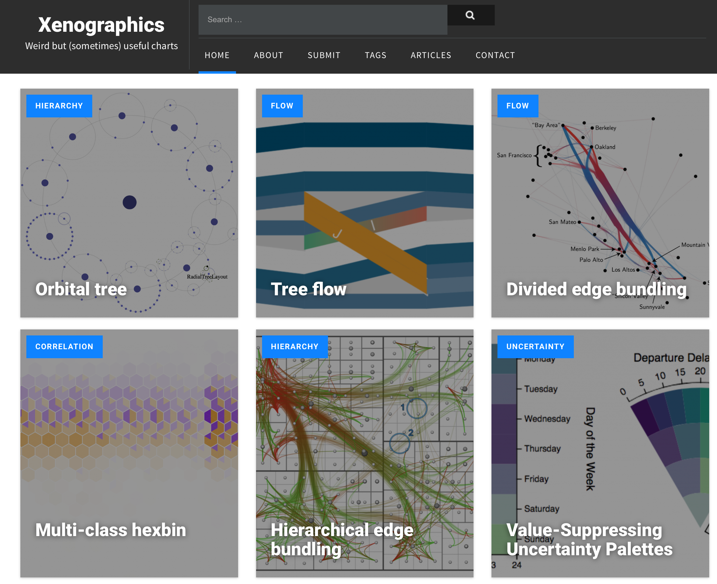
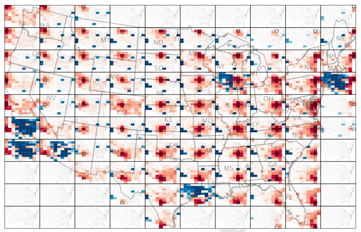
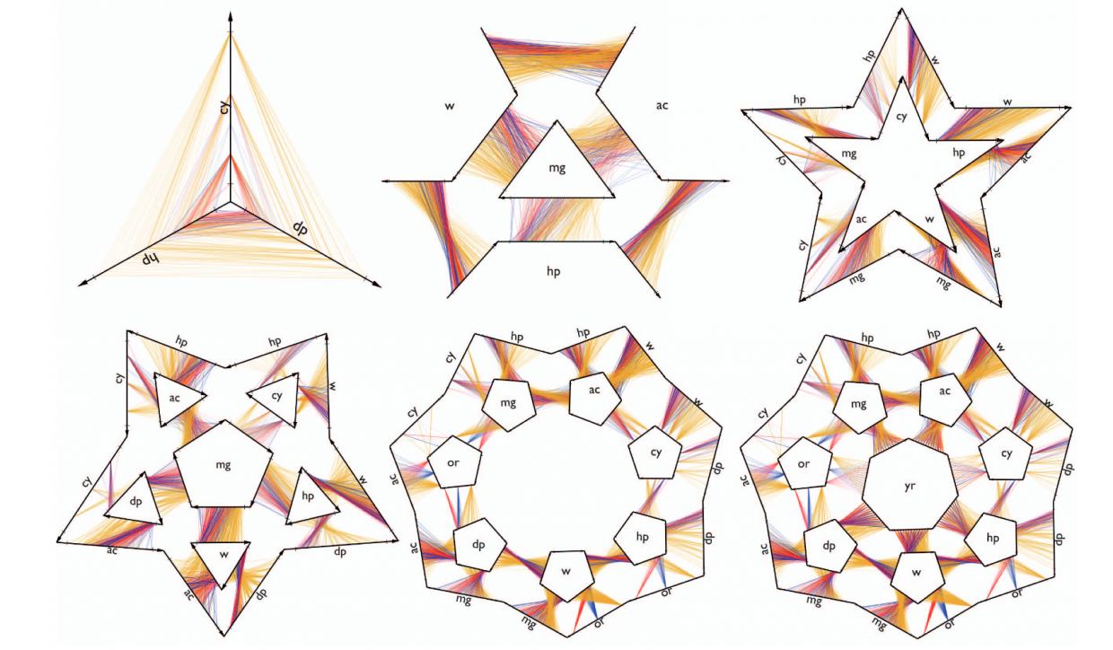
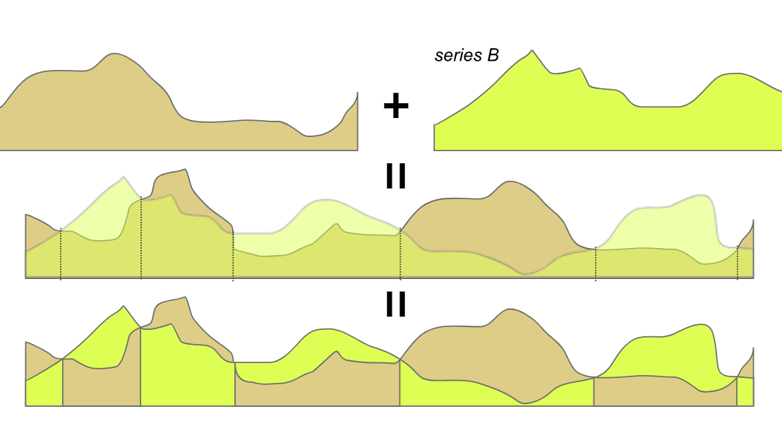
Most often in data visualization we depend on traditional charts, but occasionally we stumble onto something new, maybe even something weird: something that is interesting and beautiful. How many charts of this type exist? And do they have anything in common?
In this episode we have Maarten Lambrechts on the show to talk about his Xenographics project: a growing collection of “unusual charts and maps.”
We talk with Maarten about examples of xenographics, the system Maarten developed to organize the collection, the role of innovation in visualization, and the future of these unusual designs.
We hope you enjoy the show!
Links
Related episodes
[If you like what we do, please consider supporting us on Patreon or sending us a one-time donation through Paypal. Data Stories runs thanks to your financial support!]
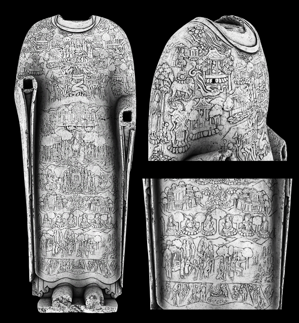
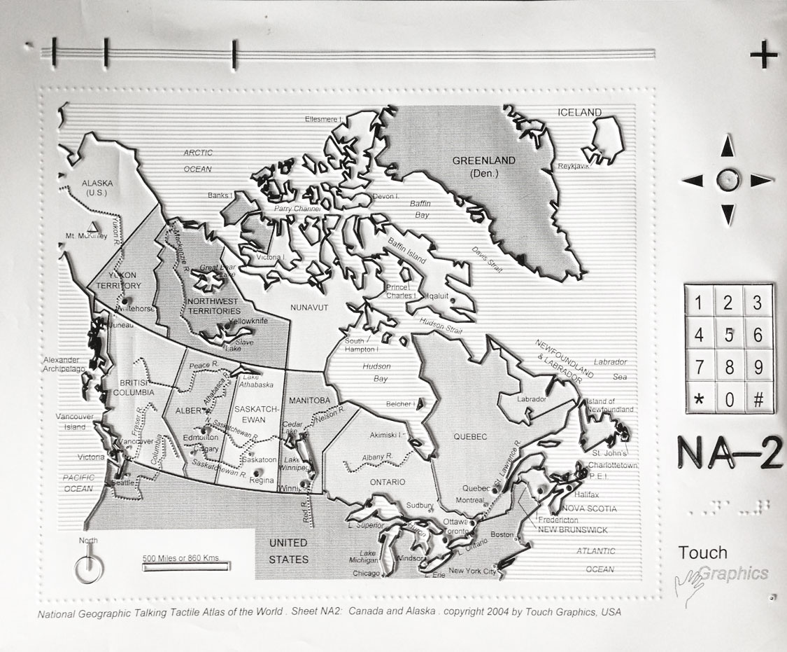
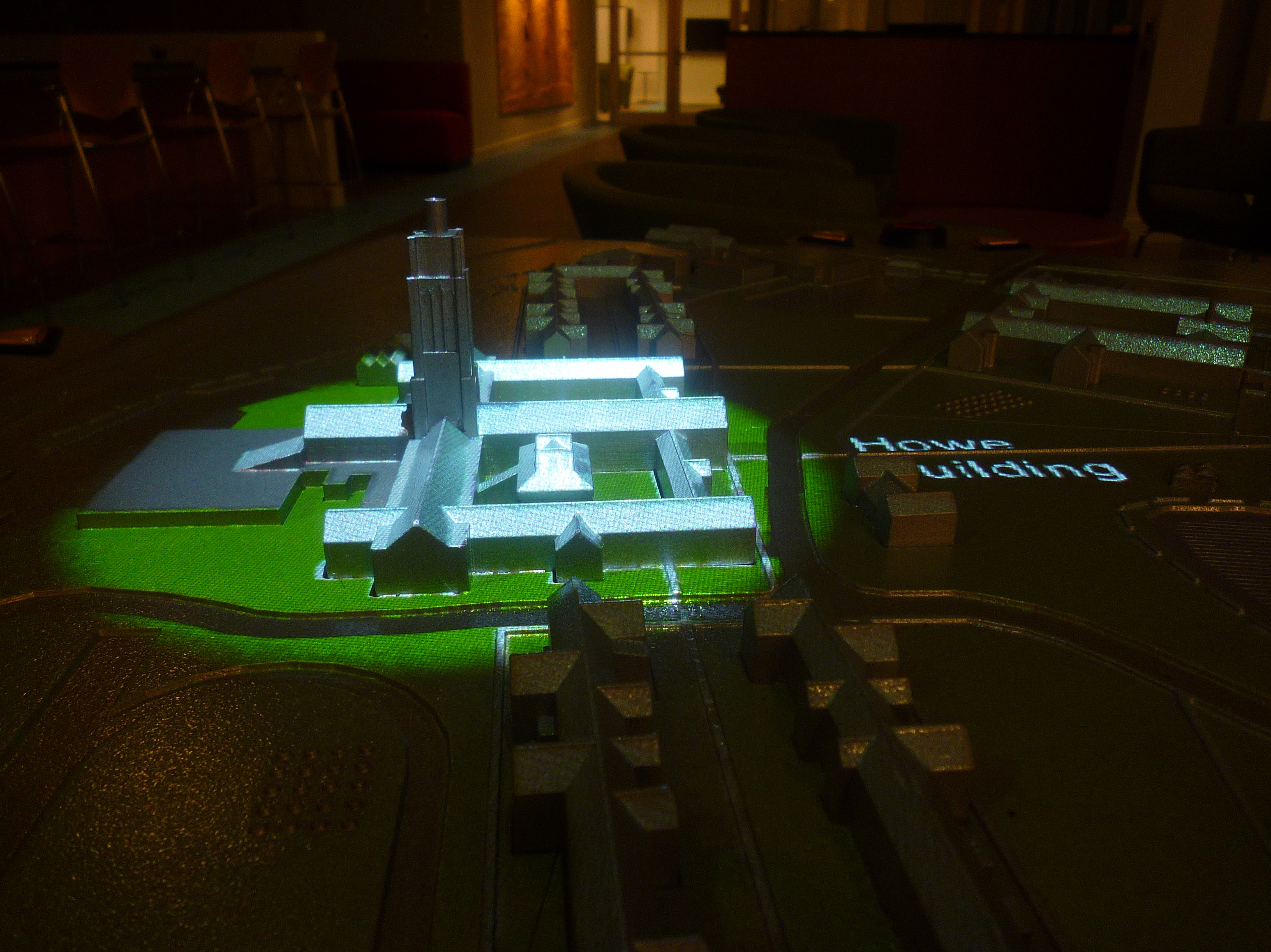
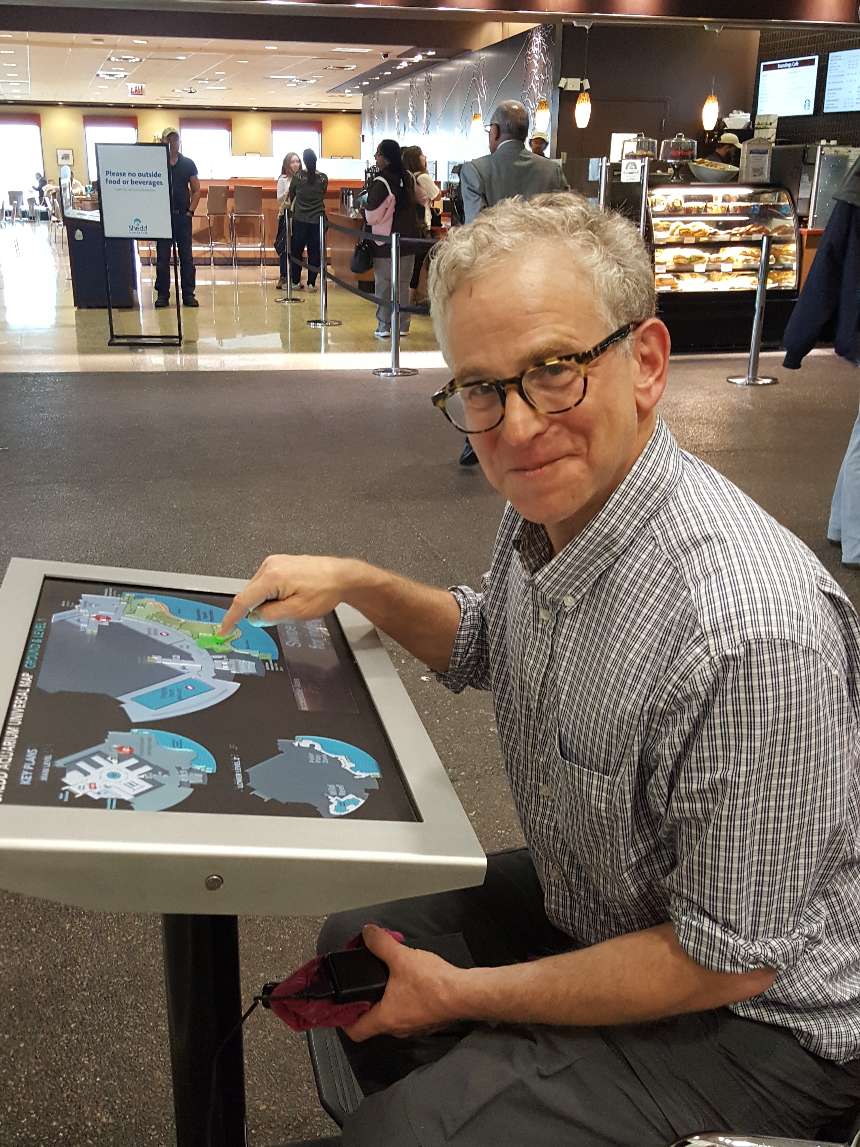
As creators of data visualization, it is important for us to remember that many of our platforms are not accessible to people who are blind or visually impaired. What can we do to help non-sighted people access the wealth of information that we convey visually?
To discuss this topic we have on the show Steve Landau, the founder of Touch Graphics, a company that develops products that “rely on multi-sensory display techniques and audio-haptic interactivity.”
We talk with Steve about the history of the company, the process for creating tactile graphics, and his suggestions for making visualization more accessible.
Enjoy the show!
Links
Related episodes

Data Stories runs thanks to the help of our listeners. Please consider supporting us on Patreon or sending us a one-time donation through Paypal. And thanks so much for your support!
This week, we have Prof. Boris Müller from FH Potsdam on the show! Moritz and Boris discuss the SENSES research project, which visualizes climate change scenarios. They also talk generally about design and science collaboration.
In other news, if you work in science and would like to improve your data visualization skills, make sure to check out the Graphic Hunters summer school In Utrecht, Netherlands, where Moritz will be offering a training on August 21, 2018.
Enjoy the show!
Links:

Related episodes