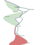
Hey, we talk about space and spacecrafts in this episode!
We have Rachel Binx on the show to discuss her experience developing data visualization software for NASA JPL.
NASA operators need to look at telemetry data coming from spacecrafts to make sense of what is happening in our skies. Super fascinating topic.
On the show we talk about the project, the process for NASA data collection and analysis, and how to write code that goes into space!
You can find the transcript for this episode here. Enjoy the show.
This episode of Data Stories is sponsored by Quadrigram, a web based application designed to bring data stories to life. With Quadrigram you can create and share interactive data stories without the need of any coding skills.
We have a nice trio on the show for this episode: Jeremy Boy is a postdoctoral researcher at NYU School of Engineering, Helen Kennedy is Professor of Digital Society at University of Sheffield, and Andy Kirk is our beloved editor at visualisingdata.com.
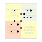
We talk with these three experts about Data Visualization Literacy — that is, how people read data visualizations. We ask, how do we measure literacy? How do we improve it? And how do we even define literacy when we’re asking our viewers to read images?
Jeremy talks about his research on methods to measure visualization literacy, while Helen and Andy discuss their Seeing Data project, which studies how people read visualizations.
If you prefer reading to listening, you can find the transcript of our episode here. Enjoy the show!
Data Stories is brought to you by Qlik, which allows you to explore the hidden relationships within your data that lead to meaningful insights. Let your instincts lead the way to create personalized visualizations and dynamic dashboards with Qlik Sense. Download Qlik Sense for free at www.qlik.de/datastories. This week, the Qlik blog features a great post on maps and the data literacy required to read them called “Here Be Dragons.”
Lee, Sukwon, et al. “How do People Make Sense of Unfamiliar Visualizations?: A Grounded Model of Novice’s Information Visualization Sensemaking.” Visualization and Computer Graphics, IEEE Transactions on 22.1 (2016): 499-508.
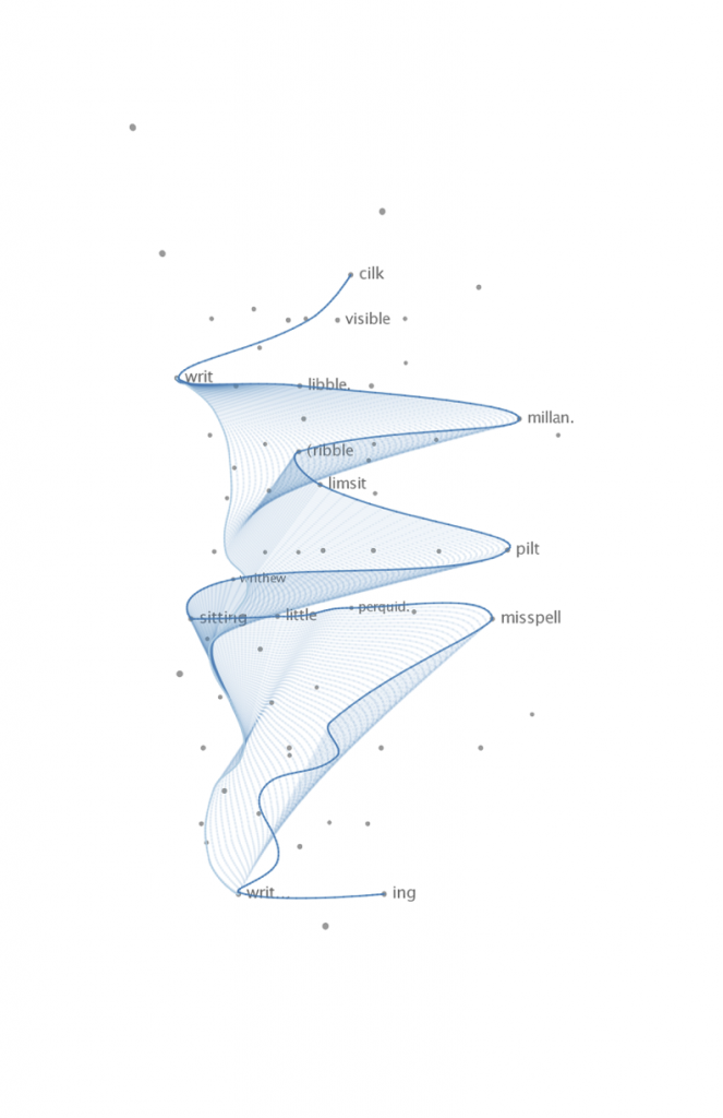
We have Miriah Meyer (Assistant Professor at Univ. of Utah) and Nina McCurdy (PhD student at Univ. of Utah) on Data Stories for a project episode about the lovely Poemage, “a visualization system for exploring the sonic topology of a poem.”
Miriah and Nina worked hand-in-hand with a group of poets to design a tool that visualizes a poem and, as such, provides inspiration for interesting poetic structures and solutions.
On the show we talk about how they derived phonological information from text, how the project evolved, and how data visualization tools can be designed to support creativity.
Listen here or read the transcript. Either way, enjoy the show!
This episode of Data Stories is sponsored by Quadrigram, a web based application designed to bring data stories to life. With Quadrigram you can create and share interactive data stories without needing any coding skills.
We have Hadley Wickham on the show, Chief Scientist at RStudio and Adjunct Professor of Statistics at Rice University and the University of Auckland.
Hadley created a number of hugely popular libraries for the R language, including ggplot2, which is used throughout the world to analyze and present data.
On the show we talk about his creative process to develop ggplot2, its growing popularity, other libraries he has built in the R ecosystem, and strategies for creating popular software for data analysis and visualization.
Enjoy listening to Hadley Wickham, or read the transcript from our interview here!
Data Stories is brought to you by Qlik, which allows you to explore the hidden relationships within your data that lead to meaningful insights. Take part in the Open Data Challenge for a chance to win $10,000 for an app created with Qlik Sense!
On the show Ben talks about how he generates new ideas, how he finds and analyzes the data, and how he turns this into amazing stories for his blog. We also talk about the impact his work had on New York City and the interesting reactions some of his blog posts have generated.
Enjoy Ben and his amazing NYC data stories, and read a transcript of our interview here!
This episode of Data Stories is sponsored by Quadrigram, a web based application designed to bring data stories to life. With Quadrigram you can create and share interactive data stories without the need of any coding skills.
Another turn of the year is approaching and we take some time to reflect with our classic guests Andy Kirk and Robert Kosara on what has happened in 2015: “What where the major trends? Big debates? Best visualizations? New tools? Etc.” We’ve even put our predictions in writing — you can read them in our transcript of this episode here.
This was a great year for Data Stories, with a total of 22 episodes (our record so far!). We want to thank our fantastic collaborators Destry and Florian for their great support with running the show, our guests for spending time talking with us, and of course all of you for listening to Data Stories!
Happy 2016! Enjoy the holidays and we’ll see you on January with a ton of new stuff from our side. Stay tuned! Read more
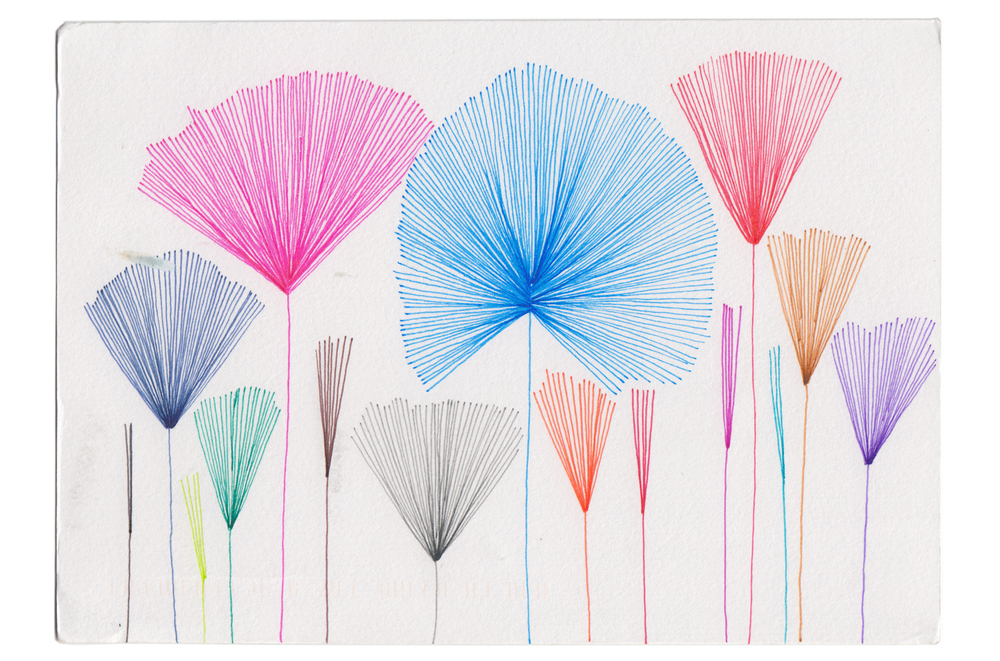
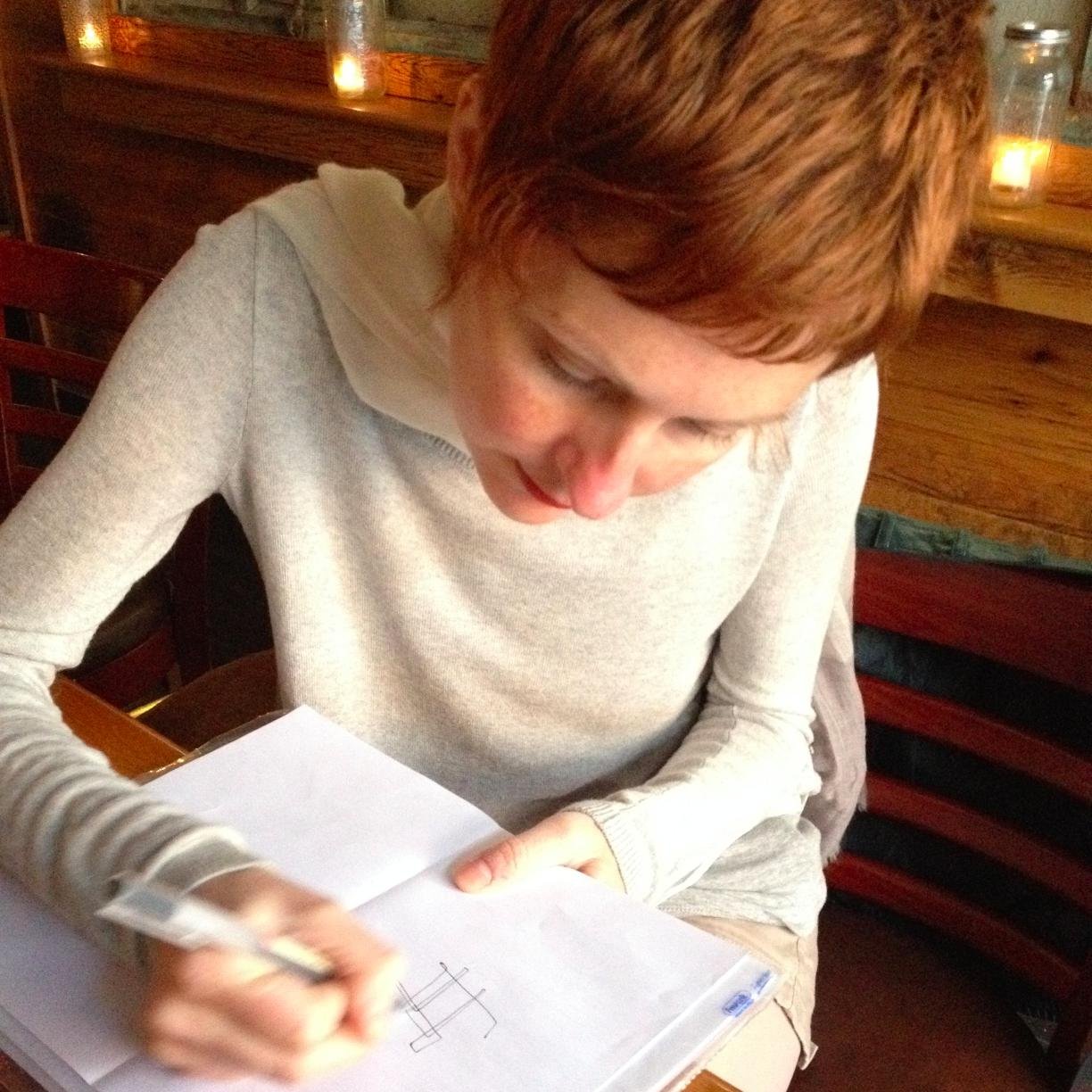
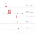
It’s time for another project-centric episode, and we finally talk about one of our favorite projects of the year — “Dear Data” by the most fabulous tag team of data illustrators around: Giorgia Lupi and Stefanie Posavec.
Their year-long project is about how “two women who switched continents get to know each other through the data they draw and send across the pond” and consists of 104 hand–drawn postcards all of which document one week of their lives. How much they cursed, laughed, read, smiled at strangers, … — all of this is documented in inventive, charming and very analogue ways.
Learn all about the project — how they started it, what they learned, and how it will live on — in the episode.
Data Stories is brought to you by Qlik, who allow you to explore the hidden relationships within your data that lead to meaningful insights. Check out this fun experiment on the qlik blog: “What Chart are You?”. And, make sure to try out Qlik Sense, which you can download for free at www.qlik.de/datastories.
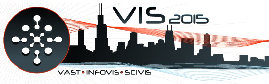
In our latest episode, Enrico recaps the IEEE VIS’15 conference with Robert Kosaraand Johanna Fulda, and we compare notes about conference projects and papers. Find the transcript here, and check out our long list of selected projects below with plenty of links and video previews!
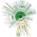
We have Assistant Professor Chris Collins from University of Ontario Institute of Technology on the show to talk about text visualization. Chris explains what Text Vis is, provides examples from his and others’ work, describes tools and knowledge to get started, and looks into the future of the field, including its challenges and opportunities.
And here’s a really cool new thing — we have a transcript of the whole show! Browse the text, search for quotes and chapters, and maybe even… visualize it? Let us know if it’s useful!
—
Hey, before we start, we ask you a favor: rate us on iTunes! This has a huge impact on how the show is ranked. To rate us on iTunes follow this link and then select “view in iTunes” (you need to have iTunes installed) and then click on “Ratings & Reviews”. You can also rate us directly from your Apple podcast player if you have one. Thanks!!!
—
Lisa is a visualization designer based in Berlin and the project is about how she collected and visualized her google search history to look into her personal data.
In the episode we discuss how she came up with the idea and all the steps she followed to realize it.
This episode is sponsored by Qlik who allows you to explore hidden relationships within data that lead to insights. Check out the new blog post on the qlik blog called: “The role of multiple devices in our workspaces” by Donald Farmer. And, there is a big Qlik Sense Roadshow with over 100 events in Europe. You can download Qlik Sense for free at: www.qlik.de/datastories.