In our latest episode, Enrico recaps the IEEE VIS’15 conference with Robert Kosara and Johanna Fulda, and we compare notes about conference projects and papers. Find the transcript here, and check out our long list of selected projects below with plenty of links and video previews!
Data Stories is brought to you by Qlik, who allows you to explore the hidden relationships within your data that lead to meaningful insights. Check out a new blog post from the Qlik Blog called “People Are Smart: Data Literacy and Broad Audiences”. As you may know Data Literacy is a subject we love to talk about! 🙂
LINKS, IMAGES, AND VIDEO PREVIEWS
1. Tutorial: Tamara Munzner on Visualization Analysis and Design

Check out her presentation slides here.
You’ll love this if: You want to get better at teaching in the design space.
2. Keynote: Donna Cox on Scientific Visualization
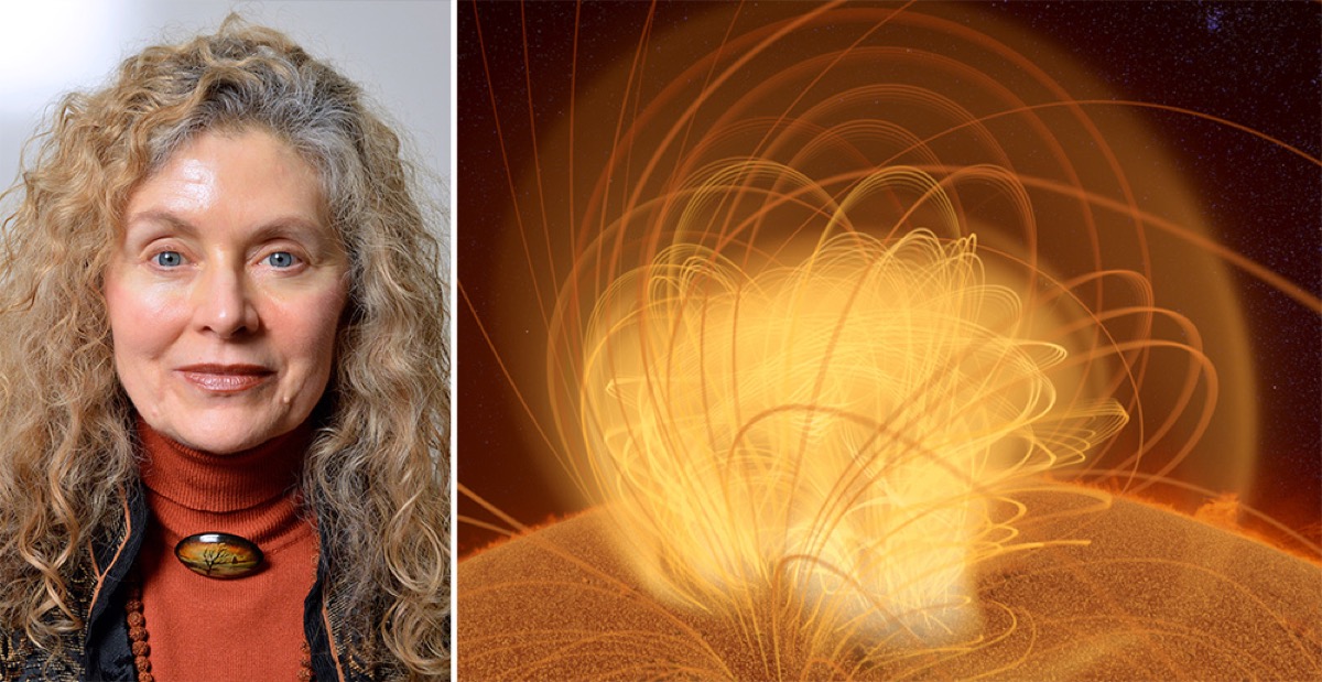
Check out her keynote description here.
You’ll love this if: You want to use your scientific research to generate, analyze, and/or visualize data using advanced digital resources. And if you do, submit to this call for participation!
3. Presentation: Julian Stahnke on Interaction and Multi-Dimensionality
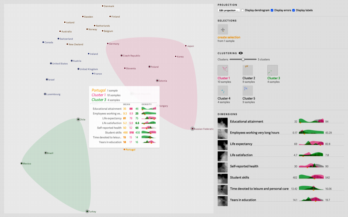
Probing Projections helps to visualize similarities and differences in datasets by looking at data in different dimensions. Read the paper here.
You’ll love this if: You’ve always wanted to understand how multi-dimensional scaling works.
4. Presentation: Stef van den Elzen on Network Representation through Time
Stef van den Elzen has figured out how to represent changing networks on a scatterplot with multidimensional scaling. Read the paper here.
You’ll love this if: You’ve been wondering how to represent changing relationships over time.
5. Presentation: Steve Kieffer on Human Network Creation
Steve Kieffer and his team developed a new automatic network layout algorithm to mirror the way networks are represented by actual people, rather than computers. Read the paper here.
You’ll love this if: You’re curious to see how humans and computers map networks differently — and you want to know how closely an algorithm can mimic human design.
6. Presentation: Melanie Tory on Personal Data Visualization
Melanie Tory presents a taxonomy of design for individuals to visualize and analyze their personal data. Read the paper here.
You’ll love this if: You have a habit of collecting data about yourself.
7. Presentation: Wesley Willet on Visualizing Notes
A look at how visualizations can help improve personal note-taking practices and information retention, read the paper here.
You’ll love this if: You might like to learn to visualize your own notes, or improve your note-taking habits.
8. Presentation: P. Samuel Quinan and Miriah Meyer on Visualizations in Weather Forecasts
WeaVER integrates existing conventions for visualizing weather forecasts with principles of effective design, and compares different features across a multitude of forecasting tools. See the project site here.
You’ll love this if: You’re passionate about implementing visualization best practices in functional ways.
9. Presentation: Aritra Dasgupta on Visualizing and Comparing Climate Models
Visualization experts and climate scientists worked together to develop a taxonomy to map climate patterns. Read the paper here.
You’ll love this if: You’re interested in cross-disciplinary collaboration between researchers, designers, and practitioners.
10. Presentation: Nina McCurdy on Poetry Visualization
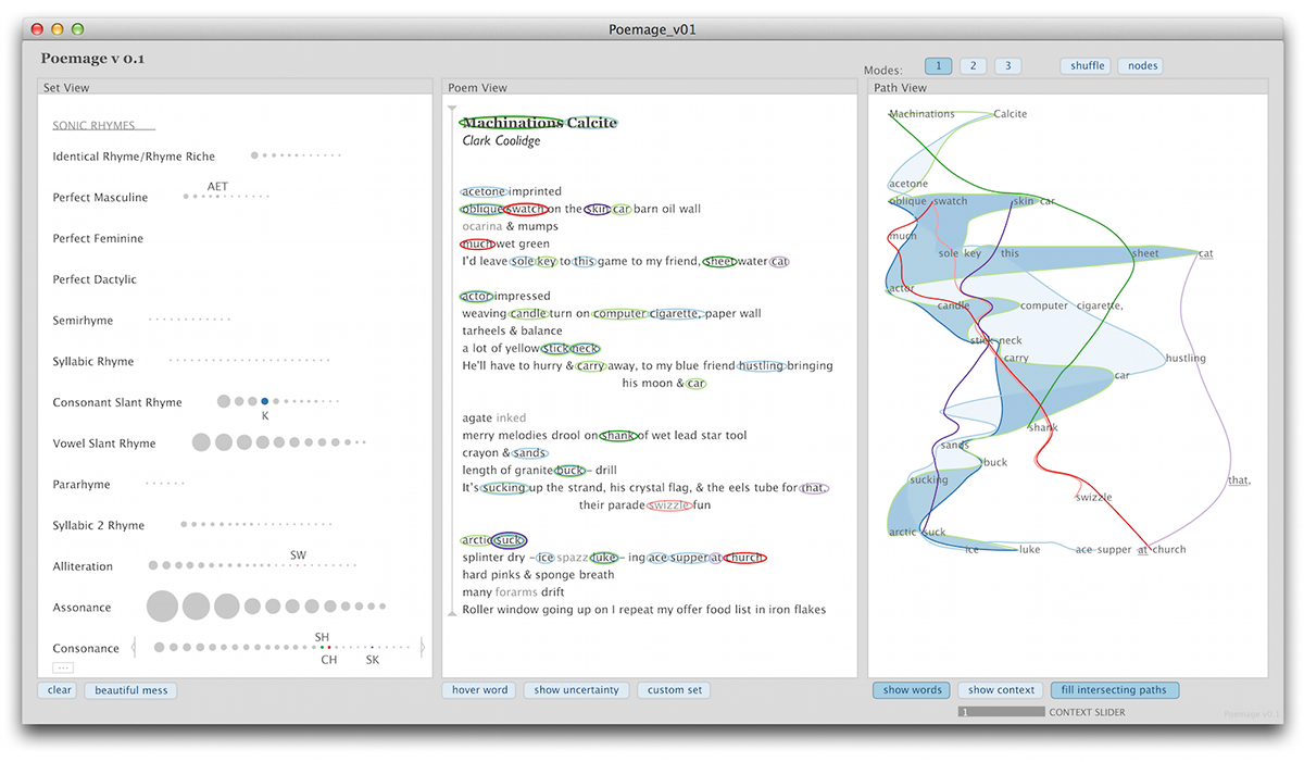
Poemage visualizes the sonic topography of a poem. A tool for inspiration, it is designed to help poets see rhyme differently and come up with new ideas. See the project page here.
You’ll love this if: You appreciate computation tools that help us to celebrate ambiguity.
11. Presentation: Michelle Borkin on Visualization Memorability
How do we recall the visualizations that we have seen? Michelle Borkin and her team study human eye movements to find out. Read the paper here.
You’ll love this if: You’re interested in the user-side of data visualization.
12. Presentation: Jeremy Boy on Visual Cues for Interactivity
Do certain visual cues more effectively encourage participants to interact with a visualization? This is just one of the questions that interests Jeremy Boy. Read the paper here.
You’ll love this: You’d like some tricks and tools to increase user engagement.
13. New Tools: Voyager and Reactive Vega
Voyager suggests which kind of chart you should select, depending on your purposes. Read the paper about it here.
Reactive Vega offers a declarative format for creating, saving, and sharing interactive visualizations. Read the paper about it here.
You’ll love these if: You want to streamline your visualization creation process.
14. Presentation: Johanna Fulda, Matthew Brehmer, and Tamara Munzner on Visual Timelines

A solution to the headache of designing timelines, TimelineCurator uses natural language processing to build easy streamlined timelines. Play with it here.
You’ll love this if: You’ve been craving a user-friendly process for putting together a timeline.
These are just a handful of the VIS’15 presentations, panels, and tools that we loved. Listen to the episode to hear about more, let us know which projects excited you, and consider attending VIS’16 next year in Baltimore.