[This podcast is fully supported by our listeners. If you enjoy listening to Data Stories, consider supporting us on Patreon. And now we also accept one-time donations through Paypal: just use this link. Thanks so much for your support!]
In this episode we have Karen Schloss on the show to talk about color. Yes, color! Karen is Assistant Professor at the University of Wisconsin Madison where she conducts research on the effective uses of color in visualization and everyday tasks.
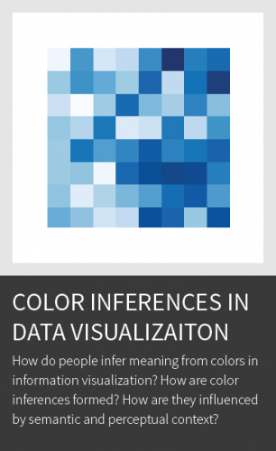
Karen walks us through the intricacies of color: explaining how it works and why it is so hard to get right. We also discuss the infamous rainbow color map, the association between colors and meaning, the tools developed in her lab, and her fascinating research on coloring trash bins!
Enjoy the show…
Links
- News from Moritz: 123 data, a new data visualization exhibition in Paris
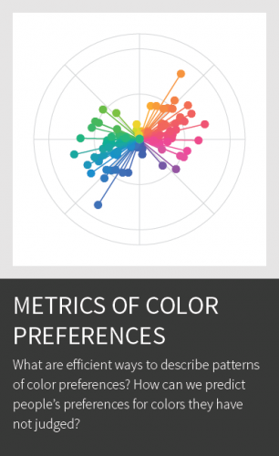
- Karen Schloss and her research on color
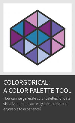
- Karen’s color tool Colorgorical
- Article: “When communicating with color, balance can be a path to accuracy”
- Enrico’s work with climate scientists
