
[Our podcast is fully supported by our listeners. Please consider becoming a supporter on Patreon or sending us a one-time donation through Paypal. And thanks!]
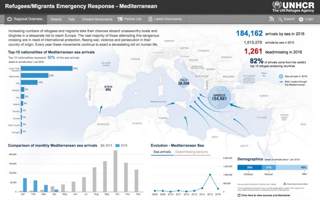
Oh dashboards… dashboards… what are they? For some, they are just ugly examples of bad visualization design (speed dials anyone?). For others, they are a first citizen of the data visualization world that deserve to be learned, studied, and understood.
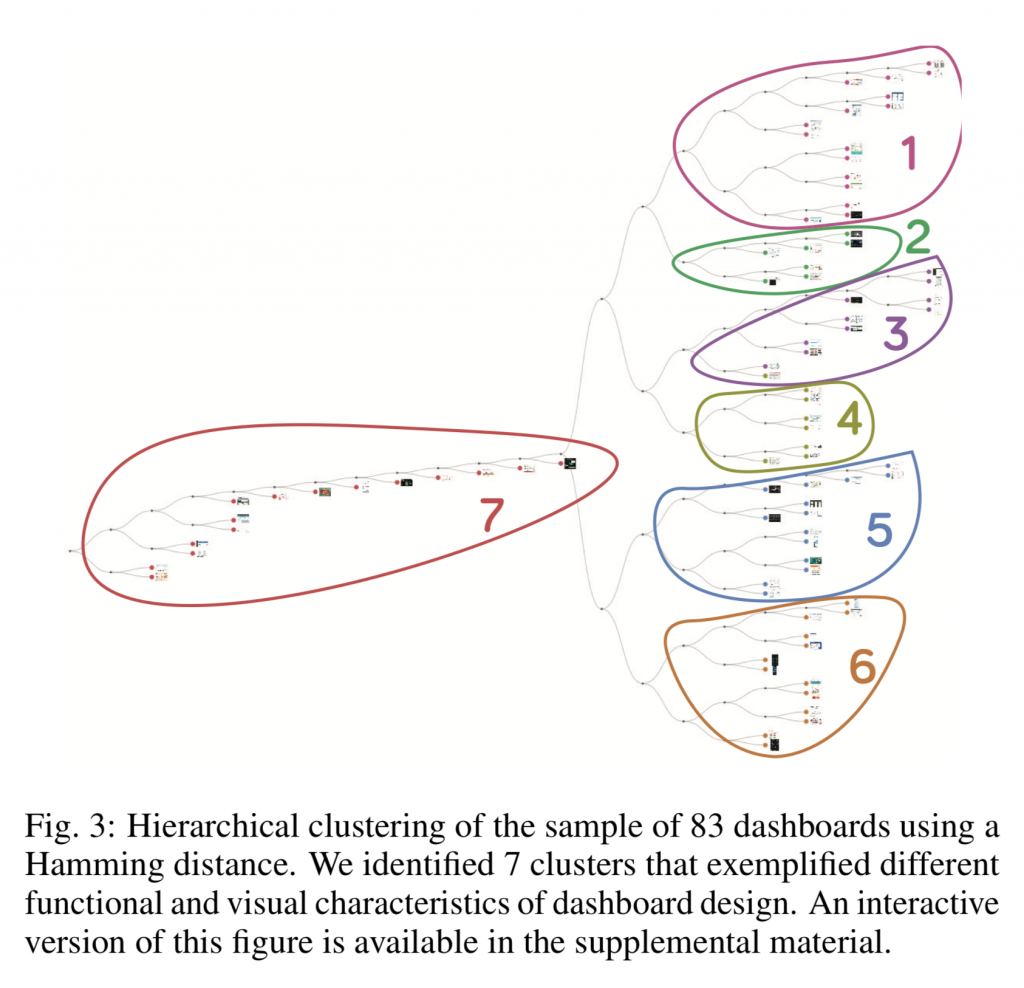
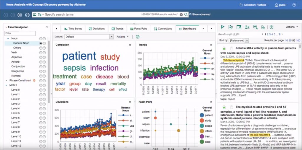
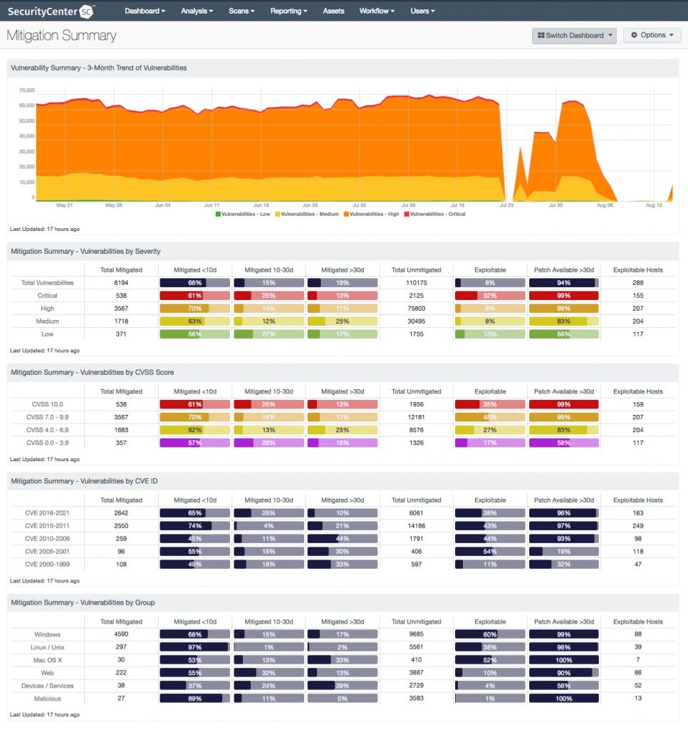
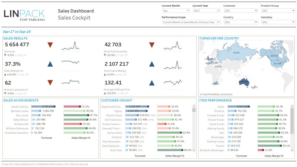
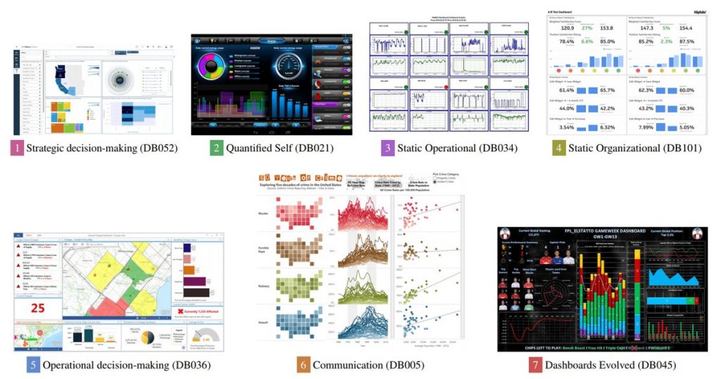
To dig into this debate, we have Lyn Bartram of Simon Fraser University and Alper Sarikaya of Microsoft Power BI on the show to talk about an exciting research project they developed. Their research seeks to build a better picture of what dashboard are and how they are used “in the wild.” The results are summarized in a paper they wrote with their colleagues from Tableau and Honeycomb.io: What Do We Talk About When We Talk About Dashboards?
On the show we talk about how the project got started, what they discovered by analyzing a large corpus of dashboards, and the many ramifications of their research.
Enjoy the show!
Links
- Project page
- Supplemental material with images of all the dashboards the team analyzed (zip)
