[Data Stories runs thanks to the help of our listeners. Please consider supporting us on Patreon or sending us a one-time donation through Paypal. And thanks so much for your support!]
This week we have David Robinson on the show to talk about data science, in particular the role of data visualization in data science. David is Chief Scientist at Data Camp and author of multiple data science books and R packages. He also writes a great blog called “Variance Explained.”
On the show we talk about visualization as a data analysis tool, the problem of validation in exploratory data analysis, and David’s opinion on programming versus GUI interfaces. Also, don’t miss his great advice — and very generous offer! — on how to get started in data science!
[This podcast is fully supported by our listeners. If you enjoy listening to Data Stories, consider supporting us on Patreon. And now we also accept one-time donations through Paypal: just use this link. Thanks so much for your support!]
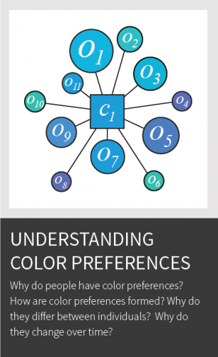
In this episode we have Karen Schloss on the show to talk about color. Yes, color! Karen is Assistant Professor at the University of Wisconsin Madison where she conducts research on the effective uses of color in visualization and everyday tasks.
Karen walks us through the intricacies of color: explaining how it works and why it is so hard to get right. We also discuss the infamous rainbow color map, the association between colors and meaning, the tools developed in her lab, and her fascinating research on coloring trash bins!
[This podcast is fully supported by our listeners. If you enjoy listening to Data Stories, consider supporting us on Patreon. And now we also accept one-time donations through Paypal: just use this link. Thanks so much for your support!]
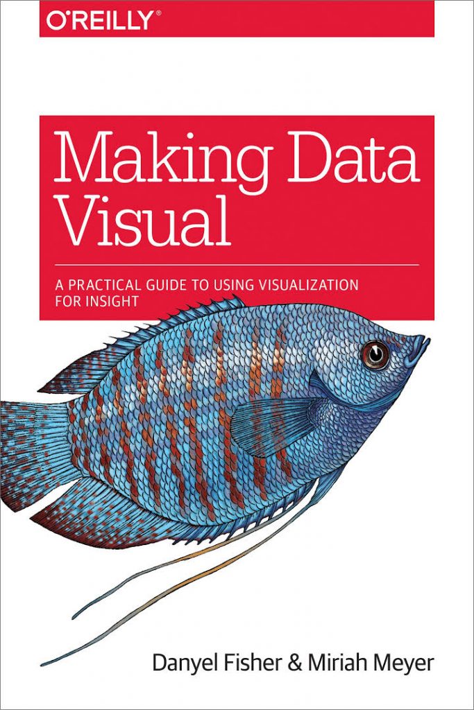
This week we have Miriah Meyer (University of Utah) and Danyel Fisher (Microsoft Research) on the show to talk about their new book Making Data Visual, which covers areas that other visualization books typically do not address: namely, how to go from formulating questions to building visualizations that solve actual problems that people have.
On the show we talk about how the book came to be; some of the concepts introduced by Miriah and Danyel in the book, such as the use of proxy tasks for data; and how you could use it for your own projects.
[This podcast is fully supported by our listeners. If you enjoy listening to Data Stories, consider supporting us on Patreon!]
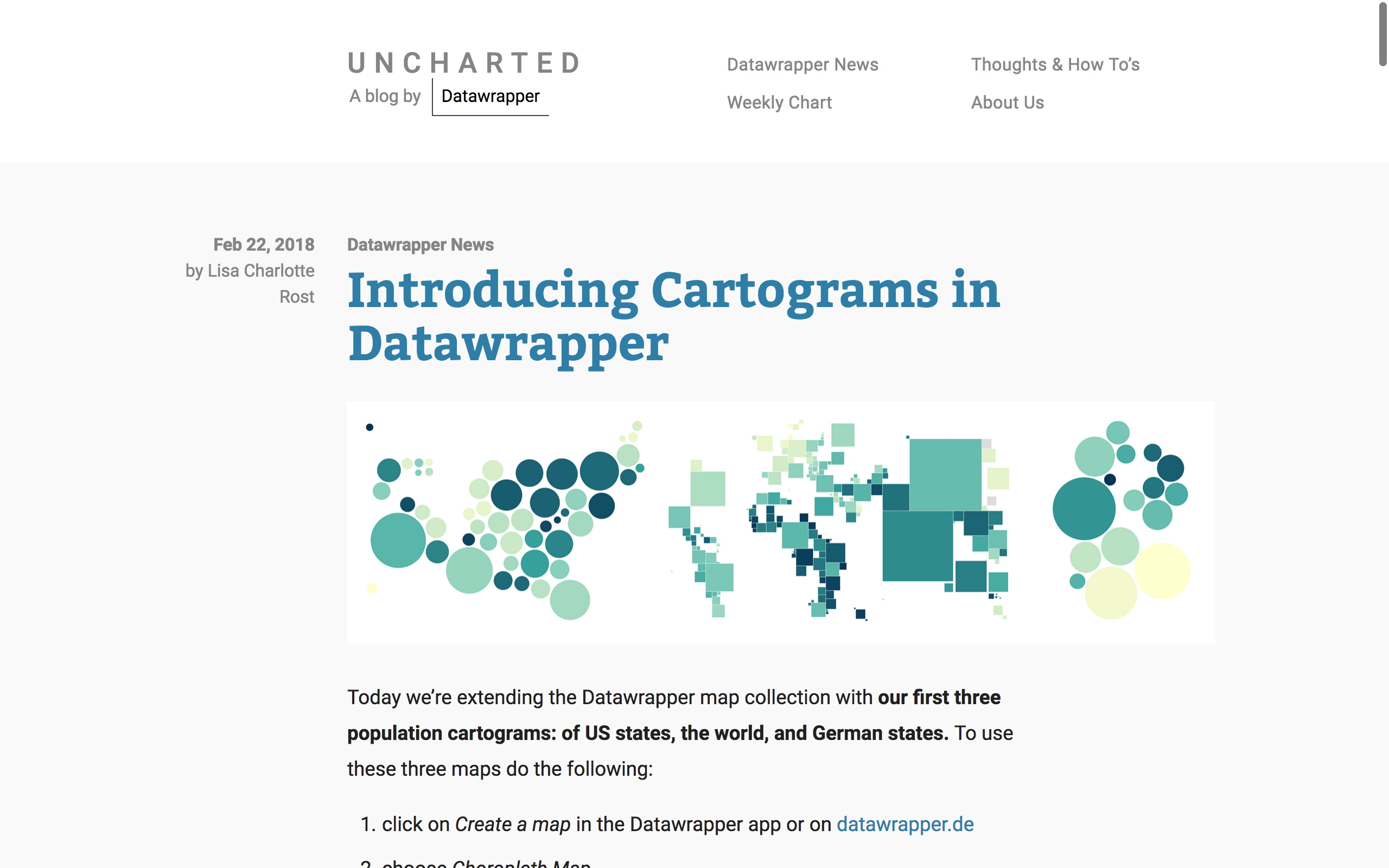
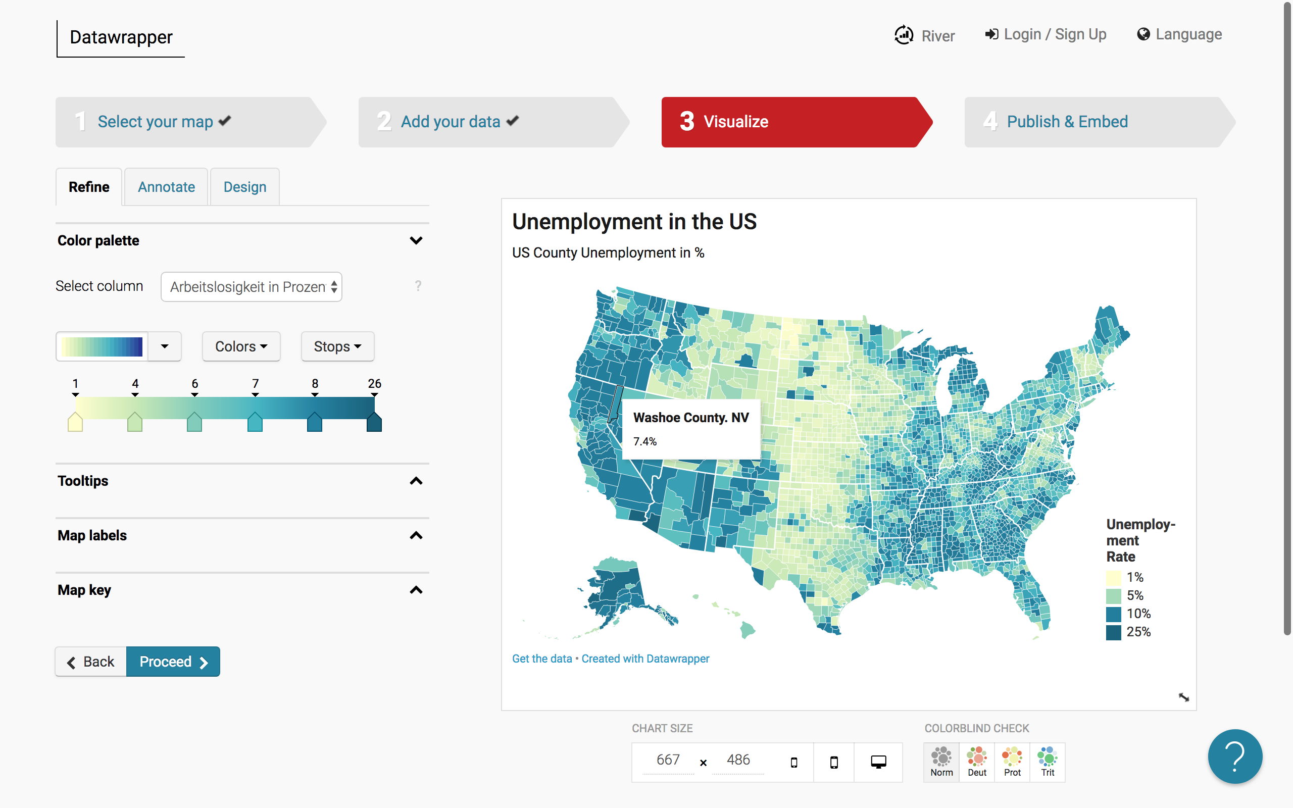
We have Lisa C. Rost and Gregor Aisch on the show to talk about the exciting work they are doing at Datawrapper. Lisa and Gregor have recently joined the company in Berlin, coming from various experiences in data journalism in the US.
Lisa is known for her long, thoughtful and beautiful blog posts and visualization guides. Gregor is a former graphics editor at the New York Times and has also developed many useful visualization libraries and tools.
On the show we talk about Lisa and Gregor’s transitions from the world of journalism to a software company, the market for data visualization products, and what we can expect from Datawrapper in the future.
[This podcast is fully supported by our listeners. If you enjoy listening to Data Stories, consider supporting us on Patreon!]
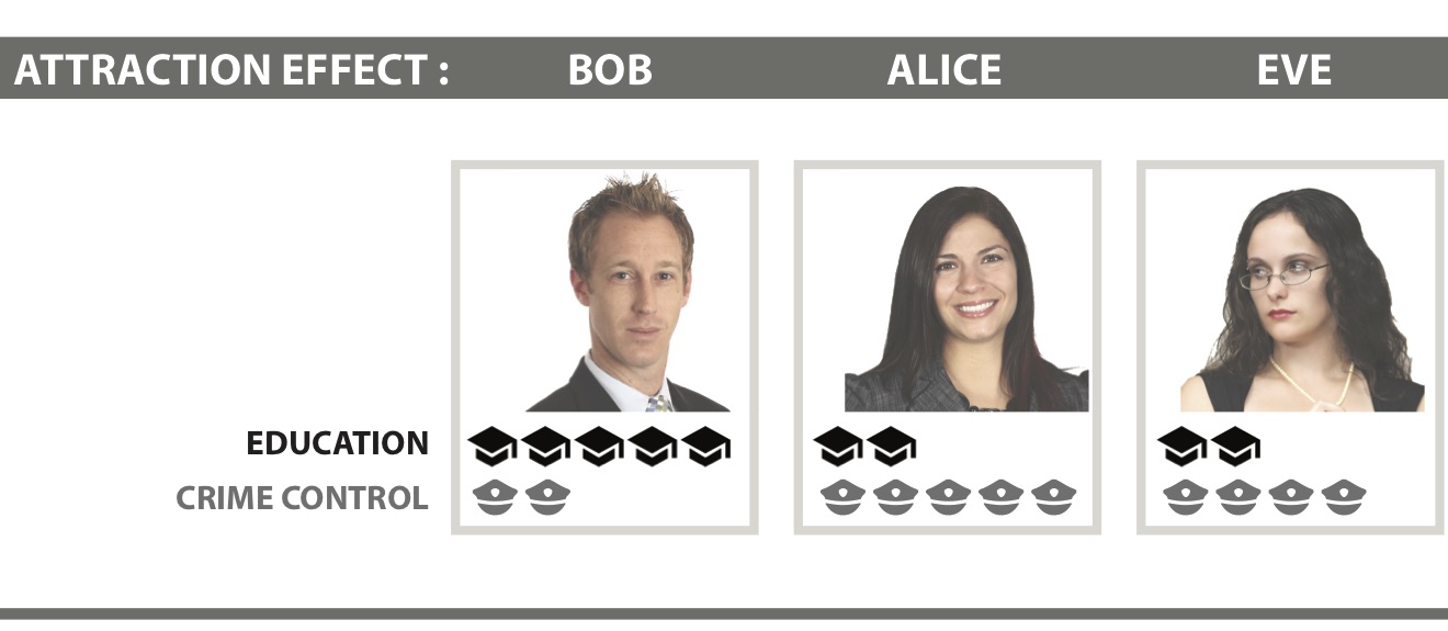
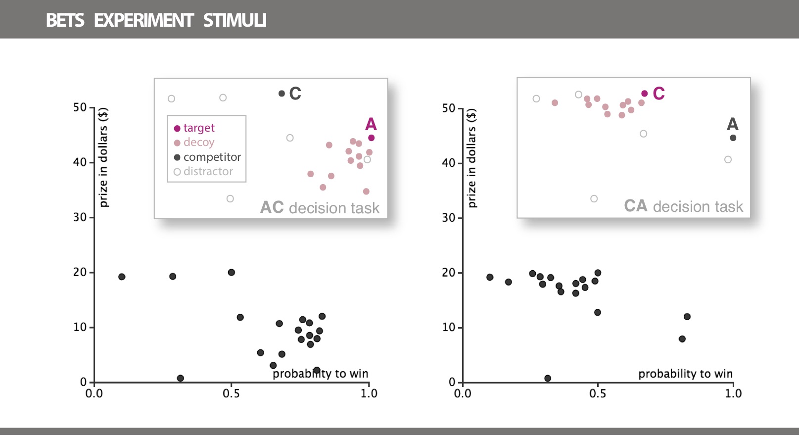
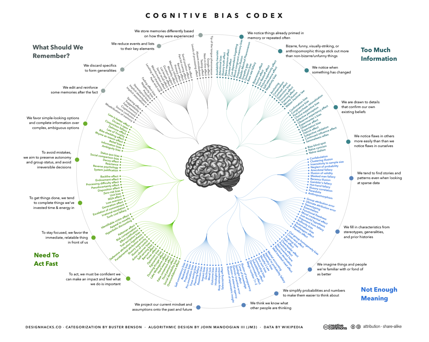
We have Evanthia Dimara on the show to talk about cognitive bias and the role it plays in visualization. Evanthia has a PhD from INRIA and is now a postdoctoral researcher at the Institute for Intelligent Systems and Robotics (ISIR) in Paris. Her work focuses on data visualization and decision-making, and she specializes in understanding how bias affects our decisions when they are supported by visual representations.
On the show we talk about cognitive biases in general, introducing some of the most popular and funny examples. We then switch gears and Evanthia describes how the effects of specific biases translate to the world of data visualization and whether visualization can play a role in reducing bias.
[This podcast is fully supported by our listeners. If you enjoy listening to Data Stories, consider supporting us on Patreon!]
How should we interact with machine learning? Is there a way to better understand what machine learning systems do and how? What role can visualization play in machine learning? These are some of the questions we discuss with Saleema Amershi on the podcast this week.
Saleema is a Researcher at Microsoft Research AI (MSR AI) where she works on technologies for helping people build and use machine learning systems.
On the show we explore the need for interaction in machine learning and discuss some of the fascinating work Saleema has done in this space, as well as what visualization can do to make machine learning more transparent for its users.
[This podcast is fully supported by our listeners. If you enjoy listening to Data Stories, consider supporting us on Patreon!]
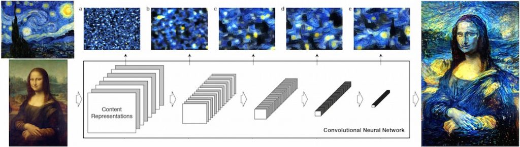
If you haven’t heard talk about machine learning (ML) lately, you must be living under a rock! For our part, we have finally managed to record a whole episode on the use of ML for art and visualization. Artist and programmer Gene Kogan joins us on the show to talk about new developments in this space, as well as new challenges and opportunities. Gene has developed numerous art and design pieces using ML technologies, which we also discuss on the show. (You should definitely check out his home page: http://genekogan.com/). Last, we talk about the role of ML in visualization and how you can integrate ML in your own projects.
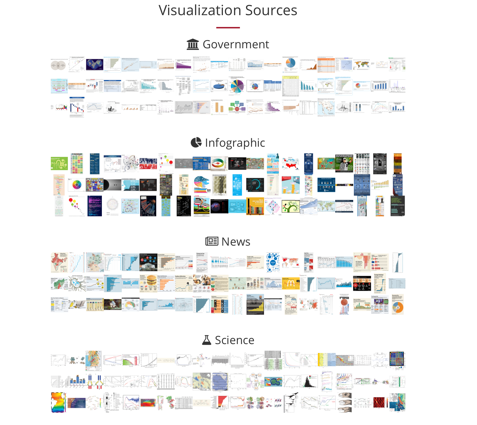
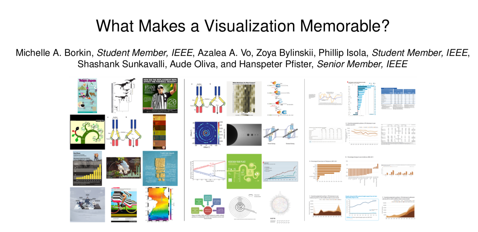
Michelle Borkin is Assistant Professor at Northeastern University where she studies the use of visualization in science research, in particular how it impacts human perception and cognition. On the show we talk about how the data viz community can better support the work of scientists, her popular research on data visualization memorability and, of course, the infamous data viz dinosaur.
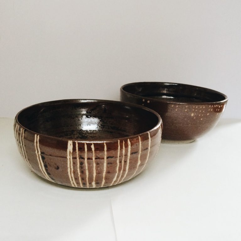
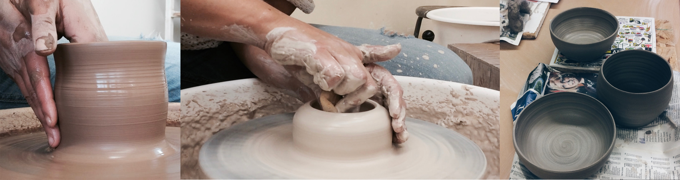
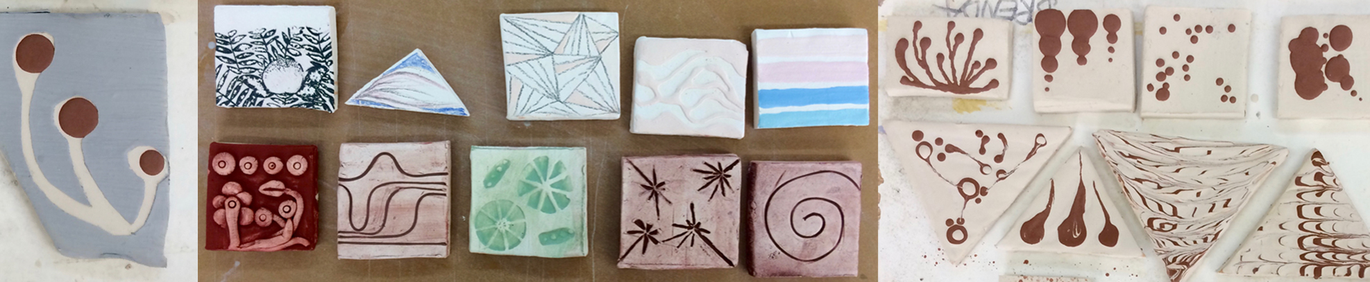
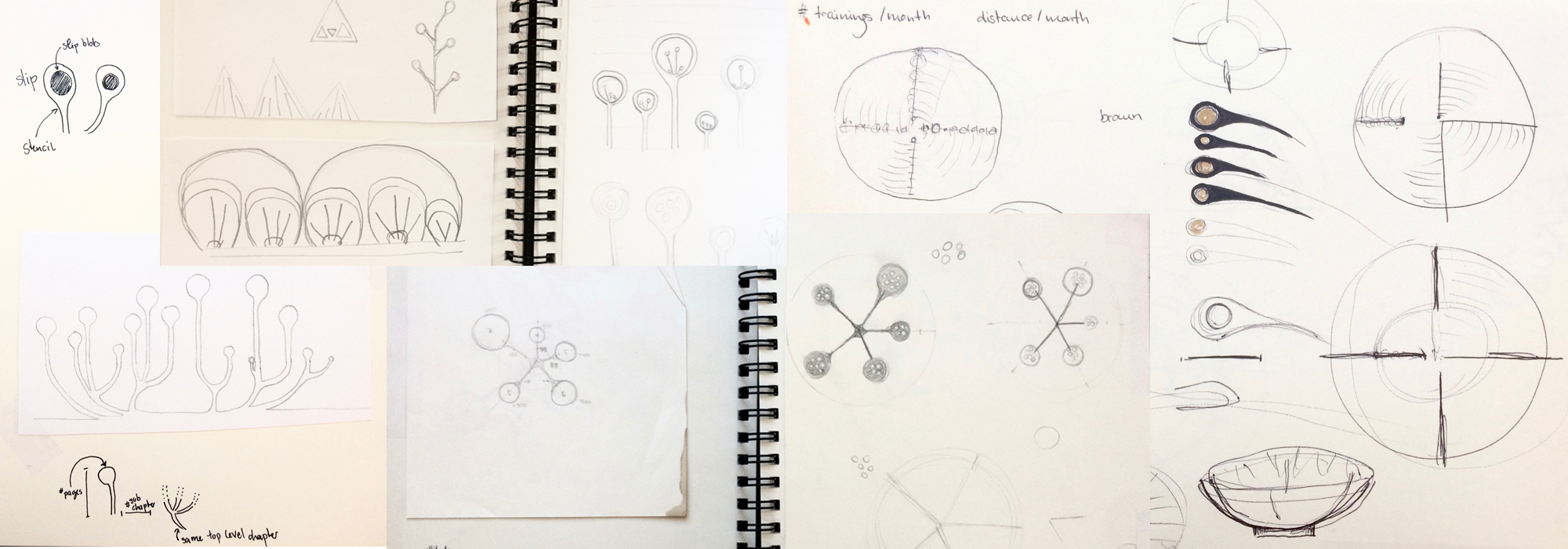
There are infinite ways to represent data. Here’s one of the more creative ones: Alice Thudt makes pottery — such as cups, plates, or teapots — that show data! Her project Life in Clay started off as a twist on a hobby, and has since become part of her PhD research on personal data visualization. In our conversation with Alice, we learn all about what it takes to put data on the table.
PS: At the end, you’ll also hear a quick update on the Information is Beautiful awards, where Alice scored an honorable mention! Congratulations!
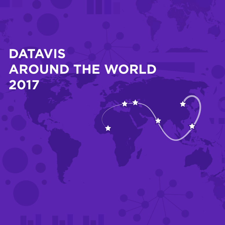
We are at the end of yet another full year, folks! And once again we have decided to go around the world to see what has happened in vis in a whole range of countries.