Folks,
Here is another great episode … honestly I think it’s one of the best we have ever recorded (-Enrico). We talk about color, and color – you know … it’s huge. To get some help we invited Gregor Aisch from Driven By Data and asked him to talk about his experience with color and his super useful library chroma.js.
We have to apologize for a number of things. The episode came out late, the quality is not super high and we have no transcribed chapters this time. No worries, this won’t happen again (or too often) and we have no intention to neglect DS. Moritz has been traveling and taking days off in beautiful Greece and Enrico was just having another baby.
Update: Useful color tools suggested by some of you
- http://www.colourlovers.com/
- http://kuler.adobe.com/ (love this!)
- http://colorusage.arc.nasa.gov/ColorTool.php
Update: Here is the chapter list! We just could not let such a great episode go without proper chapter marks…
[00:00] Intro: Today with Gregor Aisch from http://driven-by-data.net
[02:04] Computational Visualistics
[03:32] Today’s topic: Color
[03:46] Family drama interlude
[04:08] Colors: Powerful, but tricky to get right
[04:50] Color perception
[09:55] Color spaces
[15:39] Colors for categorical data
[17:20] What’s the maximum number of categorical colors to be used?
[19:40] Equidistance
[20:15] Colorbrewer
[23:13] chrome.js
[25:56] Colors for continuous data
[26:41] Mo’s six word advice
[27:04] Color for continuous data – usually not advisable
[30:14] Rainbow scales
[30:48] …and how to avoid them
[33:17] Color is difficult
[35:07] More tips on how to do it right
[37:29] Is there a method behind ugly visualization in science?
[38:58] Paper: Evaluation of artery visualizations
[42:39] How to deal with skewed distributions
[46:19] Learn about the data, highlight the interesting insights
[48:12] Redundant encoding and interaction between visual variables
[51:13] Use for secondary dimensions, or small number of categories
[52:57] Mo’s tips
[54:04] Don’t forget the legend
[54:34] Gregor’s tips
[56:07] Above all, do no harm.
[56:43] Enrico’s tips
[58:27] Wrapping it up
And stay tuned for another episode soon! We will have Jeff Heer on board! If you have any questions for him add a comment below or send us an email (see address in the right).
Take care and have fun!
Enrico and Moritz.


Gents,
So I really liked this episode and learned a lot, especially about some of the academic literature on color scales and perception. If you do more on color, what I would love to hear is your more general thoughts on colors and how to use and select them for an entire visualization. That is, how should people think about picking a general color palettes for an entire graphic; for example, how did Moritz choose the colors in the Better Life Index? Also, how do you guys feel about light text on dark background vs dark text on light background?
Again, great episode and I look forward to more.
Jon
Thanks Jon, I am glad you enjoyed the episode. I like you questions and I think they are worth discussing, maybe we will be able to adress them some time in the future. From time to time we have episodes starting with listeners’ questions. Please feel free to send more if you want us to address other issues.
Have fun,
-Enrico
colorbrewer: http://colorbrewer2.org/
colourlovers: http://www.colourlovers.com/
kuler: http://kuler.adobe.com/
Thanks Christopher for the links!
Is this the paper mentioned in the podcast regarding visualization of the heart in medical diagnosis?:
Evaluation of Artery Visualizations for Heart Disease Diagnosis
Oops, lost the link: http://dash.harvard.edu/bitstream/handle/1/8667395/evaluation_of_artery.pdf
Yes correct, this is the paper we mentioned.
Great episode. I’ll try to “force” all my colleagues to listen to it, they would definitely benefit from it.
On a slightly related note I think you should definitely listen to the Radiolab episode about colors that came out on May 21. Here’s the link: http://www.radiolab.org/2012/may/21/
Among the stories: how a shrimp has 16 color receptors in its eyes, versus our three; how there’s no mention of the color blue in Homer’s Illiad; and how colorblindness could be cured, but that would never be approved by the FDA.
A fantastic Radiolab episode, as usual.
Great tip, I just listened to it, it is a great, great episode! Crazy stuff, especially the Homer thing. How come we never learn about these things at school?
This episode was soooo good and intense. It was like reading one of tufte’s books. I felt like i was sitting in a class during a lecture and after listening to it 3 times, i felt like i knew a little more in the field of data viz. They should use this in colleges 🙂 You guys are great teachers. Thank you!
Thanks! That’s very kind and flattering of you to say! We will try and keep it helpful and informative..
Great podcast,
Very interesting and enlightening, do you mind telling more about where did Gregor studied Computational Visualistics is it a carreer or just a class? and where can we find out more.
Gregor, Moritz, & Gregor:
Thanks for the podcast, good stuff. I’ve got a couple comments. While encoding continuous variables in color is poor for estimating exact values, it does work for showing patterns and relative change. For example, it’s a good way to show something like the structure of ocean currents, you just have to understand that it may be difficult to determine if one current is warmer or cooler than another.
Color Brewer is a good resource for color palettes, but it has a few flaws (in addition to the ones you mentioned): First, they’re based on Munsell color, which does not have perceptually equal steps for saturation. Also the Munsell to RGB conversion isn’t universal across computers with different gamma and color space settings, so the scales can be skewed: to my eyes/on my system the lighter end of the palettes varies more quickly than the dark end.
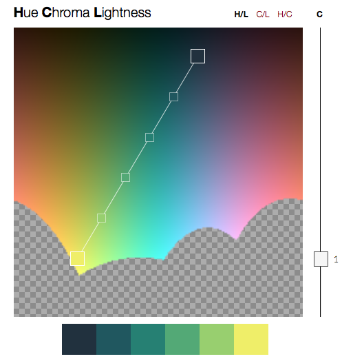
As an alternative to Color Brewer, I sometimes use the NASA Ames Color Tool, which is based on a hue, chroma, lightness color space. It’s a bit more flexible than Color Brewer, but requires a bit more work: http://colorusage.arc.nasa.gov/ColorTool.php
I still think there’s a need for a color palette generator that automatically builds perceptually-based palettes.
By the way, here’s how I’d make a map showing global warming: http://earthobservatory.nasa.gov/IOTD/view.php?id=76975
Thanks again, and I’m looking forward to listening to the previous ‘casts.
@Nora: Thanks! Gregor has a whole B.Sc. in Computational Visualistics. It’s a whole degree not just a single class. But I cannot remember what university he attended, for sure one in Germany. I guess he mentions it in the podcast.
@Robert: Thanks so much for your comments and suggestions. I like Color Brewer because it’s so much better than picking colors yourself if you dont know how to do it. It’s a safe place to be, especially for novices. I certainly agree that color can be used effectively as a way to represent continuous data in some case. We are not big fun of strict rule here anyway 🙂 Thanks for the link to the NASA tool! It looks really nice and useful. I’ll play with it as soon as I can.
Enrico: I’m not trying to discourage use of ColorBrewer, but it’s got enough flaws that I’d really like to see something better.
Very informative episode about color. Actually I read the blog on Gregor’s website and I could right away get much more control on using HCL colors than using the one’s from Color Brewer.
The one question that I have is the part where you talk about continuous colors. The context was part of a discussion I was having with a domain specialist about how to represent scalar measures on an object. Using a rainbow palette or some other equidistant color gradient might be a good option. But then the other question is to figure out the speed of change at any point, which might be more important. This will not be encoded by the color scale chosen. An option is to have another visualization with a color palette mapping the derivative, but that can shift focus from the original visualization. It will be better to enhance the original visualization. The question is that is it possible to enhance the continuous color palette with another visual encoding that can guide us regarding speed of change or is it very difficult to do it?
Hi there, I discovered your web site by the use of Google whilst searching for a related topic, your site got here up,
it looks good. I have bookmarked it in my google bookmarks.
Hi there, just become alert to your weblog through Google, and found that
it is truly informative. I’m gonna be careful for brussels. I’ll
appreciate if you happen to continue this in future.
Lots of people shall be benefited out of your writing.
Cheers!
Another great episode. Thanks for getting Gregor on to talk about colour I learnt a lot. And thanks, as always, for posting all the links. It really helps