We have Tamara Munzner from the University of British Columbia, Vancouver, and Robert Kosara from Tableau Research on the show to go through some of our personal highlights from the IEEE Visualization Conference 2019. We talk about some of the co-located events, some of the technical papers and major trends observed this year. Make sure to take a look at the links below, there is a lot of material! And especially the videos. There are quite a few that have been posted online this year.
Enjoy the show!
[Our podcast is fully listener-supported. That’s why you don’t have to listen to ads! Please consider becoming a supporter on Patreon or sending us a one-time donation through Paypal. And thank you!]
[Our podcast is fully listener-supported. That’s why you don’t have to listen to ads! Please consider becoming a supporter on Patreon or sending us a one-time donation through Paypal. And thank you!]
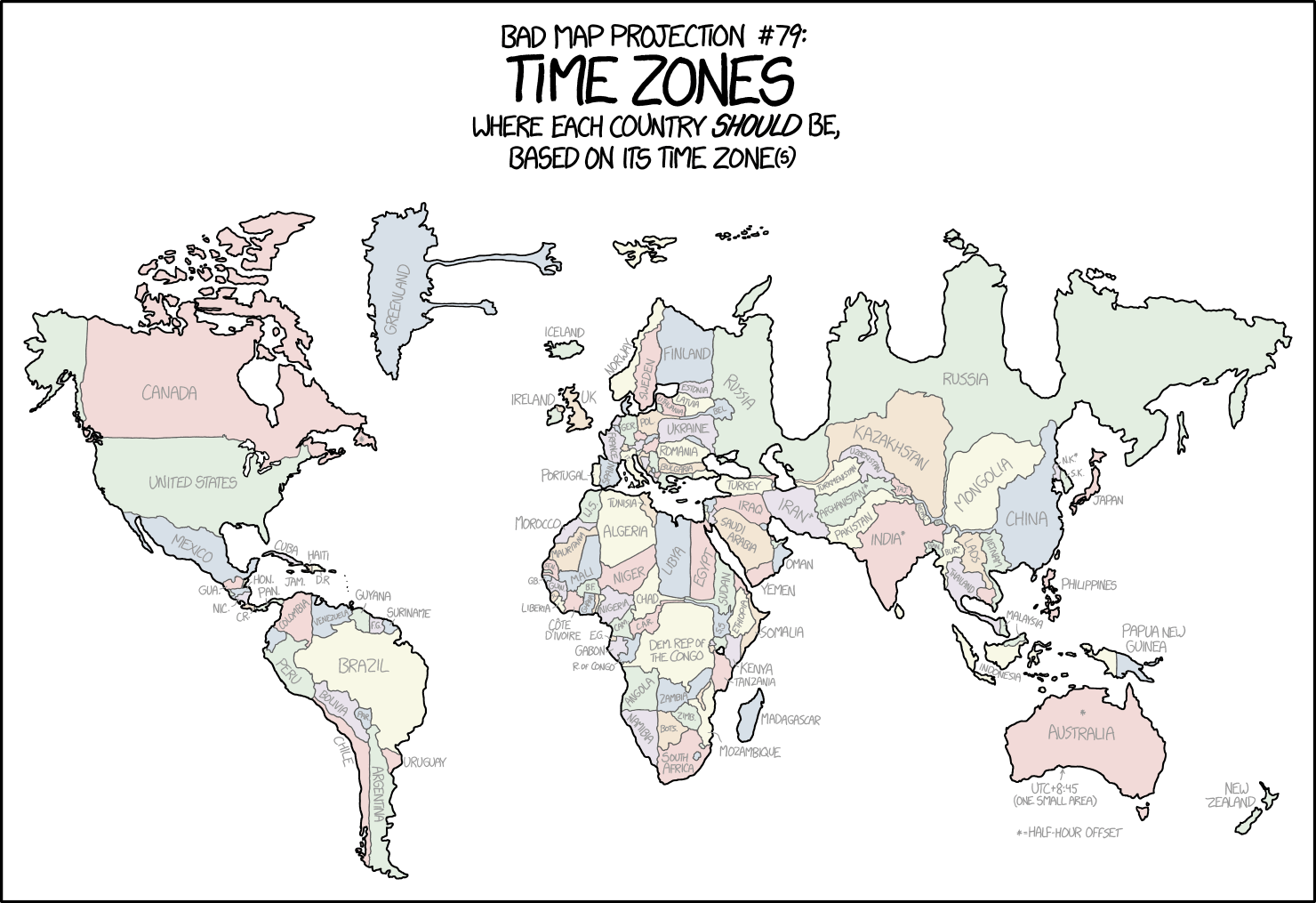
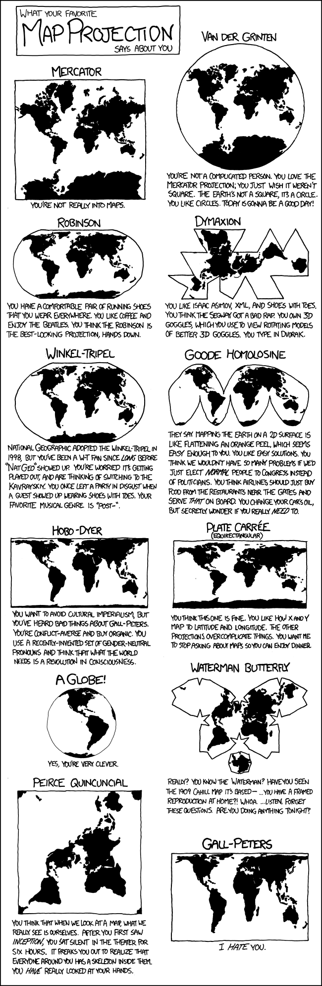
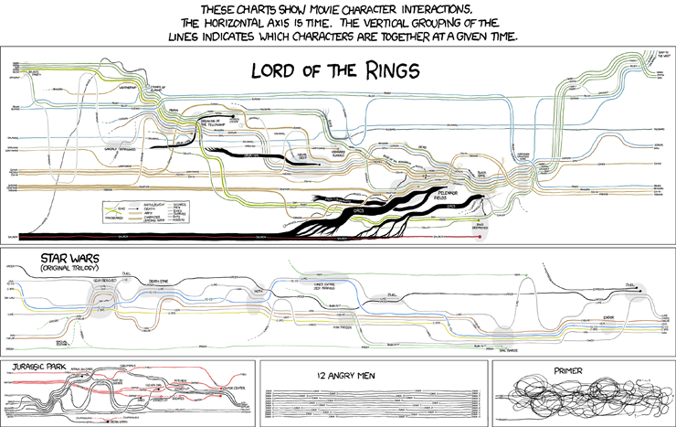
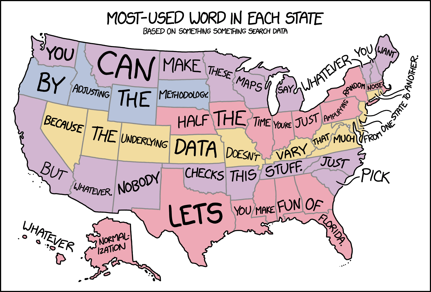
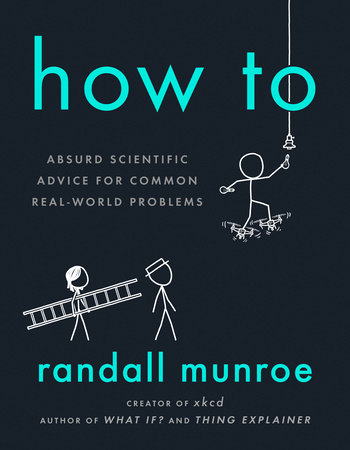
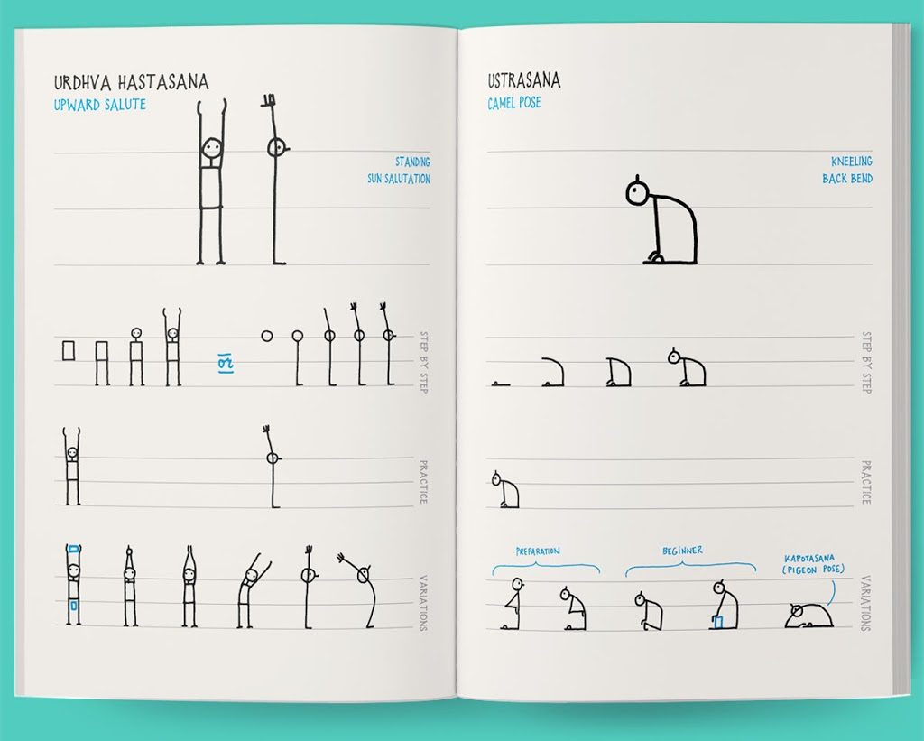
This episode is a dream come true – we have long wanted to invite Randall Munroe to the show. Randall is the mastermind behind the xkcd webcomics which have zillions of fans around the globe. In his stick figure cartoons and hilarious mini-stories, he comments on complicated scientific issues.
Over the years, Randall has also created a number of data-heavy visualizations. Some of them tackle pressing issues such as climate change, while others mock conventions of visualization such as map projections or chart types.
On the show we talk about his latest book “How To”, his work process, and the relation of complexity and simplicity in his visualizations. Enjoy the show and please make sure to listen all the way to the end, because Randall is calling out for some internet wisdom. Can anyone help find a software tool for manipulating maps in a three-point azimuthal projection?
[Our podcast is fully listener-supported. That’s why you don’t have to listen to ads! Please consider becoming a supporter on Patreon or sending us a one-time donation through Paypal. And thank you!]
In this episode we have Lace Padilla on the show to talk about how cognitive science can help create better visualizations. Lace is a newly appointed Assistant Professor at Cognitive UC Merced, where she directs the SPACE Lab.
Lace’s expertise is cognitive science, and she has published numerous papers that look at data visualization under the lens of a cognitive scientist. Believe it or not this is not so common so Lace’s work is very welcome.
On the show we talk about the role of cognitive science in visualization, what cognitive models are and how they can be used for visualization design and evaluation, decision-making supported by visualization and visualization as a way to analyze and communicate weather data.
[Our podcast is fully listener-supported. That’s why you don’t have to listen to ads! Please consider becoming a supporter on Patreon or sending us a one-time donation through Paypal. And thank you!]
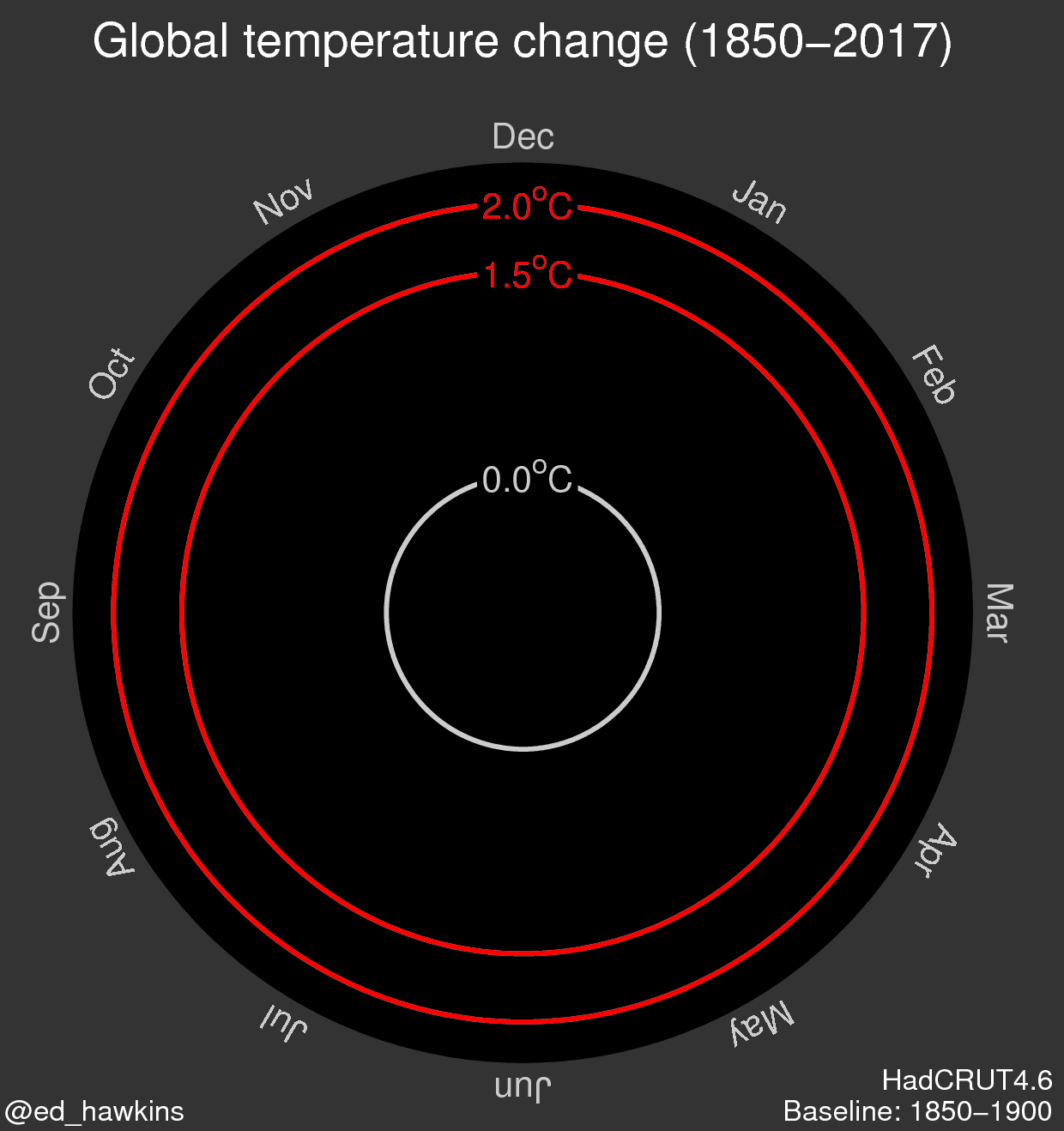
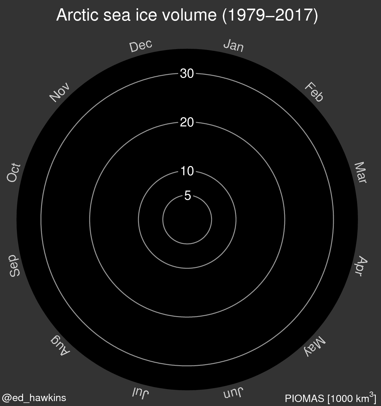
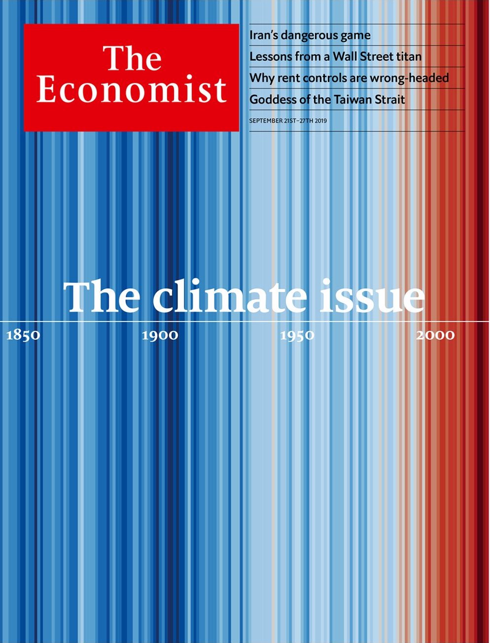
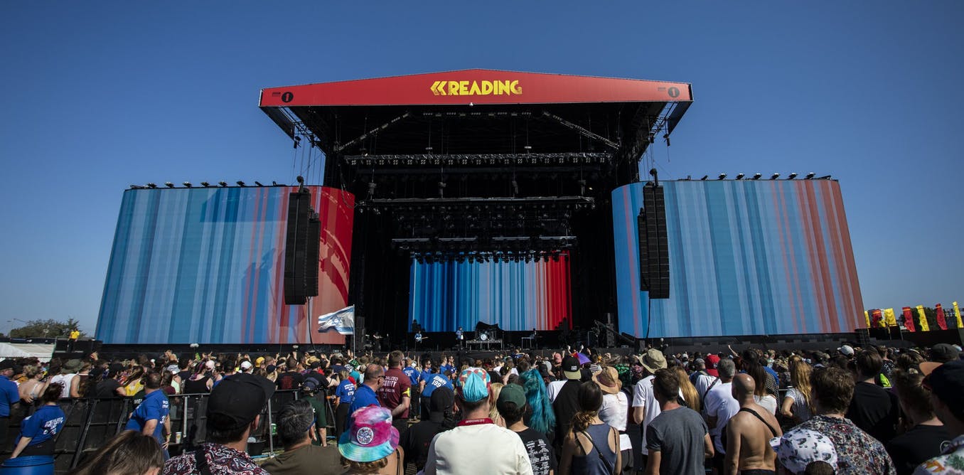
We have climate scientist Ed Hawkins on the show to talk about climate visualization. Ed is the person behind the famous spiral and stripe visualizations (see the images below). On the show we talk about how he created these visualizations and what was the impetus behind them. We also talk about breaking data visualization “rules”; climate visualization work from the visualization community; making climate information more local and more personal; and how to collaborate with climate scientists (see in the links below the list of climate scientists who are active on Twitter!).
[Our podcast is fully listener-supported. That’s why you don’t have to listen to ads! Please consider becoming a supporter on Patreon or sending us a one-time donation through Paypal. And thank you!]
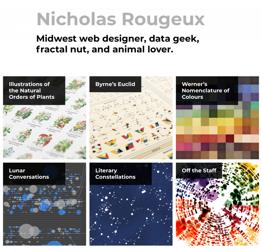
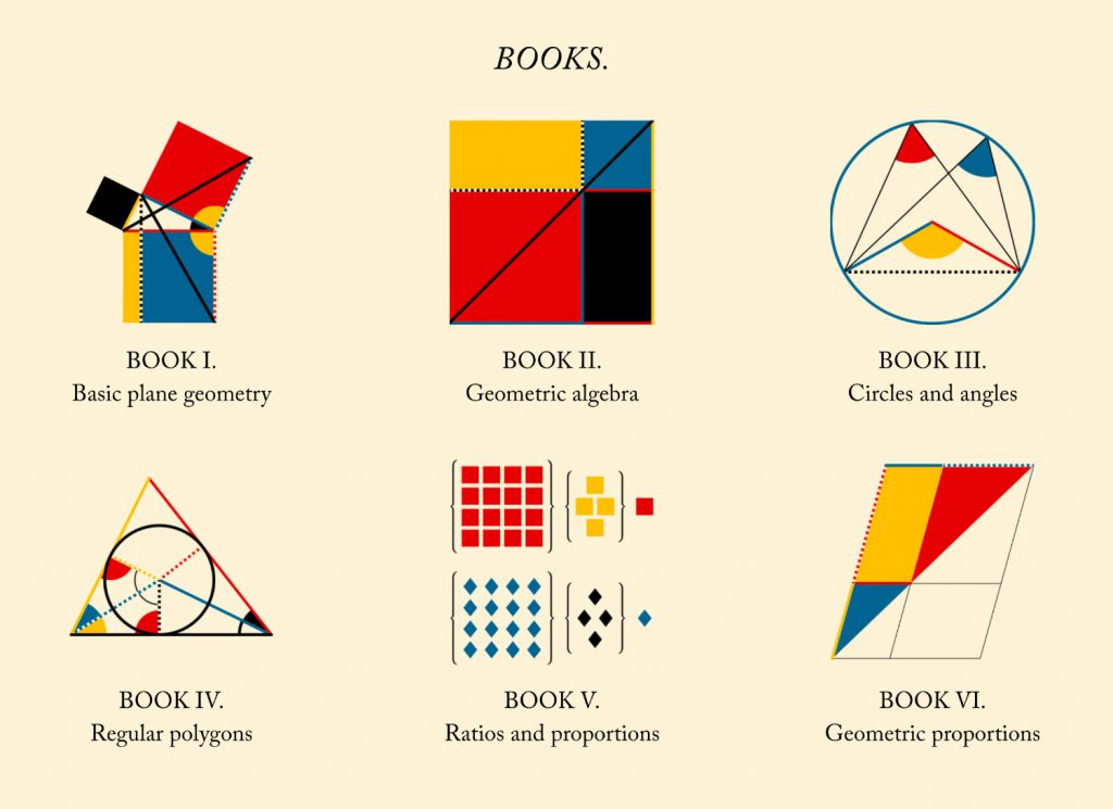
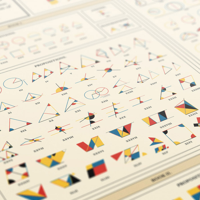
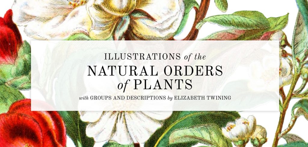
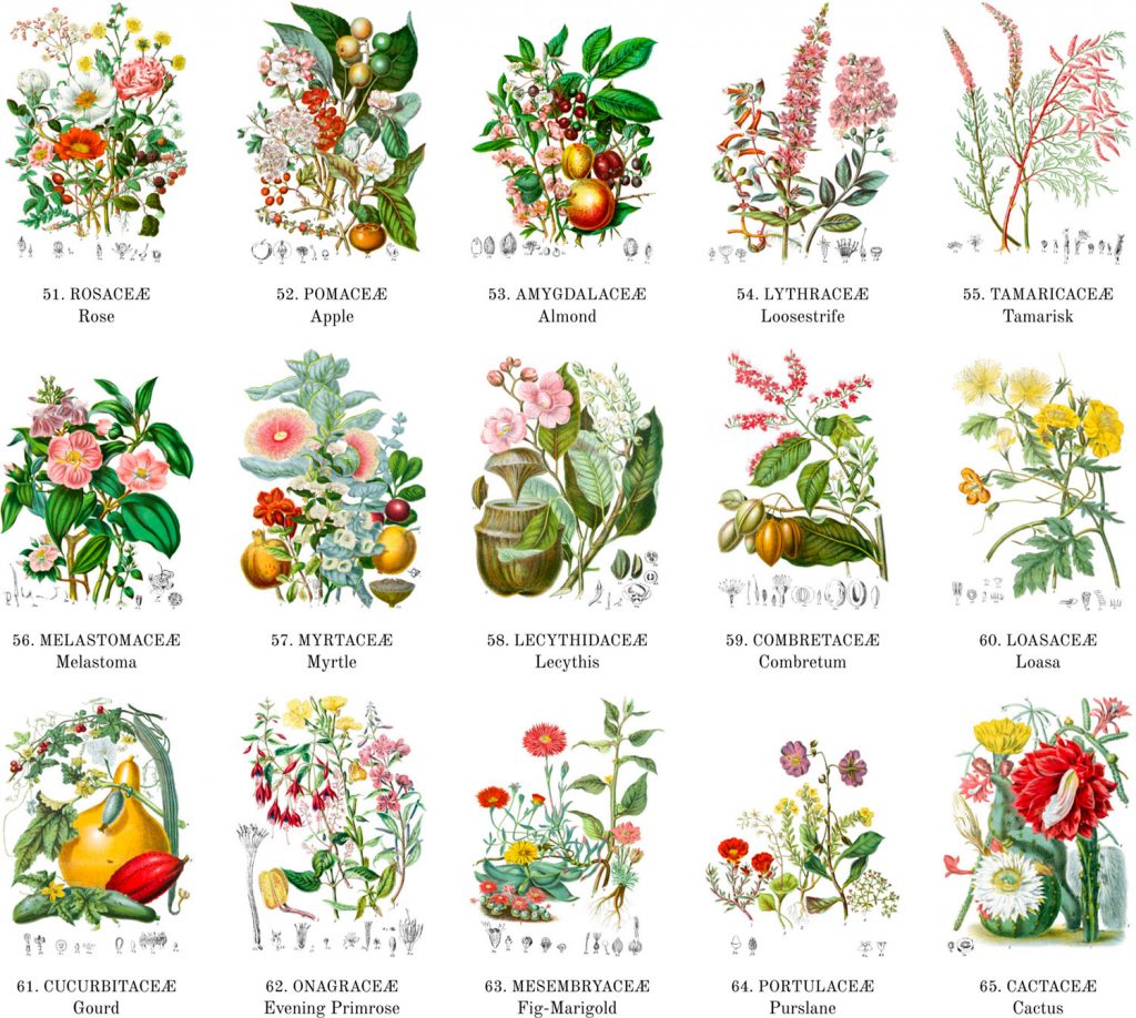
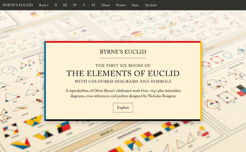
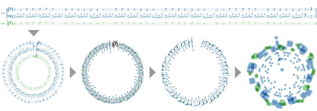
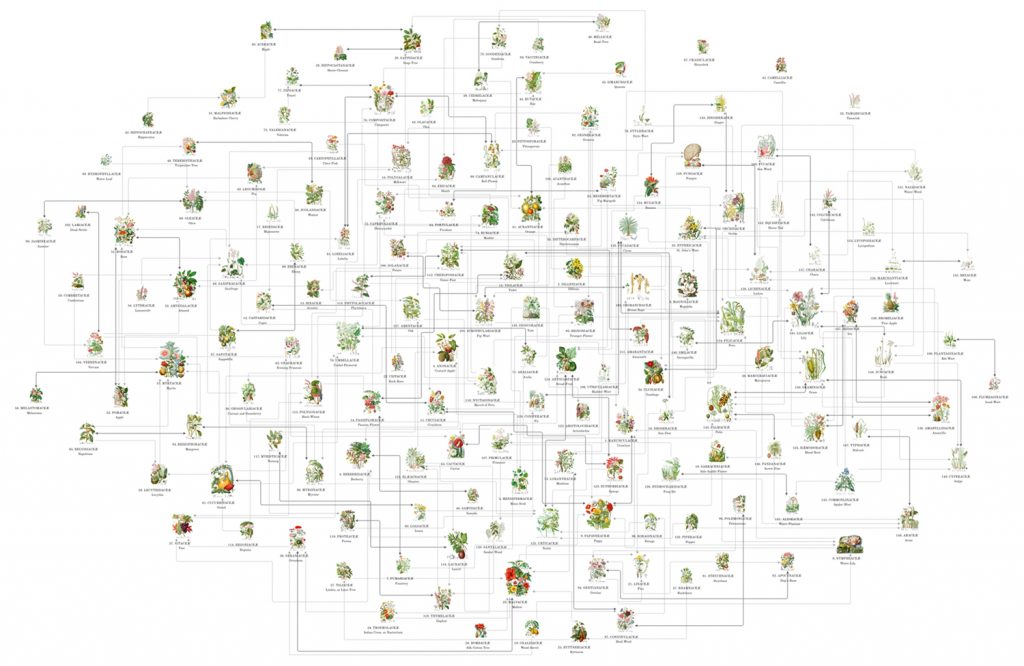
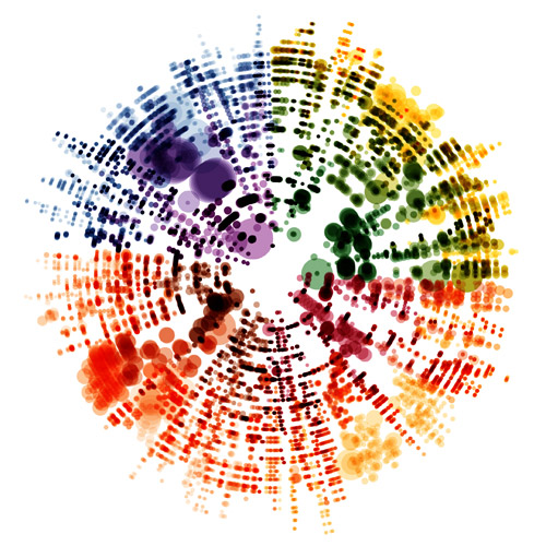
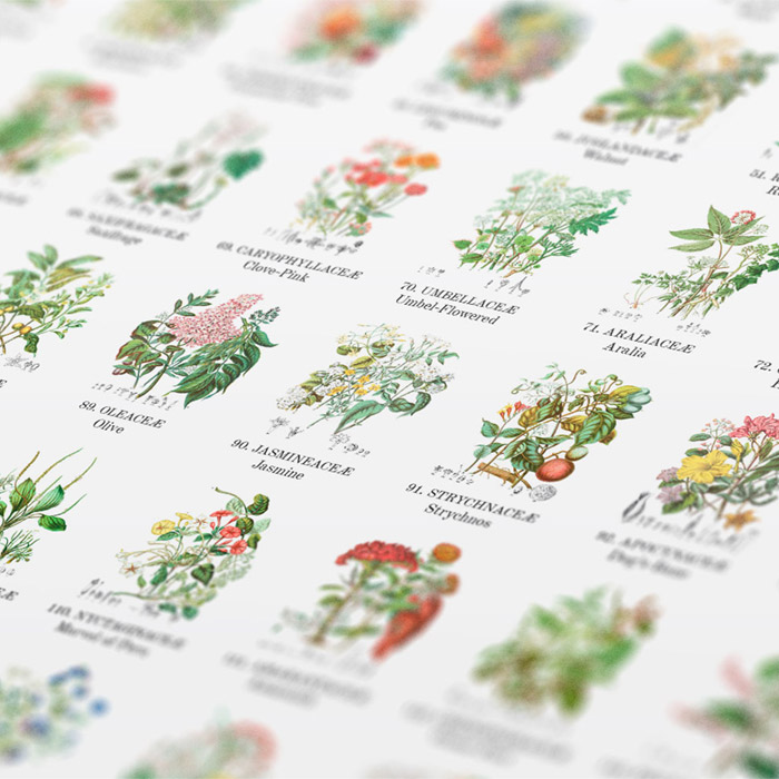
We have digital artist Nicholas Rougeux on the show to talk about his beautiful data art projects and the processes he follows. Nicholas created numerous iconic pieces with an extraordinary attention to details, such as “Seeing Music”, where he visualizes musical scores from famous composers, “Byrne’s Euclid”, a reproduction of Oliver Byrne’s geometric illustrations of Euclid’s theorem, and “Illustrations of the Natural Orders of Plants”, a digital reproduction and restoration of Elizabeth Twining’s catalog of botanical illustrations.
On the show we talk about how he gets inspiration for his projects, details about specific projects like those mentioned above, and technical details of how he actually produces these magical pieces of art.
[Our podcast is fully listener-supported. That’s why you don’t have to listen to ads! Please consider becoming a supporter on Patreon or sending us a one-time donation through Paypal. And thank you!]
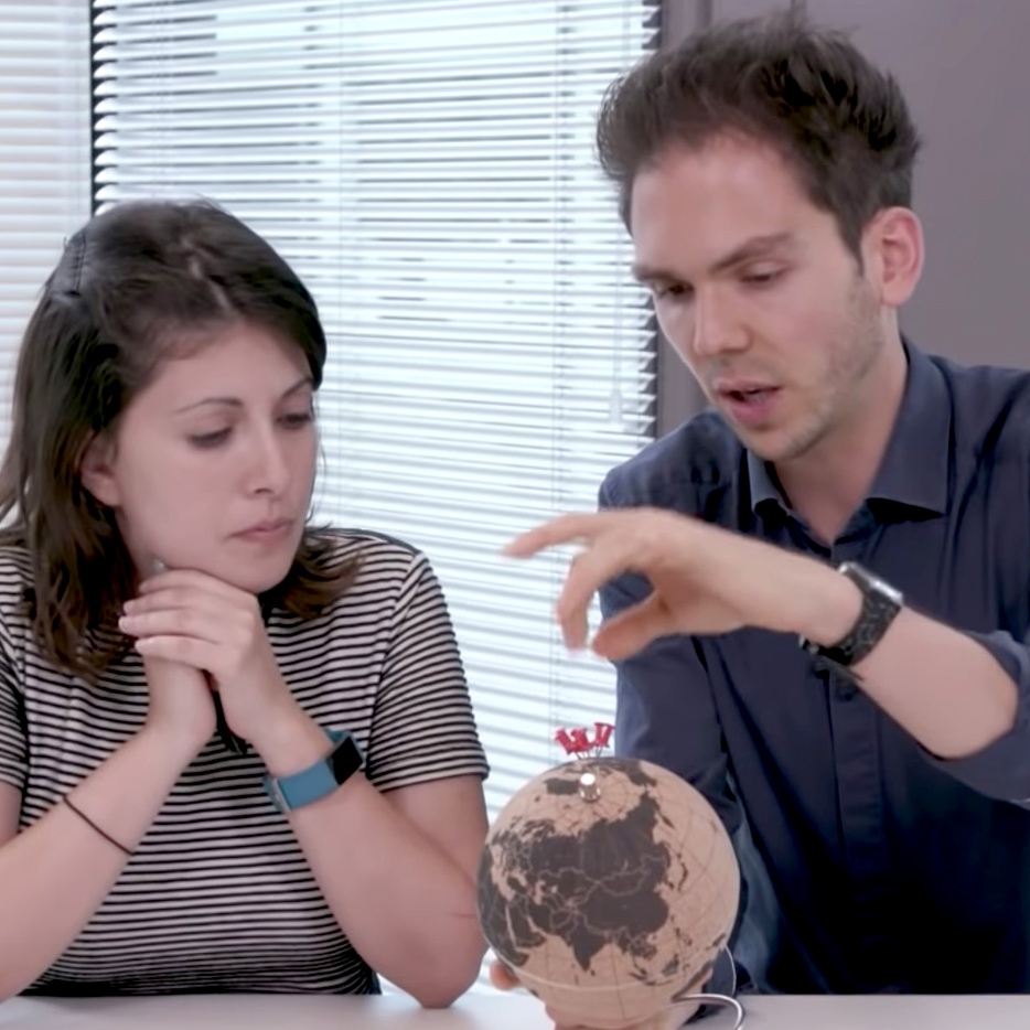
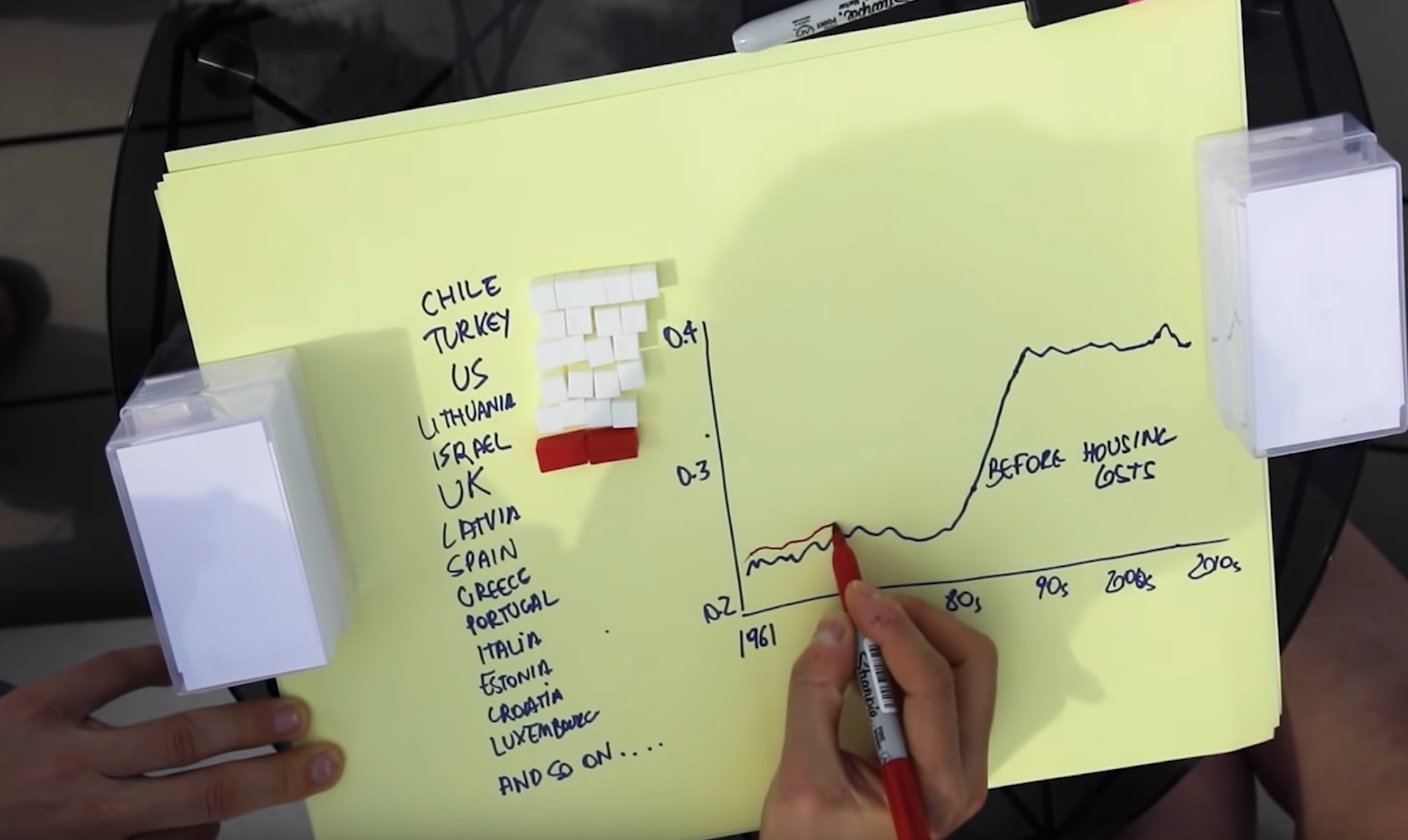
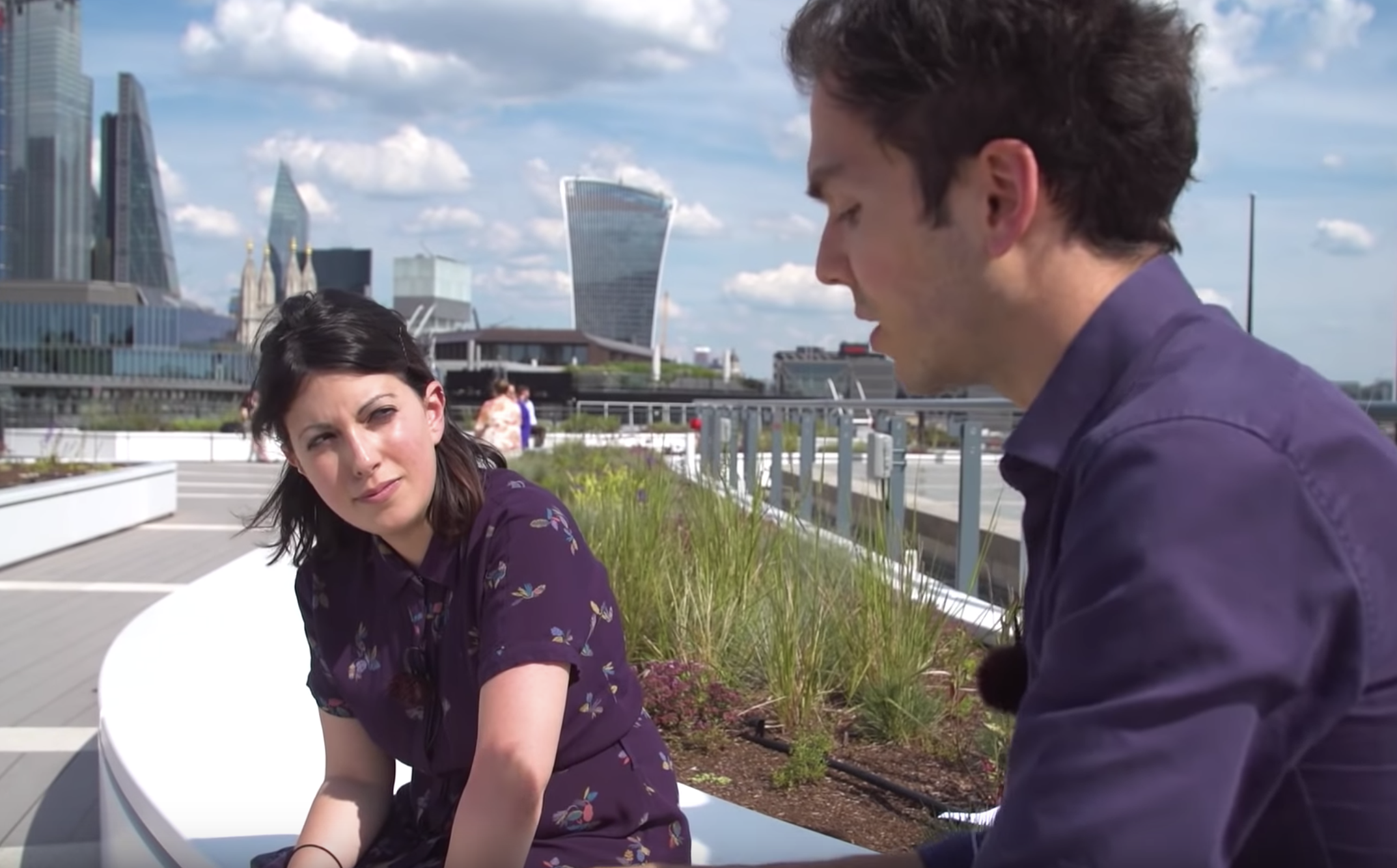
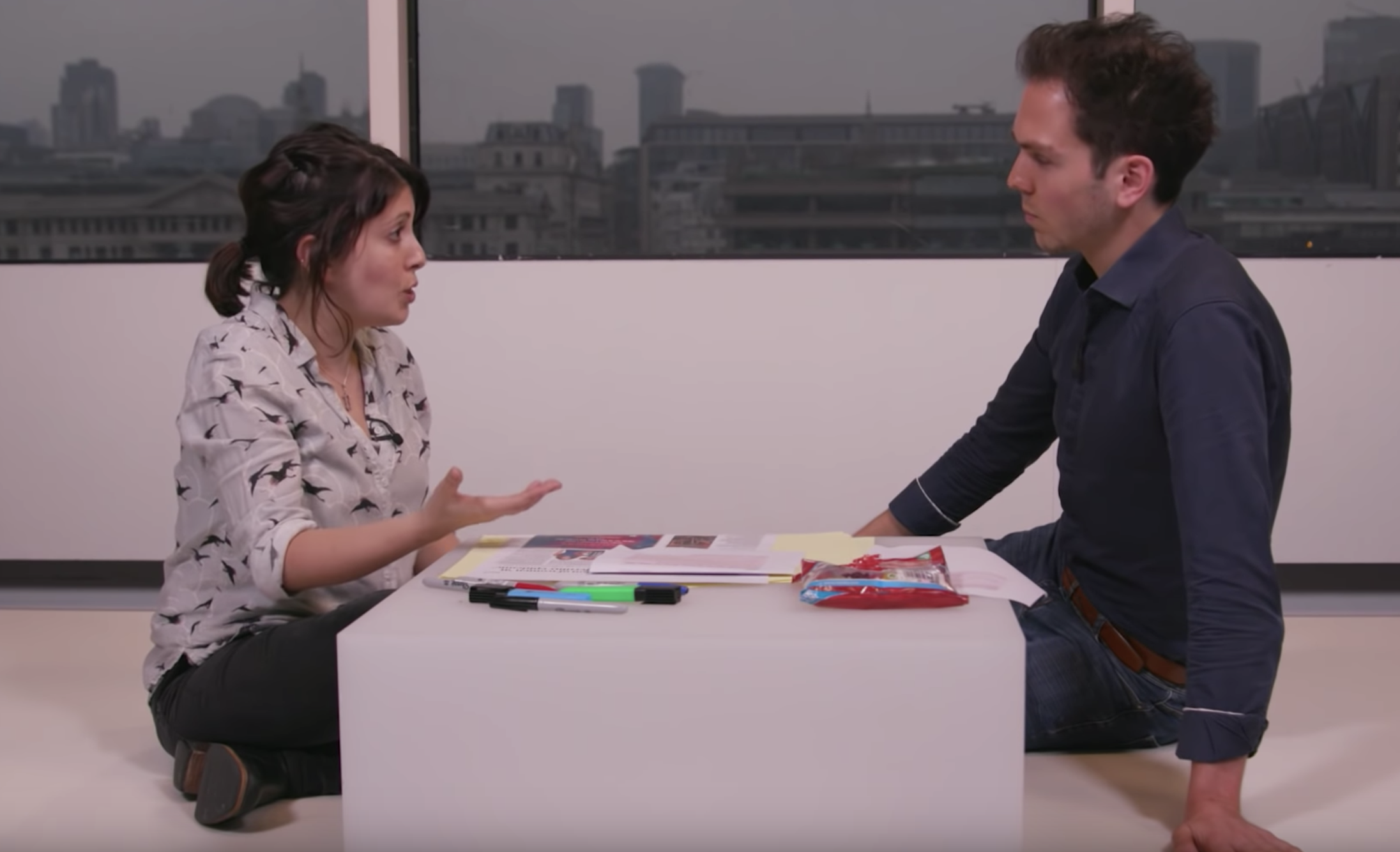
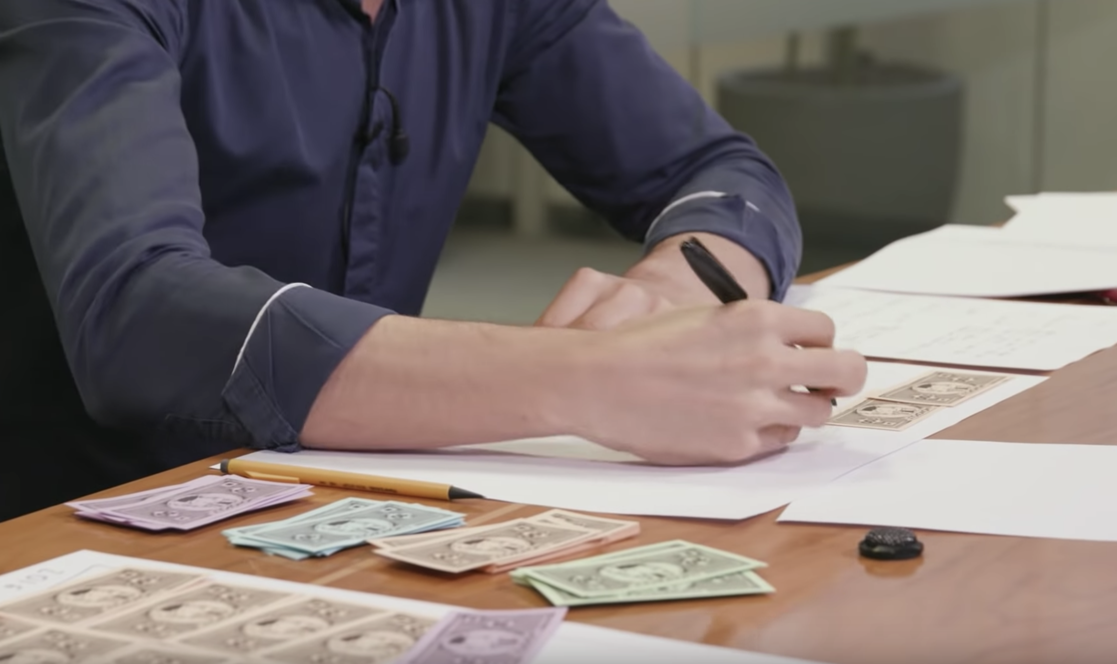
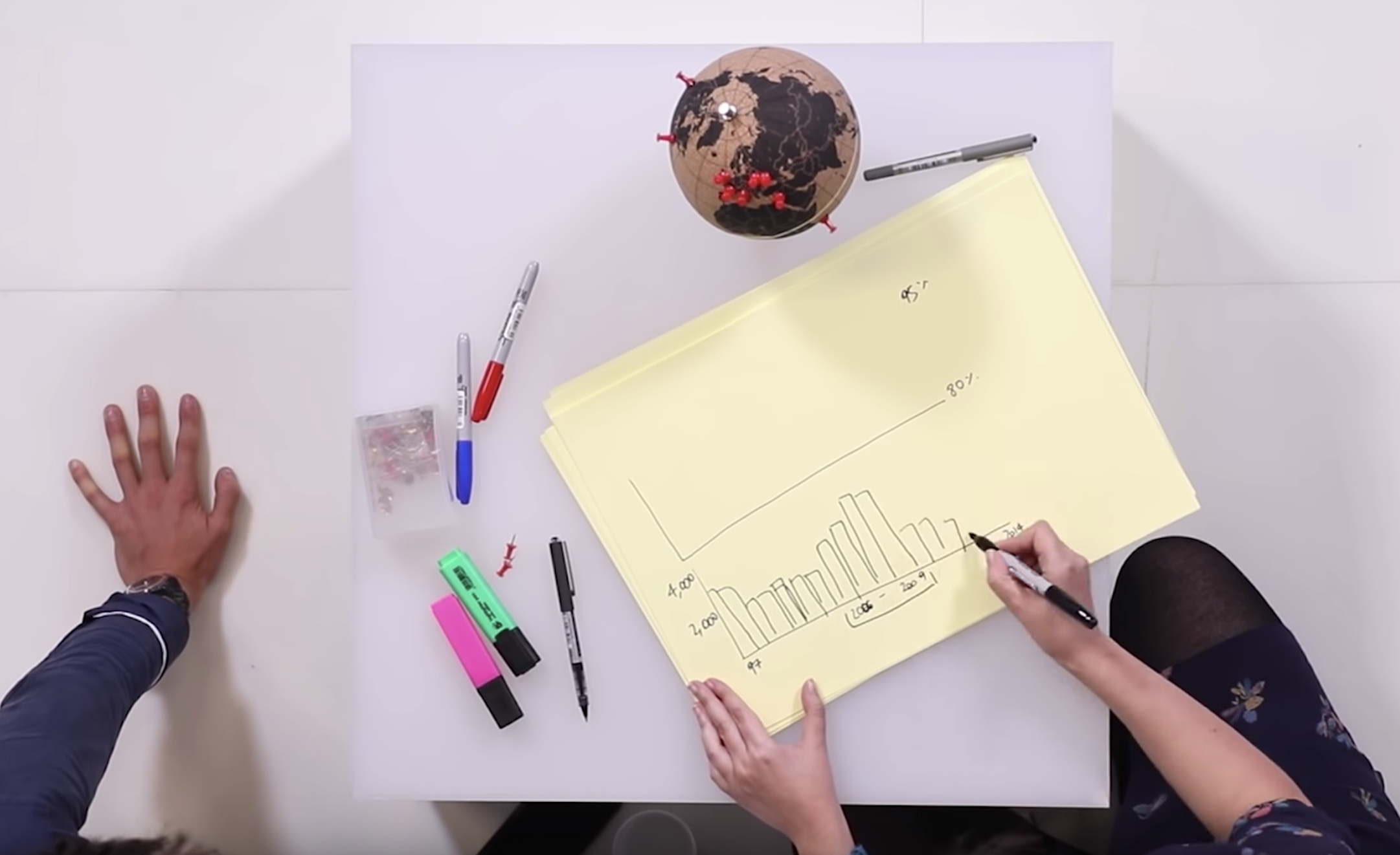
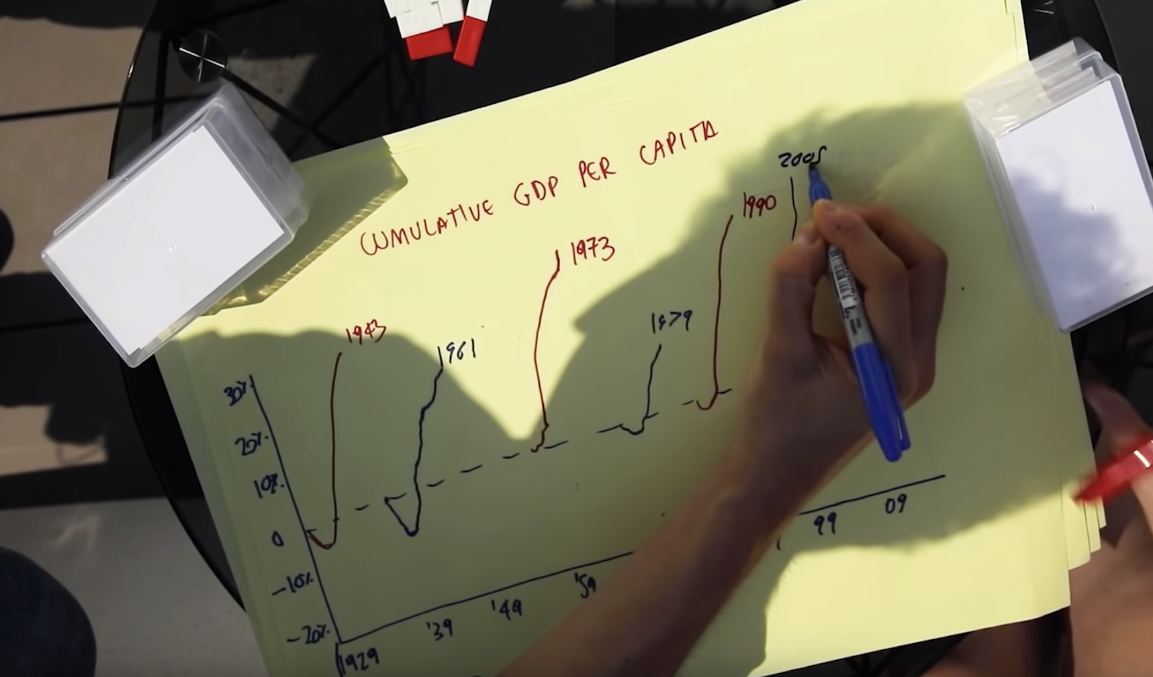
We have Federica Cocco and John Burn-Murdoch on the show to talk about their new Financial Times visualization series called Data Crunch. The series features Federica and John having a data-driven conversation about some social or economic trend while aided by graphs and charts. It’s a new way of doing data visualization. It’s casual but not trivial. Also, Federica and John draw by hand all the graphs they discuss; which makes it really engaging and fun! We talk about how the series started, what it takes to produce a whole show, the strategies they use to draw the diagrams, and what they have learned in the process.
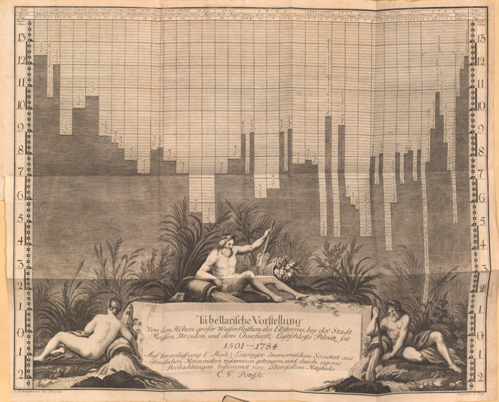
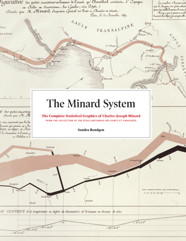
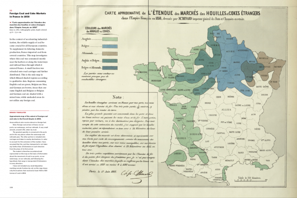
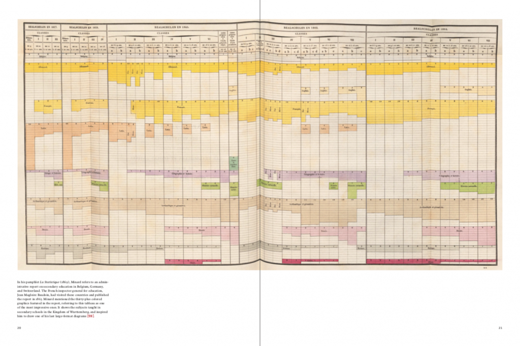
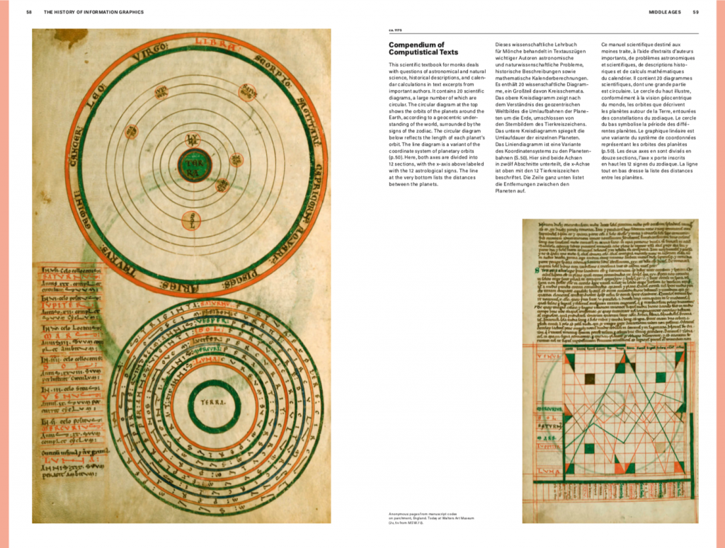
We have art historian Sandra Rendgen on the show to talk about where data visualization comes from. Sandra published two great books on the topic, one called “The Minard System”, on the great Minard and the “History of Information Graphics” with contributions from multiple authors.
On the show we talk about graphical systems in the middle ages, the great efforts in scientific cartography in the age of discovery and the innovation spurred by statistic al thinking and associated graphical formats.
As a final note: Sandra is also now our new producer! We are very happy to have her on board. Welcome Sandra! Our former producer Destry is now busy with her baby and we are very grateful for the fantastic work she has done for the show over the years.
[Our podcast is fully listener-supported. That’s why you don’t have to listen to ads! Please consider becoming a supporter on Patreon or sending us a one-time donation through Paypal. And thank you!]
[Our podcast is fully listener-supported. That’s why you don’t have to listen to ads! Please consider becoming a supporter on Patreon or sending us a one-time donation through Paypal. And thank you!]
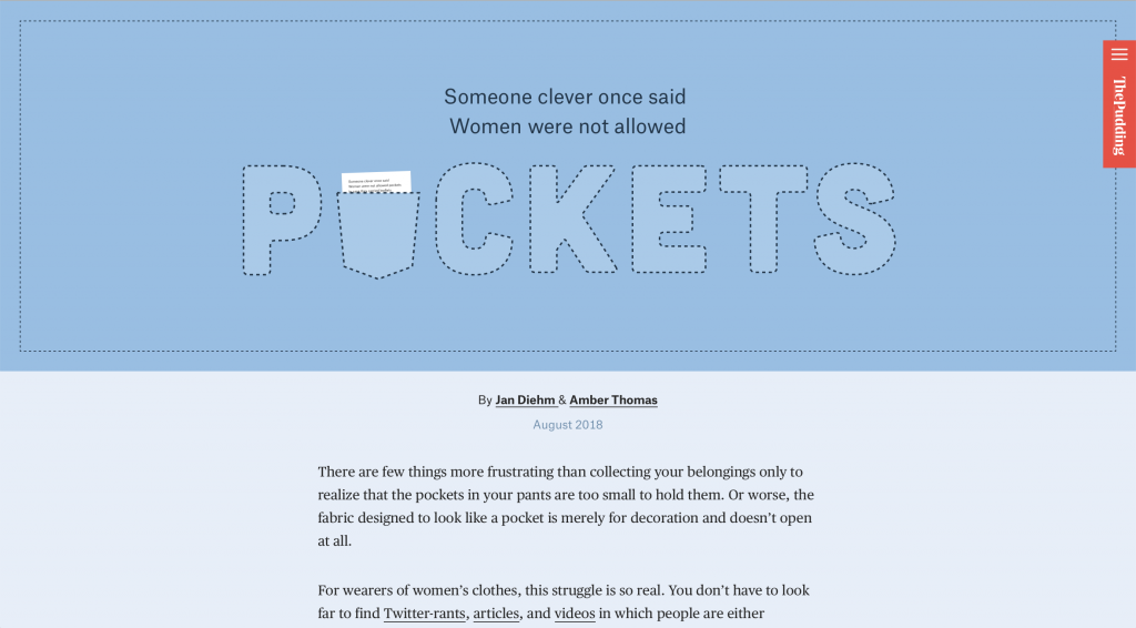
We have Matt Daniels on the show again (after more than 3 years!). Matt is the CEO of The Pudding, a collective of journalist-engineers that create visual essays that explain ideas debated in culture. Their pieces are incredibly engaging, somewhat witty and always stunning from the visual point of view.
Since our first interview with Matt, The Pudding has been hugely successful with visual essays being very popular and highly debated at the same time. The Pudding has also a very interesting business structure being partially financed by its readers and accepting submissions for visual pieces developed by freelancers.
On the show we talk about what the Pudding is and how it operated. We also comment on some of the most popular pieces. And finally Matt provides more details on how you can get involved with the Pudding and work with them if you want.
[Our podcast is fully listener-supported. That’s why you don’t have to listen to ads! Please consider becoming a supporter on Patreon or sending us a one-time donation through Paypal. And thank you!]
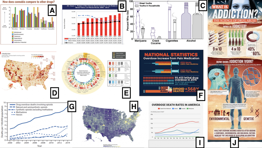
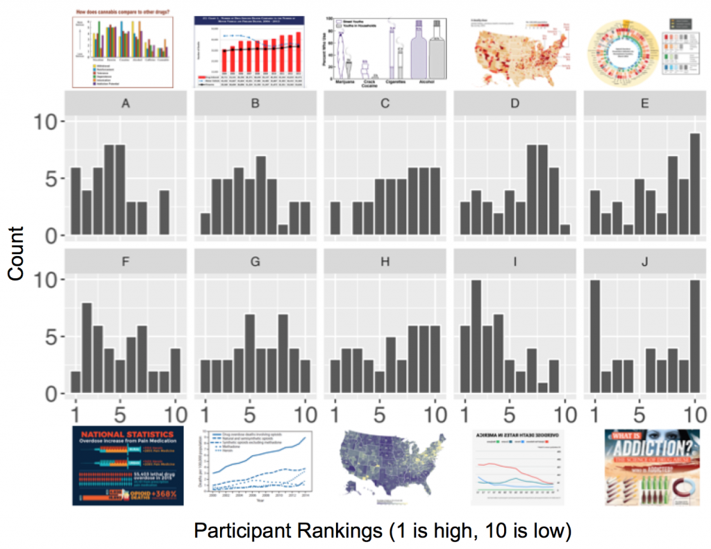
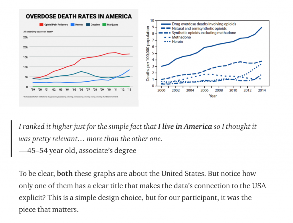
We have Evan Peck on the show to talk about the research he and his students recently published on “Data Is Personal”. The study consists of 42 interviews made in rural Pennsylvania to see how people from different educational backgrounds ranked a set of various data visualizations.
The study raises a lot of questions about how people perceive data visualization, our assumptions about who our readers are and how they use our work. Among many findings a recurring patters is that people read visualizations looking for something they can personally relate to.
With Evan we talk about how the project started, on what are the main findings, and what are the implications for data visualization design.
[Our podcast is fully listener-supported. That’s why you don’t have to listen to ads! Please consider becoming a supporter on Patreon or sending us a one-time donation through Paypal. And thank you!]
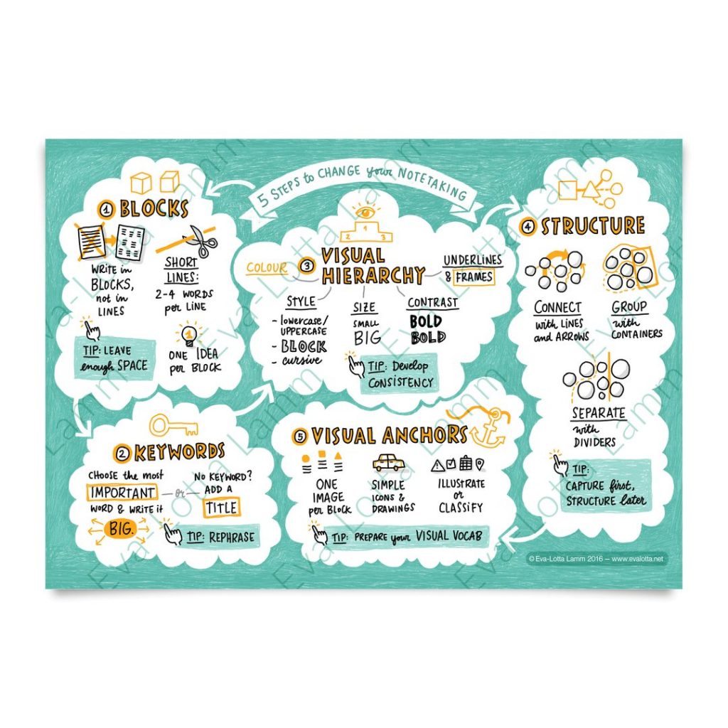
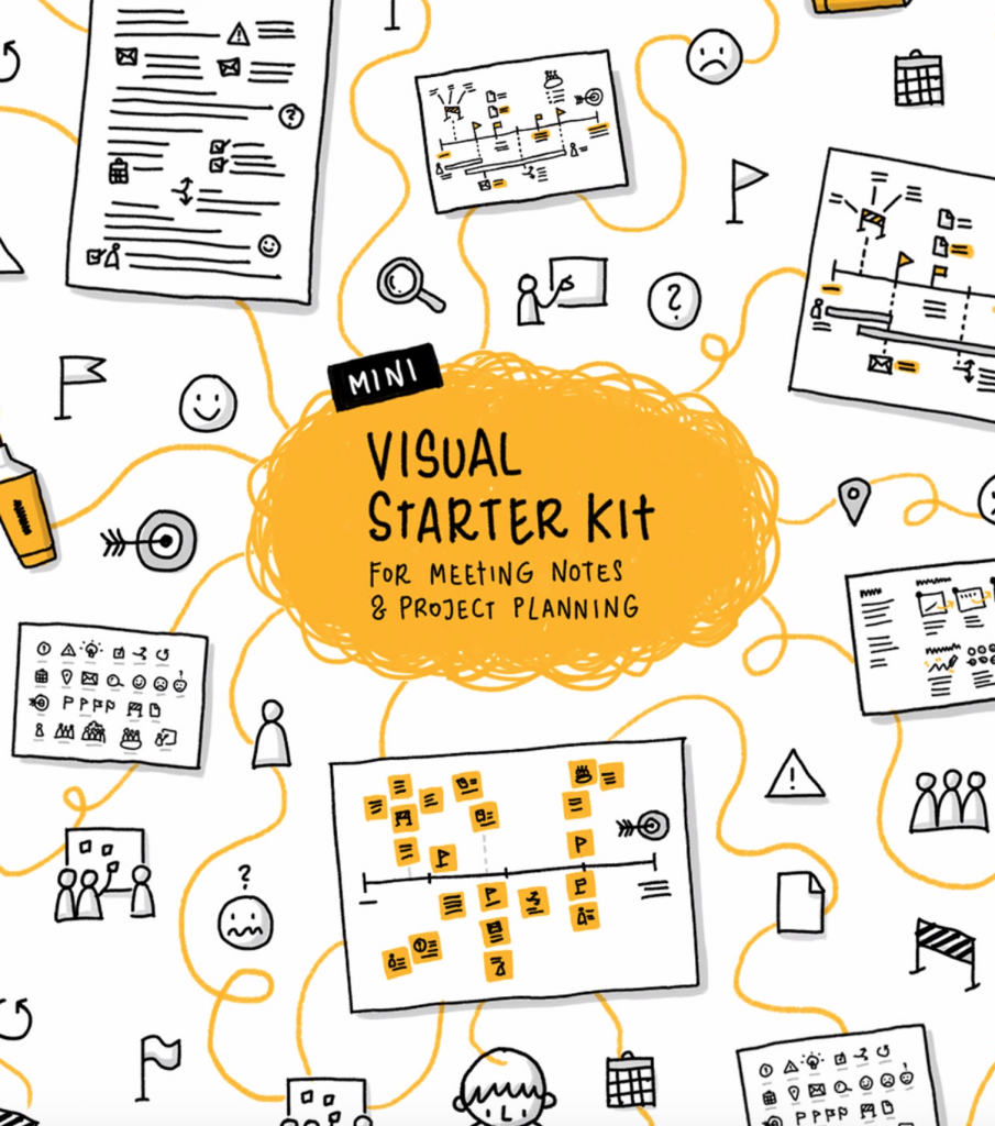
We have Eva-Lotta Lamm joining us to talk about the value of sketching and how it relates to data visualization. Eva-Lotta is a UX designer turned expert on sketching and sketchnoting: the art of summarizing talks through sketches. In the show we talk about visual thinking, sketchnoting and parallels with data visualization.