 It seems almost impossible right?! And yet, here we are with our 100th episode! Data Stories has been around for more than five years and now we mark this big milestone.
This is a good opportunity to thank all of you for listening to us and for supporting us with your comments, ideas and suggestions. It is also a good opportunity to thank all of our guests for making this show possible and donating their time to us.
In this episode we review some of the most successful episodes, talk about the major categories of episodes, and recollect some funny moments from recording the show. We also have a surprise segment where we reveal the “behind the scenes” of Data Stories.
For this special occasion we also prepared a first version of the Data Stories Dataset, a dataset with information extracted from Data Stories that you can use to create interesting visualizations. Let us know if you make something out of it!
Finally, don’t forget our crowdfunding initiative! You can support us on Patreon by pledging a fee for every episode we publish. We’re counting on you to switch to this crowdfunding model next month.
All the best!
Related episodes
 In this episode we are joined by Kim Rees and Steph Hay of Capital One. You may have heard the big news that Capital One recently decided to hire Kim Rees (formerly of Periscopic) as their Head of Data Visualization.
It’s great to see such a big company hire a high caliber data viz professional like Kim and create a position with this name. Things seems to be moving in the right direction for viz after all!
Curious about what this news might mean for the industry, we invited Kim and her new boss Steph — Head of Content, Culture, and AI Design at Capital One — to learn about their plans.
This episode is a nice counterpoint to the episode we recently recorded with Elijah Meeks, which centered on the issues that data visualization professionals are facing in the industry.
Now, with Kim and Steph we talk about the decision to create this position, the value Capital One sees in visualization, and how they plan to scale visualization to a company of 40,000 employees.
Enjoy the show!
We’re collecting listener questions, ideas, and suggestions about Data Stories for our upcoming 100th episode. Leave us a message at +1-413-650-2713 and we may just feature your voice in the podcast!
Data Stories is brought to you by Qlik. Are you missing out on meaningful relationships hidden in your data? Unlock the whole story with Qlik Sense through personalized visualizations and dynamic dashboards which you can download for free at qlik.de/datastories.
Links
[Help us fund Data Stories by donating on Patreon! We’re counting on you to switch to a crowdfunding model. Please visit our Patreon page for more details!]
Related episodes
 In this episode Moritz meets Nadieh Bremer and Shirley Wu for a face-to-face episode in Berlin.
Nadieh and Shirley recently paired up to create Data Sketches, a twelve-month collaboration. Each month they choose a topic and develop a visualization on their theme.
One nice aspect of the project is that they keep track of their entire development process, including the steps they followed to prepare the data, sketch the ideas, and create the final visualizations.
On the show we talk about the organization of the projects, some favorite visualizations from the year, the partnership between the collaborators, and how they balance Data Sketches with their freelancing work.
We’re collecting listener questions, ideas, and suggestions about Data Stories for our upcoming 100th episode. Leave us a message at +1-413-650-2713 and we may just feature your voice in the podcast!
Data Stories is brought to you by Qlik. Are you missing out on meaningful relationships hidden in your data? Unlock the whole story with Qlik Sense through personalized visualizations and dynamic dashboards which you can download for free at qlik.de/datastories.
Help us fund Data Stories by donating on Patreon! We’re counting on you to switch to a crowdfunding model. Please visit our Patreon page for more details!
Related episodes
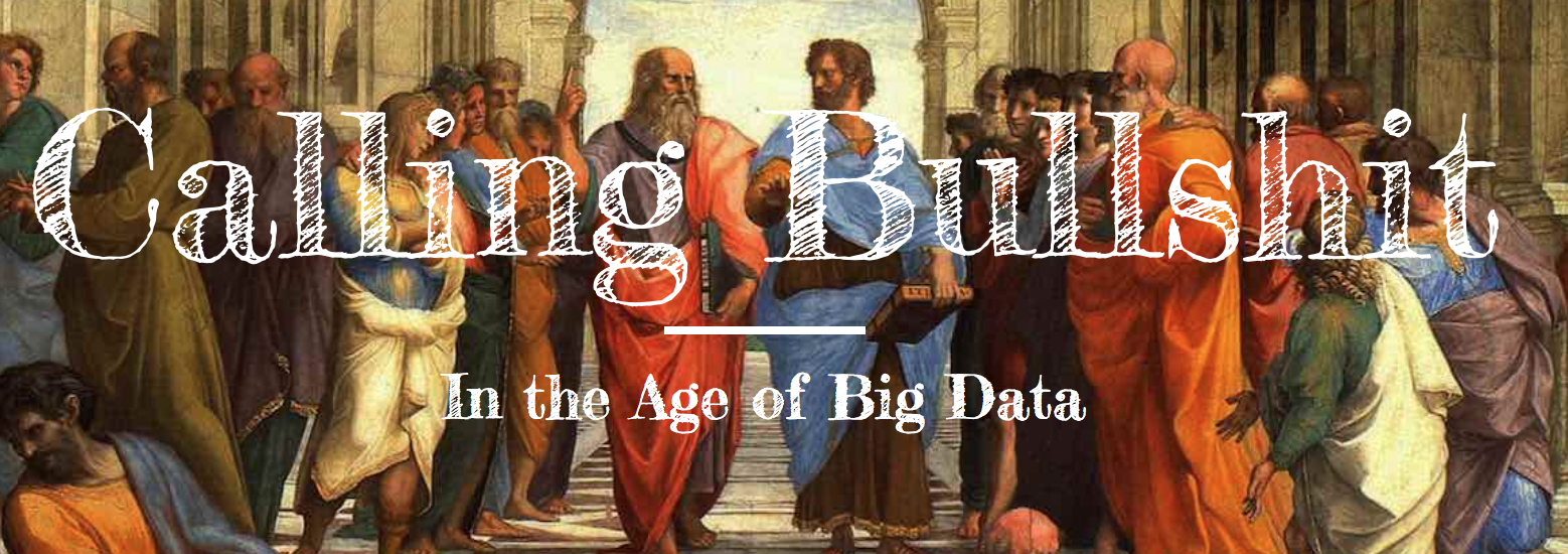
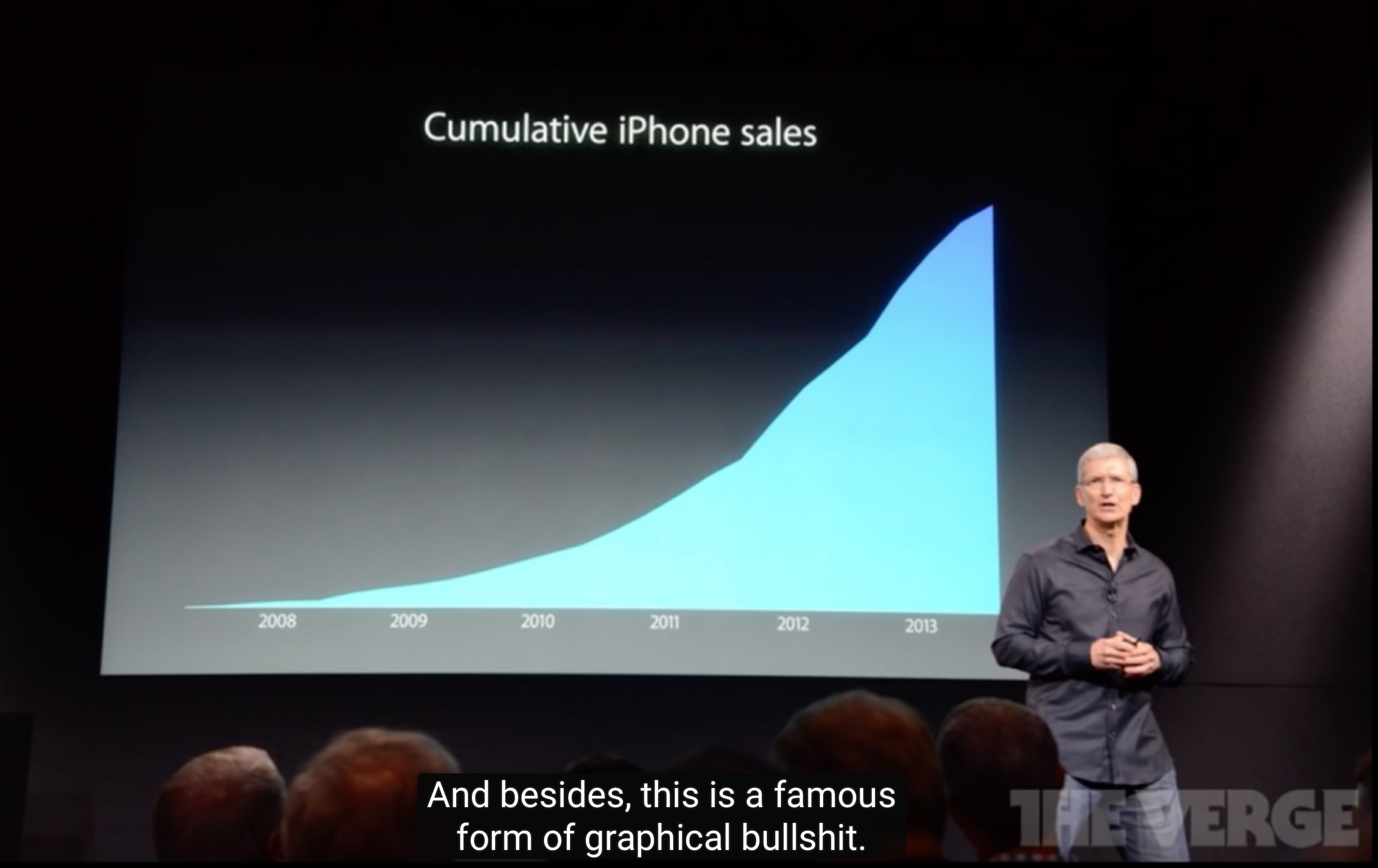
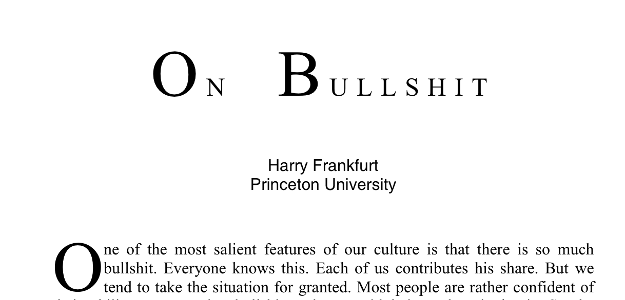
 In this episode we have Carl Bergstrom and Jevin West, two professors at the University of Washington, who talk about a fantastic new course they have designed called “Calling Bullshit“. The course aims to teach students what bullshit is, how to spot it, and how to deal with it. Needless to say, it’s timely. It’s also gotten a lot of attention lately.
Of course there are plenty of bullshit examples in data analysis and visualization. Carl and Jevin discuss many of them in their course.
On the show we talk about how they developed the course, what bullshit actually is and what distinguishes it from other types of misinformation, how to recognize examples of bullshit, and how to ‘call bullshit’ in an ethical way.
Enjoy this “bullshitty” episode! 🙂
Data Stories is brought to you by Qlik. Are you missing out on meaningful relationships hidden in your data? Unlock the whole story with Qlik Sense through personalized visualizations and dynamic dashboards which you can download for free at qlik.de/datastories.
Links
Help us fund Data Stories by donating on Patreon! We’re counting on you to switch to a crowdfunding model. Please visit our Patreon page for more details!
Related episodes

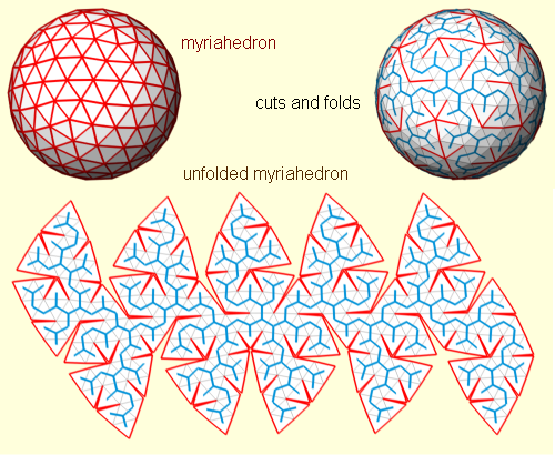
We have Jarke Van Wijk on the show this week. Jarke is a professor of visualization in the Department of Mathematics and Computer Science at Eindhoven University of Technology and an important historical figure (shall we say legend?) in visualization research.
Many amazing innovative techniques have been developed in his lab, including the widely adopted squarified treemaps (treemaps optimized to use rectangles as close as possible to squares) and hierarchical edge bundling (a technique to bundle the links of a graph together).
In this episode we hear the stories behind many of the innovations developed by Jarke and his group. Jarke also speaks to us about how to make cool stuff; the relationship between design, engineering and research; and artistry in visualization.
Enjoy the show!
Data Stories is brought to you by Qlik. Are you missing out on meaningful relationships hidden in your data? Unlock the whole story with Qlik Sense through personalized visualizations and dynamic dashboards which you can download for free at qlik.de/datastories.
Links
[Help us fund Data Stories by donating on Patreon! We’re counting on you to switch to a crowdfunding model. Please visit our Patreon page for more details!]
 This week, we have Elijah Meeks on the show to talk about the state of data visualization jobs in the industry.
Elijah sparked a recent debate with the following Twitter message: “Most people in #Datavisualization end up transitioning into data sci/eng or UI because there’s something wrong with the state of dataviz.” His tweet struck an interesting chord, so we thought we would bring him on the show to hear more.
In the episode, we talk about what is going on in the data visualization field and whether there really is a problem for data visualization professionals in the industry. We also talk about the great survey Elijah run on the state of the vis industry, which attracted around 1000 responses (!).
Enjoy the show!
Data Stories is brought to you by the upcoming 2017 Eyeo Festival. Eyeo brings together people drawn to the intersection of data, art, storytelling and creative technology. Tickets are on sale now, and almost gone. Get yours at eyeofestival.com. Converge to inspire.
Links
[Help us fund Data Stories by donating on Patreon! We’re counting on you to switch to a crowdfunding model. Please visit our Patreon page for more details!]
Related episodes
 [Hey friends, help us fund the show by donating to Data Stories on Patreon! We’re counting on you to switch to a crowdfunding model. Please visit our Patreon page for more details: https://www.patreon.com/datastories.]
In this episode, we have Alberto Cairo from the University of Miami on the show to talk about his newly announced lecture series on “Trumpery” and uncertainty.
Visualization and statistics promise to help people think and behave more rationally, but as we all know there is much more to fulfilling this promise than just showing “the right” graph.
With Alberto we touch upon many topics including partisanship and rhetoric, visualizing uncertainty and risk, and cognitive biases.
There is of course always much more to say on these topics, but this is a good start!
Enjoy the show.
Data Stories is brought to you by Qlik. Are you missing out on meaningful relationships hidden in your data? Unlock the whole story with Qlik Sense through personalized visualizations and dynamic dashboards which you can download for free at qlik.de/datastories.
Links


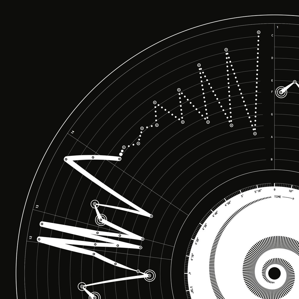
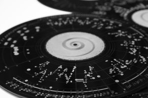
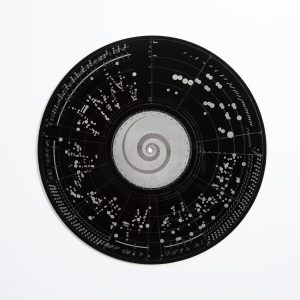
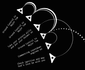
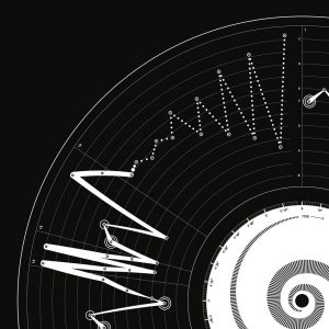
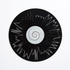
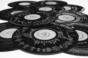
We have designer Valentina D’Efilippo and researcher Miriam Quick on the show to talk about their recent project OddityViz, a series of data visualizations of “Space Oddity,” the famous David Bowie song.
Valentina and Miriam deconstructed “Space Oddity” into multiple data sets to capture different aspects of the song: its narrative, rhythm, melody, and lyrics. Then they used each element to create a a unique data visualization piece.
They printed the visualizations as a series of posters and laser-carved acrylic black discs. Beautiful!
On the show we talk about their background, the process they followed to develop the project, and the events happening around it.
Enjoy the show!
Data Stories is brought to you by Qlik. Are you missing out on meaningful relationships hidden in your data? Unlock the whole story with Qlik Sense through personalized visualizations and dynamic dashboards which you can download for free at qlik.de/datastories.
Links
Help Data Stories get crowdfunded! You can find the details at our Patreon page: https://www.patreon.com/datastories.

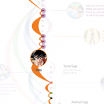
As you may have heard, Hans Rosling passed away on February 7, 2017. We are deeply saddened by this loss and, in remembering Rosling, we thought a tribute to him was due. The impact Rosling had on visualization and statistical communication is huge; he has left a very big legacy.
In this special episode, we asked five renowned visualization experts to tell us how Rosling’s work influenced them and how he impacted their own work. Here we hear from Kim Rees (Periscopic), Andy Kirk (Visualising Data), Robert Kosara (Eagereyes and Tableau), Kennedy Elliott (National Geographic), and Alberto Cairo (University of Miami).
Thanks so much Hans Rosling for your inspiration and legacy!
—
Some other tributes …
Help Data Stories get crowdfunded! You can find the details at our Patreon page: https://www.patreon.com/datastories.
[Help us become a crowdfunded podcast! Go to our Patreon homepage to become a Data Stories patron. Pledging starts at $3 per episode. And thanks!]
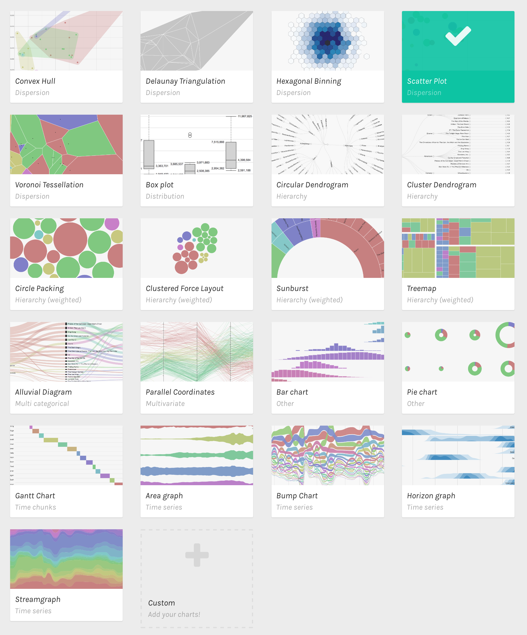
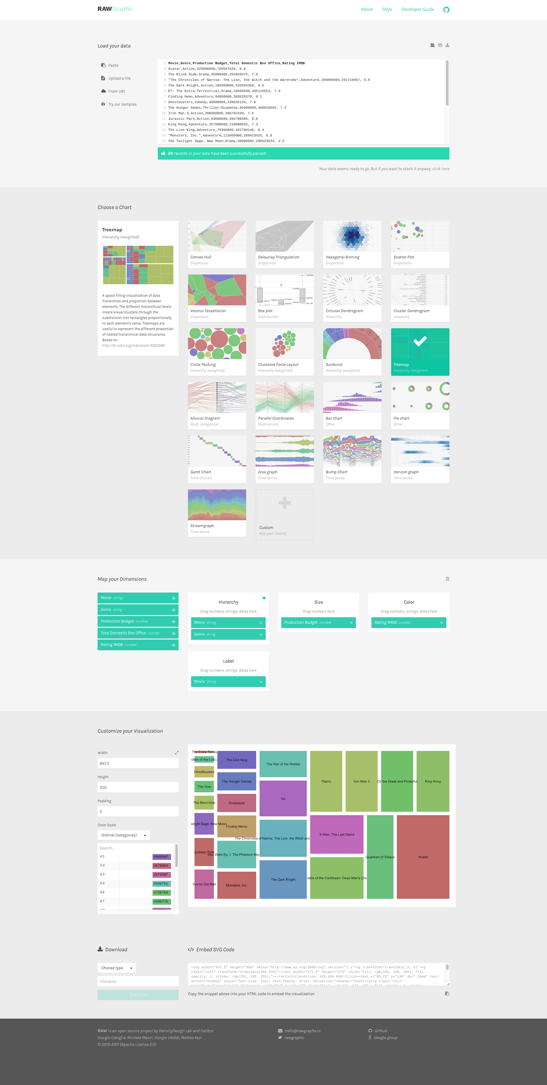
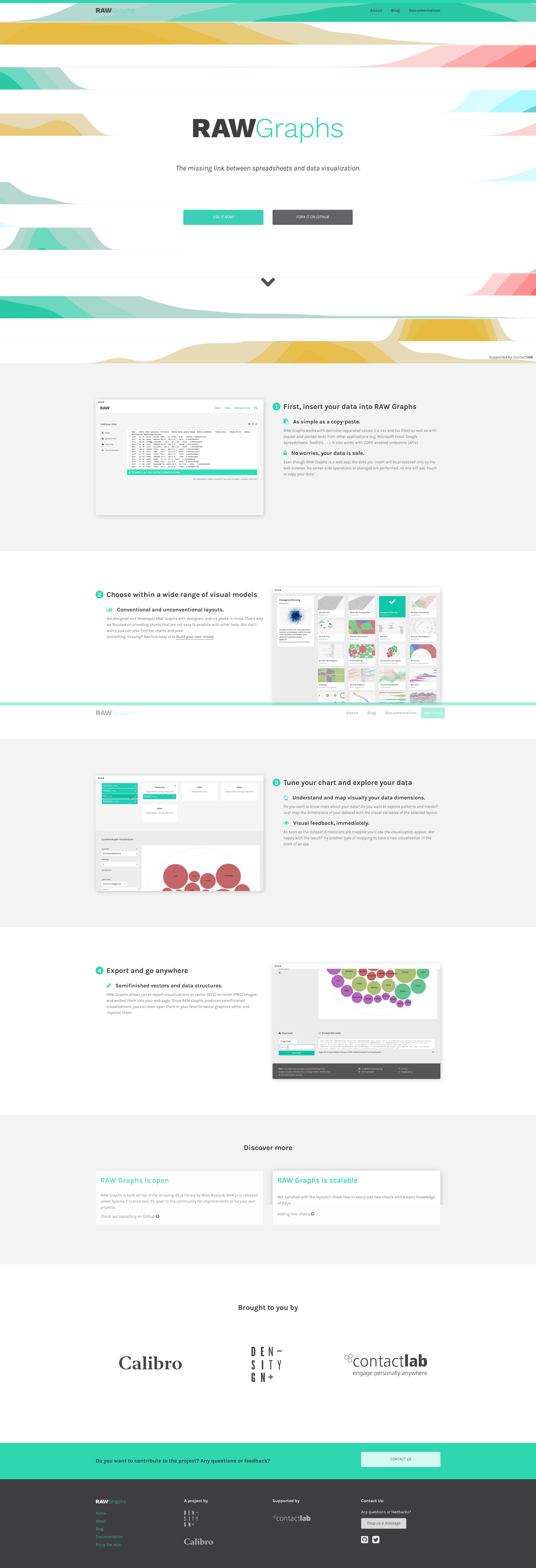
In this episode we have on a nice trio of Italian visualizers — Michele Mauri (Density Design), Giorgio Uboldi (Calibro), and Giorgio Caviglia (Trifacta) — to talk about RAW, the data visualization tool they built to help people visualize data interactively.


RAW is a very nice web-based and open-source data visualization tool that permits users to easily create charts without coding and to export them as vector graphics for further editing in external tools.
On the show we talk about why the team decided to develop RAW, how they got started, how they evolved RAW over time, the lessons they’ve learned, and their future plans.
Enjoy the show!
Data Stories is brought to you by Qlik. Are you missing out on meaningful relationships hidden in your data? Unlock the whole story with Qlik Sense through personalized visualizations and dynamic dashboards which you can download for free at qlik.de/datastories.
Links
Related episodes