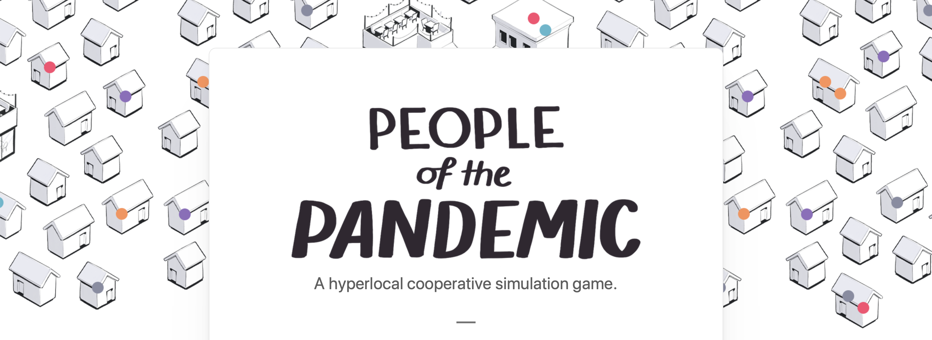
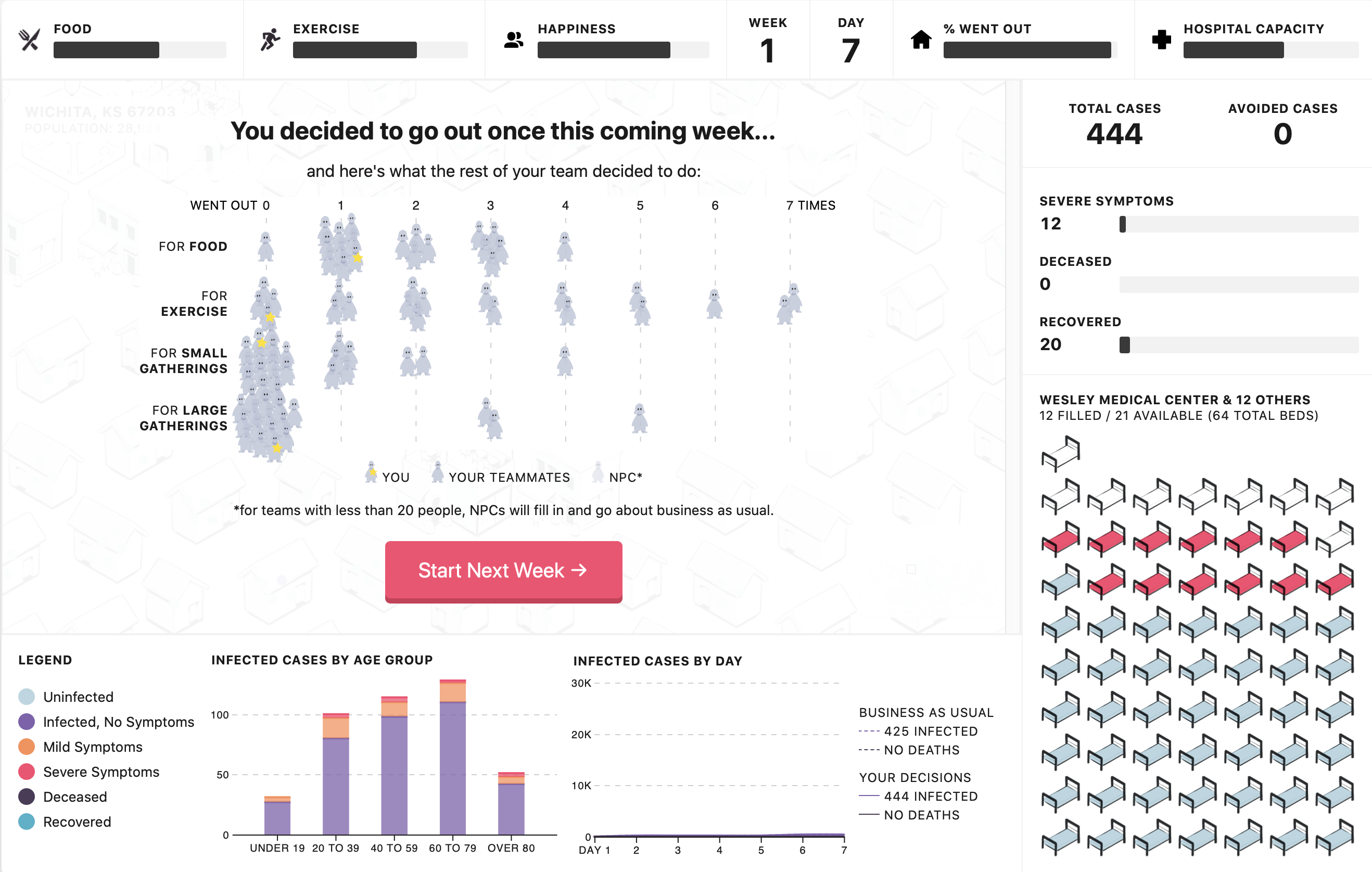
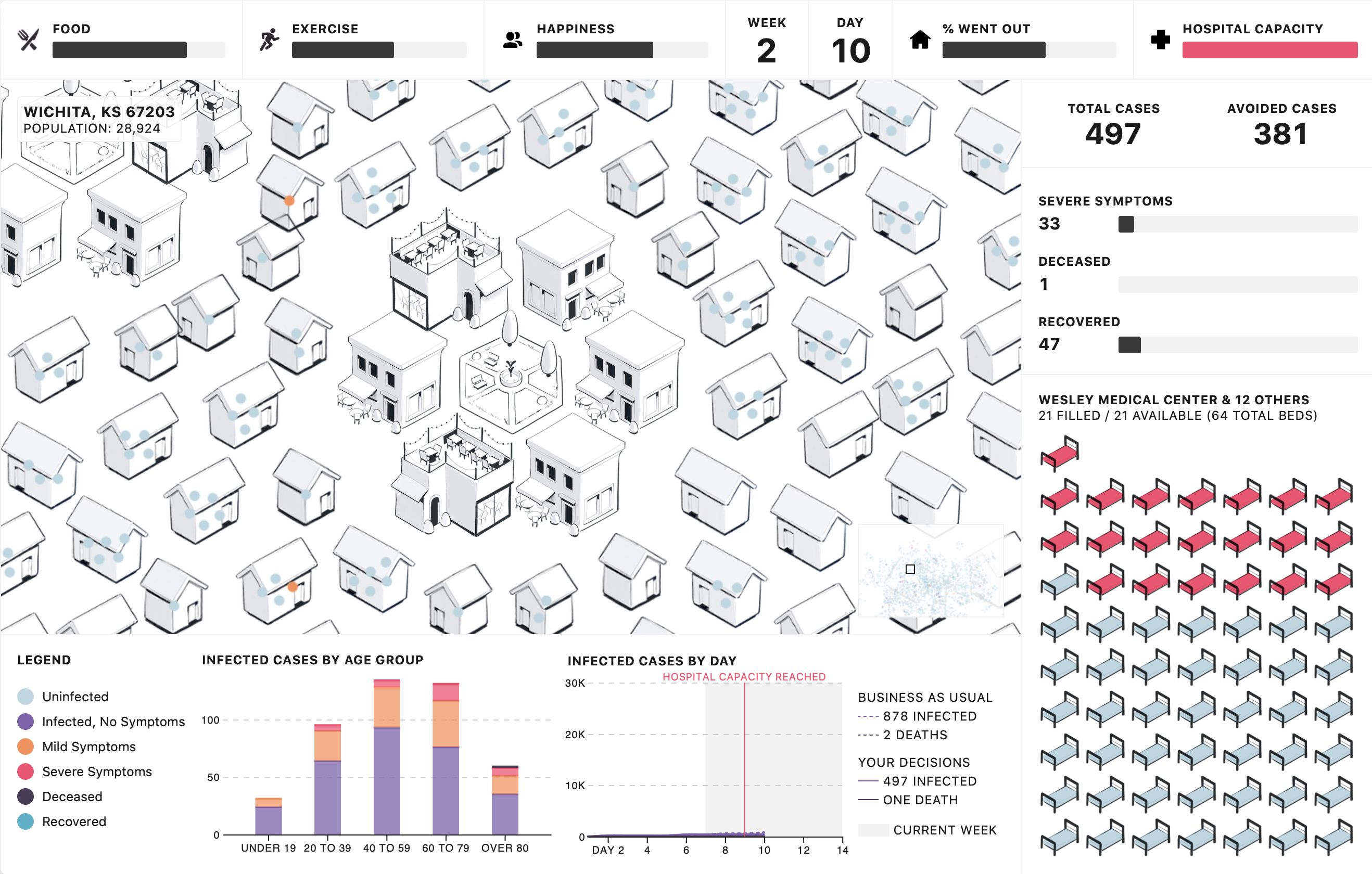
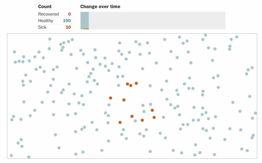
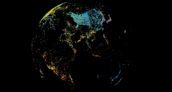
We have renowned data visualizer Shirley Wu with us again (we had her before in episode 98) to talk about a new project she and her team developed to help people reason about the covid19 pandemic at a local community level. The team developed a simulation game that shows you what happens when you make certain sets of decisions over time that may affect the spread of the virus. You can play with others and your goal is to cooperate.
Needless to say the tool uses some really interesting visualizations also but this is not the main point. It’s interesting to see the intersection between data visualization, simulation and gaming. With Shirley we talk about how the project started, specific challenges they faced, how it was received, and future developments.
We hope everyone is doing well! We finally decided to record an episode on visualization and covid19. It’s been a crazy several weeks and one of the most interesting developments has been to see how prominent visualization has been in the constant flux of information. Who expected visualization to be so relevant, uh?!
And when we talk about data and pandemics we could not find a better person than Carl Bergstrom, Professor of Biology at University of Washington, with a background in epidemiology but also an expert in scientific practices and communication.
You may remember Carl from an episode about three years ago (Episode 97). We interviewed him together with his colleague Jevin West to talk about their excellent “Calling Bullshit” project (and let’s face it, there is no lack of BS during these crazy times), a course (and soon to be a book) on how to spot BS in science.
Carl has been a constant source of information and reasoning on Twitter. Commenting on the science behind pandemics but also about the way science is communicated and the many possible traps you may fall into. If there is one thing we all learned is that visualization without reliable data is a mess!
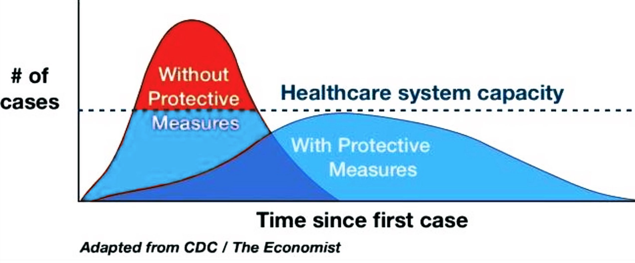
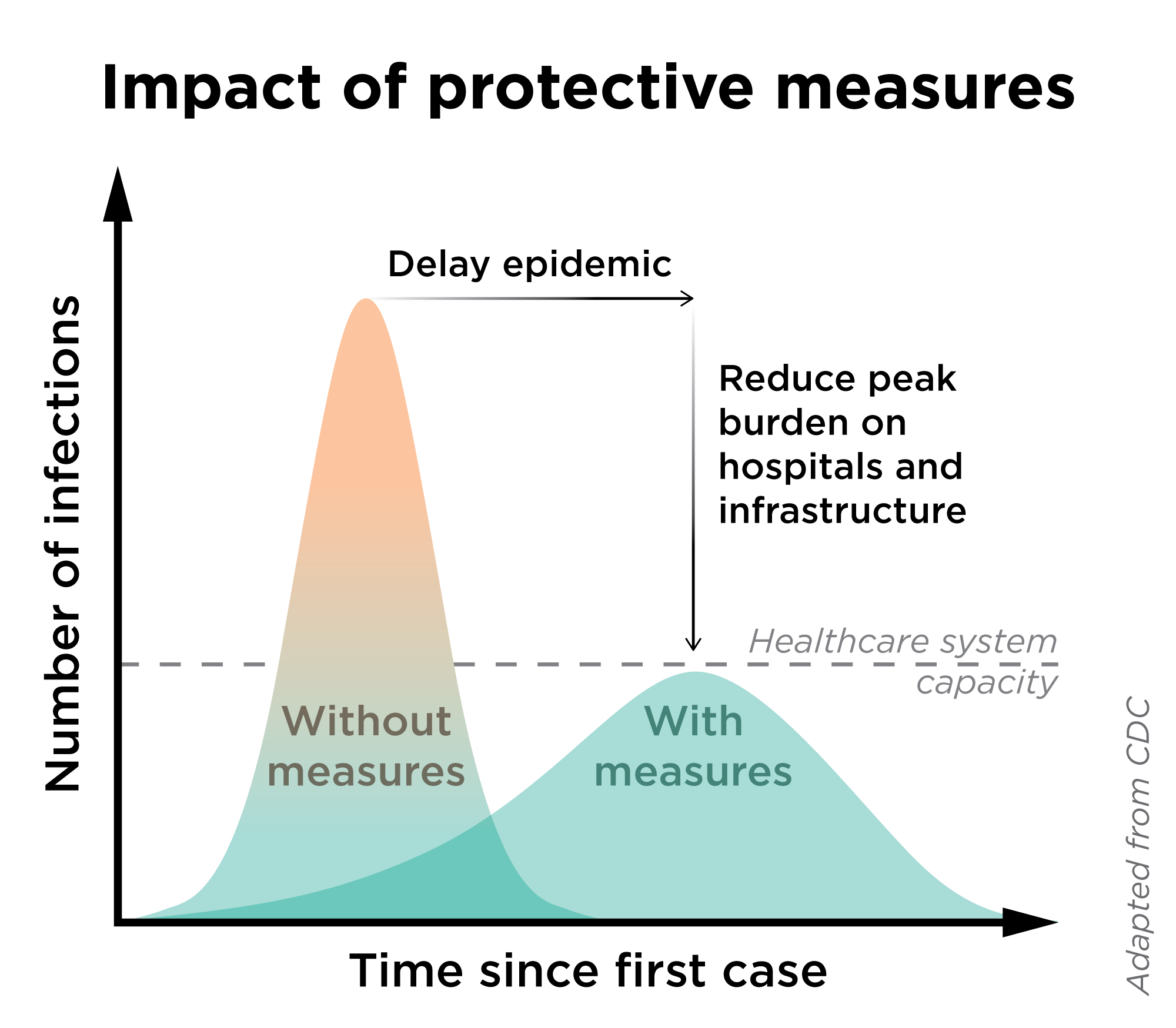
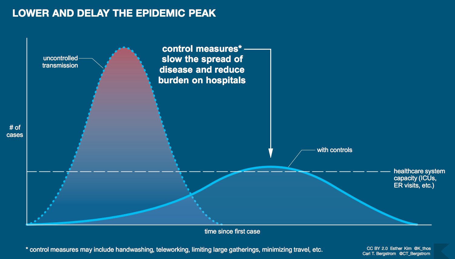
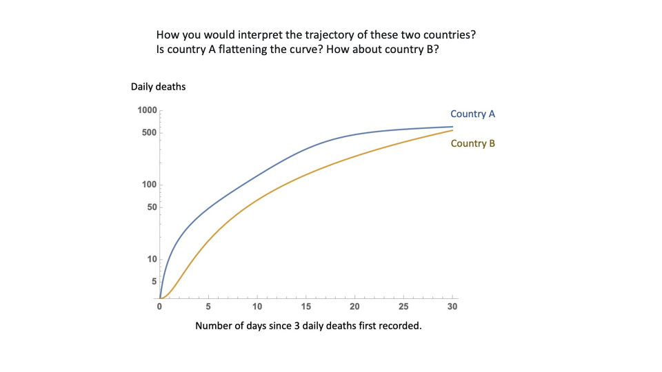
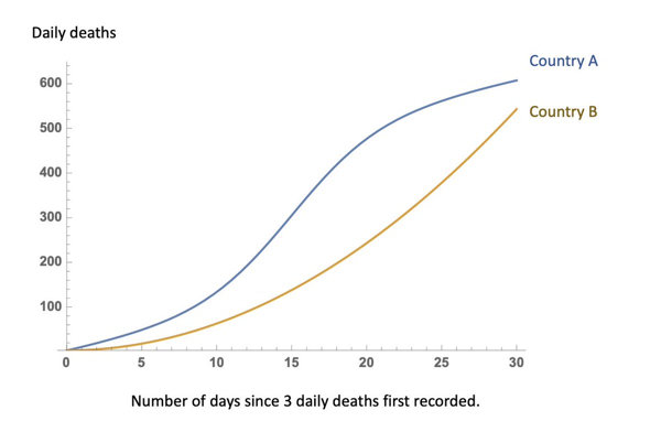
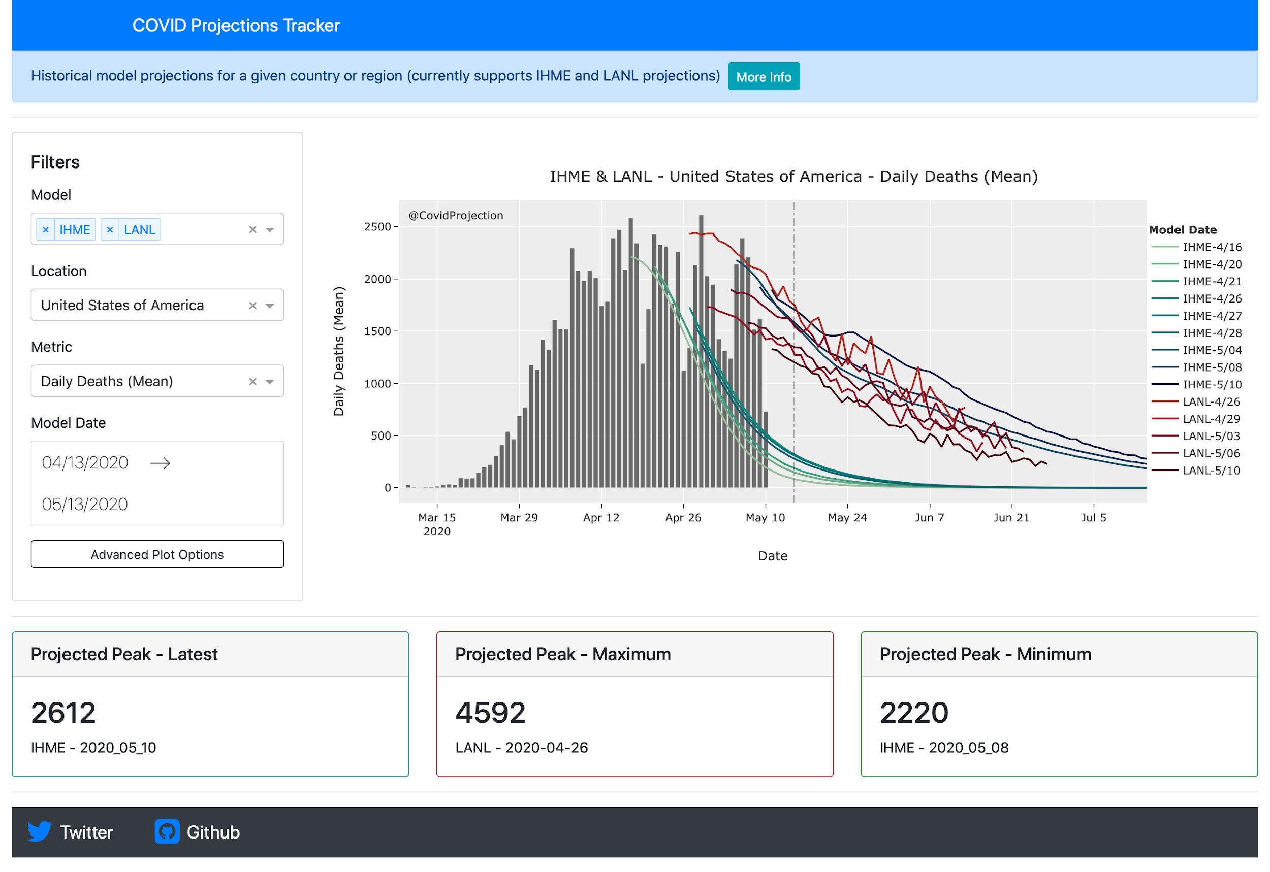
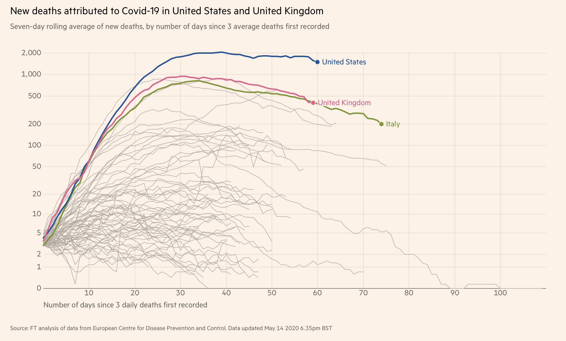
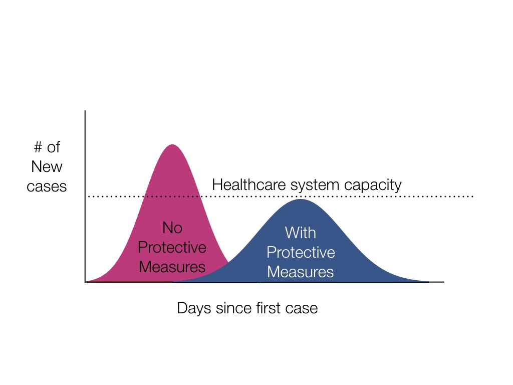
In the show, we talk about a number of iconic covid19 visualizations, the “flatten the curve” ones, the tracking lines from Financial Times and several simulations. For each of these we discuss the many variations and nuances, what we have learned from them and the many intricacies of creating visualizations for such a sensitive topic with potential huge outcomes.
[Our podcast is fully listener-supported. That’s why you don’t have to listen to ads! Please consider becoming a supporter on Patreon or sending us a one-time donation through Paypal. And thank you!]
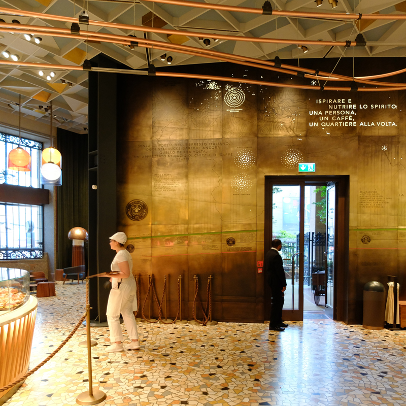
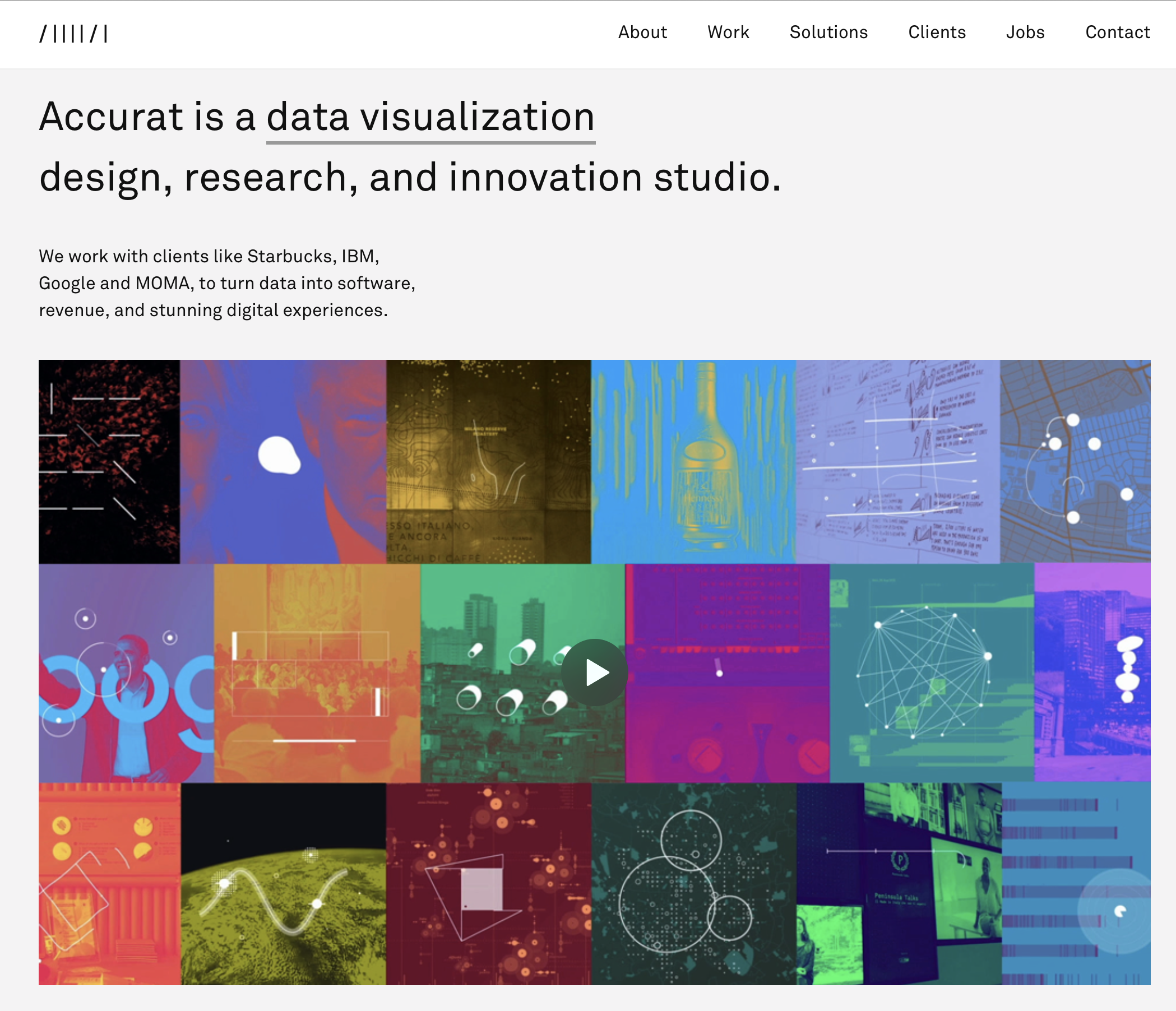
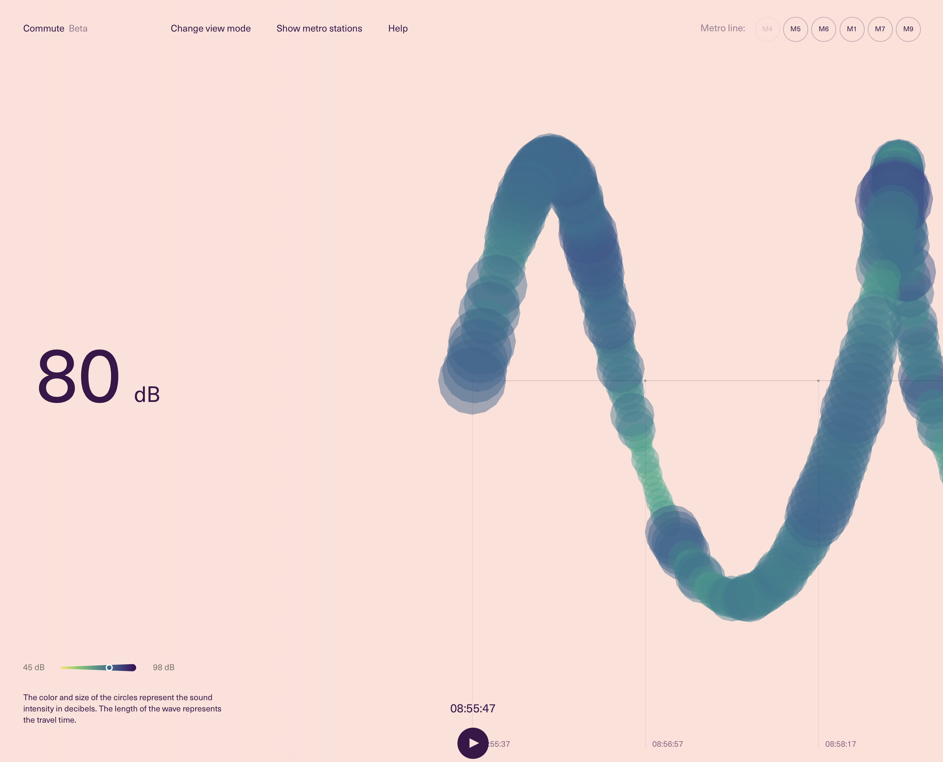
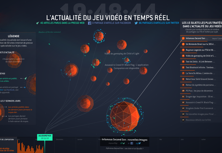
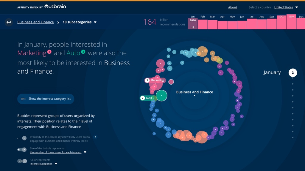
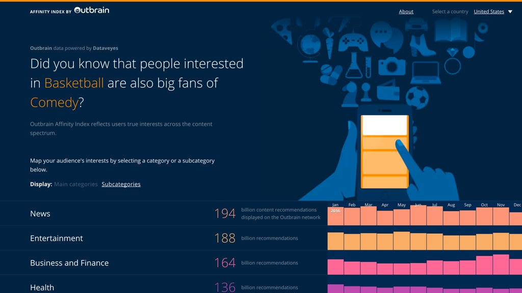
This is our second episode of our mini-series on data visualization agencies. For this episode we have Caroline Goulard from Dataveyes and Gabriele Rossi from Accurat. With them we talk about their quintessential projects, how to balance experimental with regular customers’ projects, and how the data visualization field changed over the years.
[Our podcast is fully listener-supported. That’s why you don’t have to listen to ads! Please consider becoming a supporter on Patreon or sending us a one-time donation through Paypal. And thank you!]
This is the first episode of a mini-series of Data Visualization agencies. After so many years producing this podcast we realized we never really focused on agencies and we decided it’s time to rectify! Agencies have slowly become one of the most relevant realities of the data visualization ecosystem and business landscape. In this first episode, we have Thomas Clever to talk about Clever Franke and Benjamin Wiederkehr from Interactive Things. They have been around for more than 10 years and they have produced some really amazing work.
On the show we talk about their quintessential projects, what makes agencies different from individual freelancers and other organizations, the realities and challenges of running an agency and much more.
[Our podcast is fully listener-supported. That’s why you don’t have to listen to ads! Please consider becoming a supporter on Patreon or sending us a one-time donation through Paypal. And thank you!]
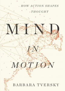
We have Barbara Tversky with us to talk about “spatial cognition”; the way humans perceive space and how space perception is related to the many ways we think. Barbara is a renowned cognitive scientist and a Professor of Psychology and Education at Columbia University. She has an extensive literature on spatial cognition and specific research on how people perceive and use diagrams, maps and other visual representations.
On the show we talk about her new book called “Mind in Motions” in which Barbara describes her research and the many fascinating ways space and motion play a pivotal role in the way we think. We also talk about the role of space in data visualization and the many fascinating ways in which spatial cognition can inform visualization design.
[Our podcast is fully listener-supported. That’s why you don’t have to listen to ads! Please consider becoming a supporter on Patreon or sending us a one-time donation through Paypal. And thank you!]
In this episode we have PhD students Yongsu Ahn and Alex Cabrera to talk about two separate data visualization systems they developed to help people analyze machine learning models in terms of potential biases they may have. The systems are called FairSight and FairVis and have slightly different goals. FairSight focuses on models that generate rankings (e.g., in school admissions) and FairVis more on comparison of fairness metrics. With them we explore the world of “machine bias” trying to understand what it is and how visualization can play a role in its detection and mitigation.
[Our podcast is fully listener-supported. That’s why you don’t have to listen to ads! Please consider becoming a supporter on Patreon or sending us a one-time donation through Paypal. And thank you!]
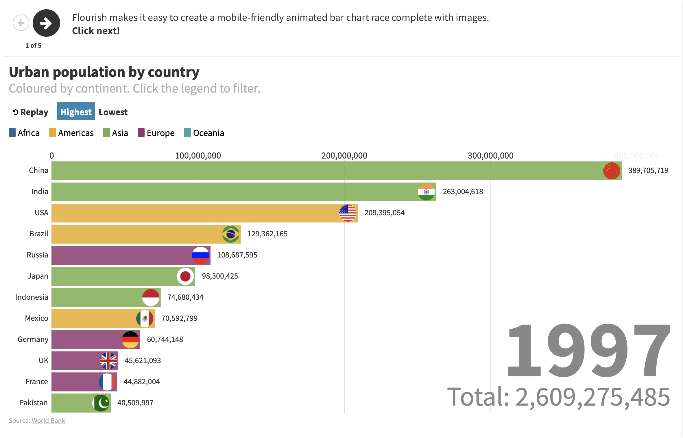
Duncan is the CEO of Flourish, a popular data visualization tool to help people create storytelling visualizations from data. Duncan founded Flourish together with Robin Houston in 2016 and since then they made a lot of progress and acquired a large user base. It’s always great to hear about successful data visualization companies!
On the show Duncan describes what Flourish is, how it works and how it differs from other data visualization tools. We also talk about the unique playback option Flourish has and the “talkies” feature, which introduces audio and sound elements to add to a visualization. Finally, we also talk about their business model and future trajectories.
[Our podcast is fully listener-supported. That’s why you don’t have to listen to ads! Please consider becoming a supporter on Patreon or sending us a one-time donation through Paypal. And thank you!]
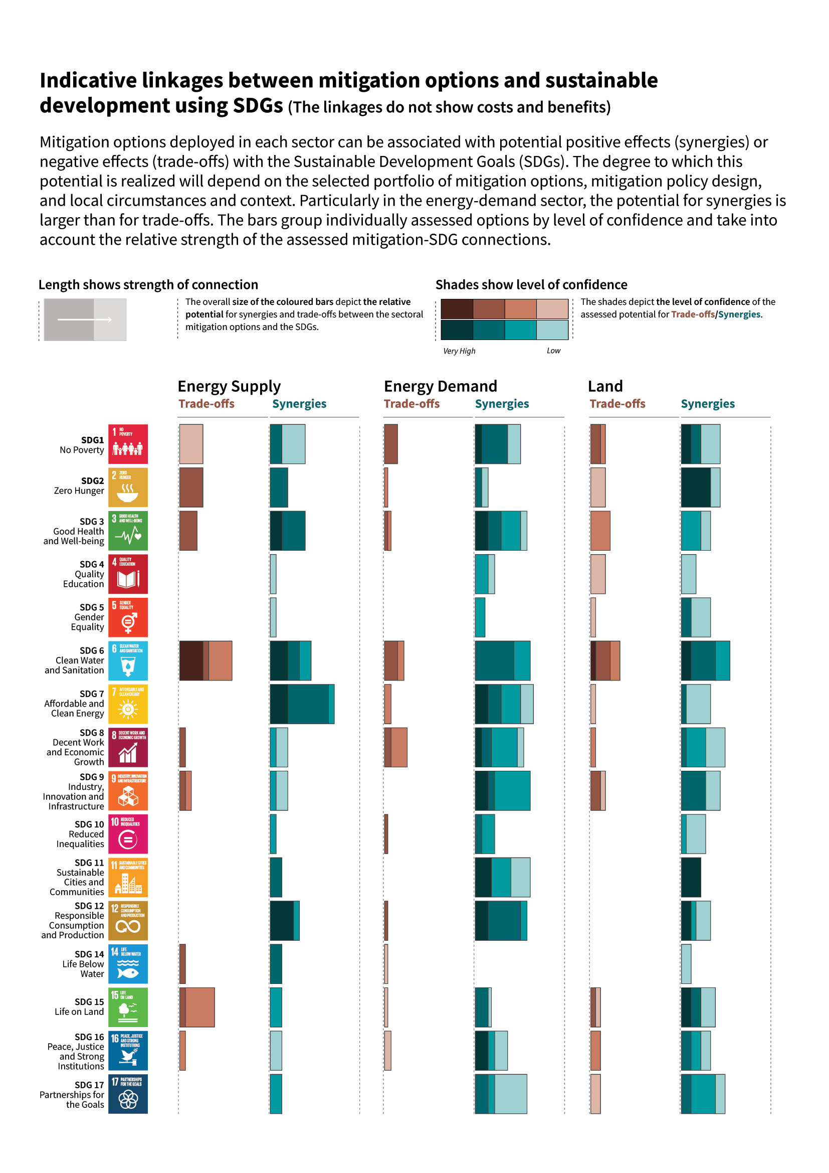
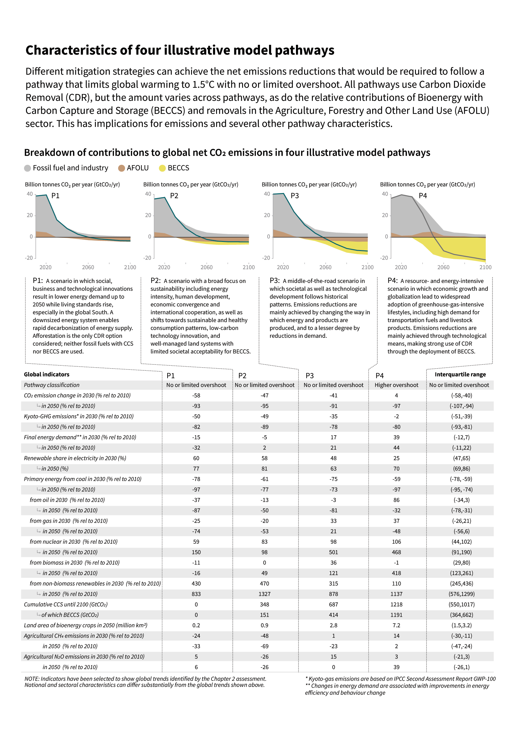
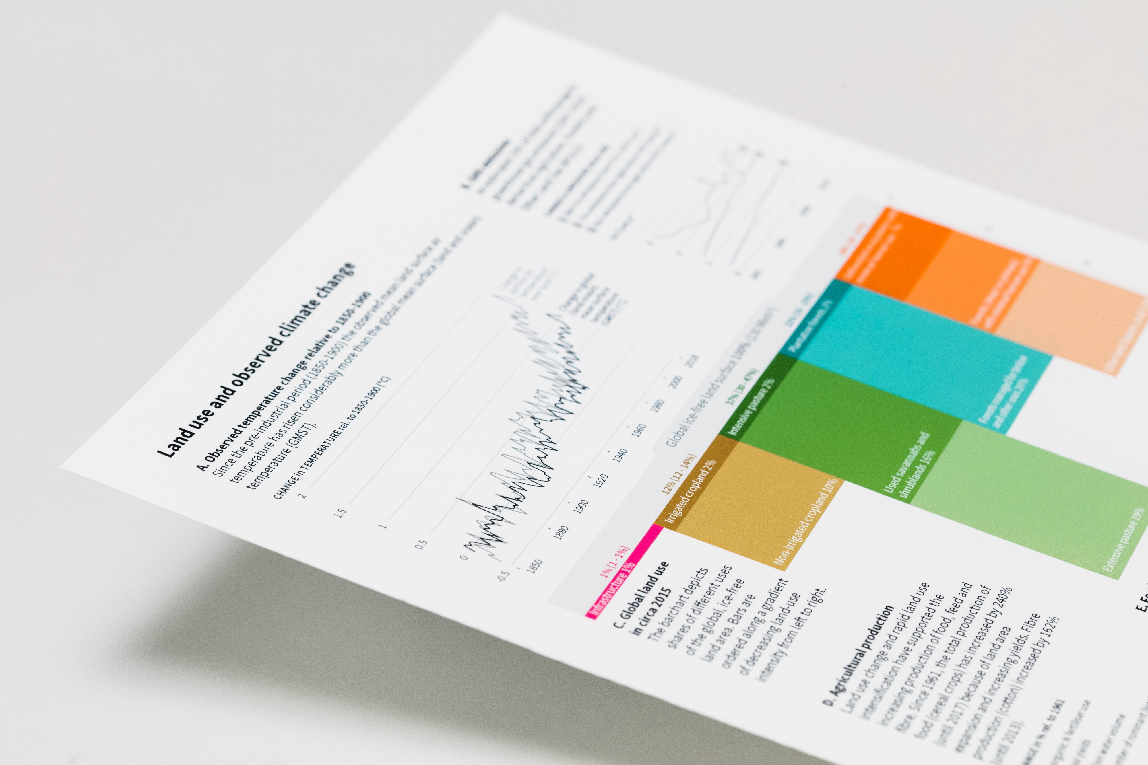
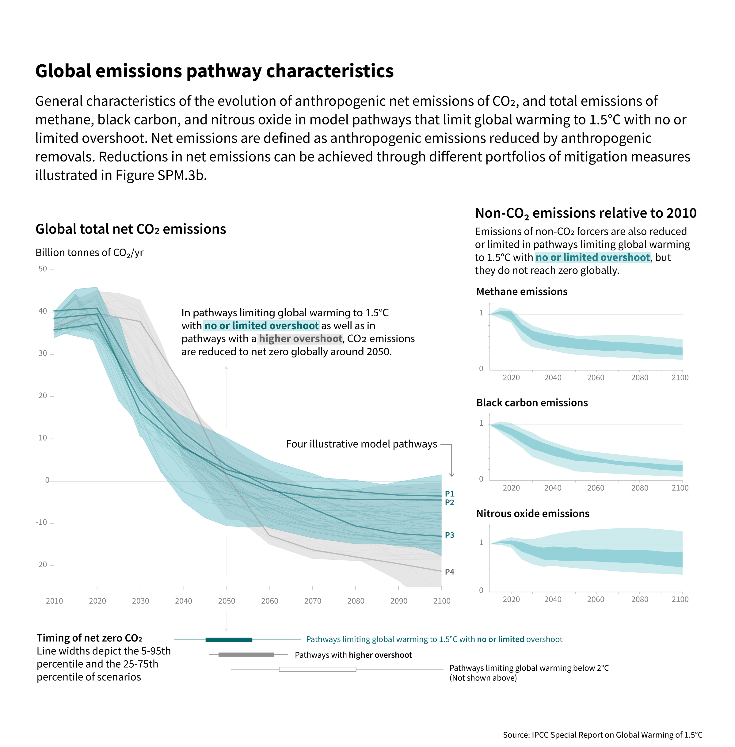
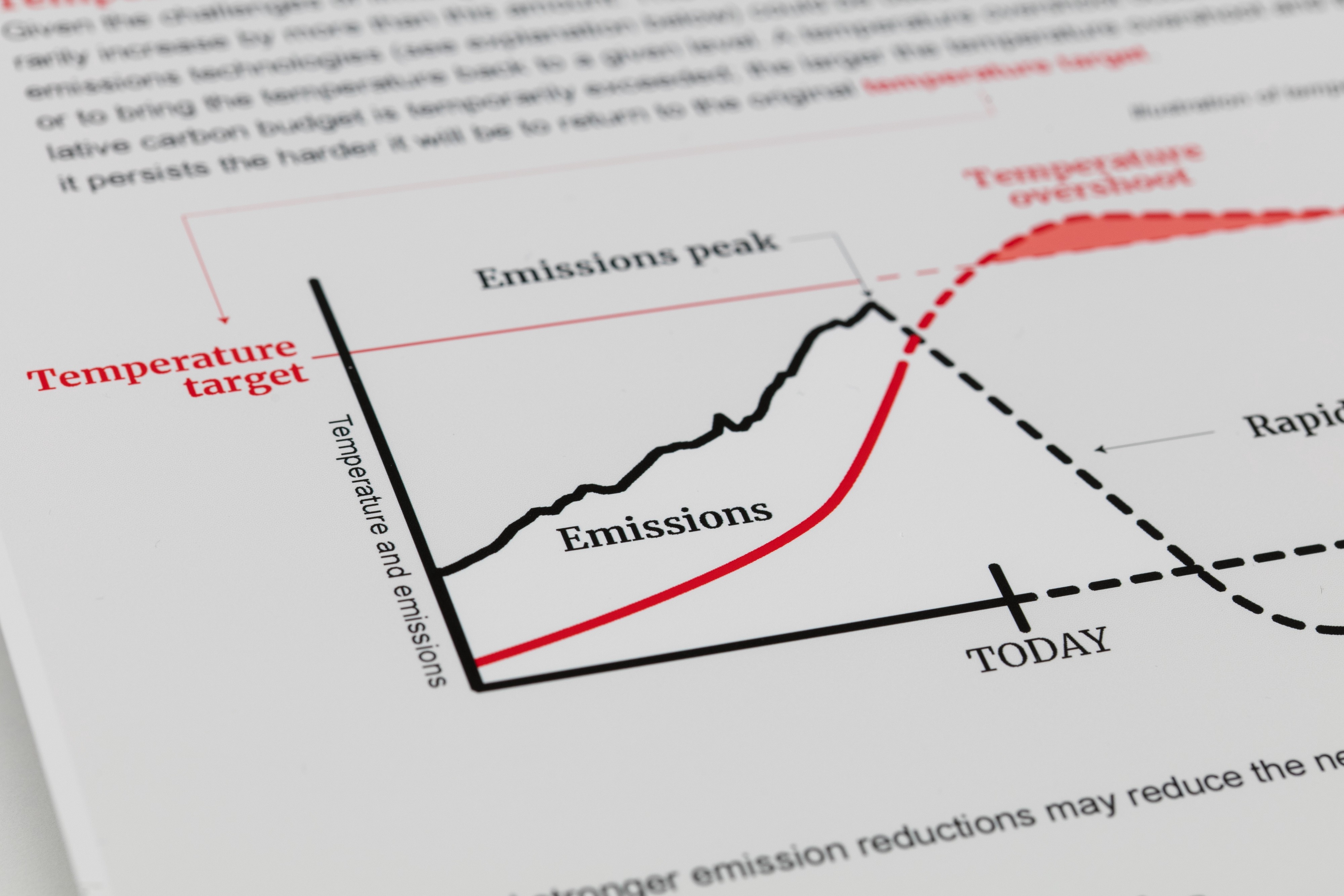
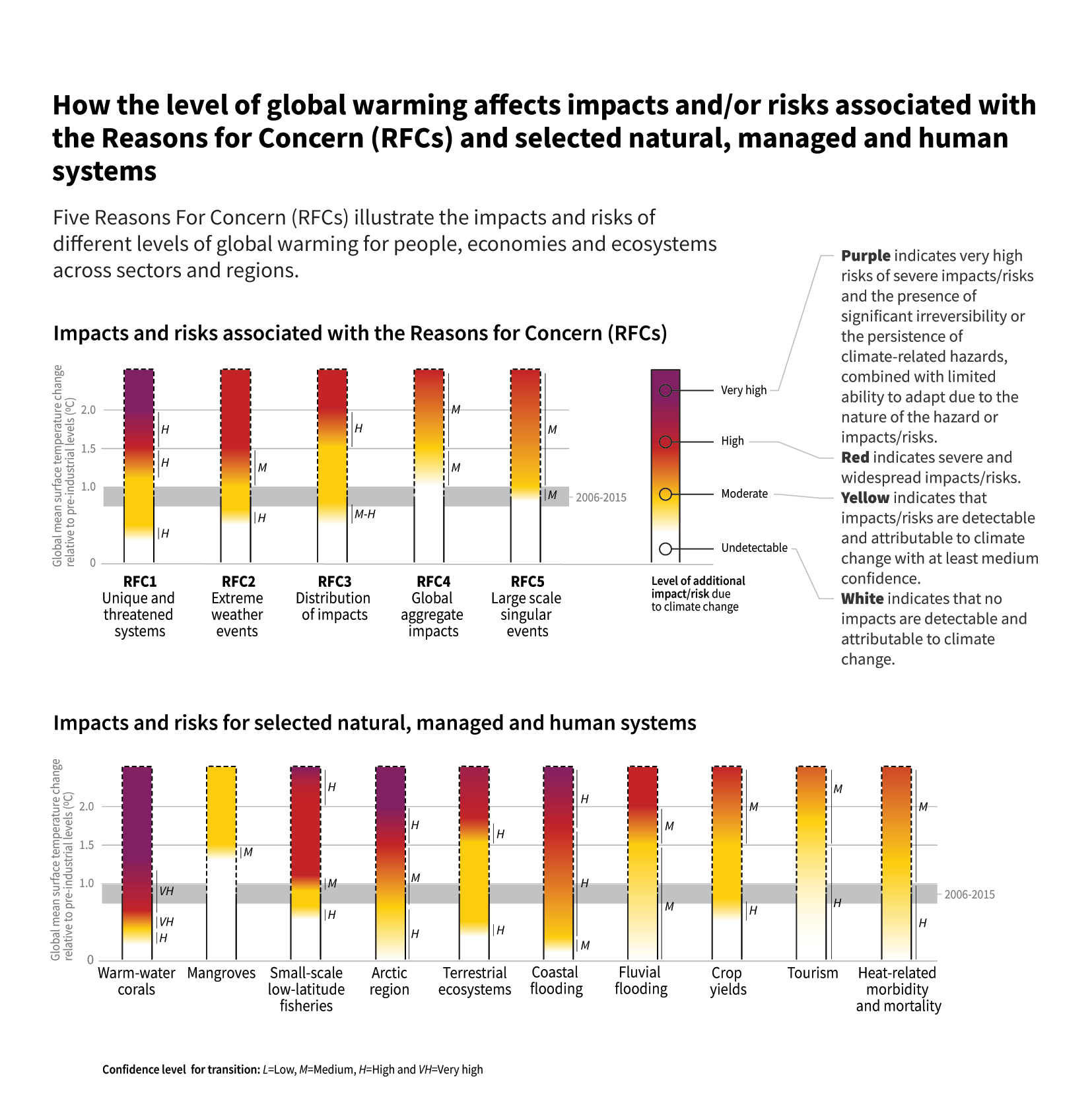
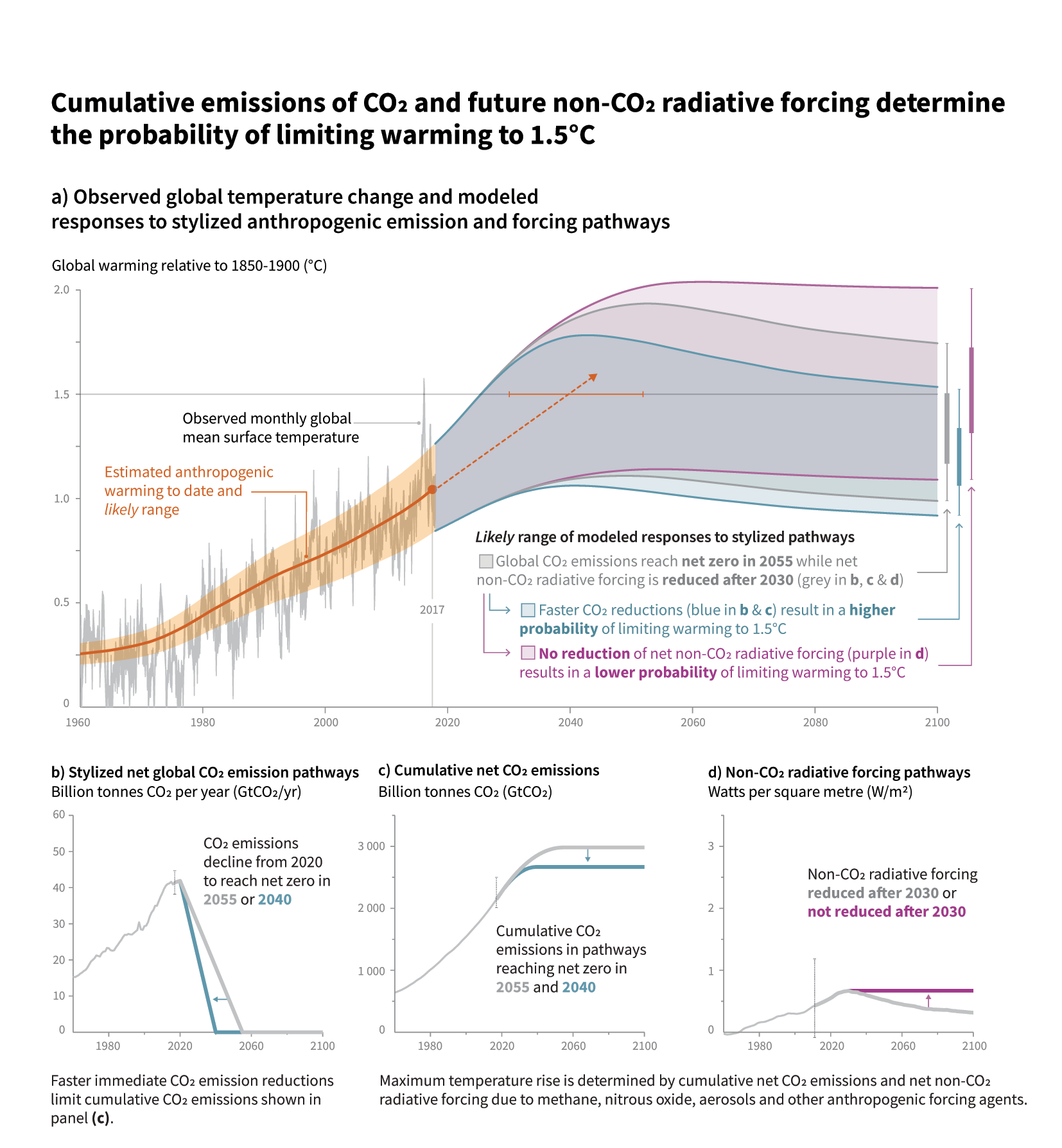
We have Angela Morelli and Tom Gabriel Johansen to talk about their effort in developing infographics for several reports of the Intergovernmental Panel on Climate Change (IPCC). Creating such reports entails a very complex and orchestrated process that needs to end with a total consensus of all the participating countries. In the show Angela and Tom tell the story of what it takes to generate such reports and handle the complex process of co-designing such important report with a large group of scientists. Angela and Tom also provide a set of lessons learned visualization designers can use.
Enjoy the show!
[Our podcast is fully listener-supported. That’s why you don’t have to listen to ads! Please consider becoming a supporter on Patreon or sending us a one-time donation through Paypal. And thank you!]
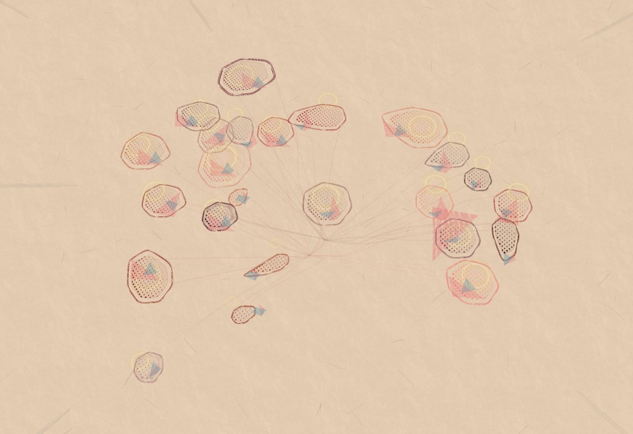
We have Marcin Ignac from Variable to talk about Data Art. Marcin and his studio have a very nice mix of data visualization and generative design projects creating stunning visuals for brands such as Nike and IBM.
On the show we talk about the scope and unique features of data art, the process the studio follows, the specific set of tools Marcin developed for visual programming and tips to get started with this kind of projects. See the long list of pointers in the links below!
[Our podcast is fully listener-supported. That’s why you don’t have to listen to ads! Please consider becoming a supporter on Patreon or sending us a one-time donation through Paypal. And thank you!]
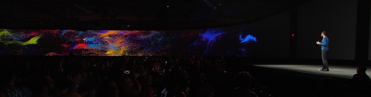
Hi everyone! We are once again at the end of a whole year. After having “end of the year episodes” with other podcasters, going around the world, and chatting with Andy and Robert, we decided to try something different this time: we asked a group of data visualization professionals to send us an audio snippet summarizing what happened in specific areas of the field over the last year. The result is a great multifaceted collage of stories and personalities. See below who we have interviewed and what they talked about.
Happy New Year! Thanks so much for listening to the show. We’ll see you in 2020 with a whole set of great new episodes!
[Our podcast is fully listener-supported. That’s why you don’t have to listen to ads! Please consider becoming a supporter on Patreon or sending us a one-time donation through Paypal. And thank you!]