Hey folks, we are back! We really hope you had a good summer.
We start the new season with an “internal” episode. We give numerous updates on Data Stories. Things have changed recently — we have future ideas and two great events to get in touch with us!
The Visualized Conference, taking place in New York on Oct 7-10, 2015, is going to host a Data Stories Meetup on Oct 7, 2015. If you live in NYC or happen to be around please drop by! We’d love to meet and talk with you.
We will also offer an Ask Me Anything on Reddit on November 3. This is a unique opportunity to ask us questions live and chat together.
In the show we also talk about some of our recent projects.
False Positive project
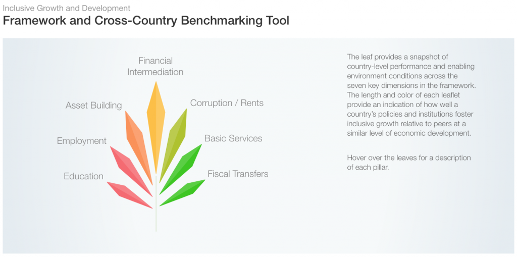
WEF Inclusive Growth Report
RevEx
Moritz talks about False Positive, an art project on data, privacy and identity. He also talks about the new Inclusive Growth Report from the World Economic Forum, for which he designed the graphics and website together with Stefanie Posavec and 9elements.
This episode is sponsored by Qlik who allows you to explore hidden relationships within data that lead to insights. Read Patrik Lundblad’s blog posts on the three pillars of data visualization(1,2,3). You can download Qlik Sense for free at: www.qlik.de/datastories.
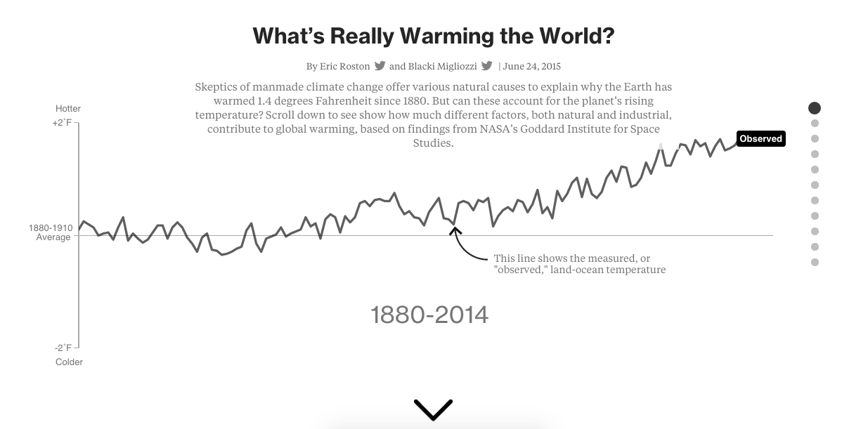
The graphic shows, through a “scrollytelling,” what factors may influence the world’s temperature according to well-established climate models. It guides you through a series of questions and visuals to all you to see for yourself what correlates (spoiler: carbon emissions) and what does not.
On the show we talk about how the Bloomberg team came up with this piece, their interaction with the NASA Goddard Institute for Space Studies (GISS) scientists who developed the model, and the many challenges of translating important scientific knowledge into more digestible, but not simplistic, articles that everyone can read.
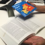
We also talk about how they took inspiration from the children book “Where’s Spot?” (which is a nice narrative technique for vis!) and all the delicate design decisions they had to make.
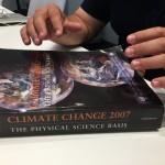
… And don’t miss the moment when Eric drops the huge IPCC (International Panel on Climate Change) report book to give a sense of how big it is!
Enjoy the show!
—
This episode is sponsored by Qlik who allows you to explore hidden relationships within data that lead to insights. Qlik was named a Top 10 Innovative Growth Company by Forbes, and they published an interesting blog post analyzing the data from the ranking. Check it out! Qlik Sense allows you to create personalized visualizations and dynamic dashboards. You can download it for free at: www.qlik.de/datastories.
—
“I believe we are bored from being 8 to 10 hours everyday in front of the screen, so when we go out from the screen the real life happens and things get more and more interesting.”
– Dani Llugany Pearson
— Hey everyone, starting from this episode we will add images/photos of projects and ideas discussed on the show so that you no longer have to guess what we are talking about! Try this one below … if you click on it you’ll get high-res pictures. Let us know if you like it!
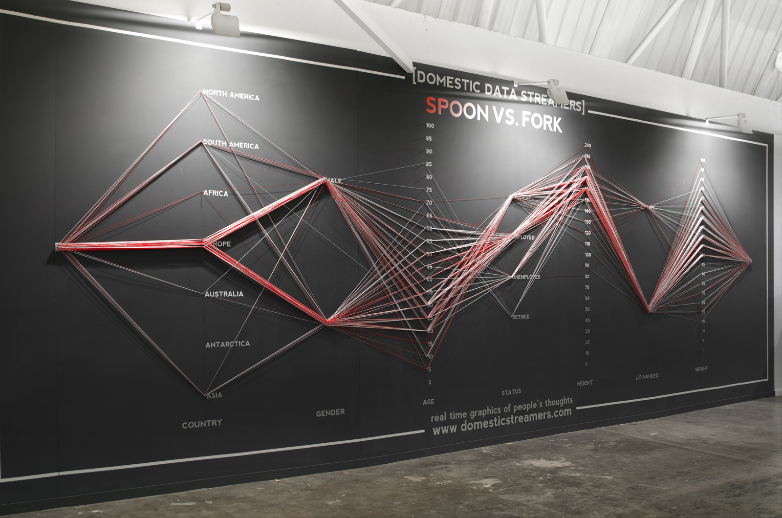
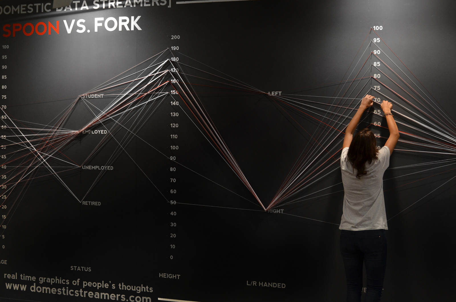
Live survey on physical parallel coordinates.
Live survey on physical parallel coordinates.
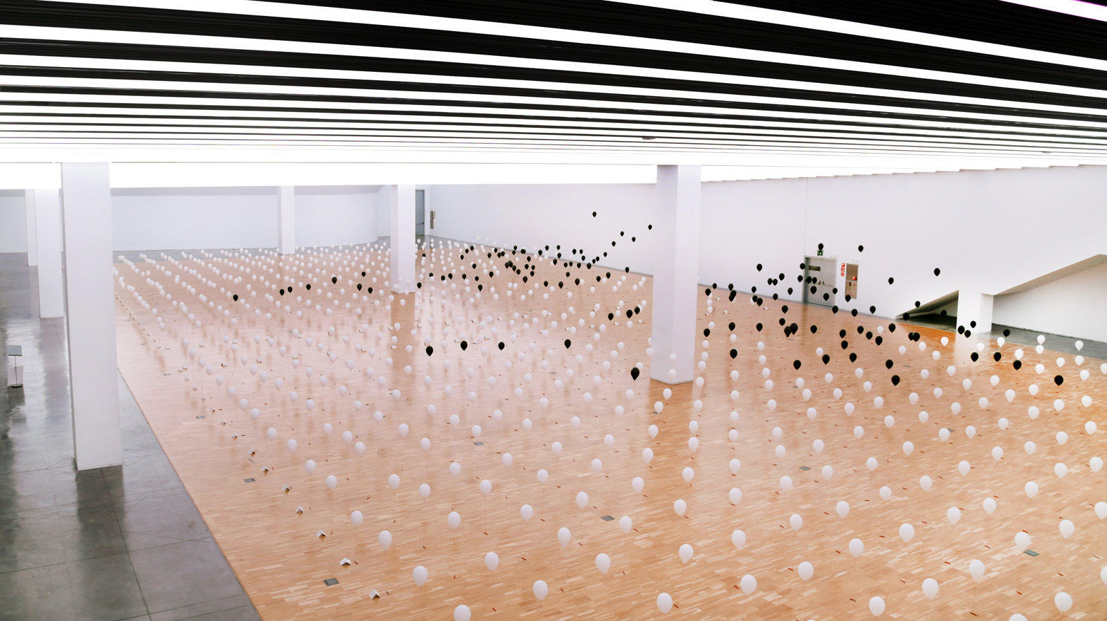
Using balloons to show the age at which one would like to die.
Using balloons to show the age at which one would like to die.
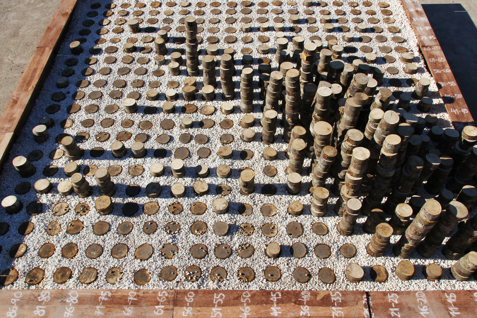
What’s the best age in a lifetime?
What’s the best age in a lifetime?
How much information is a Yottabyte?
How much information is a Yottabyte?
Each tweet is one drop.
Each tweet is one drop.
Hi folks,
We have Dani Llugany Pearson from Domestic Data Streamers to talk about their studio and the amazing participatory data installations that they make.
You really need to see examples of what they do! Go to http://domesticstreamers.com/ and take a look at their projects.
In Data Strings they ask people to add their own thread to a set of physical parallel coordinates. In Life Line they use a grid of 800 balloons to show the point between one’s real age and the age at which one would like to die. In Golden Age they use a grid to let people mark with a log what is their age and what they believe is the best age in people’s life.
On the show we talk about how they got started and the process behind some of their projects.
Enjoy the show!
—
This episode is sponsored by Qlik who allows you to explore hidden relationships within data that lead to insights. Qlik Sense allows you to create personalized visualizations and dynamic dashboards. You can download it for free at: www.qlik.de/datastories.
—
We have economist Max Roser from University of Oxford to talk about his Our World in Data project where he visualizes the social, economic, and environmental history of humanity up to the present day.
Our World in Data is a remarkable project that Max started on his own and worked on little by little in his spare time until it evolved into a full website with plenty of interesting data, presentations, and visualizations to to better understand humanity.
The nicest thing is that it provides a quite positive picture of the world and about the many ways that we are improving our conditions. Go to the website (http://ourworldindata.org/) and take a look at War and Violence, Poverty, Global Heath, Etc.
On the show we talk about how Max started his work; the process behind finding a topic, collecting, and curating the data; and producing these nice visuals that people can easily understand. We also talk about human biases, persuasion, and how Max learned to build web sites and visualizations.
Enjoy the show!
—
This episode is sponsored by Visualizing Well-Being, the Wikiprogress Data Visualization Contest 2015. Enter the contest to win a trip to Mexico! To find out more, visit the Wikiprogress website (www.wikiprogress.org) or the facebook page or follow @wikiprogress on twitter.
—
“I’d give two of my left fingers for this data” – Amanda Cox on the show 🙂
We have the great Amanda Cox from the New York Times on the show this time!
Amanda is a graphic editor at NYT and she is behind many of the amazing data graphics that the New York Times has produced in recent years.
In the show we talk about her background in statistics and how she ended up at the Times. We discuss how she uses R software to collect, analyze, and visualize data, and her thoughts on other tools. We also talk about how data graphics are produced at NYT, with lots of funny stories.
Don’t miss the parts about the “what, where, when” of data and the “net joy” concept.
Lots a data wisdom in this show!
—
This episode is sponsored by Tableau Software, helping people connect to any kind of data, and visualize it on the fly – You can download a free trial at http://tableau.com/datastories – check the new Tableau 9!
—
We have designer and activist Mushon Zer-Aviv on the show today. Mushon is an NYU ITP graduate and instructor at Shenkar University, Israel.
He wrote the very interesting Disinformation Visualization piece for Tactical Tech’s Visualizing Information for Advocacy and we decided to invite him to discuss the million different facets of disinformation through visualization.
Is data and data visualization bringing some truth or should it always be considered an argument? Is there a way we can mitigate or even prevent disinformation? What strategies can designers use to make their opinions more apparent?
These are some of the questions we discuss on the show.
And don’t miss the part on “data obfuscation,” that is, how to use disinformation to increase our privacy!
Enjoy this thought-provoking show!
This episode is sponsored by Tableau Software, helping people connect to any kind of data, and visualize it on the fly – You can download a free trial at http://tableau.com/datastories – check the new Tableau 9!
The Persuasive Power of Data Visualization. A. V. Pandey, O. Nov, A. Manivannan, M. Satterthwaite, and E. Bertini. IEEE Transactions on Visualization and Computer Graphics (Proc. of InfoVis), vol. 20, no. 12, pp. 2211 – 2220, 2014.
[This episode of Data Stories is sponsored by Tableau. You can download a free trial at http://tableau.com/datastories – check the new Tableau 9!]
Hi all!
We have Miriah Meyer with us in this episode to talk about how to build interactive data visualization tools for scientists and researchers. Miriah is Assistant Professor at University of Utah and one of the leading experts on the process of designing data visualizations for scientific discovery.
On the show we talk about her work on analyzing and understanding the design process: required steps, major pitfalls and tips on how to collaborate with domain scientists.
Hi Folks, great news … we are experimenting with a new format for Data Stories that includes … that includes … that includes … guess whaaaaaat? Video!
After having heard many many times that it’s hard to imagine how a visualization looks like when we are talking about it, we have decided to experiment with a new format.
This is for now just a pilot to see how you guys react, so we would love to hear your feedback about how you like it and how we can improve.
To be clear: we are not planning to substitute our regular podcast with this, we are trying to build a parallel channel.
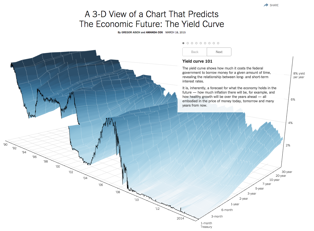
In this pilot episode the great Gregor Aisch from the New York Times agreed to describe in detail how the amazing 3D Yield Curve Chart has been realized.
As many of you may know, 3D visualization has not a very good reputation among data visualization experts, yet Gregor and Amanda managed to create a super interesting and useful 3D chart.
Gregor shows us where the idea originated from, all the crazy details about how to create a 3D chart that people can actually read, and how to calculate optimal views and a good narrative out of it.
Enjoy the new TV show! We are looking forward to hearing from you.
P.S. A big big thank you to Gregor for accepting to shoot this video with these two totally unexperienced video editors! 🙂 Thanks Gregor, that was awesome!
Hi folks! We have Benedikt Groß with us on the show. Benedikt defines himself as a “speculative and computational designer who works antidisciplinarily.” Benedikt graduated from the Design Interactions course at the Royal College of Art and he works for his studio in Stuttgart, Germany. He is the co-author of ‘Generative Design,’ one of the standard books on the topic.
In the show we talk about some of his amazing data projects at the intersection of art, design, science, sociology, etc. Aerial Bold, for instance, is a project about searching satellite images to find buildings and geographic features that look like letters. The Big Atlas of LA Pools, is a project about mapping all pools in LA. And Population.io is about showing demographic data in an engaging way and even giving you a prediction of when you are going to die! This is an amazing episode with stories about how Bill Gates crushed Population.io with one tweet, how they published 74 books of pool images totaling about 6000 pages, and how they outsourced some of the work to an Indian company to trace the pools. Amazing stuff!
Hey yo, we have Jen Christiansen from Scientific American with us in DS#52.
Jen is art director of information graphics at Scientific American magazine where she is been for about then years and she has a background in natural science illustration from the University of California, Santa Cruz.
Science communication is one of our favorite topics and we are so happy to have such an amazing expert like Jen on the show. Jen reveals the nitty gritty of scientific visualization and illustration as experienced by one of the top scientific communication magazines in the world.
“How does a scientific piece come to life? Where does an idea for a new piece come from? How do they interact with the scientists to make sure everything they report is accurate and yet accessible for a broad audience? And what does need to be done before an illustration gets ready for print?”
We discuss this and many other questions with Jen. Enjoy the show!


 He wrote the very interesting Disinformation Visualization piece for Tactical Tech’s Visualizing Information for Advocacy and we decided to invite him to discuss the million different facets of disinformation through visualization.