Hi Folks, great news … we are experimenting with a new format for Data Stories that includes … that includes … that includes … guess whaaaaaat? Video!
After having heard many many times that it’s hard to imagine how a visualization looks like when we are talking about it, we have decided to experiment with a new format.
This is for now just a pilot to see how you guys react, so we would love to hear your feedback about how you like it and how we can improve.
To be clear: we are not planning to substitute our regular podcast with this, we are trying to build a parallel channel.
—
Here’s the video!
https://vimeo.com/datastories/datastories-tv-00
—
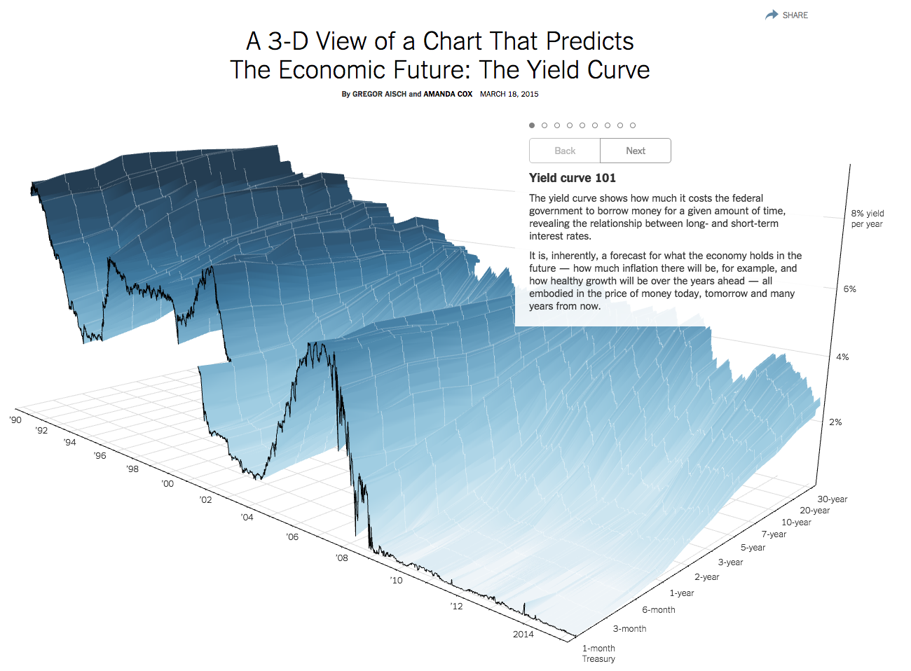
In this pilot episode the great Gregor Aisch from the New York Times agreed to describe in detail how the amazing 3D Yield Curve Chart has been realized.
As many of you may know, 3D visualization has not a very good reputation among data visualization experts, yet Gregor and Amanda managed to create a super interesting and useful 3D chart.
Gregor shows us where the idea originated from, all the crazy details about how to create a 3D chart that people can actually read, and how to calculate optimal views and a good narrative out of it.
Enjoy the new TV show! We are looking forward to hearing from you.
P.S. A big big thank you to Gregor for accepting to shoot this video with these two totally unexperienced video editors! 🙂 Thanks Gregor, that was awesome!