We have Dietmar Offenhuber, Assistant Professor at Northeastern University, on the show again to talk about “Indexical Visualizations”: visualizations that reduce the gap between the recorded phenomenon and its representation.
In Dietmar’s words: “If we understand ‘data’ as a collection of symbolically encoded observations, could we think of a display that conveys information—without the symbolic encoding of data—through the object itself?”
On the show we talk about strategies to define and build indexical visualizations. Dietmar provides numerous examples, including thermometers, tree rings, petri dishes, and the blinking lights in your router. He also offers tips on experimenting with this kind of visualization and connecting to the indexical vis community.
This episode is sponsored by Tableau. Tableau helps people see and understand their data. Tableau 10 is the latest version of the company’s rapid fire, easy-to-use visual analytics software. It includes a completely refreshed design, mobile enhancements, new options for preparing, integrating and connecting to data and a host of new enterprise capabilities. You can find more information on the upcoming Tableau 10 here.
Living tomato ripeness chartt http://imgur.com/AMYSUi1
Natalie Jeremijenko’s Clear Skies Facemasks that visualize urban air quality
The Cyanometer Is a 225-Year-Old Tool for Measuring the Blueness of the Sky http://www.thisiscolossal.com/2014/05/the-cyanometer-is-a-225-year-old-tool-for-measuring-the-blueness-of-the-sky/
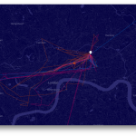
Kamel Makhloufi: Pixellating the War Casualties in Iraq https://www.flickr.com/photos/melkaone/5121285002/
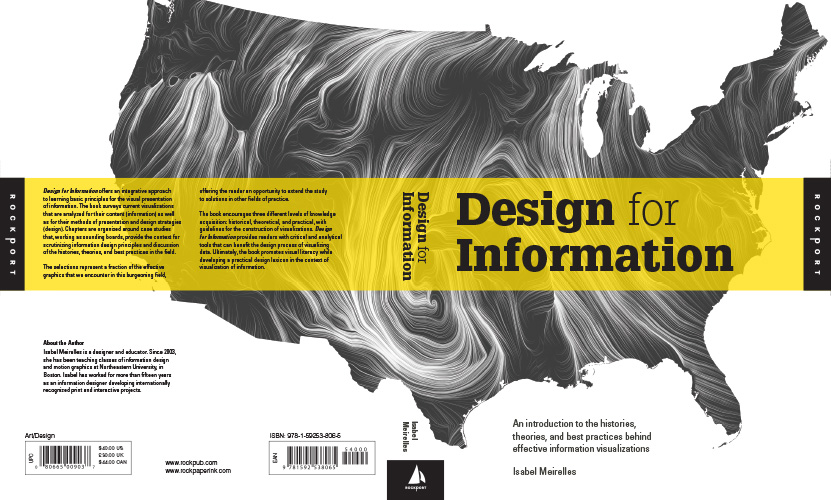
Isabel Meirelles is Professor in the Faculty of Design at OCAD University in Toronto, Canada. She is the author of Design for Information, a lovely data visualization book featuring pages of beautiful illustrations and loads of data visualization science. On the show we talk about how Isabel came to write the book, how she designed its content and structure, and how it is now being used for teaching.
We also talk about Information Plus, the data visualization conference she co-organized and took place last June in Vancouver, Canada at Emily Carr University. The conference brought together a whole host of amazing speakers and gained tons of attention from the Twitter-sphere.
Enjoy the show!
This episode of Data Stories is sponsored by Qlik, which allows you to explore the hidden relationships within your data that lead to meaningful insights. Any Formula 1 fans out there? Check out this Qlik Sense app which gives you the history of every race and where each competitor finished. And make sure to try out Qlik Sense for free at: qlik.de/datastories.
Mimi is fascinated by the moment when data get collected — by what can be captured in that moment, and what goes unseen. As a Fulbright-National Geographic Fellow, Mimi developed Pathways, a data storytelling project on a month’s worth of mobile data from a small group of Londoners. Using a quasi-ethnographic approach, the project reflects not only the individuals’ mobile metadata, but also their experiences becoming data subjects.
On the show, we discuss Mimi’s process recruiting both friends and strangers to become her data subjects, her experience developing personal relationships with each of them, and their reaction to the final product.
This episode of Data Stories is sponsored by Qlik, which allows you to explore the hidden relationships within your data that lead to meaningful insights. Ever wondered what it costs to live in Singapore or Sydney? Check out the Qlik Sense app “Cost of Living” to answer that question and many others! And make sure to try out Qlik Sense for free at: qlik.de/datastories.
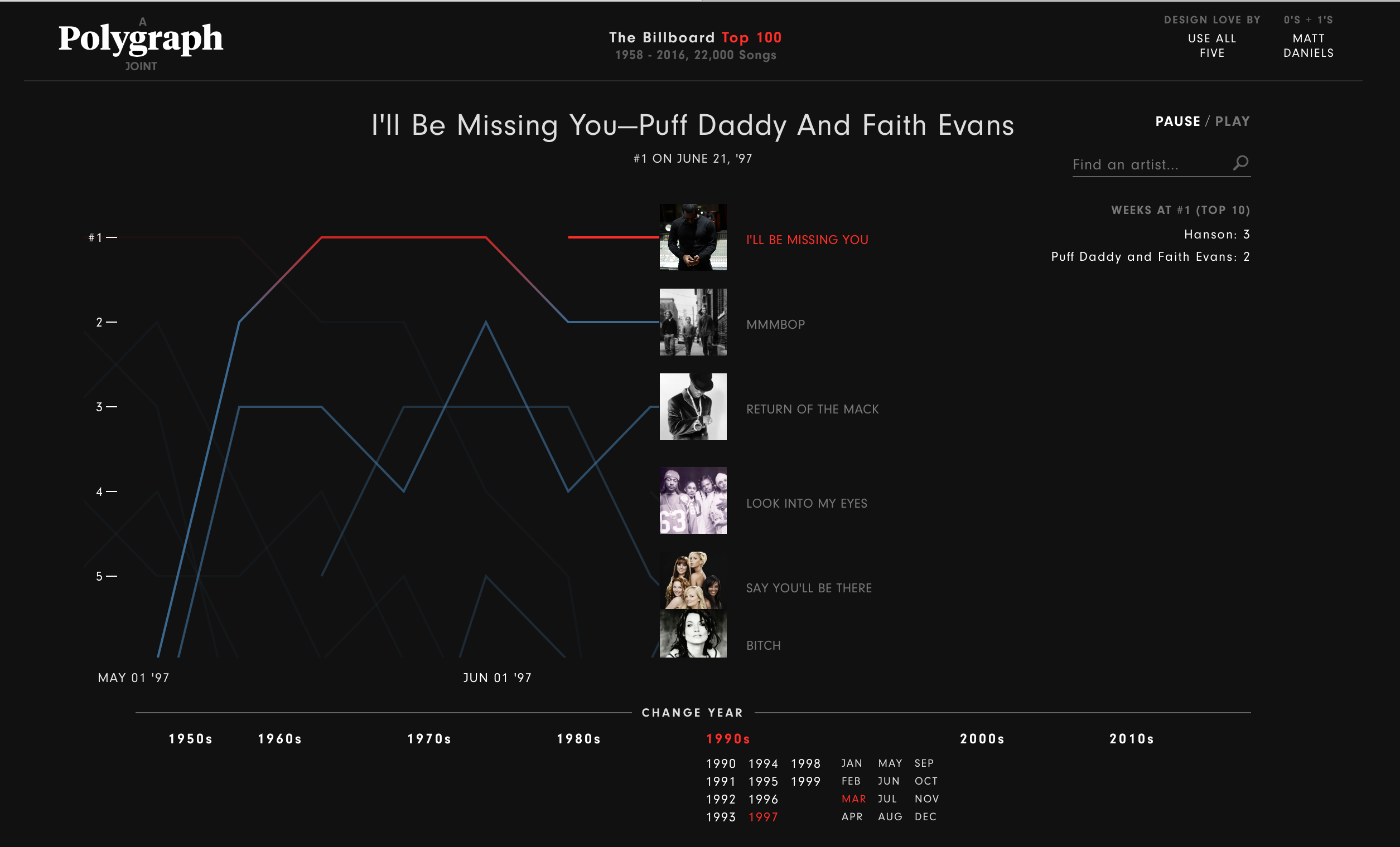
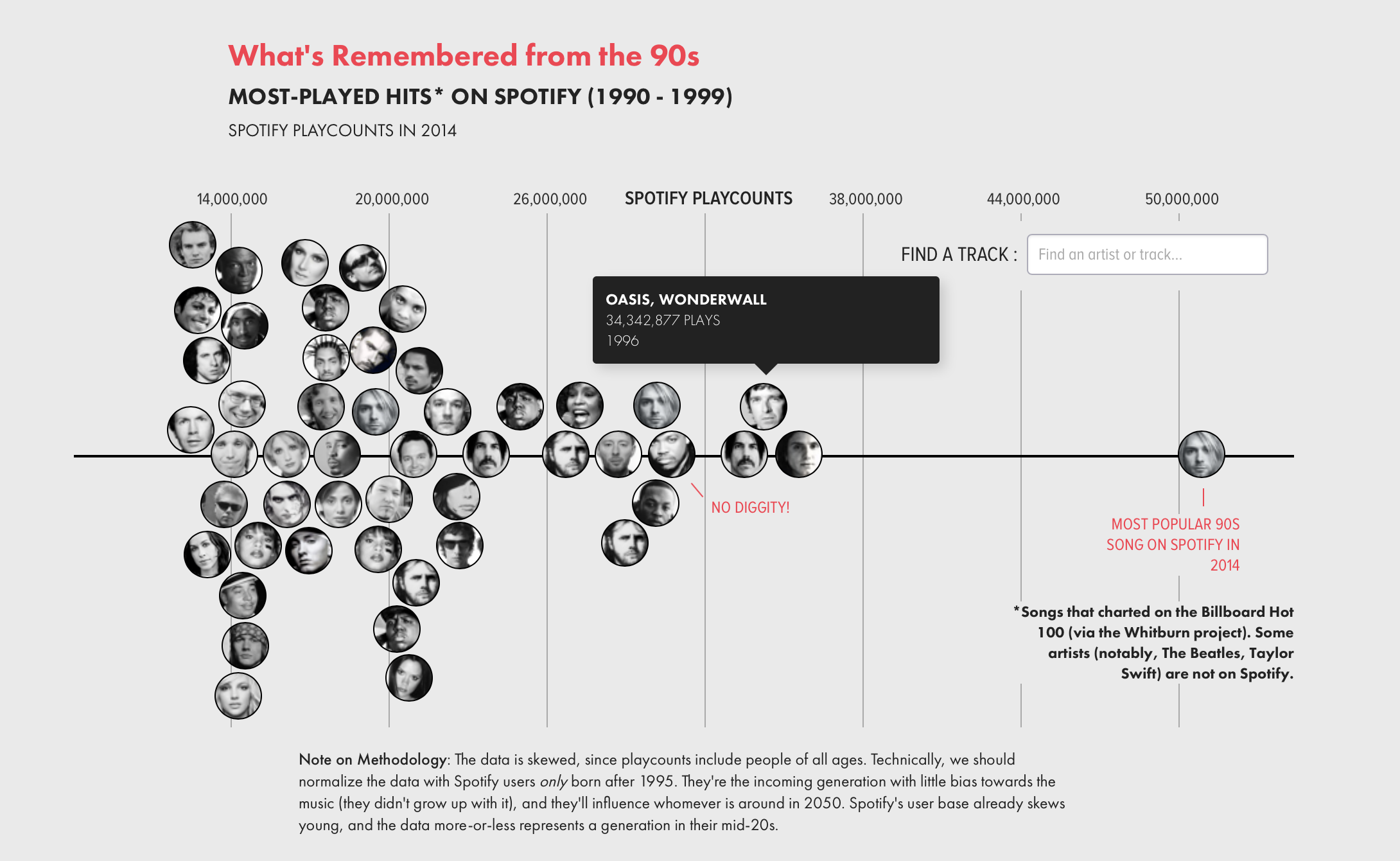
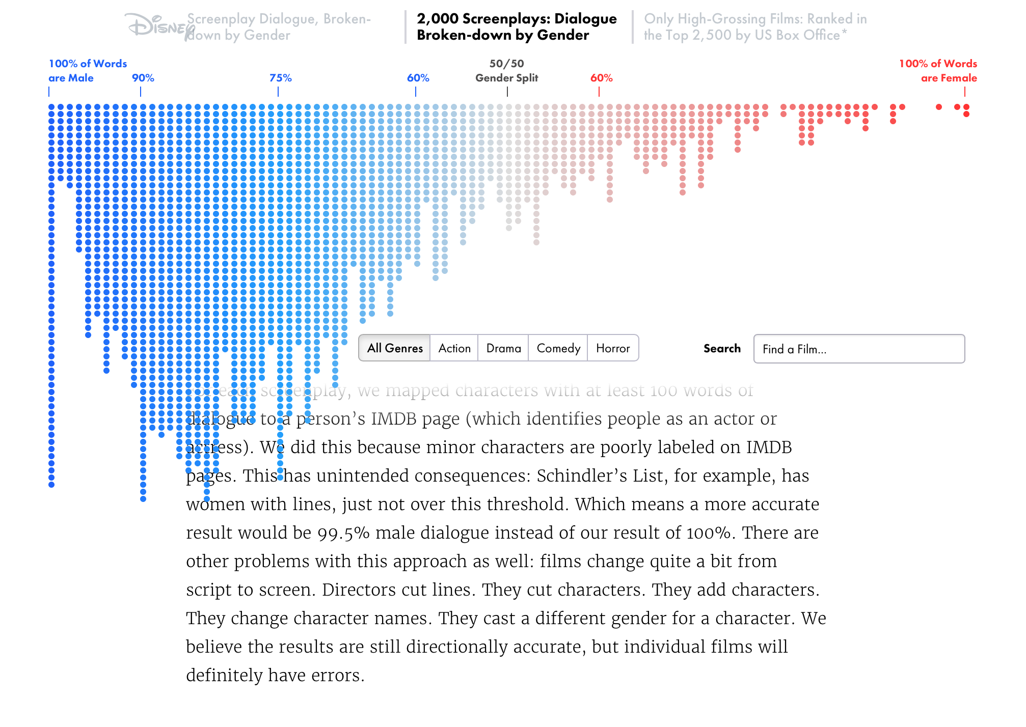
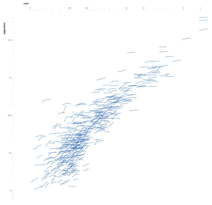
We have Matt Daniels on the show, the “journalist engineer” behind Polygraph, a blog featuring beautiful journalistic pieces based on data. If you are not familiar with the site, stop now and take a look.
Matt starts with a simple question — for example, what songs from the ’90s are still popular? — and tries to answer it through data analysis and visualization. The result is always a well-crafted web page and applications, with a mix of data analysis, interactive graphics, and explanations.
This episode of Data Stories is sponsored by CartoDB. CartoDB is an open, powerful, and intuitive platform for discovering and predicting the key facts underlying the massive location data in our world. Whether you are a business, government agency, or simply a lover of revolutionary spatial insight technology, don’t settle for anything less than the best interactive maps around. Learn how CartoDB is shaping the world of location intelligence at cartodb.com/gallery and check out the Location Data Services mentioned in the ad.
On the show this week we have Irene Ros, Jim Vallandingham, and Yannick Assogba from the data visualization team of Bocoup. We talk about how they collaborate with other groups to create open-source data visualization software. We also talk about OpenVis Conference, the successful and innovative visualization event they organize each year, as well as the cool visualization projects they develop internally.
This episode of Data Stories is sponsored by CartoDB. CartoDB is an open, powerful, and intuitive platform for discovering and predicting the key facts underlying the massive location data in our world. Whether you are a business, government agency, or simply a lover of revolutionary spatial insight technology, don’t settle for anything less than the best interactive maps around. Learn how CartoDB is shaping the world of location intelligence at cartodb.com/gallery.
Dear friends, we are really excited to publish our first “data sonification” episode ever! After many years of searching for the right person, subject and format, we are happy to publish this fantastic episode with Scott Hughes from MIT. Scott is an astrophysicist and a key figure at LIGO, the laser interferometer project that finally allowed scientists to “listen” to the sound of two colliding black holes.
Here Scott talks about how he decided to sonify his data and how sonification is being used by scientists to understand astrophysical phenomena.
Listen as we play a number of samples; Scott walks us through their meaning and the physics behind them. It’s really really cool. Warm up your ears!
You can also listen to some samples from Scott Hughes and his team here:
Simulation of a final collision of two massive black holes, what Scott calls “the ringing mode” of a black hole. All that is audible is the last “pop” of the system settling down to a single black hole.
Two objects moving past each other in space. The gravitational waves in this case are loud when the small body moves close to the large body (its motion is fast during that part of the orbit), and they are quiet when the small body is far away (when its motion is slow).
Also, take a look at the many links that we have added below. You can listen to the sounds yourself and discover a number of additional sonification projects.
Huge thanks to Scott for spending so much time with us preparing the sounds and recording the show. We loved it!
This episode of Data Stories is sponsored by CartoDB. CartoDB is an open, powerful, and intuitive platform for discovering and predicting the key facts underlying the massive location data in our world. Whether you are a business, government agency, or simply a lover of revolutionary spatial insight technology, don’t settle for anything less than the best interactive maps around. Learn how CartoDB is shaping the world of location intelligence at cartodb.com/gallery.
We have Eleanor Saitta on the show to talk about data privacy. Eleanor is “a hacker, designer, artist, writer, and barbarian.” She is also Etsy’s new Security Architect.
During our chat we discuss the fine line between the excitement of being able to work with great data sets and the many — oftentimes unexpected — privacy risks associated with it.
This episode of Data Stories is sponsored by Qlik, which allows you to explore the hidden relationships within your data that lead to meaningful insights. Make sure to check out the data visualization mapping tutorial on the Qlik Blog. You can try out Qlik Sense for free at: qlik.de/datastories.
Kim works in a team of scientists to create effective and beautiful visualizations that explain complex scientific phenomena.
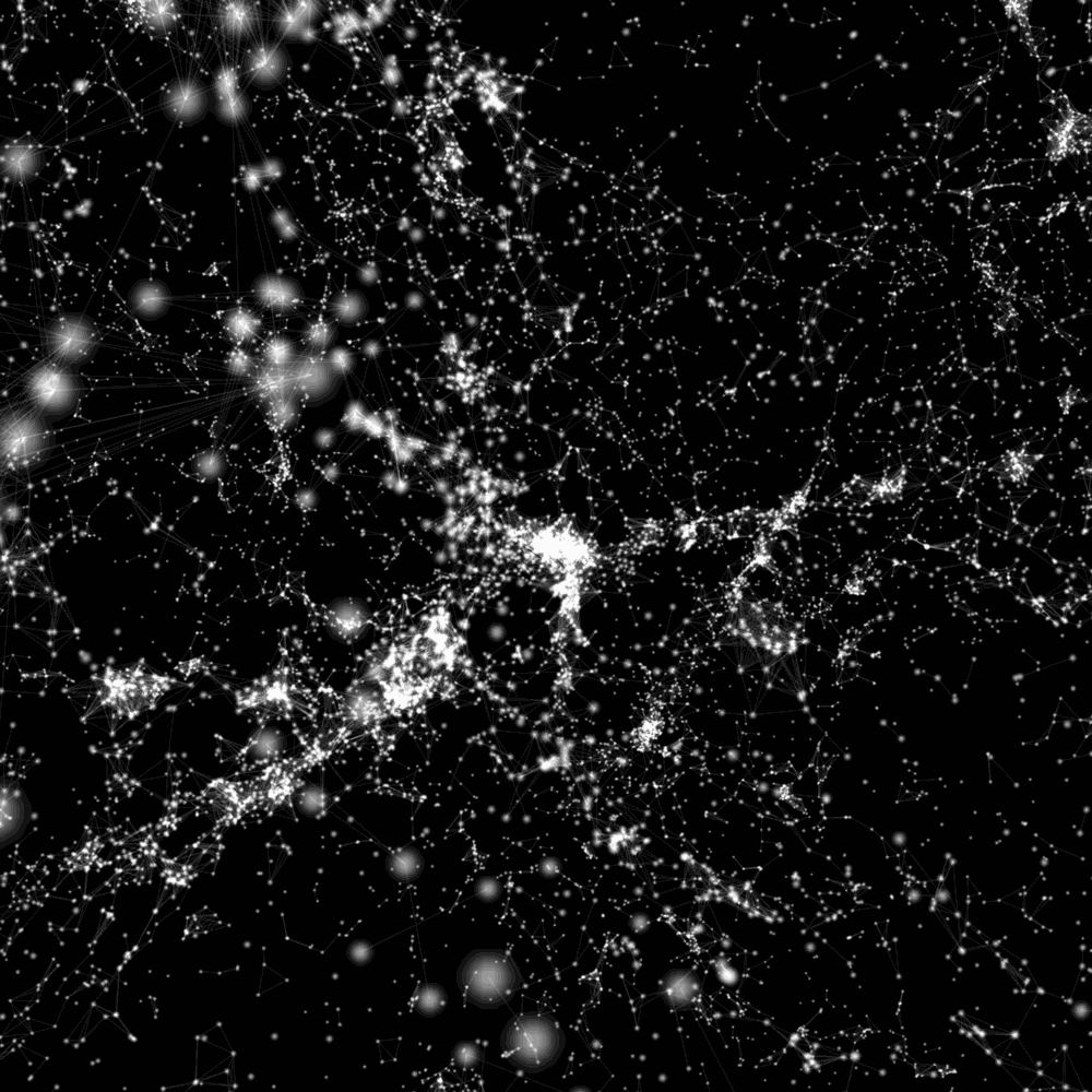
In the show we focus on Untangling Tennis, a data visualization project aimed at explaining the relationship between popularity and athletic performance. We also talk about his more recent project, the Cosmic Web, which visualizes 24,000 galaxies and their network of gravitational relationships.
Enjoy the show!
This episode of Data Stories is sponsored by Qlik, which allows you to explore the hidden relationships within your data that lead to meaningful insights. Make sure to check out the blog post listing Visualization Advocate Patrik Lundblad’s favorite data visualization pioneers. You can try out Qlik Sense for free at qlik.de/datastories.
Jeff Heer is Associate Professor at the University of Washington where he leads the Interactive Data Lab (IDL). Jeff has worked on many visualization libraries and software programs, including Prefuse, Flare, Protovis and the widely adopted D3 (with his former PhD student Mike Bostock). Jeff is also the co-founder of Trifacta, a data analytics company focused on data wrangling.
On the show we talk about many interesting research tools and products developed in Jeff’s lab, including Vega, Voyager and Lyra. We also talk about Trifacta and the challenges and promises of visualization research.
Enjoy the show!
Data Stories is brought to you by Qlik, which allows you to explore the hidden relationships within your data that lead to meaningful insights. Let your instincts lead the way to create personalized visualizations and dynamic dashboards with Qlik Sense, which you can download for free at www.qlik.de/datastories. Make sure to check out their post on truth & beauty (!) at the Qlik blog.
Hey guys, this is a special edition from Tapestry, the conference on Data Storytelling that brings together visualization experts, journalists, designers, NGOs, academics, and more.
Enrico sits down with Robert Kosara to recap the conference, especially the keynotes and some of the short story talks. Plus, Robert fills us in on how to participate in Tapestry conferences in the future.
The transcript for this episode is available here.
Data Stories is brought to you by Qlik, which allows you to explore the hidden relationships within your data that lead to meaningful insights. Download Qlik Sense for free at http://www.qlik.de/datastories. For all Quantified Selfers, a senior member of Qlik’s Demo Team, Michael Anthony, has published his 2015 “My Life In Data” Report, where he tracks life events including miles run, coffees consumed, commuting mileage, food eaten and more!


 We have Matt Daniels on the show, the “