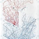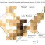
We have Dietmar Offenhuber, Assistant Professor at Northeastern University, on the show again to talk about “Indexical Visualizations”: visualizations that reduce the gap between the recorded phenomenon and its representation.
In Dietmar’s words: “If we understand ‘data’ as a collection of symbolically encoded observations, could we think of a display that conveys information—without the symbolic encoding of data—through the object itself?”
On the show we talk about strategies to define and build indexical visualizations. Dietmar provides numerous examples, including thermometers, tree rings, petri dishes, and the blinking lights in your router. He also offers tips on experimenting with this kind of visualization and connecting to the indexical vis community.
If you enjoy this episode you may also want to listen to our previous episode with Dietmar and to our “data sculptures” episode with Domestic Data Streamers.
Enjoy the show!
This episode is sponsored by Tableau. Tableau helps people see and understand their data. Tableau 10 is the latest version of the company’s rapid fire, easy-to-use visual analytics software. It includes a completely refreshed design, mobile enhancements, new options for preparing, integrating and connecting to data and a host of new enterprise capabilities. You can find more information on the upcoming Tableau 10 here.
LINKS
- OddOne (who made our new title music)
- Dietmar Offenhuber: http://offenhuber.net/
- Paul Slovic’s “Psychic Numbing”
- Example: Kamel Makhloufi’s Iraqi casualties
- Example: Hydrogen sulfide measurement
- Documentation from Indexical Design Symposium
- Photoviz book from Nicolas Felton
- Related Data Stories episodes:
- Book chapter: Offenhuber, Dietmar, and Orkan Telhan. 2015. “Indexical Visualization—the Data-Less Information Display.” In Ubiquitous Computing, Complexity and Culture, edited by Ulrik Ekman, Jay David Bolter, Lily Diaz, Morten Søndergaard, and Maria Engberg, 288–303. New York: Routledge.
- Other examples:


