Hey yo! We are back!
We have a very researchy kind of episode this time. Jessica Hullman is on the show to talk about her research on narrative visualization. Jessica is a Postdoctoral Fellow at Berkeley and soon to be Assistant Professor at University of Washington iSchool.
In the show we talk about lots of interesting basic visualization research issues like visualization literacy, bias and saliency, uncertainty, and some interesting automated annotation systems that Jessica has developed.
We also talk about Jessica’s background in experimental poetry!
Have fun.
—
Links
Hi there!
We have been chasing Paolo for a while and eventually we managed to have him on the show. Paolo is Associate Professor at Politecnico di Milano and he is the founder of Density Design, a lab with an interesting mix of research, design and visualization.
With Paolo we talk about all things at the intersection of design and visualization, including a very interesting digression on architecture and how it helped him in the development of the lab. We also talk about how to teach design and the role of Visualization in the Humanities.
We also talk about Raw, an online visualization tool they developed which has recently gained quite some popularity (if you don’t know it you should try it).
Enjoy the show!
—
Links

Hey yo … super cool guest today on Data Stories. We have data artist Jer Thorp for a whole episode on Data Art and Visualization. We managed to catch him before he leaves for a deep dive in a submarine next week.
Jer is former artist in residence at New York Times R&D Labs and now he is the co-founder of the Office For Creative Research, a studio/lab that mixes science and art. Among many other things he is the creator of the algorithm and software tool “to aid in the placement of the nearly 3,000 names on the 9/11 Memorial in Manhattan” and Cascade, a tool to visualize “the sharing activity of New York Times content over social networks.”
In this episode we talk about his past and new projects, teaching art and vis and the many intersections between art and science.
[Big thanks to Nathan Griffiths for audio-editing the episode!]
Links
Related episodes

Hi all,
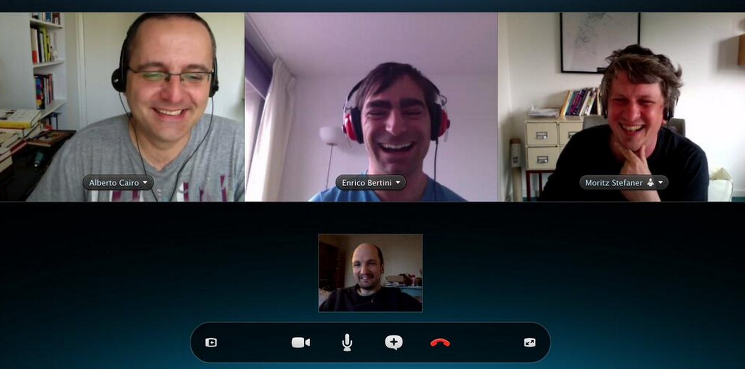
Hot topic today! We invited Alberto Cairo and Robert Kosara to discuss the role of storytelling in visualization. What is storytelling? Is all visualization storytelling? Should we always strive for telling a story? How does storytelling match with exploratory visualization? Should we aim more for worlds and macroscopes than stories as Moritz advocated a while back at Visualized? We went on a somewhat lengthy discussion on these topics and I think we all ended up agreeing on a lot of things and developed a much more nuanced view of storytelling. As you can see from the picture we had lots of fun (thanks Robert for taking the screenshot). Fantastic chat!
Note: Alberto had a lot more to say after the episode so he decided to publish a follow up post that clarifies some of the things he said on the show. But — spoiler alert — listen to the episode first! 🙂
P.S. Big, big thanks to Fabricio Tavares for taking care of the audio editing of this episode!
—
Links
[Thanks to our audio editor Nathan Griffiths (twitter.com/njgriffiths) for taking care of this episode]
Hi everyone!
After a long while … we have a real British voice on the show again! In this episode we have the pleasure to host data journalist Simon Rogers.
Simon has been leading data journalism initiatives at The Guardian for many years and he recently moved to Twitter (with the official role of Data Editor) where he takes care of creating visual stories out of Twitter data.
In the show we talk about his past experience at The Guardian as well as the more recent and exciting developments at Twitter.
Links

Hi folks,
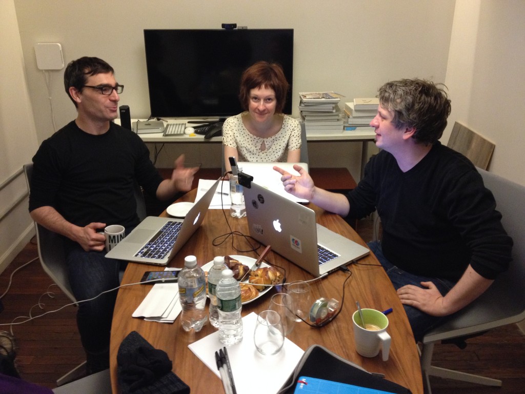
We have Giorgia Lupi from Accurat on the show with us this time in our first real face-to-face episode ever — yes Moritz and Enrico in the same room!
Giorgia’s work, and generally the work done by her agency, has been super popular lately. You might have seen, for instance, their work visualizing Nobel Prizes or visualizing painters’ lives.
Giorgia kindly hosted us in the Accurat’s studio in New York where we had a nice chat on hand-crafted visualization, high-density designs, design studios, and much much more.
Here is us arguing even before starting the recording 🙂
Enjoy the show!
—
Links
Happy 2014!
Here we go folks. Another year has passed. We review what was big and major trends in 2013 and what to expect in 2014.
We have two old DS friends on the show to help us with the review: Andy “Visualisingdata” Kirk and Robert “Eagereyes” Kosara.
Important announcement: in 2014 we want to hear more from you! Please feel free to contact us to ask questions, we will address them in our upcoming podcasts. You can also suggest new guests or topics you would like us to cover. You can reach us through: Twitter (@datastories) | Facebook | Email: mail@datastori.es. We are looking forward to hearing from you!
Take care.
—
Links
Hi there,
We have Marian Dörk on the show today to talk about the “Information Flaneur”: an approach to data visualization centered on navigating, exploring, browsing and observing data with curiosity to learn about what’s there, and to see and be surprised by new thoughts and discoveries.
Marian is Research Professor at the University of Applied Sciences Potsdam near Berlin where he works on “exploring novel uses of interactive visualizations to support a wide range of information practices.”
We talk about many interesting new directions for visualization like visualizing data starting from a few seed points, whether we always need an overview first in visualization, and tips on how to design visualization for “information flaneurs.”
Enjoy the show!
—
Links
Hi Everyone,
We have a super guest this time on the show! Ben Shneiderman joins us to talk about his new treemap art project (beautiful treemap prints you can hang on the wall), treemaps and their history, and information visualization in general. Needless to say, we had a wonderful time chatting with him: lots of history and very inspiring thoughts (tip: we should look at vis 50-100 years from now!)
Take care.
—
Links
Papers
- Bruls, Mark, Kees Huizing, and Jarke J. Van Wijk. “Squarified treemaps.” Data Visualization 2000. Springer Vienna, 2000. 33-42. [First algorithm taking care of aspect ratio]
- Bederson, Benjamin B., Ben Shneiderman, and Martin Wattenberg. “Ordered and quantum treemaps: Making effective use of 2D space to display hierarchies.” AcM Transactions on Graphics (TOG) 21.4 (2002): 833-854. [paper with extensive evaluation of alternative treemap layouts]
- Ahlberg, Christopher, Christopher Williamson, and Ben Shneiderman. “Dynamic queries for information exploration: An implementation and evaluation.” Proceedings of the SIGCHI conference on Human factors in computing systems. ACM, 1992.
Hi Folks!
We did it again: we have a special episode directly from IEEE VIS’13 (the premier academic conference on visualization). Enrico caught Robert Kosara and recorded almost one hour of highlights from the conference. And there is a final message for Moritz too! Don’t miss it.
Take care.
—
Links (some of the papers mentioned):
Related episodes