Category: Episodes

008  |  Interview with Jeff Heer

Hi Folks,

We are raising the bar here!

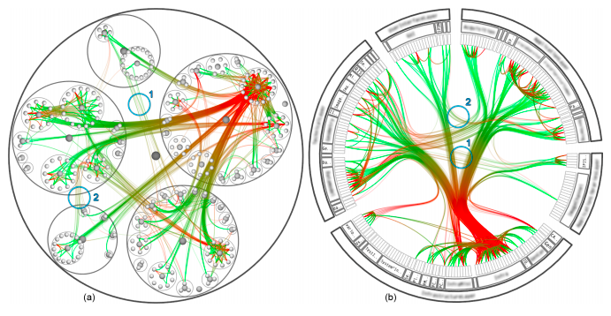
In this new episode we have Jeff Heer, Assistant Professor at Stanford and creator of 4 (!) data visualization toolkits/languages (Prefuse, Flare, Protovis, D3).

Jeff is a very well regarded researcher in the area of visualization, user interfaces and human-computer interaction. If you don’t know him yet we strongly encourage you to give a look to his projects web page, you’ll find lots of cool stuff there like his studies on Graphical Perception and Wrangler, a data pre-processing tool.

Talking with Jeff has been great and very inspiring. We talk about past, present and future of visualization; everything dressed with LOLs, a bit of gossip and … one scoop at the end of the podcast!

Have fun,
Enrico & Mo

Episode Chapters

[00:00:00] Introduction: Today’s special guest – Jeff Heer
[00:03:12] Investigating complete data interaction flows, and how visualization can help
[00:06:47] Data wrangling
[00:09:50] Prefuse, flare, protovis, d3
[00:10:44] prefuse
[00:14:52] flare
[00:17:05] protovis
[00:22:17] d3
[00:28:52] Comparing the different paradigms
[00:35:06] What’s next?
[00:38:33] Flexible tools for data exploration
[00:41:42] How to bridge research and practice?
[00:49:44] Function vs. aesthetics?
[00:53:33] Is there a future for high-end customized visualization?
[00:56:02] Why is visualization so popular right now?
[01:01:18] The future of visualization
[01:14:06] Super secret start-up in formation!

007  |  Color (feat. Gregor Aisch)

moritzstefaner

Folks,

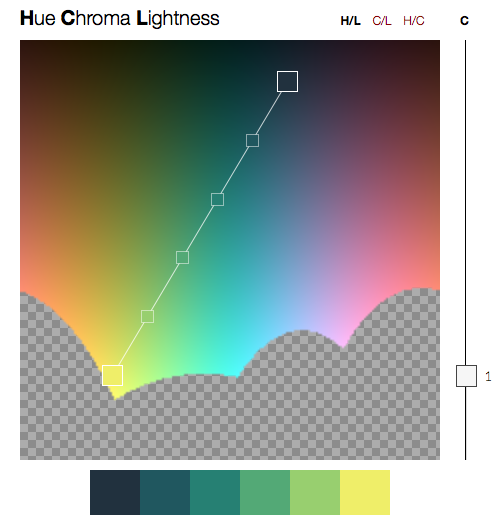
Here is another great episode … honestly I think it’s one of the best we have ever recorded (-Enrico). We talk about color, and color – you know … it’s huge. To get some help we invited Gregor Aisch from Driven By Data and asked him to talk about his experience with color and his super useful library chroma.js.

We have to apologize for a number of things. The episode came out late, the quality is not super high and we have no transcribed chapters this time. No worries, this won’t happen again (or too often) and we have no intention to neglect DS. Moritz has been traveling and taking days off in beautiful Greece and Enrico was just having another baby.

Update: Useful color tools suggested by some of you

  • http://www.colourlovers.com/
  • http://kuler.adobe.com/ (love this!)
  • http://colorusage.arc.nasa.gov/ColorTool.php

Update: Here is the chapter list! We just could not let such a great episode go without proper chapter marks…

[00:00] Intro: Today with Gregor Aisch from http://driven-by-data.net
[02:04] Computational Visualistics
[03:32] Today’s topic: Color
[03:46] Family drama interlude
[04:08] Colors: Powerful, but tricky to get right
[04:50] Color perception
[09:55] Color spaces
[15:39] Colors for categorical data
[17:20] What’s the maximum number of categorical colors to be used?
[19:40] Equidistance
[20:15] Colorbrewer
[23:13] chrome.js
[25:56] Colors for continuous data
[26:41] Mo’s six word advice
[27:04] Color for continuous data – usually not advisable
[30:14] Rainbow scales
[30:48] …and how to avoid them
[33:17] Color is difficult
[35:07] More tips on how to do it right
[37:29] Is there a method behind ugly visualization in science?
[38:58] Paper: Evaluation of artery visualizations
[42:39] How to deal with skewed distributions
[46:19] Learn about the data, highlight the interesting insights
[48:12] Redundant encoding and interaction between visual variables
[51:13] Use for secondary dimensions, or small number of categories
[52:57] Mo’s tips
[54:04] Don’t forget the legend
[54:34] Gregor’s tips
[56:07] Above all, do no harm.
[56:43] Enrico’s tips
[58:27] Wrapping it up

And stay tuned for another episode soon! We will have Jeff Heer on board! If you have any questions for him add a comment below or send us an email (see address in the right).

Take care and have fun!

Enrico and Moritz.


Related episodes

006  |  On Food

Hi Folks!

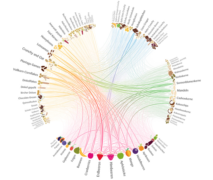
In this episode we talk about food. Food? Yes, food. Moritz recently created the Müsli Ingredient Network, a visualization of ingredient combinations in müsli, and we took this as an opportunity to talk about one of our favorite topics other than visualization, that is, food. But hey … there is a lot to visualize about food! Listen to the episode and you’ll see it.

Visualizations discussed in detail:

Mo’s Müsli Network

Mo’s Müsli Matrix

Barabasi’s Flavor Network

Episode breakdown:

[00:00] Intro
[02:18] Today’s topic – food!
[02:46] Moritz’s Muesli ingredient network
[10:13] Barabasi’s food ingredient analysis
[16:20] Are scientific papers the best way to communicate research?
[18:19] Food pairing website
[19:23] Visualizing food 40 ways
[21:02] How America spends food and drink spending per city
[22:49] Use food to represent data
[24:32] Personal data
[24:55] Nutrition data
[28:26] Self nutrition data
[30:25] Maragrida’s email: Data sexuals
[31:15] Big data – overrated?
[33:09] Hourly webcam shots
[34:57] Manually collected data
[36:20] Should you learn to code? (Sakshita’s comment)
[39:55] Wrapping it up

Links and Images:

As usual your feedback is more than welcome. And let us know if you intend to do some visualization with food data. Have fun!

005  |  How To Learn Data Visualization (with Andy Kirk)

Hi Folks! We love Andy so much that we decided to keep him with us for another episode (well, actually we hope somebody will eventually pay the ransom). This time we talk about “learning visualization”, which is the perfect topic for him given his experience with his training visualization courses.

We received many requests from people who wanted to know how to learn visualization in the past. So, here we are with a more than one hour long podcast with the three of us talking about it. We just hope you’ll find the time to listen to the entire episode. If not, the breakdown below can help you chunking it into a few sessions. Have fun!

Breakdown of the episode

Introductory thoughts
00:00:00 Intro, Andy Kirk (http://visualisingdata.com) is again our guest
00:01:15 Topic: How to learn visualization
00:01:56 Multidisciplinarity
00:06:31 Reports from teaching practice
00:09:21 Theory and practice – rules vs, free exploration
00:12:24 Do you need to start with a question?

Basic skills
00:15:43 What is the basic skill set to learn?
00:16:15 Visual variables
00:18:53 Statistics and data analytics
00:19:32 Gestalt laws
00:20:32 The journalistic sense – what is an interesting angle?
00:22:19 Position is everything
00:23:38 Color is difficult

Process and tools
00:25:05 Tools
00:26:18 Data types and repertoire
00:27:15 Metaphors
00:28:52 Interaction
00:31:27 The role of design
00:32:57 How to get started?

Learning options and books
00:39:46 Everybody should have a datavis course!
00:41:32 How to learn it yourself? Books, lectures, …
00:42:39 Stephen Few: Show me the numbers
00:43:20 Andy’s first book, and mo is the cinderella of datavis
00:43:52 Readings in Information Visualization: Using vision to think
00:45:09 Edward Tufte: Visual display of quantitative information
00:46:05 Ware: Information Visualization – Perception for Design
00:47:42 Misc.
00:49:23 Our scoop!
00:52:03 Google for “information visualization lecture pdf”

The craft of visualization design
00:53:43 Now that you know everything – how to do it in practice?
00:55:01 DIY vs. template-based tools
00:57:01 Do you need to learn how to program? Yes, yep, yes, yeah. Me too.
00:58:36 Tools
01:00:17 Finding data
01:02:28 Put it out there
01:04:08 The pathetic misery that is creating data visualizations

Conclusion
01:05:52 Trying to wrap it up
01:07:13 see conference – and see+
01:08:44 Trying to wrap it up – again!

Resources and Links

That’s all folks. Let us know how you like it and feel free to ask more questions if you have.

004  |  Malofiej 20 (with Andy Kirk)

We have our first guest on the show! Andy Kirk and Moritz just came back from Malofiej 20, the Infographic World Summit, and we used the chance to discuss our impressions of the event — the conference, the awards, the workshops and the general vibe.

Breakdown of the episode

[00:00:00] Intro and welcome to our guest Andy “Not McCandless” Kirk from visualisingdata.com
[00:02:31] Malofiej: what is it, how did we there and some history
[00:07:20] Pamplona lifestyle
[00:08:42] Stockholm syndrome or best friends forever?
[00:10:08] Conference talks in short
[00:10:23] Gonzalo Peltzer
[00:12:12] Andrew Vande Moere
[00:14:02] Moritz Stefaner (slides)
[00:16:13] Andy “Big Data” Kirk (slides)
[00:23:00] Sheila Pontis
[00:25:15] Bryan Christie
[00:27:39] Simon Rogers
[00:28:47] Robert Kosara
[00:30:44] Alberto Cairo
[00:31:59] Anne Gerdes, Nora Coenenberg
[00:33:42] Nigel Holmes
[00:35:20] Matthew Bloch
[00:37:15] Ginny Mason
[00:39:14] Carl DeTorres
[00:41:34] Jaime Serra
[00:44:17] Sergio Pecanha
[00:45:50] Mario Tascon (@mtascon)
[00:46:43] The awards
Winner list (pdf)
Gold medals with Jury remarks
All online winners with links [colorful-data.net]

[00:49:49] New York Times dominates
[00:51:22] Best of show: Guantanamo Detainees
Print piece (and some background info)
Online

[00:53:49] New York Times again
[00:58:17] Internet Group do Brasil
[00:58:49] Resumé
[01:03:02] What is an information graphic, after all?
Images of the Devastation Along Misurata’s Main Road
Part Ape, Part Human

[01:05:25] We should all submit our online works
[01:06:27] We just can’t finish


The jury + speaker crowd

More on Malofiej 20

003  |  How do you evaluate visualization?

Hi there, we made it to the third episode (a bit late though, Moritz was travelling to SXSW).

In this episode we first answer to some of the questions we received and then we move on to the main topic: how do you evaluate visualization? We have been discussing some contests in episode #2 and thought evaluation is really a key issue there.

Breakdown of the episode

[00:00] Intro
[01:34] Listener question: Terms and conditions in competitions
[03:46] Listener question: Connect research and practitioners
[07:43] Listener question: How to stay objective about your own work?
[10:23] Listener question: Do we criticize each other?
[11:15] Listener question: How to introduce business people to benefits of visualization beyond Excel?
[13:58] News: Visualizing sprint
[15:54] News: Kartograph
[19:40] SxSW Panel: Intent and Impact: How Visualization Makes a Change
[21:36] Quality criteria and evaluating information visualizations: traditional academic approach
[28:08] Evaluation beyond simple, clear-cut tasks
[33:13] Enrico admits his secret love of David MacCandless
[33:58] Andrew Vande Moere and Helen Purchase: On the role of design in information visualization
[35:00] Truth and Beauty or: “I know it when I see it”
[38:36] Data politics and importance of how the end product came about
[40:36] Tamara Munzner’s nested model for visualization evaluation and design
[44:25] Code of ethics
[45:59] Wrap up and outlook

Links and images

Research papers mentioned in the episode

Have fun and, as usual, let us know what you think!

002  |  Visualization Contests, Marathons, Challenges, Awards, Etc.

Hi Folks, the second episode is out!

First and foremost: thanks a lot for your kind and useful feedback! It’s fantastic to know you are there listening to us. In a way, it’s magic.

A big thank also to to David Schroeder of pilotvibe.com for creating a jingle for Data Stories. Yes, we have a jingle now!

In this episode we talk mainly about contest, awards, marathons, etc. (but don’t miss Mo’s rant at the end :-)).

Here is the episode chapters breakdown:
[00:27] Recent activities
[01:56] Feedback for first episode
[05:22] Title music by Dave Schroeder from pilotvibe.com
[05:43] Visualizing.org marathon grand prize
[09:13] Types of contests and awards
[11:28] NSF visualization award has no category for interactive vis
[12:28] Academic contests tradition
[13:45] VAST Challenge
[21:05] Information is beautiful awards
[22:15] Lines in the sand
[24:23] Information is beautiful awards pt. 2
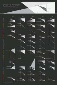
[25:19] Our favorite entry: “Spotlight of profitability”
[31:55] Wrapping up the contests
[33:07] Mo’s rant on outrageous RFPs
[35:33] Outlook

Visualizations Discussed in Detail
Some of you voiced the need to have more to see before listening to the episode. Here are the main visuals we discuss in details (click on the images to have a higher resolution version).

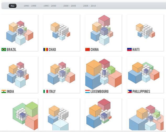
E-Cube-Librium – Visualizing Marathon 2011 Grand Prize Winner
(see how it works: http://invent.ge/ecube-how)

e-cube-librium

Spotlight of Profitability (see 2nd entry in the list) – Information is Beautiful Awards
(Our favorite entry for IBA)

SPOTLIGHT-ON-PROFITABILITY

Contests Mentioned in the Episode

As usual, let us know what you think. Criticism is welcome.

001  |  Exuberant Animated Data Kitsch

Hi Folks, in this episode we discuss the goods and bads of animated visualization:

03:26 – Introducing Data Stories
06:05 – Data Animation Kitsch
14:40 – Using Animation Interactively
17:54 – Scientific Research on Animation
27:17 – Eye-candy and the 2D vs. 3D Debate
29:37 – Engagement and “Data Entertainment”
31:19 – Contests and Marathons
41:07 – Conclusion

Here are some useful links to follow the discussion.

Examples.

Well-crafted round-up article by Andy Kirk

Research papers on animation.

What do you think of animation in visualization? Is it effective? Can you resist the allure?


Related episodes