[Our podcast is fully supported by our listeners. Please consider becoming a supporter on Patreon or sending us a one-time donation through Paypal. Thanks!]
What is uncertainty? Why is it important to take it into account when designing data visualizations? And how do you actually do so? We explore these and other questions with Jessica Hullman of Northwestern University and Matthew Kay of the University of Michigan. Jessica and Matt have written many publications on the topic that help orient us to the intricate world of uncertainty, probabilities, and their relevance to data visualization.
We hope you enjoy the show!
Links
- National Institute for Standards (NIST): “Measurement Error”
- Useful material to learn about uncertainty visualization:
- Leland Wilkinson’s The Grammar of Graphics (chapter on uncertainty)
- Howard Wainer’s Picturing the Uncertain World
- Richard McElreath’s Statistical Rethinking
- Claus Wilke’s uncertainty vis chapter
- Matt’s github of uncertainty examples
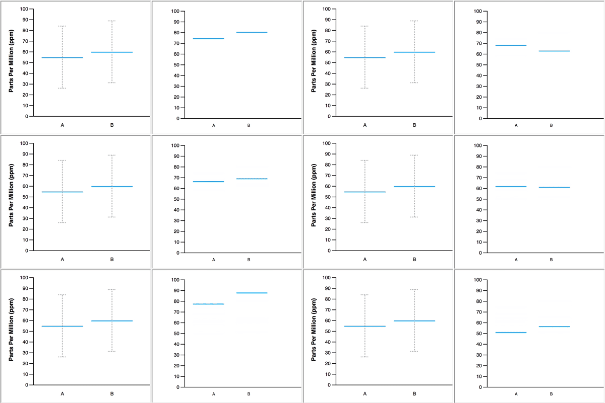
- Hypothetical Outcome Plots
- Hypothetical Outcome Plots: Experiencing the Uncertain
- Paper: Hypothetical Outcome Plots Outperform Error Bars and Violin Plots for Inferences about Reliability of Variable Ordering
- Paper: Hypothetical Outcome Plots Help Untrained Observers Judge Trends in Ambiguous Data
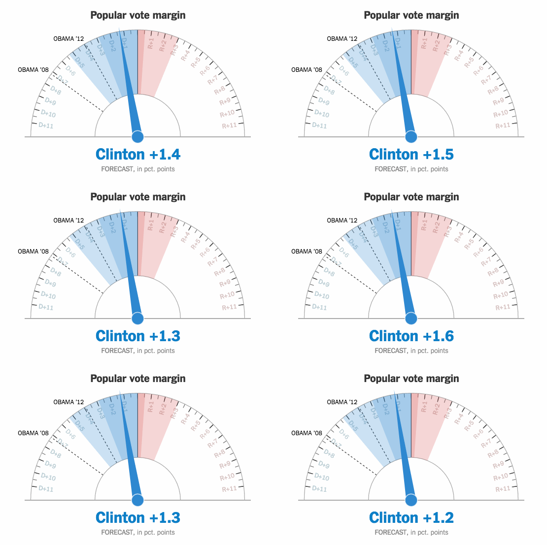
- Gregor Aisch on: “Why we used jittery gauges in our live election forecast”
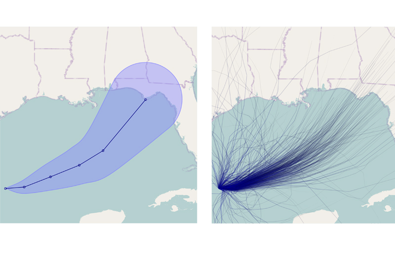
- Ensembles – Visualizing storms
- Visual variables used to show probability/confidence
- Related: Value suppressing color palettes
- Related: Sketchy rendering
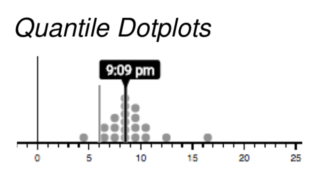
- Static depictions of outcomes (quantile dotplot)
- Paper: When (ish) is My Bus? User-centered Visualizations of Uncertainty in Everyday, Mobile Predictive Systems.
- Paper: Uncertainty Displays Using Quantile Dotplots or CDFs Improve Transit Decision-Making
- Paper: Imagining Replications: Graphical Prediction & Discrete Visualizations Improve Recall & Estimation of Effect Uncertainty
- Evaluation
