[Help us run the show by supporting us on Patreon!]
This week we have Krist Wongsuphasawat on Data Stories to talk about visualization projects at Twitter. Krist has a Ph.D. in Computer Science from the University of Maryland, where he worked with Ben Shneiderman. Most recently, he has been a Data Visualization Scientist at Twitter since 2012.
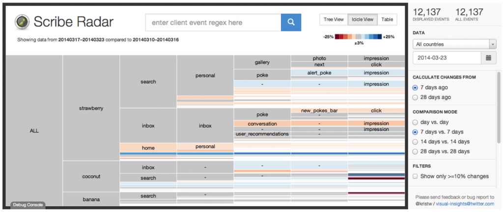
On the show, Krist describes the kinds of projects that the visualization team at Twitter develops. He also walks us through a few of the most popular of these projects, including their famous visualization of Game of Thrones.
Also, don’t miss Krist’s masterpiece post “How I carefully crafted a truly terrible data visualization” 🙂
Enjoy the show!
Data Stories is brought to you by Qlik. Are you missing out on meaningful relationships hidden in your data? Unlock the whole story with Qlik Sense through personalized visualizations and dynamic dashboards which you can download for free at qlik.de/datastories.
Links
- Wahl 2Q17
- Enrico’s website
- Krist’s website
- The Twitter interactive page
- “How every #GameOfThrones episode has been discussed on Twitter”
- Twitter platform for developers
- Labella.js
- Twitter D3Kit
- Krist’s post: “How I carefully crafted a truly terrible data visualization”
Related Episodes
- Data Stories 11: emoto with Stephan Thiel from Studio NAND
- Data Stories 54: Designing Exploratory Data Visualization Tools with Miriah Meyer
- Data Stories 62: Text Visualization: Past, Present and Future with Chris Collins
- Data Stories 95: Challenges of Being a Vis Professional in Industry with Elijah Meeks


