We hope everyone is doing well! We finally decided to record an episode on visualization and covid19. It’s been a crazy several weeks and one of the most interesting developments has been to see how prominent visualization has been in the constant flux of information. Who expected visualization to be so relevant, uh?!
And when we talk about data and pandemics we could not find a better person than Carl Bergstrom, Professor of Biology at University of Washington, with a background in epidemiology but also an expert in scientific practices and communication.
You may remember Carl from an episode about three years ago (Episode 97). We interviewed him together with his colleague Jevin West to talk about their excellent “Calling Bullshit” project (and let’s face it, there is no lack of BS during these crazy times), a course (and soon to be a book) on how to spot BS in science.
Carl has been a constant source of information and reasoning on Twitter. Commenting on the science behind pandemics but also about the way science is communicated and the many possible traps you may fall into. If there is one thing we all learned is that visualization without reliable data is a mess!
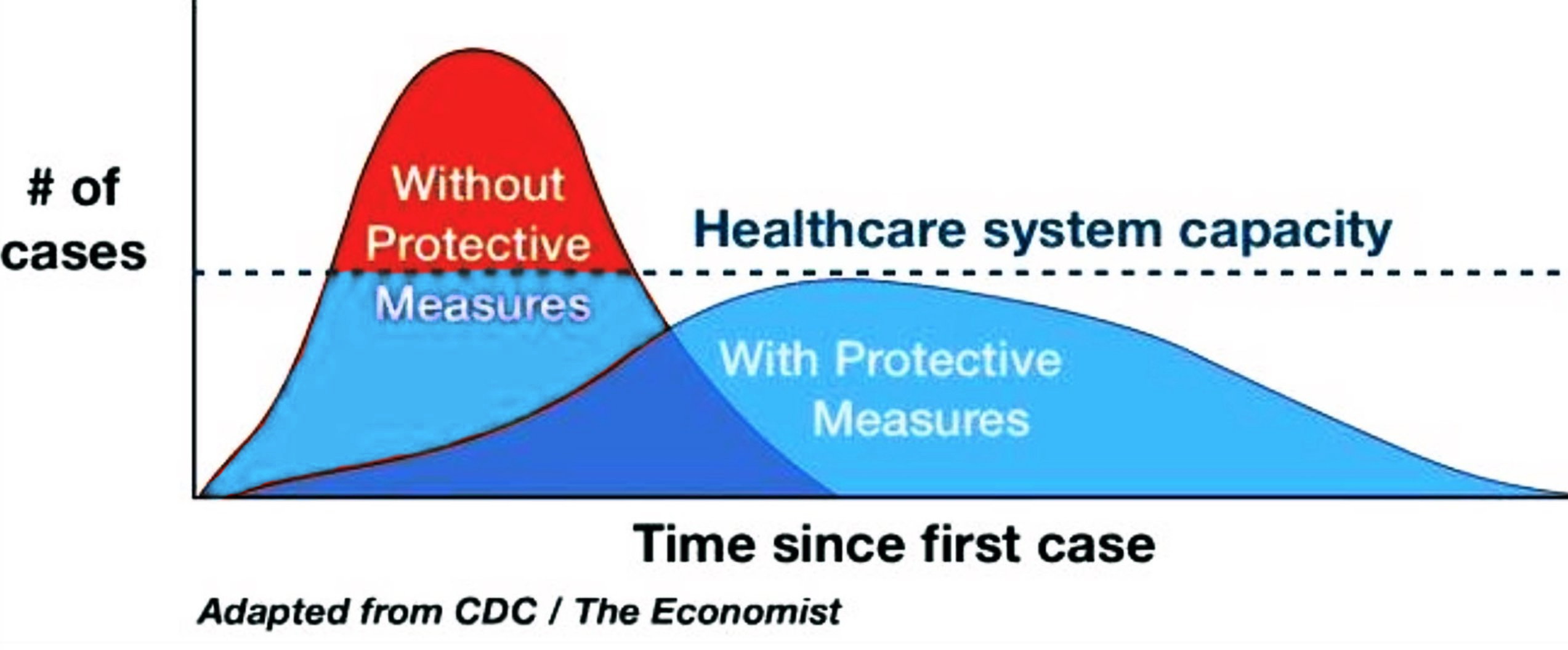
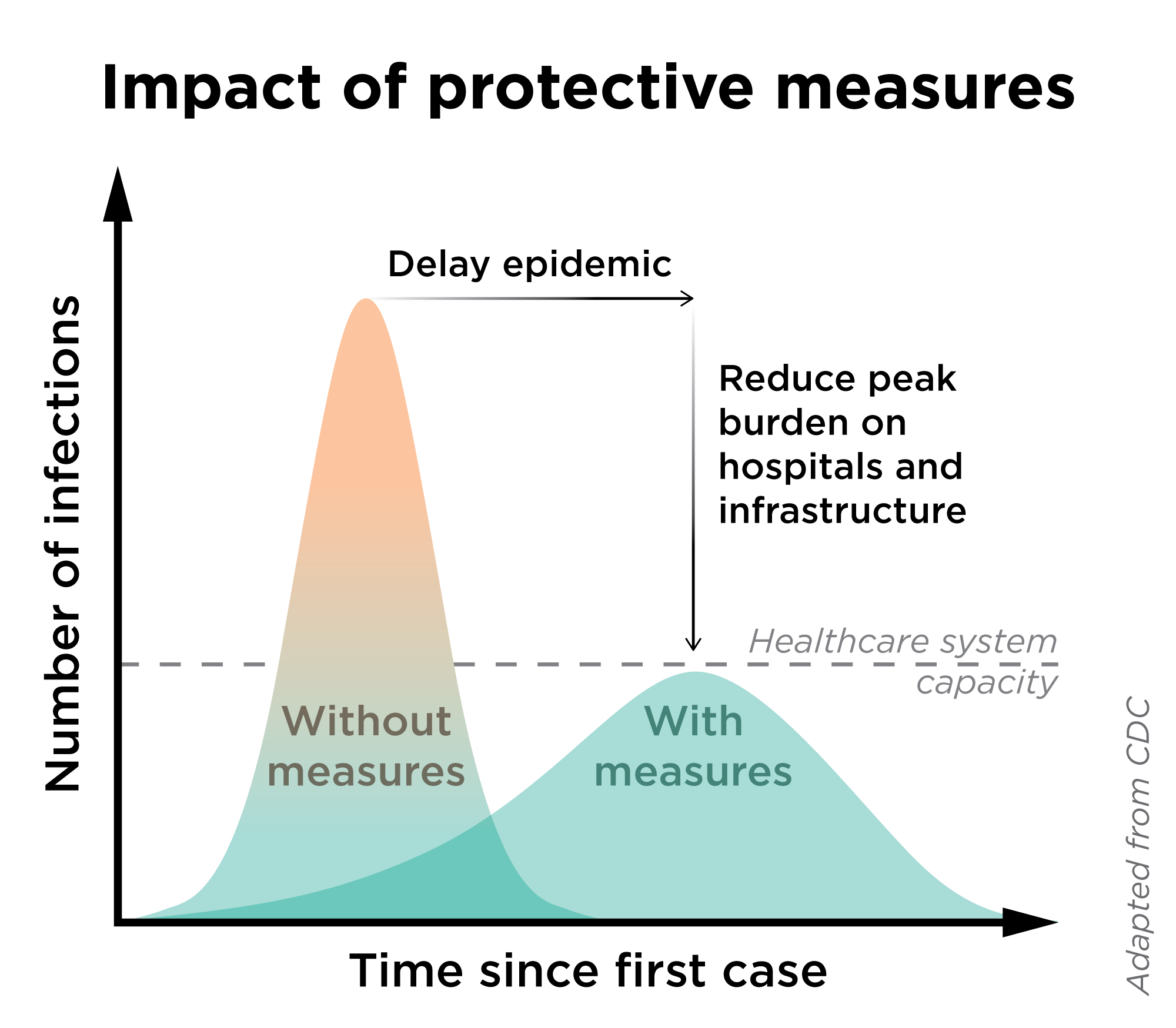
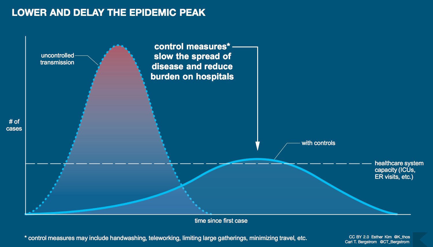
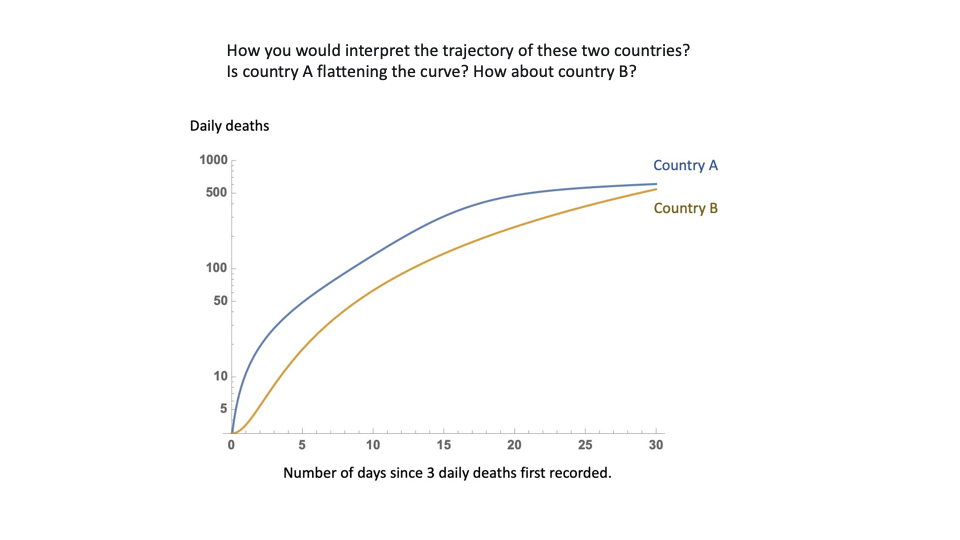
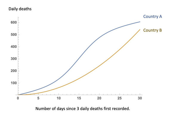
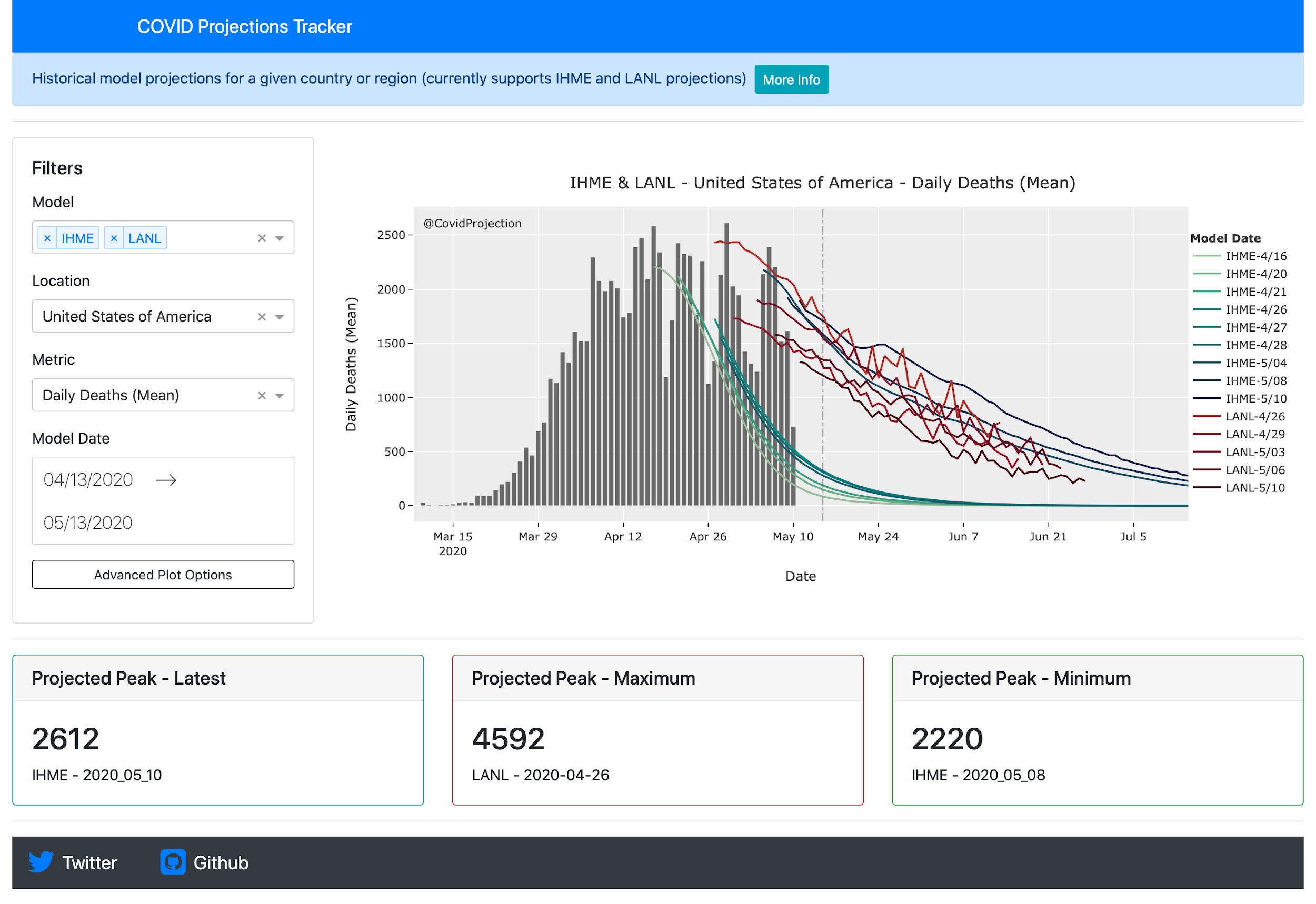
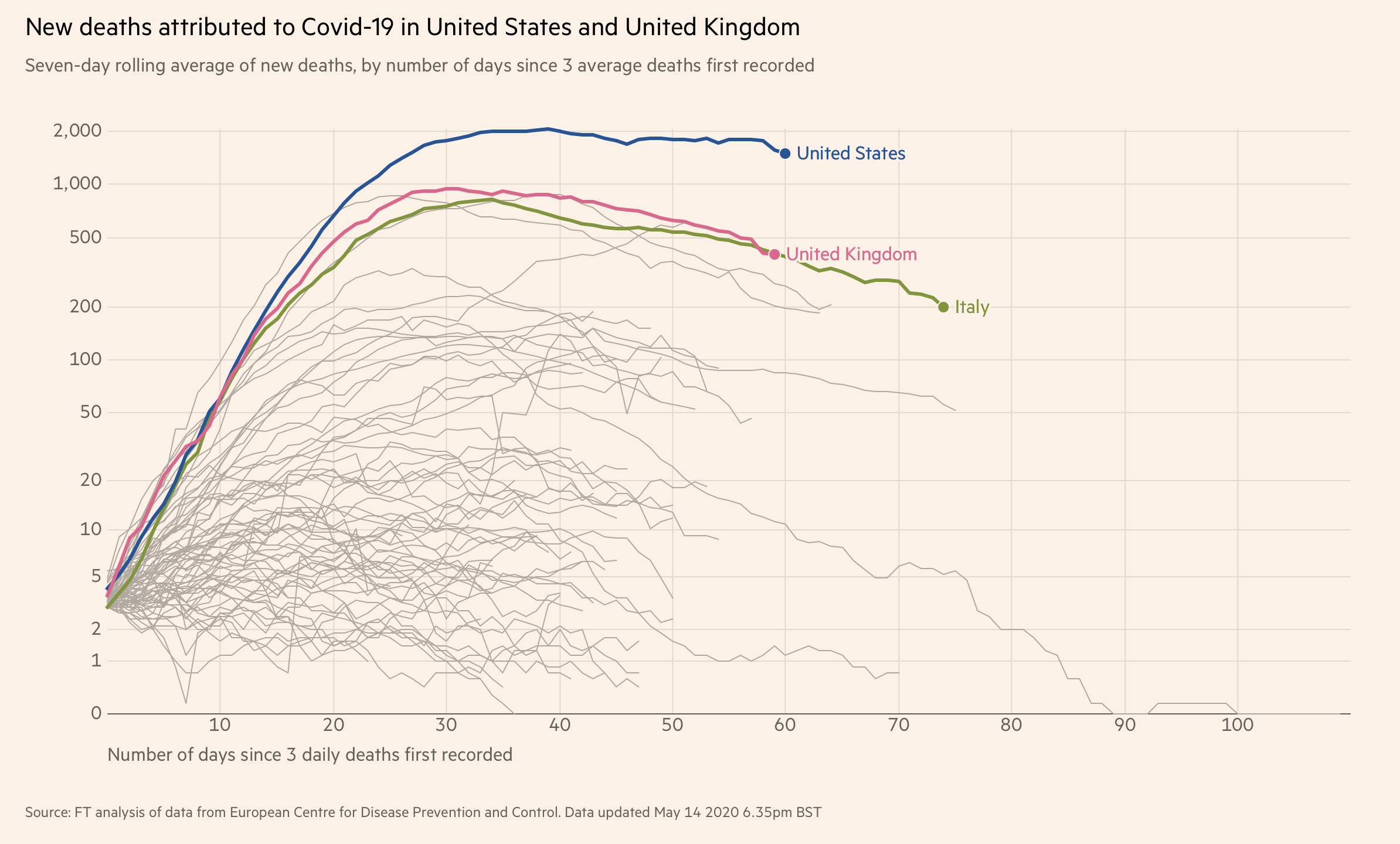
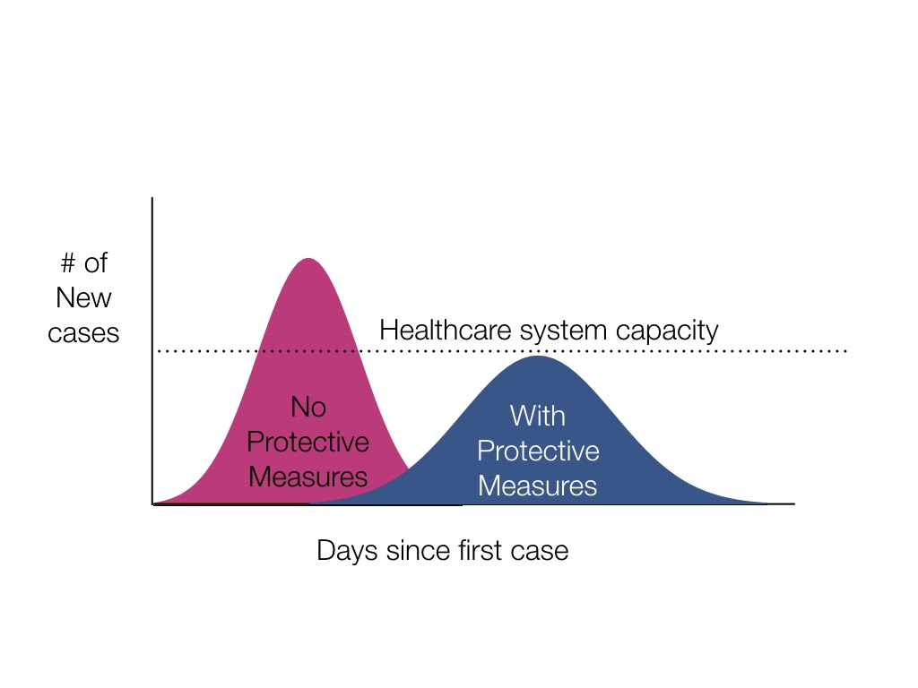
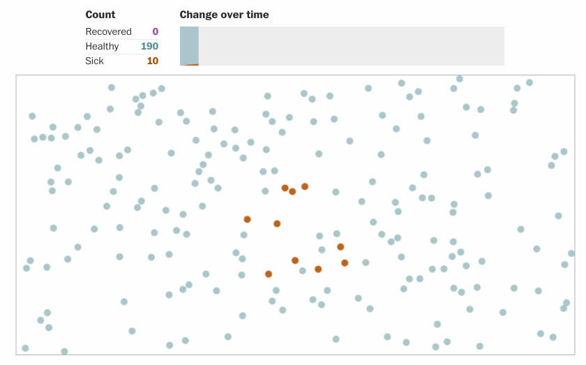
In the show, we talk about a number of iconic covid19 visualizations, the “flatten the curve” ones, the tracking lines from Financial Times and several simulations. For each of these we discuss the many variations and nuances, what we have learned from them and the many intricacies of creating visualizations for such a sensitive topic with potential huge outcomes.
[Our podcast is fully listener-supported. That’s why you don’t have to listen to ads! Please consider becoming a supporter on Patreon or sending us a one-time donation through Paypal. And thank you!]
Links:
- Prof. Carl Bergstrom
- Siouxsie Wiles’ Flatten the Curve cartoon
- Medium: Don’t Flatten the Curve
- Vox: Coronavirus mitigation could kill thousands. Suppress the virus, don’t just “flatten the curve.”
- Scientific American: Leading with the Unknowns in COVID-19 Models
- WaPo: Why outbreaks like coronavirus spread exponentially, and how to “flatten the curve”
- Carl’s tweet on normalizing by population size (or not?)
- Matthew Fox’s Tweet on Uncertainty Bounds in the IHME model
Stats and Tracking:
- COVID Projections Tracker
- FT’s tracker: Coronavirus tracked: the latest figures as countries fight to contain the pandemic
- Our World in data: Coronavirus Pandemic (COVID-19) – Statistics and Research
- John Hopkins tracker: COVID-19 Map – Johns Hopkins Coronavirus Resource Center
Visual Simulations:
- People of the Pandemic | a hyperlocal cooperative simulation game
- Why outbreaks like coronavirus spread exponentially, and how to “flatten the curve”
- What Happens Next? COVID-19 Futures, Explained With Playable Simulations
- Outbreak