It's time for another project-centric episode, and we finally talk about one of our favorite projects of the year — "Dear Data" by the most fabulous tag team of data illustrators around: Giorgia Lupi and Stefanie Posavec.
Their year-long project is about how "two women who switched continents get to know each other through the data they draw and send across the pond" and consists of 104 hand–drawn postcards all of which document one week of their lives. How much they cursed, laughed, read, smiled at strangers, … — all of this is documented in inventive, charming and very analogue ways.
Learn all about the project — how they started it, what they learned, and how it will live on — in the episode.
Links mentioned:
Yay for slow data!
Reporter app: http://www.reporter-app.com/
Notebook app: http://www.notebooksapp.com/
And read the episode transcript here!
Data Stories is brought to you by Qlik, who allow you to explore the hidden relationships within your data that lead to meaningful insights. Check out this fun experiment on the qlik blog: "What Chart are You?". And, make sure to try out Qlik Sense, which you can download for free at www.qlik.de/datastories.
Dear Data Stories Friends, We are ready to try something new together with you. After many years of financial support from our generous sponsors, we now want to move to a crowdfunding model, where the show is funded by you — our listeners. If you have enjoyed listening to our show so far — …
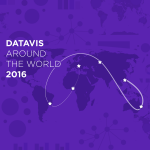
In this 2016 year review episode, we interview 6 visualization experts from 6 different countries. There is a lot to learn about data visualization around the world!
Wishing a Happy Holidays and a Happy New Year to all our listeners!
Hi folks! We have Benedikt Groß with us on the show. Benedikt defines himself as a "speculative and computational designer who works antidisciplinarily." Benedikt graduated from the Design Interactions course at the Royal College of Art and he works for his studio in Stuttgart, Germany. He is the co-author of ‘Generative Design,’ one of the standard books on the topic.
In the show we talk about some of his amazing data projects at the intersection of art, design, science, sociology, etc. Aerial Bold, for instance, is a project about searching satellite images to find buildings and geographic features that look like letters. The Big Atlas of LA Pools, is a project about mapping all pools in LA. And Population.io is about showing demographic data in an engaging way and even giving you a prediction of when you are going to die! This is an amazing episode with stories about how Bill Gates crushed Population.io with one tweet, how they published 74 books of pool images totaling about 6000 pages, and how they outsourced some of the work to an Indian company to trace the pools. Amazing stuff!
Enjoy it!
LINKS
Generative Design - Benedikt's book on generative design
RCA Design Interactions
The Big Atlas of LA Pools
Aerial Bold Kickstarter Page
Letter Hunt for Aerial Bold - help Benedikt and his team find letters!
Population.io
Foldit - Science Gamification Tool
Transcripts Transcript: 82 | Information+ Conference Review Transcript: 81 | The Hustle with Mahir Yavuz and Jan Willem Tulp Transcript: 80 | Indexical Visualization with Dietmar Offenhuber August 28, 2013 – Dietmar Offenhuber, a new faculty member in the College of Arts, Media and Design and the College of Social Sciences and Humanities, specializes in …
We are recapping the year in data visualization with Andy Kirk and Robert Kosara — what were the biggest trends, the biggest misses, and what do we expect for 2016?